Raising the roof

ramases1.jpg

Roger Dean’s album cover art extends further than his sleeve illustrations for Yes. His earlier designs for the Vertigo label showed his visual invention to good effect, and a couple of those designs have had their imitators. The cover art for Dedicated To You, But You Weren’t Listening by the Keith Tippett Group is one that I’ve seen copied although I forget where for the moment so you’ll have to take this on trust. (Ahem.)

ramases2.jpg

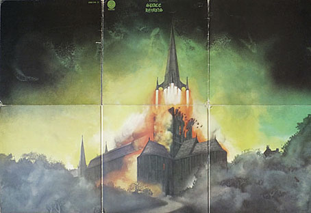
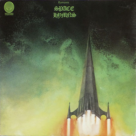
The church steeple blasting off from Space Hymns (1971) by Ramases is borrowed somewhat crudely in a 2011 ad for the Wien Museum which shows Vienna’s St Stephen’s cathedral undergoing a similar transformation. The Ramases idea is so eye-catching I’m surprised I’ve not seen it imitated before, although it wasn’t Dean’s invention; in his Views book he says that it was the group’s idea, and they gave him a thorough brief. I presume by this he means that they also wanted the spire as a cover detail, and looking sufficiently rocket-like to give a surprise when the sleeve is opened.

wien.jpg

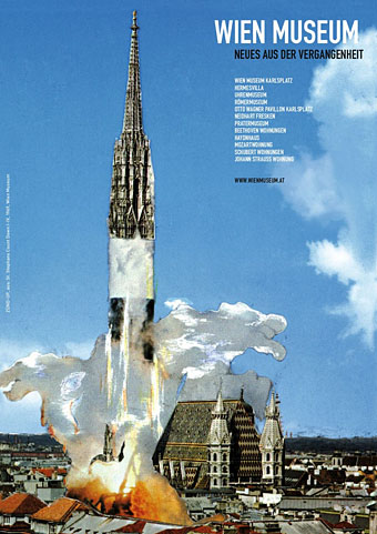
“Ramases” was Martin Raphael Barrington Frost, an Egypt-obsessed British musician who recorded two albums and a single with wife, “Selket”. The single B-side, Mind’s Eye (1968), is a decent piece of psychedelia that turns up on compilations. The same can’t be said for Space Hymns, unfortunately; the presence of 10cc as backing band isn’t enough to rescue songs whose cosmic titles offer more than they deliver. But that’s still a great sleeve. Thanks to @weird_prophet for the Wien tip!

Elsewhere on { feuilleton }
The album covers archive

Previously on { feuilleton }
Roger Dean: artist and designer

Babel details

babel01.jpg

The Tower of Babel (c. 1563) by Pieter Bruegel the Elder. Kunsthistorisches Museum, Vienna.

Seeing as how I have a fetish for Towers of Babel I ought to have examined this one sooner, the copy at the Google Art Project being one which allows you to explore the surface of the picture in greater detail than the artist himself would have seen unless he was using a magnifying glass. I still find the Art Project interface awkward so the grabs here were taken from a massive jpeg at Wikipedia: 30,000 pixels across, or 243 MB, scaling up to around 1.84 GB in Photoshop which means it’ll make older machines grind in complaint.

babel02.jpg

The detail is astonishing even by Bruegel’s standards. I’d never realised before how much care is given to the individual actions of every single worker on the tower, however small. Bruegel’s close observation of the working habits of the people around him is here reflected in the myriad figures, all of whom are doing something purposeful. At this resolution you’re able to see that the workers have taken their wives and children up the tower with them—there’s the familiar line of washing hung out to dry—while various beasts of burden haul building materials up the spiral roadway. You could spend a long time exploring the details of the tower before even looking at the background where tiny boats are sailing the sea and the rivers, and more fortunate animals have been left to graze in fields.

Wikipedia has several more of these enormous images. It’s a shame there aren’t many more of Bruegel’s works available at this size, his other crowded paintings deserve equal scrutiny.

babel03.jpg

One of the builders on his lunch break.

babel04.jpg

A jug on a window sill.

Continue reading “Babel details”

MMM

macgregor1.jpg

Post number three thousand, and searching the memory for anything which might be filed under MMM led to more occult art. Moina MacGregor Mathers (1865–1928) was the wife of Samuel Liddell MacGregor Mathers, one of the founders of the Hermetic Order of the Golden Dawn in the 1880s. Moina was the sister of the French philosopher Henri Bergson, and later took to signing her illustration work “M. Bergson MacGregor”. The illustration above, however, a frontispiece for her husband’s translation of The Sacred Magic of Abramelin the Mage (1897) was signed “M.M.M.” (The signature has been removed in this reproduction but is visible here.) That triplet of initials is typical of western occultism; when Aleister Crowley (no friend of the Mathers) was appointed head of the O.T.O. in Britain his new lodge was named Mysteria Mystica Maxima, or M.M.M.

Ms Mathers wasn’t the greatest of artists but her few works have a fin de siècle charm, and are informed by occult study which she and her husband took seriously. The example below is from yet another slim volume of mystical poetry, Poems (1897) by Golden Dawn adept Charles Rosher. No need to wonder why Max Beerbohm made Enoch Soames a poet; it often seems that those who weren’t writing poetry in the 1890s were in the minority.

macgregor2.jpg

Previously on { feuilleton }
Whirlpools
The Sapphire Museum of Magic and Occultism

Whirlpools

whirlpool.jpg

This was a surprise. My first thought on seeing the cover for Ethel Archer’s “book of verse”, The Whirlpool, was that its swirling waters were borrowed from Harry Clarke’s typically astonishing illustration for A Descent into the Maelström by Edgar Allan Poe. The problem there is that the Ethel Archer book was published in 1911 while Clarke’s first collection of Poe illustrations didn’t appear until 1919. The cover for the Archer book was by Ethel’s husband, Eugene Wieland, the publisher of Aleister Crowley’s Equinox periodical/occult treatise, and also the publisher of this volume. Crowley provided an introduction to the book. Given these occult associations it’s possible that Harry Clarke might have seen a copy of this. Clarke’s work appeared in Austin Spare’s own occult periodical, The Golden Hind, and he wasn’t averse to producing occult art of his own. This isn’t to say that Clarke necessarily took anything from the Archer book—sometimes a whirlpool is just a whirlpool—but it’s not outside the bounds of possibility.

There’s a copy of Ethel Archer’s book currently on sale at eBay, together with some original drawings by Eugene Wieland. The cover above came via John Eggeling’s Flickr page of rare book covers. The Poe illustration is via 50 Watts.

maelstrom.jpg

Previously on { feuilleton }
The Sapphire Museum of Magic and Occultism

Out of season

fisher1.jpg

Photographer Andrew G Fisher sent a link to his web galleries recently, among which there’s a great series of shots from various seaside towns. If I respond to these more than the others it’s because I grew up by the sea. Views like this are an indelible feature of my childhood memories, they often recur in dreams. The peculiar melancholy of an out-of-season holiday resort isn’t exactly an unknown quantity, but if you’ve grown up in one of these places it becomes an ingrained feature of your life. Resort towns have no industry other than catering to holidaymakers; for half the year they lie fallow and appear semi-deserted when their population has been so drastically reduced. Add to this the disparity between the sunny days for which all the facilities cater, and the winter when many of those facilities have been closed down and the weather brings gales howling off the sea, and you have a curious parallel existence which the inhabitants of other towns and cities never experience.

Andrew Fisher’s photographs capture some of this parallel life: the abandoned shelter under a grey sky, empty promenades with iron bollards corroded by the salt air, a line of unused seats made even more cheerless by the presence of a floral tribute. That last shot fixes the nature of the seaside resort as an absolute boundary; the built environment can extend no further than this. Yes, I miss the sea.

fisher2.jpg

fisher3.jpg

fisher4.jpg

fisher5.jpg

Previously on { feuilleton }
Old lighthouses