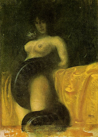
Stuck’s serpents

stuck1.jpg

The Sin (1894).

Some pictures in honour of the Chinese year of the Water Snake which begins this Sunday. Paintings of women with snakes are legion, even after you winnow out all the Eve and the Serpent pictures, so you need to narrow the field of view. Artists of the 19th century must have been delighted when Gustave Flaubert published Salammbô in 1862, chapter 10 of which—The Serpent—gave them an excuse to depict an exotic woman involved with a snake completely free of any Biblical trappings.
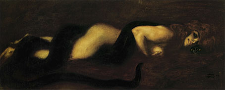
stuck3.jpg

Sensuality (1891).

Franz Stuck’s celebrated trio of serpent women can be read as Eve figures but their provocative posing is more in line with the prurient misogyny common to much art of the period, an attitude which condemned women for being so tempting whilst also secretly lusting after their bodies. Sensuality is remarkable for the way its oiled snake is so firmly lodged between the woman’s thighs. Stuck was never very interested in Christian themes—many of his other works are a Teutonic take on Classical subjects—so I wonder whether his use of the word “sin” was merely a fig leaf for delivering imagery he wouldn’t have otherwise been able to exhibit.

stuck2.jpg

The Sin (1893).

wilson.jpg

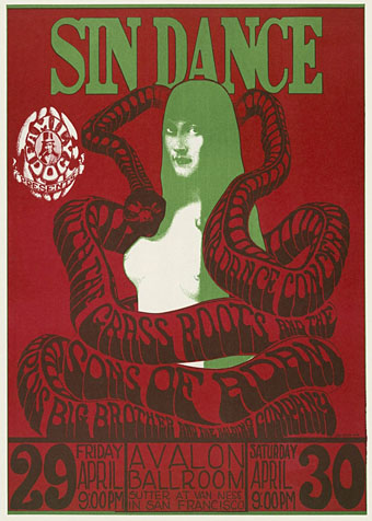
Sin Dance (1966) by Wes Wilson.

Symbolist art was rediscovered in the 1960s after decades of neglect, and the psychedelic poster artists happily plundered the art books for suitable imagery. Stuck’s Sin returned to the world in these two Avalon Ballroom posters. Wes Wilson’s Sin Dance was a design for an event which was cancelled so this might explain why the same painting appeared a few months later on a Stanley Mouse and Alton Kelley poster. The Mouse & Kelley version was printed with metallic inks.

For more of Franz Stuck’s work see WikiPaintings.

mouse.jpg

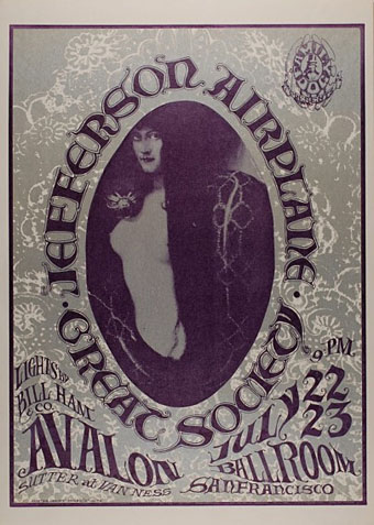
Jefferson Airplane at the Avalon Ballroom (1966) by Mouse & Kelley.

Previously on { feuilleton }
Serpentine pulchritude
Salammbô illustrated
The Feminine Sphinx
Men with snakes

Underground labyrinths

wallinger.jpg

Labyrinth (Westminster) by Mark Wallinger.

A mandatory post, this one, seeing as how it combines two continual sources of interest: labyrinths and the London Underground transport system. Transport for London commissioned artist Mark Wallinger to create something for the 150th birthday celebrations of the Tube, the result being a series of 270 different labyrinth designs, one for each of the capital’s stations. Needless to say, I like the idea, and it’s been interesting to see that some of Wallinger’s designs hark back to earlier labyrinths. The one for the Westminster station is notable for the way it references the famous Chartres Cathedral labyrinth (below)—a nod to Westminster Abbey, perhaps—and also features an enclosed and inaccessible loop, a possible comment on the irresolvable dealings occurring across the road in the Houses of Parliament.

maze02.jpg

It’s Nice That has more of Wallinger’s designs while Creative Review draws attention to an earlier maze design on the wall at Warren Street station.

Previously on { feuilleton }
Cthulhu Labyrinth
The labyrinth of Versailles
Maze and labyrinth panoramas
Mazes and labyrinths
Labyrinths
Jeppe Hein’s mirror labyrinth

MC Escher album covers

scaffold.jpg

L The P (1969) by Scaffold. Art: Ascending and Descending (1960).

A follow-up to yesterday’s post. MC Escher lived long enough to see his work move from curiosities appealing to a small circle of print collectors, through enthusiasm among scientists and mathematicians, to mass acceptance in the late 1960s thanks, in part, to the general vogue for any art that looked weird or far out. New Worlds magazine used Relativity on a cover in 1967, while Thomas Albright writing for Rolling Stone in 1970 introduced a generation of American heads to Escher’s work. A year earlier, another Rolling Stone, Mick Jagger, had tried to persuade Escher to create something for the cover of Let It Bleed; the artist declined but that didn’t stop others using his prints for cover art.

mott.jpg

Mott The Hoople (1969) by Mott The Hoople. Art: Reptiles (1943).

Escher’s work is so well-suited to a vinyl sleeve that I’m surprised his lithographs and woodcuts haven’t seen more use. Liverpool group Scaffold beat Mott the Hoople to the first usage by a few months in 1969 (unless there’s an earlier example I don’t know about); L The P is a play on the Scaffold’s big hit, Lily The Pink. As is often the case with these music design histories, things start off well with sympathetic treatments of the artwork then degrade when hamfisted amateur designers take over. I can’t imagine Escher being flattered by some of the later examples. If you know of any others, good or bad, then please leave a comment.

beaverkrause.jpg

In A Wild Sanctuary (1970) by Beaver and Krause. Art: Three Worlds (1955).

mandrake.jpg

Puzzle (1970) by The Mandrake Memorial. A gatefold sleeve which opened out to reveal the whole of Escher’s House of Stairs I (1951). Inside the gatefold was Curl-up (1951). Design by Milton Glaser who also designed the group’s second album, Medium.

Continue reading “MC Escher album covers”

Escher and Schrofer

schrofer5.jpg

Design by Jurriaan Schrofer.

That’s Maurits Cornelis Escher (1898–1972), the Dutch artist, and Jurriaan Schrofer (1926–90), the Dutch typographer and graphic designer. Aside from a shared nationality the pair had a similar interest in periodicity and incremental metamorphosis, something that’s strikingly apparent when you compare their works. I don’t know much about Schrofer so I can’t say whether he was consciously following Escher’s example or whether this is coincidence. Some of the gradations and distortions also bear comparison with the Op Art paintings of Bridget Riley, Victor Vasarely and others.

escher8.jpg

MC Escher signed most of his works with three square “MCE” letters which are remarkably similar to Schrofer’s type designs.

There’s an opportunity to find out more about Schrofer’s distinctive approach to graphic design in a forthcoming book from Unit Editions (currently available at a reduced pre-order price). More of his work can be seen at But Does It Float and scattered around Tumblr. MC Escher is well-represented on the web; I’d suggest starting at WikiPaintings.

escher1.jpg

Circle Limit I (1958) by MC Escher.

schrofer1.jpg

Design by Jurriaan Schrofer.

escher2.jpg

Square Limit (colour, 1964) by MC Escher.

Continue reading “Escher and Schrofer”

Nothing Is

sunra.jpg

1: Nothing Is… (1966), an album of science fiction jazz by Sun Ra.

What does the empty space of that ellipsis imply?

beatles.jpg

2: Strawberry Fields Forever (1967), a single by The Beatles.

“Strawberry Fields / Nothing is real”

harrison1.jpg

Cover art by Sam Green.

3: Empty Space (2012), a science fiction novel by M. John Harrison.

Chapter 1: “Nothing is real,” he said.

harrison2.jpg

mbv.jpg

4: MBV (2013), an album by My Bloody Valentine which emerged from empty space at the weekend.

Track 8: Nothing Is.

Previously on { feuilleton }
Golden apples and silver apples