Piranesi record covers

piranesi12.jpg

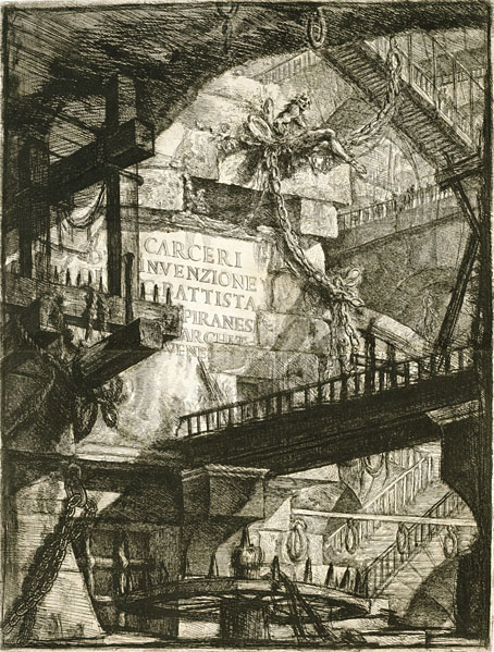
Title page for the Carceri d’Invenzione (second state), 1761.

Continuing an occasional series about artists or designers whose work has appeared on record sleeves. Giovanni Battista Piranesi (1720–1778) is a cult figure here so this is an inevitable post even if there isn’t a great deal to look at. Many of the record covers that use Piranesi etchings are for classical releases, which isn’t so surprising. The prints that comprise the Vedute di Roma were Piranesi’s most popular works, and remain so today despite their exaggerations of the true size of Rome’s monuments and ruins. But I thought the Carceri d’Invenzione (aka The Prisons) might be more popular, especially in the metal world where dark and gloomy imagery is de rigueur. There may be more examples, of course, since I’m having to rely on Discogs which doesn’t always note the work of uncredited artists. I suspect that architecture alone isn’t attractive enough for the metal hordes, however vast and tenebrous that architecture might be. The covers I’ve done for metal bands have always had to incorporate figures—human or otherwise—or some kind of occult symbolism. The most prominent musical piece based on Piranesi’s Prisons is also a classical work, one of the Bach cello suites recorded by Yo-Yo Ma in 1998. Ma’s album, Inspired By Bach, was accompanied by six films from different directors; the film for Suite No. 2, The Sound of the Carceri by François Girard, shows Ma playing the piece inside a CGI rendering of Piranesi’s colossal spaces. Copies of Girard’s film come and go on YouTube so this one may not stay around.

piranesi01.jpg

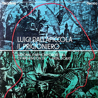
Luigi Dallapiccola: Il Prigioniero (1975); National Symphony Orchestra Of Washington DC, Antal Dorati.

piranesi02.jpg

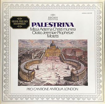
Palestrina: Missa Aeterna Christi Munera / Oratio Jeremiae Prophetae / Motetti (1976); Pro Cantione Antiqua, London.

piranesi03.jpg

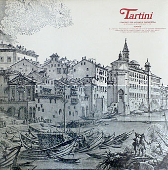
Tartini: Concerti Per Violino E Orchestra / Sonate (1981); P. Toso, I Solisti Veneti, C. Scimone, E. Farina.

piranesi04.jpg

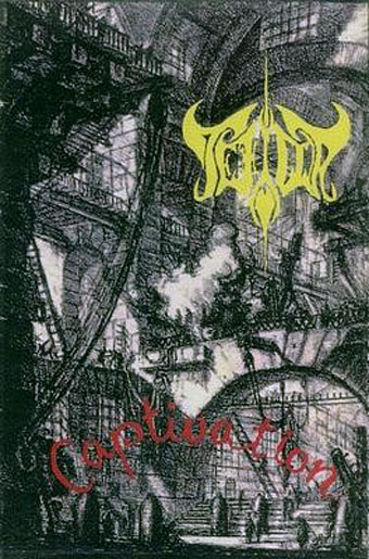
Captivation (1994) by Tefilla.

Continue reading “Piranesi record covers”

Weekend links 556

wilson.jpg

Captain Edward St. Miquel Tilden Bradshaw and his Crew Come to Grips with Bloodthirsty Foe Pirates by S. Clay Wilson, Zap Comix no. 3, 1968.

• RIP S. Clay Wilson, the wild man of American comics. The scene of mayhem above is typical in being barely coherent at a small size; click for a larger view. Patrick Rosenkranz at The Comics Journal describes Wilson as “the most influential artist of his generation…creating an extensive body of work that will defy authority and offend propriety until the end of days”. When Moebius was writing in the 1980s about the founding of Métal Hurlant he had this to say about the American undergrounds: “They were the first in the world to use comics as a means of communication, to express real emotions. Before, comics were used only to do stories, entertainment. They had some great moments but they were all very conventional. The American Underground showed us in Europe how to express true feelings, how to tell something to the reader through the comics. They blew the minds of the few professionals in Europe who saw them.” Also at TCJ, the S. Clay Wilson Interview. Wilson sent me a postcard once. I wish I knew what the hell I’d done with it.

• Michael Hoenig, synthesist for Agitation Free and (briefly) Tangerine Dream, plays one of the pieces from his debut album of electronic music, Departure From The Northern Wasteland, on a radio show in 1977. Hoenig’s album is long overdue a remastering and re-release.

• “My job, which the BBC has tasked me to do, is to provoke people and ask them, ‘Have you thought about looking at the world this way?'” Adam Curtis talks to Michael J. Brooks about his new TV series, Can’t Get You Out Of My Head.

m_chat.jpg

{ feuilleton } celebrates its 15th birthday today. Monsieur Chat, the mascot of this place, is happy about that but then Monsieur Chat is happy about most things.

• At Greydogtales: Opening The Book of Carnacki. A call for contributions to a collection of new stories about William Hope Hodgson’s occult detective. I’d be tempted if I didn’t already have more than enough to keep me occupied.

• “I’m being asked to talk about it a great deal at the moment, with the pandemic.” Roger Corman and Jane Asher on filming The Masque of the Red Death.

• New music: Cygnus Sutra by Mike Shannon, “a soundtrack to a fantasy/sci-fi epic not yet written”.

• A trailer for The Witch of King’s Cross, a documentary about occult artist Rosaleen Norton.

• At Dennis Cooper’s: Spotlight on…Hans Bellmer & Paul Eluard The Games of the Doll (1949).

• RIP also this week to Rowena Morrill, fantasy artist, and to Chick Corea.

• “Computers will never write good novels,” says Angus Fletcher.

• DJ Food on Zodiac posters by Funky Features, 1967.

• Mix of the week: Fact Mix 794 by Lutto Lento.

Annie Nightingale’s favourite music.

Zodiac (1984) by Boogie Boys | From The Zodiacal Light (2014) by Earth | Zodiac Black (2017) by Goldfrapp

A Can pin

pin1.jpg

I’ve always liked badges, and I especially like the enamel pin variety even though I tend to buy them then not wear them very much for fear of losing them. This handsome item arrived a couple of days ago from an eBay seller, and is the first Can-related pin I’ve come across. After Kraftwerk, Can were the most popular of the German groups in the Britain of the 1970s but I’ve never seen any Can badges or anything else related to them from that decade aside from the records. The resurgence of interest in German music—Krautrock, if you must—has prompted the badge manufacturers who populate eBay, Etsy and elsewhere to create a number of items based on the record covers of Can, Neu!, Harmonia and others. The quality isn’t always very good but then badges in the 1970s were often crude designs as well. You can’t go wrong with a simple logo but shrinking an album cover down to 25 mm isn’t always a good idea. A couple of years ago I bought three Can badges from another eBay seller; two of them, with logo designs taken from sleeves, were okay but the third, based on the Future Days album cover was poorly printed. This pin equivalent is much better, as well as being one of the few Can sleeves you could transform in this manner. The raised gold lines are a good match for the Art Nouveau-styled design by Ingo Trauer and Richard J. Rudow which was embossed on the original German pressing. The group may have been popular in Britain but UA gave British Can-heads a flat sleeve.

pin2.jpg

The same eBay seller also makes these Kraftwerk pins which I bought a while ago. I’d still prefer to have the traffic cone without the band name—something that only aficionados would recognise—but it was good to find a pin based on the early years of the group’s career, the period which Kraftwerk themselves have long disowned. The seller recently added a new design with the same traffic cone in green as it is on the Kraftwerk 2 album cover, but the green cone was only a variation on a theme, the orange leitkegel is the ubiquitous and definitive icon of the pre-Autobahn years.

Previously on { feuilleton }
Holger’s Radio Pictures
Jaki Liebezeit times ten
Can esoterics
Can soundtracks
The kosmische design of Peter Geitner
Reworking Kraftwerk (again)
Leitkegel
German gear
Autobahnen
Ralf and Florian
Can’s Lost Tapes
Reworking Kraftwerk
Autobahn animated
Sleeve craft
Who designed Vertigo #6360 620?
Old music and old technology
A cluster of Cluster
Aerodynamik by Kraftwerk

Covering Genet

pelham-genet1.jpg

While writing Monday’s post I came across this series of new cover designs for the most recent Faber editions of Genet’s novels. I hadn’t seen these before but I liked the way they look as a set. Jonathan Pelham is the designer. At first glance the covers infringe one of my personal rules for cover design, that you should try and create something that couldn’t easily be used on another book by a different author; this is more of a challenge when a design is minimal or tending towards abstraction as these are. But Genet’s covers from British publishers have veered from the featureless (the Anthony Blond hardbacks of the 1960s) to the bizarrely random (the 1971 Penguin edition of Miracle of the Rose with a detail from Max Ernst’s Europe After the Rain—see below), so anything that looks this smart and consistent is a plus. I still like the series of paperbacks that Panther published in the early 1970s (also below) but they only did three of the books, with the Rubens typeface being a carry over from the Grove Press hardbacks designed by Roy Kuhlman. The new editions from Faber also feature new introductions by Neil Bartlett (Funeral Rites), Terry Hands (Miracle of the Rose), Jon Savage (Querelle of Brest), and Ahdaf Soueif (The Thief’s Journal).

pelham-genet2.jpg

pelham-genet3.jpg

pelham-genet4.jpg

pelham-genet5.jpg

Continue reading “Covering Genet”

Notre Dame des Fleurs: Variations on a Genet Classic

genet1.jpg

Another week, another book release. Notre Dame des Fleurs is a collection of artistic responses to Jean Genet’s debut novel, compiled and published by Jan van Rijn, for which I contributed three pieces:

Based on the English translation of the unabridged original edition, published in 1949 by Edition Paul Morihien, it is by no means a consistent illustration of the book nor is it a cohesive interpretation in form of a graphic novel. It is a truly personal collection that throws highlights on a beautiful piece of literature, printed in a run of 150 signed and numbered copies. The participating artists in alphabetical order: Michael AmpersantAntoine BernhartWim BeullensSusie Bright – John Coulthart – Lauri ElexsenRinaldo HopfAnja MolendijkBrane MozeticJohn Thomas ParadisoRexApollonia Saintclair Jan van RijnVilela Valentin

Genet’s novel caused a considerable stir when it was first published in France in 1943. Part memoir, part fiction, part masturbation aid, the book was famously written by Genet on sheets of wrapping paper in his Paris prison cell, and is probably the first account of homosexual lives—especially of homosexual erotic lives—lived on their own terms, without any apologies made to straight society or, for that matter, the straight reader. (“Straight” here applies to criminality as much as sexuality.) Antecedents exist, like Teleny Or the Reverse of the Medal, but Teleny is more assertively pornographic, which means it wanders into the fantasy world that porn always creates, a place where desire is everything and introspection doesn’t exist. Genet was writing about the people he knew in Paris before the war, the thieves and pimps and male prostitutes of Montmartre, and doing so in a manner that had to be considered as literature however transgressive the content might be for the literary establishment of the day.

genet2.jpg

The unique qualities of the novel present difficulties for an illustrator. Literary fiction tends to look inside its characters much more than genre fiction, summoning thoughts, moods and feelings which resist easy depiction in a visual form. I’d first been asked to consider illustrating Notre Dame des Fleurs several years ago for a Graphic Classics collection of crime fiction, a request to which I agreed then had to turn down after deciding that the task of condensing the book into a few pages was a near impossibility. For Jan’s book, rather than illustrate a scene or two from the novel I opted for a conceptual approach. My three pages are intended to be promotional materials from a parallel universe in which Notre Dame des Fleurs was made into a French feature film some ten years or so after its publication, complete with hardcore sex scenes. The latter may seem unlikely but Genet was in the vanguard of presenting gay sex on the cinema screen in Un Chant d’Amour, the 26-minute silent film he made in 1950. He subsequently disowned the film, as he disowned—or “forgot”—many of his creations in later years, but it remains a pioneering and influential work.

Continue reading “Notre Dame des Fleurs: Variations on a Genet Classic”