Queer Noise and the Wolf Girl

queer_noise.jpg

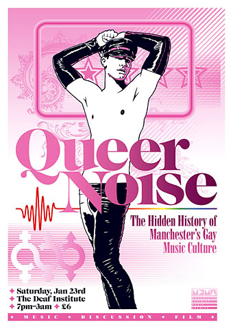
Two recent pieces of work which were being created at the same time so they share some similarity of style (and the same baroque flourish). Queer Noise is a music-related event taking place in Manchester (UK) next month. Music journalist Jon Savage will be leading the discussion and some may recognise the event title as relating to his Trikont CD compilation Queer Noises 1961–1978: From the Closet to the Charts. There are further details about the event at the MDMArchive.

Designing for gay content can be a fraught business since it’s almost inevitable that someone will disagree with your choices. Best then to abandon any thought of trying to please everyone and follow your own instincts. Making this a riot of pink seemed like a good way to offset the fetishised figure as well as making an eye-catching design. My first impetus had been to try an arrangement of pink and black on white similar to that used by Barney Bubbles in one of his Ian Dury designs. In the end this evolved away from that idea but it was a useful starting point. And while we’re on the subject of pink, there’s a growing backlash against the way the colour is forced on young girls:

Back in the 1800s, most children were dressed alike. Gender differences weren’t really apparent until they could walk, or later: boys and girls both wore dresses or skirts until they were six or so. By the end of the century, as the Ladies’ Home Journal noted, boys’ and girls’ clothing styles began to diverge. According to Professor Jo Paoletti of the University of Maryland, pink emerged as an appropriate colour for boys because it was “a close relative of red, seen as a fiery, manly colour”. Blue was considered better suited for girls because of its associations, in art, with the Virgin Mary. (More.)

curse.jpg

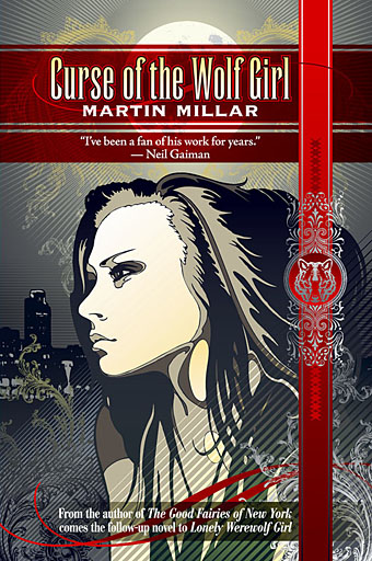
Curse of the Wolf Girl is a young adult title by Martin Millar about which I can tell you very little at the moment other than I’ve finished the cover and the book will be out some time in the new year from Underland Press. More about that when it happens.

Previously on { feuilleton }
Coming Out Day
Over the rainbow
Queer Noises

Finch posters

finch.jpg

I won’t say this is by popular demand but after persistent requests for posters of my cover art for Jeff VanderMeer’s latest novel, Finch, I’ve opened a new CafePress shop selling exactly that. The largest of these is 58.38cm x 82.55 (22.984″ x 32.5″) which should be big enough for most appetites. There’s also a smaller size 35.03cm x 49.53 (13.7904″ x 19.5″) and I’ve added some cards and postcards.

In Finch, mysterious underground inhabitants known as the gray caps have reconquered the failed fantasy state Ambergris and put it under martial law. They have disbanded House Hoegbotton and are controlling the human inhabitants with strange addictive drugs, internment in camps, and random acts of terror. The rebel resistance is scattered, and the gray caps are using human labor to build two strange towers. Against this backdrop, John Finch, who lives alone with a cat and a lizard, must solve an impossible double murder for his gray cap masters while trying to make contact with the rebels. Nothing is as it seems as Finch and his disintegrating partner Wyte negotiate their way through a landscape of spies, rebels, and deception. Trapped by his job and the city, Finch is about to come face to face with a series of mysteries that will change him and Ambergris forever.

Jeff is currently promoting Finch on his latest book tour, details of which can be found here.

Previously on { feuilleton }
Finch

Real Unreal: Best American Fantasy 3

baf3.jpg

Another work update and another cover for Underland Press, this being the third volume in the Best American Fantasy series. The picture is based on a description from Jeffrey Ford’s story although I don’t know how accurate this may be since I only had a précis to go on, not the story itself; I hope Mr Ford will forgive the necessary artistic licence. The book will be published in January 2010.

New things for April

drive-in.jpg

I drew attention yesterday to the abraded look of the Taking Woodstock poster and mentioned a recent book design of mine which used a similar effect. This is that cover, created for a collection of Joe R Lansdale’s horror novels coming soon from Underland Press. Lansdale is known mainly for being the writer of the story which Don Coscarelli adapted for Bubba Ho-tep in 2002 (a great film, incidentally) but he’s done a lot more besides. Find out more at his website.

While on the subject of self-promotion, the invent-your-own-band website Figment posted an interview with me as a complement to their cover art competition which I’ve been judging. Results of that will be announced at the end of the week.

And speaking of interviews, I’ll mention again Jay Babcock’s exclusive interview/feature with comic artist Rick Veitch over at Arthur. Rick’s an artist I’ve always had a lot of time for and this piece includes a special intro/appreciation by collaborator Alan Moore. The interview examines the serious business of dreaming, with Rick’s advice on using your dreams for artistic breakthroughs, personal growth, problem solving, and time/space travel.

Previously on { feuilleton }
Sleeve craft
Finch

Finch

finch.jpg

A new book cover design which I’m posting slightly ahead of time—it still needs a suitable blurb adding—since Jeff VanderMeer was eager to show it to his readers. You can see it bigger size here.

Finch is the third book in Jeff’s cycle of unique fantasy novels and stories about the city of Ambergris. This book shifts emphasis from the previous ones with a tone borrowed from crime/thriller fiction (but still set in the fungus- and squid-infested city) hence the gun outline and blood spatters. I keep being drawn back to Ambergris, having provided designs for the first volume, City of Saints and Madmen, and recently designed a new edition of Shriek: An Afterword.

Publisher: Underland Press, October 31, 2009, trade paper

Description: A noir thriller/visionary fantasy set in the failed state of Ambergris, 100 years after Shriek: An Afterword. The gray caps, mysterious underground inhabitants, have re-conquered Ambergris and put the city under martial law, disbanding House Hoegbotton, and controlling the human inhabitants with strange addictive drugs, internment in camps, and random acts of terror. The rebel resistance is scattered, and the gray caps are using human labor to build two strange towers. Against this backdrop, John Finch, who lives alone with a cat and a lizard, must solve an impossible double murder for his gray cap masters while trying to make contact with the rebels.

Nothing is as it seems as Finch and his disintegrating partner Wyte negotiate their way through a landscape of spies, rebels, and deception. Trapped by his job and the city, Finch is about to come face to face with a series of mysteries that will change him and Ambergris forever.

The cat and the lizard watch intently. Something is about to happen. And they both want to know: who is Finch, really?

Previously on { feuilleton }
Steampunk Horror Shortcuts
A cover for Mr. VanderMeer
Pasticheur’s Addiction
Fungal observations
Shriek: The Movie
Jeff on Bldgblog
An announcement redux
City of Saints and Madmen