Rodler’s Fine, Useful Booklet

rodler01.jpg

Another treatise on perspective, and an older one than Pozzo’s so the drawings are somewhat cruder. Eyn schön nützlich büchlin und underweisung der kunst des Messens (A Fine, Useful Booklet and Instruction in the Art of Measurement) by Hieronymus Rodler was published in 1531, and features a number of full-page views where the perspective is accurate but also alarmingly severe in places. The emptiness and unusual appearance of the scenes has an unintentional charm, they remind me of the illustrations from The Dumas Club (1993) by Arturo Pérez-Reverte where the mysterious drawings—based on old alchemical illustrations—contain subtle variations. Rodler’s book made an appearance at Giornale Nuovo in 2005 so I’ll point you there for further discussion of its technical qualities. The book itself may be browsed here or downloaded here.

rodler02.jpg

rodler03.jpg

rodler04.jpg

rodler05.jpg

Continue reading “Rodler’s Fine, Useful Booklet”

Antonio Basoli’s Pictorial Alphabet

basoli1.jpg

My thanks to Paul Rumsey for reminding me of the Alfabeto pittorico (1839) by Antonio Basoli (1774–1848). This is the same idea as yesterday’s pictorial alphabet but with an architectural theme. Basoli’s series of prints depicts each letter in an architectural style which matches the initial: A is for Arabia but also for aranciera (orangery). The attention to detail and the rendering of light and shade is very Piranesian, and it so happens that Piranesi had earlier designed a small number of capitals for use in books, the letterforms being created by architectural scenes. It’s tempting to see Basoli’s series as an elaboration of this idea done in the manner of Piranesi’s Prima parte di Architettura e Prospettive.

Given how much I enjoy this kind of thing I would have posted something about them by now, but seeing as they’d already been covered by the late-lamented Giornale Nuovo I stayed my hand. Mister Aitch’s post on the subject is still worth a look for the detail he supplies regarding the prints and their creator. For scans of the entire volume, go here.

basoli2.jpg

basoli3.jpg

basoli4.jpg

Continue reading “Antonio Basoli’s Pictorial Alphabet”

Paulini’s mythological alphabet

paulini1.jpg

Whoever I. Paulini was, no one seems to know his (or, indeed, her) first name. Even the Metropolitan Museum of Art, NYC, which owns a copy of these plates, doesn’t elaborate. The copies here are scans from a Getty edition of Alphabeto, part of the collection of Getty Institute volumes at the Internet Archive. The book is usually dated 1570 but a note states that “The watermarks … suggest a printing date closer to the end of the 16th century than to 1570, the conjectural date of first publication.”

paulini2.jpg

Paulini gives use twenty engraved plates each showing an ornamented letter of the Roman alphabet with a background depicting a scene from Greek and Roman mythology; each letter is tied to a different character or scene, so here we have G for Ganymede, and N for Narcissus. Mister Aitch at the late, lamented Giornale Nuovo was a great enthusiast for these kinds of alphabets, and for engravings in general. He pursued his own researches into the Paulini mystery back in 2006 when copies of the complete set of letters were difficult to find.

Elsewhere on { feuilleton }
The etching and engraving archive

Previously on { feuilleton }
Joseph Balthazar Silvestre’s Alphabet-album
Johann Theodor de Bry’s Neiw Kunstliches Alphabet
The Book of Ornamental Alphabets
Paul Franck’s calligraphy
Gramato-graphices
John Bickham’s Fables and other short poems
Letters and Lettering
Studies in Pen Art
Flourishes

Johann Theodor de Bry’s Neiw Kunstliches Alphabet

debry.jpg

A page from Johann Theodor de Bry’s Neiw Kunstliches Alphabet (1595) which can be found in a free PDF version here, the scans being taken from a Victorian reprint. The late, lamented Giornale Nuovo featured some of these curious letter designs in 2005. Each capital is embellished with various symbolic figures—Moses appears perched on the letter M, for example—whilst also being draped with fruit, lobsters and even insects. I used a smaller redrawing of De Bry’s letter S for one of the page designs in Jeff VanderMeer’s City of Saints and Madmen in 2002. Probably not the use that De Bry intended but then I expect he’d be surprised that his work was still being used at all after four hundred years. Via BibliOdyssey.

strange.jpg

Previously on { feuilleton }
The Book of Ornamental Alphabets
Paul Franck’s calligraphy
Gramato-graphices
John Bickham’s Fables and other short poems
Letters and Lettering
Studies in Pen Art
Flourishes

Ave Atque Vale!

ave.jpg

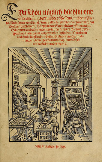
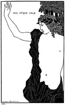
Aubrey Beardsley illustrates Catullus for The Savoy, no. 7 (1896).

Farewell then, Mister Aitch, now he’s decided to call it a day at the wonderful and unique Giornale Nuovo. He’d been blogging (must we call it that? It seems we must…) for five years which probably makes him first generation in the concentrated timescale of web-existence. Five years is a long time to be doing anything never mind regularly throwing hard-won morsels of research to the browsing hordes.

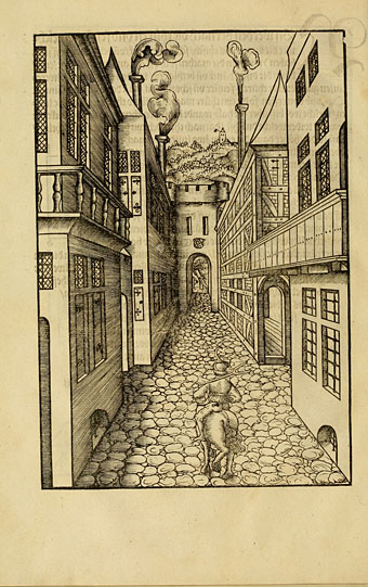
His posts will be missed here since it was his journal, along with a handful of others (Bldg Blog, The Nonist, BibliOdyssey among them), which confirmed for me that this discipline could have a purpose beyond mere diaristic vanity, something I enjoy reading but had no desire to engage in myself. One of the specialist concerns at Giornale Nuovo was the etching or engraving and Mister Aitich managed to cover this area so comprehensively I frequently found that artists I’d considered writing about were already discussed there in far greater detail than I could summon the energy (or the book resources) for myself. Those book resources are a thing of wonder and I remain eternally jealous of Mister Aitch’s library.

Happily Giornale Nuovo will remain online as an archive, which is good to hear. This raises again the spectre of what’s to happen to all this energy and activity when we let it go. Books regularly outlive their creators but all these fragile electronic media are dependent on the whims of webhosts and developing technology. Do we want this work to survive for the benefit of future historians or not? Or should we celebrate it as ephemeral and transient? What happens when the web advances beyond Unix networks, PHP and HTML? The British Library has already expanded its deposit scheme to encompass electronic works but online publications differ from their paper equivalent in that the publisher—legally obliged in the UK to send one copy of every printed volume to the British Library—is invariably also the author. What happens if the author dies before they have a chance to submit their work which then sinks into the swamp of a billion other weblogs? When do you decide to submit a work which is forever unfinished?

I’ll leave those questions to librarians and the scholars at the Long Now Foundation who consider some of the issues presented by the prospective obsolescence of present technology. In the meantime we’ll raise a farewell toast to Mister Aitch and wish him all the very best. Don’t be hesitant in browsing his archives, there’s a wealth of eclectic, eccentric and neglected culture there deserving of your attention.