Tom Keating (1917–1984) was a fascinating character who you don’t really hear about today, despite his brief flush of notoriety in the late 1970s. A versatile artist, Keating worked for many years as a restorer of old pictures, cleaning huge history paintings while also helping art dealers turn damaged canvases into saleable works. The ease with which he could imitate other artists and their techniques prompted some of his employers to start requesting wholesale fakes, which he produced for a while until he discovered that his paintings were being sold for substantial sums while he was still being paid a labourer’s wage. His defence of his subsequent career as an art forger hinged on this experience; he claimed that the situation turned him against the entire art market, and prompted a resolve to undermine the galleries and auction houses by flooding them with as many fake paintings as possible. Keating’s illicit activities became headline news in the late 1970s when he and his partner were prosecuted for selling a number of fake Samuel Palmers.

Episode 1: Turner.
Being a versatile artist myself I’ve always been intrigued by the forgery business. If you have any degree of skill in an artistic medium the thought soon arises that you could turn that skill to imitating the work of an artist who used similar techniques. In my case this has never gone further than doing one-off pastiches. Outright forgery raises the level of the game; it also raises the stakes since you open yourself to legal consequences if the forgery is exposed. Art forgery is an unusual combination of skill and cunning (the artists being forged must have plausible gaps in their oeuvre; provenance has to be invented), archaeology (the older the work being faked, the more important it is to use authentically aged or antique materials), and a peculiar bloody-mindedness to go to all this trouble while never being able to admit in public that you were the creator of the forgery.

Episode 2: Titian.
Tom Keating on Painters was a short TV series broadcast by Channel 4 (UK) in 1982, in which Keating demonstrated his knowledge of historical painting techniques by imitating the work of several well-known artists. If he hadn’t presented a follow-up series about Impressionist artists two years later Tom Keating on Painters would be unique in being a rare TV series about painting which isn’t a guide intended to instruct the amateur artist. Keating’s sole concern in these short films is to show how five artists—Turner, Titian, Constable, Rembrandt and Degas—created their work. In each film he describes the stages of the painting process (pastel in the case of Degas) but this is never a course of instruction. In the sixth film he talks about art restoration, something he continued to work at once his forging exploits had been exposed. Art forgery is one subject he doesn’t mention at all.

Episode 3: Constable.
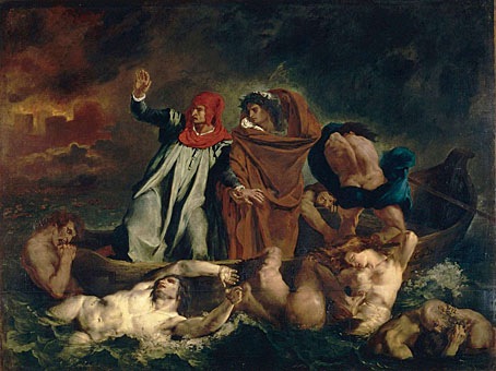
The main thing I remembered about this series was that two of the demonstration paintings were reverse views of a pair of pictures that always top lists of the nation’s favourite works of art. Turner’s The Fighting Téméraire and Constable’s The Hay Wain are monuments rather than mere artworks, occupants of that rare class of painting that you see so often in reproduction it can be difficult to set aside their ubiquity and see them afresh. Keating achieves this to some degree by taking each painting back to the bare canvas then building it up again from a different point of view, showing us the stern of the old warship in Turner’s painting, and the arrival of the horse and cart at the river in the Constable. The demonstrations repeat work that Keating had already done when he painted finished versions of the reversed views for his own amusement. The films only show the early stages of the paintings but enough is demonstrated to indicate the opposed techniques of each artist. Turner and Constable were exact contemporaries but Turner’s later paintings seem to belong more to the 20th century than the 19th. So too with his technique which begins with a light canvas rather than working up light colours from a dark ground.

Episode 4: Rembrandt.
The films about Titian and Rembrandt show more of the traditional approach, with Keating copying Titian’s Tarquin and Lucretia, and inventing a self-portrait of Rembrandt with his son. The latter is the least successful of the five imitations, Keating doesn’t seem to have been very good with portraits. Much better is his variation on The Ballet Class by Degas, an oil painting which he recreates using the pastels that Degas often favoured for his other work. This last picture is the only one that really looks finished but then pastel is a simpler medium. All of these films would have benefitted by being longer and going into more detail but such is the nature of television, the most compromised medium of all.

Episode 5: Degas.

Episode 6: Restoring Pictures.
Previously on { feuilleton }
• More Aubrey fakery
• Aubrey fakery