The Fantastic Fiction of Hannes Bok

bok1.jpg

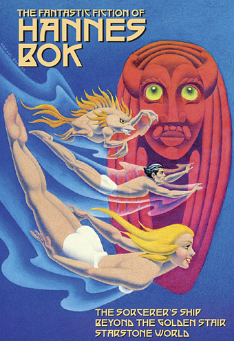
A belated note of thanks to Robert T. Garcia who sent me a PDF of this book a few weeks ago. The Fantastic Fiction of Hannes Bok is a hardcover collection of three fantasy novels by artist Hannes Bok, all of which have been out of print for decades (75 years in the case of Starstone World). Bok has a lasting reputation as an illustrator of fantasy, science fiction and horror during the pulp era but he also wrote fiction and poetry for the pulps, in addition to essays for Mystic Magazine that included a short-lived astrology column. Two of Bok’s novels were published posthumously by Lin Carter in the Ballantine Adult Fantasy series, the existence of which intrigued me for many years, not least because the Ballantine paperbacks weren’t easy to find in UK bookshops. Bok’s fantasy isn’t quite to my taste (I prefer things to be generally darker and more grotesque) but I’m pleased to see these stories back in the world.
bok2.jpg

Contents:
The Fantastic Fiction of Hannes Bok‘s cover art is by Bok (published previously in Hannes Bok: A Life in Illustration in a poor image, scanned here for the first time from the original).
• Original Introduction by Charles de Lint!
• Ballantine Adult Fantasy editor Lin Carter’s introductions to The Sorcerer’s Ship and Beyond the Golden Stair, plus an all-new afterword detailing the publishing history of The Sorcerer’s Ship by Bok collector and college professor William Lorenzo. Publisher, Bob Garcia provided an introduction to Starstone World.
• A number of unpublished photos of Bok.
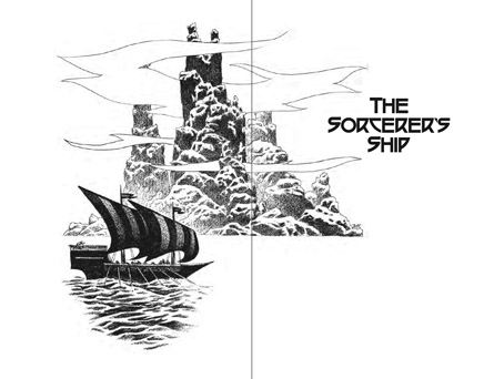
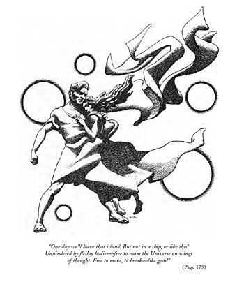
• Bok’s pulp art for The Sorcerer’s Ship is included, plus two paintings specified by the artist as illustrating that novel: a color reprise of an interior illustration and a color portrait of the creature Yanuk done for a fan.
• Since the other two novels did not have artwork by the artist, Jim Pitts provides us a wonderful original frontispiece for each.
• Bok sketches from The Hannes Bok Sketchbook Folio, and A Hannes Bok Sketchbook plus unpublished sketches.
bok3.jpg

Previously on { feuilleton }
Ballantine Adult Fantasy covers

Ten titles and a cover

cdlcover.jpg

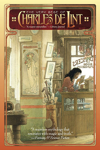
The Very Best of Charles de Lint. Art by Charles Vess.

Over the weekend I found the time to finally update the book design section of the site, adding new pages for most of the titles I’ve been working on recently. There’s still a couple of things missing but I’ll add those in due course. Many of these design jobs have been for the interiors only so what follows is a comparison of title spreads from books I’ve worked on that have been published this year. Lest it seem that I have an army of clones at my service it should be emphasised that I was working on several of these last year (and Engelbrecht was completed in 2008) but the nature of release schedules means they all carry 2010 publication dates.

sr.jpg

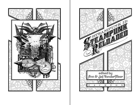
Steampunk II: Steampunk Reloaded, edited by Ann & Jeff VanderMeer.

I invariably make a feature of title pages, usually creating them as a spread in order to heighten their impact. The title page is a kind of gateway to the rest of the book which gives you an opportunity to establish a mood for what follows. It’s also the area where you can be most lavish with your graphic treatment and, where necessary, add illustrative material without worrying too much about intruding on the content. With a number of these designs I was following typographic choices from pre-designed covers so the challenge was to find something that would match the cover and connect to the rest of the interior. The Charles de Lint book was a variation on this process in that the author had chosen a Charles Vess drawing for the cover art. I designed a cover to accommodate the drawing then carried the design inside. The colours were chosen to match Vess’s artwork while the general Art Nouveau style came from an Alphonse Mucha poster he’d placed on the wall. With a different cover picture the entire book would have had a very different design.

pkd.jpg

The Search for Philip K Dick by Anne R Dick.

Continue reading “Ten titles and a cover”

More book design

hotel.jpg

Yes, it’s been a busy year. These are books three and four respectively of the titles I’ve been designing for Tachyon Publications, and there are more on the way.

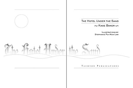
Kage Baker’s The Hotel Under the Sand is a charming fantasy for children concerning the hotel of the title and its curious inhabitants, which include a ghost bellboy and a pirate captain. The illustrations were by Stephanie Pui-Mun Law and I tried to complement these with the lettering design and graphic elements. I always enjoy working on illustrated books.

fandsf.jpg

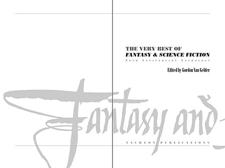
The Very Best of Fantasy & Science Fiction is a very different beast, a big (480 pages) selection by Gordon Van Gelder of some of the many first-class stories from the sixty-year history of the fiction magazine. F&SF has published so many classic stories over the years the book could easily have been twice as big. As it is there are pieces by Alfred Bester, Ray Bradbury, Shirley Jackson, Philip K Dick, Harlan Ellison, Stephen King and Neil Gaiman, among others. The design in this case came from studying a copy of the magazine from 1967; I was already thinking of using Bodoni for the story titles and that choice was confirmed when I saw it used for the same purpose in the magazine. The calligraphic titles were also scanned from there, their design going back to the very first issue.

Both these books are on sale now, and Keith Brooke gave a glowing appraisal to the latter in The Guardian at the weekend.

Previously on { feuilleton }
Medicine Road by Charles De Lint
The Best of Michael Moorcock

Medicine Road by Charles de Lint

delint.jpg

The second of my book designs for Tachyon Publications is published this month and it was good to receive a copy in the same week as getting a load of new CDs. Medicine Road is a contemporary fantasy of shape-shifting and shamanic magic set in the American South West. This job was particularly pleasurable for being illustrated by Charles Vess, celebrated among other things for his many collaborations with Neil Gaiman, including Stardust. I embellished the opening pages with designs based on Native American petroglyphs, a couple of which are from the tribes mentioned in the text.

Laurel and Bess Dillard are charismatic bluegrass musicians enjoying the success of their first Southwestern tour. But the Dillard girls know that magical adventures are always at hand. Upon meeting two mysterious strangers at a gig, the red-headed twins are drawn into a age-old, mystical wager along the Medicine Road.

One day, seeing a red dog chasing a jackalope, Coyote Woman gave them human forms. They became Jim Changing Dog and Alice Corn Hair. In return, both of them must find true love within a hundred years or their “five-fingered” forms will be forfeit. Alice has found her soul mate, but trickster Jim is unwilling to settle down — until he sets eyes upon free-spirited Bess Dillard.

Yet time is running out for the red dog and the jackalope. In just two weeks they will journey to their reckoning at the Medicine Wheel. Meanwhile, a motorcycle-riding seductress and a vengeful rattlesnake woman are eager to meddle, and Bess and Laurel, caught in a web of love and lies, must find their own paths into the spirit world.

Next up from Tachyon will be a book by Kage Baker. More about that later.

Previously on { feuilleton }
The Best of Michael Moorcock