The Dillons at Caedmon

dillons18.jpg

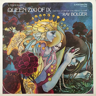
L. Frank Baum: Queen Zixi Of Ix (Or The Story Of The Magic Cloak) Read By Ray Bolger (1977).

There’s a lot you could write about illustrators Leo and Diane Dillon. They were very prolific for a start, creating many book covers and interior illustrations in a variety of styles and different media. They also maintained a long-running association with Harlan Ellison whose praise for the pair was never less than fulsome. Like Bob Pepper and other versatile illustrators, they created art for album covers as well as books, with regular commissions from Caedmon Records, a label that specialises in spoken-word recordings.

dillons12.jpg

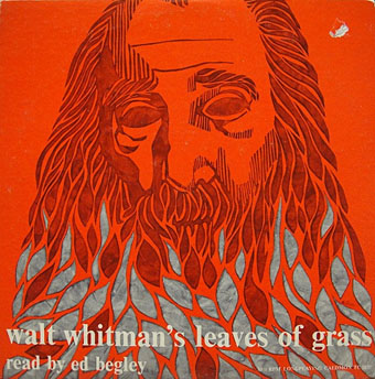
Walt Whitman’s Leaves Of Grass Read By Ed Begley (1959).

During the time the Dillons were working for Caedmon most of the label’s releases were on vinyl, a format that tended to restrict the readings to poetry, short stories or extracts from novels and plays. The format was limited for writers and listeners but beneficial for book illustrators, giving them a larger canvas to work on. These examples are a small selection of the Dillons’ output, more of which may be seen at Discogs. Not everything on Caedmon looked this good. I used to own the David McCallum reading of The Dunwich Horror, an album whose cover art was so amateurish it might have been drawn by Wilbur Whateley himself. The Dillons’ cover for The Rats in the Walls is much better, with a gnawing figure that resembles the woodcut-style illustrations the pair created for Harlan Ellison’s Dangerous Visions anthologies. I’ve never read anything about the Dillons’ techniques so can’t say whether their woodcut style was a product of actual wood engraving rather than linocut, a more convenient medium. I’d guess the latter since the end results look pretty much the same, but if anyone knows the answer then please leave a comment.

dillons01.jpg

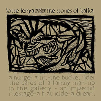
The Stories Of Kafka Read By Lotte Lenya (1962).

dillons07.jpg

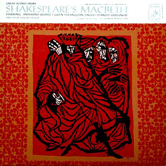
Great Scenes From Shakespeare’s Macbeth: Anthony Quayle, Gwen Ffrangcon-Davies, Stanley Holloway (1962).

dillons06.jpg

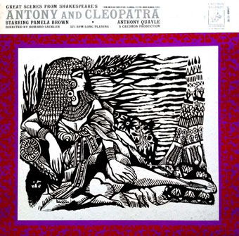
Great Scenes From Shakespeare’s Antony And Cleopatra: Pamela Brown And Anthony Quayle (1963).

Continue reading “The Dillons at Caedmon”

George Crumb – His Life and Work

crumb1.jpg

A page from the score for Makrokosmos I (1972) by George Crumb.

American composer George Crumb died in February at the age of 92, something I only discovered a couple of months ago. Outside the USA he always seemed like an obscure figure, seldom mentioned in British newspapers (although The Guardian did run an obituary), with even a sympathetic magazine like The Wire only interviewing him once in February 1997. Well, I have a perverse attraction to the art made by overlooked mavericks, and I’d managed to accumulate several recordings of Crumb’s compositions after being alerted to his existence by Jack Sullivan’s profile in The Penguin Encyclopedia of Horror and the Supernatural (1986), a book that Sullivan also edited which turned out to be a surprisingly useful music guide. Sullivan’s entries were invaluable at the time for discussing classical music and composers from an uncommon point of view, namely the degree to which various compositions might be considered a part of the horror genre, whatever the original intention behind their writing. Musicologists would dismiss such an approach as vulgar but I was pleased to read descriptions that for once used emotional words like “atmospheric”, “spectral”, “haunting”, or “chilling”, instead of the formal analysis of timbres and tone clusters that you find in sleeve notes; Sullivan even describes one of Crumb’s orchestral works as “a terrifying racket” which is exactly the kind of thing I like to be told if I’m going to spend time tracking down scarce recordings.

crumb2.jpg

Cover art by Bob Pepper, 1971.

Not everything by Crumb belongs in a horror encyclopedia but his most celebrated composition, Black Angels: Thirteen Images from the Dark Land (1970), certainly does, a string quartet for amplified instruments augmented by glass and metal percussion. The opening section, Threnody I: Night of the Electric Insects, is shriekingly violent, a response to the use of attack helicopters in Vietnam that also shows Crumb’s predilection for an evocative title. His Makrokosmos suites for amplified piano include sections with titles like The Phantom Gondolier, Music of Shadows, and Ghost-Nocturne: for the Druids of Stonehenge, while later compositions include Apparition (1979) and A Haunted Landscape (1984). The four volumes of Makrokosmos belong in Sullivan’s “spectral” category, with the performer(s) being required to sporadically shout, whistle and strum the strings of the piano. Unusual sounds and unorthodox approaches to instrumentation and performance were a consistent feature of Crumb’s compositions.

crumb3.jpg

Cover design by Paula Bisacca, 1975.

For the curious or uninitiated, George Crumb – His Life and Work is a 28-minute compilation of pre-existing video pieces put together by Andreas Xenopoulos that provides a useful introduction to the composer. Extracts from an interview with Crumb are interleaved with examples of his music that include a few glimpses of live performance. I’m very familiar with the first three volumes of Makrokosmos but these extracts made me realise that I’d never seen them performed before, so I’d never considered the amount of times the pianists have to manipulate the piano strings while they’re playing the keys. Black Angels requires similar input from the performers—whispering, shouting, bowing tam tams and tuned wine glasses—something referred to by David Harrington of the Kronos Quartet in another interview extract. Black Angels is a particularly important part of the Kronos Quartet’s repertoire (I recommend their 1990 recording), being the composition that prompted Harrington to form the quartet in the first place. YouTube has a number of live performances including this one by Ensemble Intercontemporain. Play loud.

For a composer with a career spanning several decades, Xenopoulos’s compilation might have been longer but most of the extracts still seem to be present in full elsewhere. And while I usually dislike Christmas music, given the time of year I’ll direct your attention to Crumb’s A Little Suite For Christmas, AD 1979 played by Ricardo Descalzo. The piece wouldn’t have warranted a mention in the horror encyclopedia but it isn’t tinselly nonsense either.

Previously on { feuilleton }
A playlist for Halloween: Orchestral and electro-acoustic

Abe Gurvin album covers

gurvin01.jpg

Nuggets: Original Artyfacts From The First Psychedelic Era 1965–1968 (1972).

Reading this article last week about Lenny Kaye’s Nuggets compilation I realised I’d never looked up the album’s cover artist, Abe Gurvin (1937–2012); this despite owning two copies of Kaye’s compilation, one of which, an expanded box of four CDs, includes additional Gurvin art (see below). Nuggets was released in 1972 on Elektra, a label for whom Gurvin worked regularly as a designer as well as an artist. The only other cover of his I definitely recall seeing before is for one of Mort Garson’s electronic novelty albums, Cosmic Sounds (credited to The Zodiac), although some of the classical recordings on Elektra’s Nonesuch imprint look vaguely familiar. Nonesuch were using vivid art and graphics on the covers of their classical albums from the mid-60s on, years in advance of rival labels; Gurvin, along with Bob Pepper, Gene Szafran and others, provided the cover paintings. In the 1980s many of these albums turned up cheap in British remainder shops, hence the familiarity, although I can’t say whether it was Gurvin’s art I remember seeing.

gurvin02.jpg

Disc art from the four-CD Nuggets box (1998).

The subtitle of the Nuggets album—”Original Artyfacts From The First Psychedelic Era 1965–1968″—always promised more than it delivered when only a quarter of the songs could be called psychedelic. Without Gurvin’s artwork providing a contextualising frame it’s hard to imagine the compilation sustaining its reputation as a psych classic, whatever the subtitle might suggest. Gurvin’s florid aesthetics were put to similar use elsewhere, not only on classical recordings. Some of the examples below are a result of attempts by art directors to give artists like Gene Pitney a trendy spin.

gurvin03.jpg

Cosmic Sounds (1967) by The Zodiac. “Must be played in the dark” says a note on the back cover.

Nuggets, incidentally, was beneficial in its influence even if its psychedelic quotient is lacking. Without its success there might not have been the 28 psych/garage compilations known as Pebbles, a bootleg series that retrieved from obscurity many minor bands and one-off singles; and without Pebbles we wouldn’t have had further imitations like Boulders (11 discs) and all the many series that followed, including my personal favourite, Rubble, a 20-disc collection of British psychedelic singles.

gurvin09.jpg

The Dove Descending: Choral Music (1966) by The Canby Singers.

gurvin10.jpg

Haydn: Symphony No. 21 In A Major / Symphony No. 48 In C Major (“Maria Theresia”) / Symphony No. 82 In C Major (“L’Ours”); Chamber Orchestra Of The Saar, Karl Ristenpart / Gürzenich Symphony Orchestra Of Cologne, Günter Wand (1966).

gurvin15.jpg

Sweet, Sweet Lovin’ (1968) by The Platters.

Gurvin’s contribution to this one is the hand-drawn title design.

Continue reading “Abe Gurvin album covers”

Gene Szafran album covers

szafran01.jpg

Sibelius: 4 Legends From “The Kalevala”, Op. 22 (1968); Buffalo Philharmonic Orchestra, Lukas Foss.

Gene Szafran (1941–2011) was an American artist who painted illustrations for magazines and provided cover art for many science-fiction paperbacks throughout the 1970s. He shared with fellow paperback artist Bob Pepper a parallel career producing album cover art for Elektra Records and Elektra’s subsidiary for classical recordings and contemporary composition, Nonesuch, the latter contributing to William S. Harvey’s policy of making classical albums look as vibrant and contemporary as their neighbours in the rock sphere. Bob Pepper’s album covers, however, tend to resemble his book covers whereas Szafran’s book covers are simpler in style than his album art which fills out the larger space in a post-psychedelic style that’s often very detailed and done in a variety of media. It took me a while to realise that I’d known Szafran’s name for a long time via his cover for Pictures At An Exhibition by Tomita, the art for which isn’t a painting but a relief sculpture of the head of Tomita-san. A similar use of three-dimensional elements occurs on other album covers, and extends to a form of collage in which painted backgrounds are overlaid with physical objects, a technique which became a common sight in the 1980s but which wasn’t common at all in the 1960s. There might have been more work like this but Szafran’s career was cut short by multiple sclerosis in the late 1970s. Glimmer Graphics has several pages dedicated to his life and art.

szafran02.jpg

The Ages Of Rock (1968) by Cy Coleman.

szafran03.jpg

John Cage: Concerto For Prepared Piano & Orchestra / Lukas Foss: Baroque Variations (1968).

szafran04.jpg

The Nonesuch Guide To Electronic Music (1968) by Paul Beaver & Bernard L. Krause.

szafran05.jpg

The Moray Eels Eat The Holy Modal Rounders (1968) by The Holy Modal Rounders.

Continue reading “Gene Szafran album covers”

The hundred-year Voyage

arcturus1.jpg

Today’s post at Wormwoodiana reminds me that David Lindsay’s unique novel of philosophical fantasy, A Voyage to Arcturus, was published a hundred years ago today. I designed a lavish reprint for Savoy Books in 2002, an edition which unfortunately used the re-edited text from earlier reprints instead of going to the original publication. This wasn’t done for lack of a first edition, it was more out of ignorance—nobody bothered to look into the history of the text—as well as convenience; Savoy’s earlier reprinting of Anthony Skene’s Monsieur Zenith the Albino had involved many weeks of text preparation, scanning pages from a photocopy of Skene’s very scarce novel, then running the copy through rudimentary OCR software and proofing the result. In Savoy’s slight defence, the reprint of Arcturus did correct a couple of typos that everyone else had missed.

arcturus2.jpg

I still think the best feature of my design was the selection of Jean Delville’s remarkable Symbolist painting, The Treasures of Satan (1895), a picture used with the permission of the Brussels Museum of Fine Art. (They supplied us with a print of the painting together with a photo of Delville’s Angel of Splendour (1894) for the back cover.) With the exception of Bob Pepper’s artwork for the 1968 Ballantine paperback, previous reprints of the novel seldom reflected the contents on their covers. I’m no longer happy with the type layout on the rest of the dust-jacket, however, although the front cover looks okay. The Savoy edition included an introduction by Alan Moore, an afterword by Colin Wilson, a collection of philosophical aphorisms by David Lindsay, plus a couple of photos of the author which I don’t think had been published before. Despite its flaws, the book was well-received. The paper was heavier stock than is generally used for hardback fiction which made for a heavy and expensive volume but the edition still sold out.

Penguin are reprinting the novel next year in an edition which continues the tradition of unsuitable cover art. According to Lindsay site The Violet Apple the figure on the cover is from an illustration for a Dostoevsky novella, so what is it doing on Lindsay’s book? Cover art aside, the novel is in a class of its own, and very highly recommended.

Previously on { feuilleton}
The art of Bob Pepper
Masonic fonts and the designer’s dark materials