
Kieran at Sci-Fi-O-Rama was in touch recently asking me to contribute a paragraph about a favourite Roger Dean picture for this feature about the artist. The following splurge of polemic was the result, something I’d been intending to write for a while. Since so many words would have overwhelmed the other contributions it’s being presented here while Kieran’s post has a variety of shorter appreciations and further examples of Dean’s art and design.

Pathways (1973). A slightly reworked version of the original painting.
“Science fiction is unfortunate in having a most unsatisfactory framework of existence—it’s considered literary kitsch. I believe it should be the mainstream of literature because all the books that have become important down the generations of civilisation have been books about ideas. Superficially, science fiction would seem to offer the most scope for idea content, but the promise is unfulfilled. Good ideas and good writing rarely coincide. All too often the medium is used for entertainment alone and its potential beyond this should be obvious to everyone. I don’t just mean in the sense of fantasy technology. The potential for anticipating human evolution is there and perhaps the means to bring it about and definitely the means to bring about a social evolution.”
Roger Dean, interviewed in Visions of the Future (1976).
If popularity is often a curse as well as a blessing, it’s been Roger Dean‘s curse to see his work dismissed along with many other products of a decade—the 1970s—with more than its share of cultural heroes and villains. Music journalists in Britain have for years given the impression that the arrival of the Sex Pistols in 1976 swept away all that preceded them, in particular bands such as Yes whose album covers had helped raise the visibility of Dean’s art to an international level. This is not only a lazy assumption, it’s also wrong. When Yes released Going For the One in 1977 it was their first studio album in three years, yet despite the punk explosion it went to no. 1 in the UK album charts, while a rare single release from the band made the UK top ten. Yes were playing sell-out tours in Europe and the US in 1977 and 78, as were Pink Floyd whose The Wall was massively popular worldwide in 1979. Punk didn’t sweep prog away, what happened with its advent was that progressive rock and everything associated with it—Roger Dean’s art included—became critically disreputable almost overnight, such that no music journalist would dare say anything good about it. That disrepute has persisted for thirty years despite a lasting and indelible influence. This is an old argument but some facts often need restating anew. *
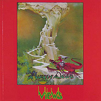
Views (1975).
I was 13 in September 1975 when Roger Dean’s first collection of his illustration and design work, Views, was published. At that time, I hadn’t heard any of the music to which his paintings and drawings were attached, and I didn’t even see a copy of the book until February 1976 when I happened to be in London on a school trip and found a big pile of what I guess was the second edition in Foyle’s book shop. This appeared at exactly the right moment. I wasn’t listening to the music but I was reading a lot of science fiction, and was starting to notice and imitate the work of various paperback artists. I recognised many of the pictures in Views from the covers displayed in the window of our local record shop, Cobweb, whose shopping-bag logo was a cowled magician figure à la Dean or Rodney Matthews. It’s difficult to say what struck me about Dean’s work at the time since you rarely articulate your preferences at that age. I think I liked the consistency of vision and the invention which blended the organic and mechanical, the architecture which looked at once ancient and futuristic, and the flat landscapes which put lone pine trees into rocky terrain familiar from Japanese and Chinese prints. For a teenager his style was also relatively easy to imitate if you forgot about basic things such as imagination and finesse, and I spent a year producing a lot of badly-drawn reptiles posed against lurid watercolour skies.
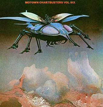
Motown Chartbusters Vol. Six (1971).
Dean was packaging many different kinds of bands and styles of music throughout the early Seventies, most notably Yes, for whom he also designed stage sets, but also various folk-rock artists on the Vertigo label, rock outfits such as Uriah Heep and Budgie, and Afrobeat groups Osibisa and Assagai; he even did a cover for a Motown compilation. But whatever the commission he remained resolute in using the album cover to explore his own obsessions and design concerns. It was this latter aspect of his work which surprised me when I finally got my hands on a copy of Views late in 1976 and discovered that these weren’t mere illustrations but were often coming out of his explorations of furniture and architectural design. In that respect, his work is a lot less like the artists he’s usually grouped with—fantasists such as Rodney Matthews or Brian Froud, or the popular SF illustrators of the decade like Chris Foss—but is closer to the speculative industrial designs of futurist Syd Mead. The outsized reptiles and surreal moments in Dean’s pictures tended to obscure the architectural speculation, while being the very elements which made him so popular. That popularity coincided with a boom in poster art which made him easy to dismiss later on as part of the reprehensible hippy froth of the era. What people missed then, and continue to miss when he’s branded as merely another illustrator, is the obsessive reworking of vistas and visual motifs—dragons, Asian rock formations, pine trees, floating islands—whose origin is the same psychological impulse which birthed the internal landscapes of the Surrealists or the jungles and deserts of JG Ballard. Dean’s landscapes are frequently depopulated and appear dream-bright, awaiting the arrival of a new breed of colonists for their porous architecture. It’s no surprise that his work in recent years has caught the attention of filmmakers and games designers.
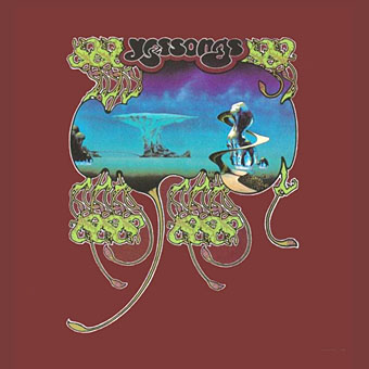
Yessongs (1973).
The success of Views had one lasting benefit in that it launched the Dragon’s Dream/Paper Tiger publishing imprints which made the work of many science fiction and fantasy illustrators available in lavish book form. Among the early run of titles was the first proper study of album cover art, The Album Cover Album (1977), produced in collaboration with Hipgnosis, and a Syd Mead collection, Sentinel (1978). When I started hanging around the Savoy bookshops in Manchester in the 1980s I was surprised to see Roger Dean’s autograph on the wall of what used to be Bookchain in Peter Street. His scrawled name and accompanying dragon head had been left there in 1979 when he turned up to sign copies of Views along with three of the artists from the Dragon’s Dream volume The Studio—Mike Kaluta, Berni Wrightson and Jeff Jones—each of whom also signed the shop wall.
Dean’s 1969 logo for Harvest Records, a division of EMI.
Roger Dean’s art has been out of critical favour for so long that it’s difficult to discuss it positively without sounding overly defensive. While many other shunned aspects of the pre-punk era have been rehabilitated—folk music, psychedelic drugs, flares—I’ve yet to see anyone mount a serious reappraisal of Dean’s artwork despite his furniture and architecture designs having been exhibited at the V&A. There’s a certain kind of critic, usually male and British, who finds the exercise of a Romantic imagination to be a suspect and unwholesome activity. That suspicion often sees a single “story” being told in art history which skips from Impressionism to Cubism and ignores the Symbolists and Decadents; it dismisses Dalí’s work after the 1930s and won’t even look at the paintings of HR Giger, Ernst Fuchs or Mati Klarwein; it’s a suspicion which marginalised Mervyn Peake almost to the year of his death in 1968, which scowls at genre fiction, and ignored JG Ballard (always a proud science fiction writer) until his Booker Prize nomination in 1984. Minimalism and restraint is favoured over exuberant invention, and a blokey cynicism is favoured over any kind of visionary impulse which is regarded as tasteless or kitsch, with “kitsch” in this context almost always meaning “whatever I dislike”. For every Marina Warner, Michael Moorcock, Clive Barker or China Miéville who assert and promote the value of the imagination, you’ll find a vocal crowd who find the whole thing to be unpalatable and juvenile. It’s an older argument than punk versus hippy, going back to the nineteenth century debate between Realism and Romanticism. It’s also a peculiarly joyless English attitude; the French have shared the debate as far back as Zola but are generally a lot happier for serious intellectual dialogue to sit side-by-side with comics, films, science fiction and fantasy.
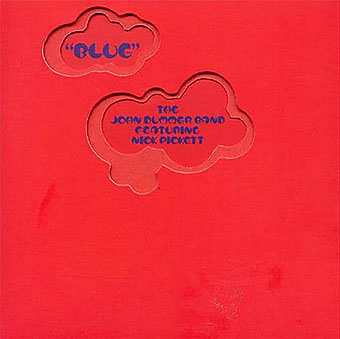
Blue by John Dummer featuring Nick Pickett (1972). One of Dean’s die-cut sleeves for Vertigo Records.
I’d argue that it’s the perceived “bad taste” quality of Dean’s work, and his guilt-by-association with a disreputable period of music, which has delayed any reassessment of his art and cover designs. Barney Bubbles was a great graphic designer exactly contemporary with Dean—both worked for Vertigo in the early Seventies—but as an illustrator Bubbles’ work is nearly always playing riffs on styles or motifs borrowed from elsewhere, and is less original as a result. Bubbles escaped the wrath of punk dismissal by being personally evasive, dropping the hippy elements from his work and becoming house designer for Stiff Records in 1976. Roger Dean, meanwhile, simply carried on being Roger Dean, and the powerful illustration side of his art continued to overshadow his design interests. Since design critics are nearly always the ones who write the histories they tend to favour graphic design over illustration; design is the intellectual component, it’s functional and has a job to do. Illustration, on the other hand, is often treated as mere decoration. The attitude of writer and designer Jon Wozencroft, discussing album cover design in The Graphic Language of Neville Brody (1988), is typical:
Work done by Roger Dean for the group Yes cannot really be counted in this category, for although his cover design posters adorned many bedroom walls in 1973, their content was no more challenging than an airbrushed greetings card.
I wonder whether Wozencroft has seen Dean’s 1971 sleeve for Motown Chartbusters Volume 6, whose beetle spacecraft certainly challenges expectations for how a pop/soul compilation should look? As for challenging the form of the album package, there’s the elaborate die-cut sleeves which Dean was creating for Vertigo at this time, and his design for Dutch band Earth & Fire which had some of its artwork printed on the inside of the sleeve envelope and therefore largely hidden from view. With a few rare exceptions, graphic designers usually only influence other graphic designers whereas the influence of a good artist or illustrator permeates the wider culture. Singularity of vision counts for a lot, whether it’s HR Giger‘s creations for Alien or Syd Mead’s work on Blade Runner and Tron. I happen to rate Dean as a graphic designer in his own right, for his beautifully simple Harvest Records logo, for those die-cut Vertigo sleeves, and for his elegant and futuristic extensions of Art Nouveau lettering and the typographic stylings of the San Francisco poster artists. But it’s the body of his artwork which has the lasting influence. Nearly every review I’ve seen of James Cameron’s Avatar has referred to its visual character as resembling a 1970s album cover, by which they mean it looks like a Roger Dean painting. Accusations of plagiarism have proliferated now people have realised that Dean’s floating mountains, looped rock formations and flying reptile fauna predate Avatar by many years. That Dean’s work can represent an entire decade is a measure of its significance even if the theft of his landscapes and the use to which they are put—a backdrop for more of Cameron’s simple-minded belligerence—is something the artist wouldn’t necessarily want.
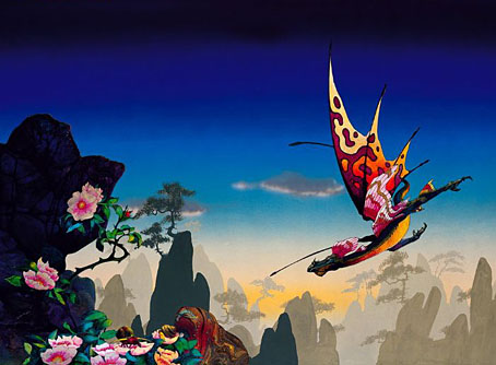
Morning Dragon.
Dean’s influence will continue not least because new generations don’t care about the old battles and unexamined prejudices of the punk era. With the wholesale fragmentation of popular culture, artists today curate their influences from their own interests and obsessions rather than the dictats of critics, and what critics there are have become smaller voices struggling to be heard in a global discussion. Views sold over a million copies and is still in print along with Dean’s subsequent books; his work is easy to find even if few care to examine it seriously. The writings of JG Ballard and Philip K Dick gained widespread popularity when the world began to more closely resemble their fiction. In Roger Dean’s case, technology is now better able to bring his imagination to life. Over the past decade we’ve seen the creation of buildings which resemble his organic designs, while his holistic approach to architecture and the environment is more widely accepted than it was when Views first appeared. Hollywood and games designers have the means to create the kinds of worlds Dean was imagining thirty years ago but as the technology accelerates in scope and power the visions it might render remain in short supply, hence the recourse to a Dean or a Giger or a Syd Mead whose Tron designs return in a sequel later this year. Dean’s art was never intended to épater le bourgeois and he wasn’t aiming to be the El Lissitzky of the 1970s; to berate him for failing this not only misses the point but ignores the singularity and lasting quality of his work.
* Progressive rock’s disrepute has been so ingrained that it’s taken Alan McGee over thirty years to admit that it might be okay to listen to some post-Barrett Pink Floyd. In a similar vein, The Wire is the most open-minded of all the current music mags but the King Crimson and Yes reappraisals in their December 2009 issue were the first substantial pieces they’ve run on either band.
Elsewhere on { feuilleton }
• The album covers archive
Excellent! Well said.
As an American teenager growing up in a rural Georgia cotton mill village, Dean’s and YES’s fantasies were proof that another world beyond the one we knew existed. We didn’t want hyperrealism and tragic stories of how we live now. We wanted something that lifted us out of ourselves. The art and the music did that and how.
But you know the best of the punks did that too. The mindscape of Patti Smith’s HORSES is just as much a vision as CLOSE TO THE EDGE.
Hi Stephen. I should note that this post isn’t intended as a mirror reflection of the decades-old argument, it’s more of a call to shun unexamined prejudices wherever they occur. I dislike either/or polarities and the punk v. prog opposition is one that persisted for far too long, as the Alan McGee piece demonstrates.
Among my favourite punk mindscapes I’d include the first two Ultravox! albums (from when they still had the ! on their name). The first isn’t completely successful despite Eno’s production but Ha! Ha! Ha! is a great extension of the Burroughs influence of Diamond Dogs into a kind of queer dystopia, and its energy still thrills today.
Hi John,
Thought I’d bring your attention to the cover of the Australian band, TISM’s 2 CD album – De Rigueurmortis” where they pay homage to Roger Dean’s style.
Typical of the sardonic wit of these guys, TISM have included some characteristic Aussie symbols – the “Hills Hoist” clothesline crashing to the ground, the rubber thong, the “wheelie” rubbish bin, Ayers Rock and Dean’s flying beetle morphed into a “Victa” lawnmower …
The whole package is impeccably styled – again typical of all TISM releases. The credit for the cover illustration goes to one : Otto Schmidinger – Art design by TISM and Peter Barrett @ FMR Design.
Roger Dean was a big favourite of my art teacher at high school – when it came to silkscreen printing classes, perfecting the perfect Dean gradient was de rigueur … oh the horror! ;=)
I’ve scanned my copy here : http://tinyurl.com/yddvcss
cheers
mr.kenneth
Hi John
Yet another excellent career overview; great calls on RD’s Harvest logo and Vertigo work in partic.
Age might account for something here – you were able to come to RD clean of all expectations and preconceptions.
Alan McGee is roughly my age and, like me, between the ages of 12 and 16 (1972-1976) was repeatedly let down by the music RD’s designs packaged.
I well remember in 1974 arriving home with my copies of Yessongs and Tales From Topographic Oceans home – having poured over the covers on the bus from Islington – and the feeling of profound disappointment with the overblown meanderings contained within.
Difficult at that age (and that time) to disassociate one from t’other.
Similarly Greenslade and a host of other RD clients; in time, sad to say, RD became an signifier of what to avoid – and that’s why it has taken so long for such excellent reappraisals as the one printed above (and why it may take even longer for the likes of Alan and I to finally overcome our prejudices).
BTW the Peter Barrett involved in the TISM (great band) cover was designer of many a great British single/album sleeve from the late 70s onward, including all of those for Dexy’s – from Searching For The Young Soul Rebels through the campaign based on childhood shots for the release of the single Show Me to the Celtic romanticism of Too-Rye-Aye and the Ivy League Don’t Stand Me Down.
Pete remixed his artwork for the latter album when a remastered version was issued by – who else? – Creation’s Alan McGee.
Mr Kenneth: Thanks for that! Funny stuff, I was wondering whilst writing this what parodies of Dean’s work might be out there. The only others I recall seeing are on techno things from the early 90s.
Paul: You’re right about the age thing, at the time I discovered Views my favourite band was 10cc, I hadn’t heard any of the music Dean’s work was decorating. During 76 and 77 I was backtracking to Yes, Pink Floyd and Hawkwind while one of my step-brothers got into punk in a big way so I had the privilege of being hit by both currents at the same time. Much of that early 70s British rock I find unlistenable, and it’s especially poor when you compare it to the Krautrock and electric jazz of the period. I was thinking about this last night while watching Jon Savage talk at the Queer Noise event. Punk was mentioned a lot, of course, and the discussion was followed by a great punky female trio, (hooker).
Excellent piece. I’ve always loved the hazy depth to Roger Dean’s work, the feeling of distance and a world beyond the frame. This also put me in mind of how easily artists can disappear as I’ve been trying to track down examples of another favourite of mine (another Dean), Mal. Old, yellowing examples in decaying copies of New Worlds no longer satisfy the hunger.
Hi Charlie. I know Mal Dean’s work very well, some of it is featured in the huge Moorcock book which I designed recently and which Savoy Books will be publishing later this year. There’s at least one collection of his work, Mal Dean, 1941-74: Cartoons, Illustrations, Drawings and Paintings, although it’s probably out of print by now.
Thanks Paul for the info on Peter Barrett up there in your post. I look forward to investigating him further.
mr.K
Thanks very much for writing this. It put a lot of my own frustrations with a certain strain of criticism into words.
Glad to hear there’ll be some Mal Dean in… Into The Media Web, I presume.
I’ve been trying to track down Mal Dean 1941-74 for some time. I once saw one for sale and nearly passed out when I saw the price.
No prob – FMR = Festival Mushroom Records, Australia’s largest independent label which is where PB works these days.
Great entrey, John! “Views” is still at hand for me, after all these years, and I always thought Roger Dean’s art reached far more distant galaxies than the work he did for Yes, which beacame the most known around the world. I think he has many other great works, including book covers, who also deserve to be known.
Best!
Someone connected with Australian group Flash And The Pan (ie Harry Vanda and George Young) must been a Dean fan, as the artwork for one of their albums will attest.
http://members.multimania.nl/Vaipen/images/Flash.jpg
Yes, that’s certainly reminiscent of Dean’s work. Not sure whether he’d regard it as a compliment!
Wonderful, wonderful post, superbly articulate and passionate without being defensive. I have tried to argue that Dean was unfairly dismissed, but been shouted down (literally in some cases, with added spluttering) in a knee-jerk reaction to his association with Prog (which I also liked), I am fed up with being made to feel that an admiration for the Dean brothers and their design and architectural ideals, is somehow a ‘guilty pleasure’. Thanks.
Hi David, glad you enjoyed it.
hello, Iam writing to ask Roge Dean, A9 year old girl has been working on graphs since she was 3. any way I wanted to askif he would take a look o one of her works. I would swear that she got a Gene from you, her art is very much on the same bases tha Mr. Dean might take a look , and let us know if we are wrong.
ThankYou,
Cindy McClain
Hello, Iam inquring about some at my 9 yr. did it reminded me of your art Mr dean. I would like to send you this1 particular picture, she drewthe art that came ot ofher hed is amazing. We would like, a return answer. if you please. Luca-2@comcast.net
Thank you
Cindy S McClain
Hi John
I came across your blog looking for some examples of Roger Deans lettering – as I want to do the name of my recently acquired narrowboat in a hybrid of trad canal art and Dean text! Great read, thanks, a very good summary of how I feel about Dean who had such a massive influence on me in 1977-8 during A Level Art. Whilst I still think the work holds up (and I also made the Avatar connection a few minutes into the film) I think its a shame that Dean seams to have stopped producing work sometime in the 80’s and continues to flog the original images over and over. Your work is also great thanks for the website. Pete
Roger Dean not only illustrated YES album covers,but also African band` OSIBISA and URIAH HEEP´s. Also GREENSLADE. And a few others. But,then of course his most celebrated works are YES album covers…
Prof. Luis Clark: Both Osibisa and Uriah Heep are mentioned in the post above.
Dear John,
I worked with Roger Dean in the late ’70s as a writer, editor and researcher for Paper Tiger and Dragon’s Dream. I don’t know whether he has seen what you have written about his work, but I think he would appreciate it. Extremely perceptive and brilliantly written – bang on the money. You’ve articulated the basis and quality of his work and its social, musical and art historical context so well that I’ll never need to worry about being biased when I describe what he, Hipgnosis and the best of other so-called ‘commercial artists’ (particularly in the music and film business) have been doing in the last 40 years or so as being in the best, most ambitious traditions of art and design. (As opposed to all the super hyped ‘conceptual’ dullness of the BritArt mob, and the derivative and unambitious stuff produced by the Saville tendency in graphics and design.
Thanks a bundle.
Jim Slattery
Hi Jim, and thanks, that’s gratifying to hear, as has been the rest of the response here. This piece was a bit angrier than I usually get–there’s more than enough bad temper on the internet and I dislike adding to it–but I’d spent years gnashing my teeth at lazy prejudice. The Dragon’s Dream/Paper Tiger books (and the Hipgnosis album covers) were formative influences for me, and played a large part in leading me to the work I do today.