More Steampunk and the Crawling Chaos

steampunk1.jpg

Yes, it’s these again, and no, I’m not posting them because it Christmas (although you probably don’t believe that). This is the first opportunity I’ve had to add the designs to CafePress after letting them sit for a while seeing as they’re all still available on Modofly’s book range. I’ve had queries recently for the Steampunk designs as poster prints so these are now available in the usual CafePress sizes of large, small and mini. There’s also a range of CafePress t-shirts, and if you’d like one of those they have a bewilderingly extensive choice. The four pieces are:

Steampunk | CafePress shop
Steampunk Redux | CafePress shop
Steampunk: Life in Our New Century! | CafePress shop
Nyarlathotep: the Crawling Chaos | CafePress shop

steampunk2.jpg

While we’re on the subject of Coulthart merchandise, I haven’t mentioned that I’ve discontinued selling signed prints for the time being so CafePress is now the sole place to get a print of anything. I’ve been so busy recently that keeping up with print orders was becoming a serious problem, in addition to never having been very lucrative in the first place. CafePress has excellent printing and can produce things at a large size a lot more cheaply than I’d be able to manage. This doesn’t rule out signed prints altogether but in future they’ll probably be strictly limited editions, signed and numbered. Any developments along those lines will be announced here.

Previously on { feuilleton }
New Modofly books
Nyarlathotep: the Crawling Chaos
Steampunk Redux
Steampunk framed
Steampunk Horror Shortcuts

The art of François Schuiten

schuiten1.jpg

Paris au XXieme Siecle by Jules Verne (1994).

Following a comment I made last week in the post about the Temples of Future Religions by François Garas I’ve decided it’s time to give some proper attention to one of my favourite comic artists, François Schuiten, a Belgian whose obsession with imaginary architecture resembles the earlier endeavours of Garas and others. Schuiten’s parents were both architects which perhaps explains his predilection. In addition to a large body of comics work, he’s produced designs for film—notably Taxandria by Raoul Servais—Belgian stamps, and a steampunk makeover for the Arts et Métiers station of the Paris Métro. In 1994 he created cover designs and a series of illustrations for the publication of Jules Verne’s rediscovered manuscript, Paris au XXieme Siecle.

schuiten2.jpg

Cover for Spirou (2000).

I first encountered Schuiten’s work in a 1980 issue of Heavy Metal magazine which was reprinting translated stories from the French Métal Hurlant along with original work. Schuiten’s story, The Cutter of the Fog, was an erotic and futuristic tale of a small community and the obsession of the local “fog-cutter”. François’s brother Luc wrote the piece and it bears some similarity with JG Ballard’s Vermilion Sands story, The Cloud Sculptors of Coral D. Unusually for Schuiten, the architecture was downplayed in this one although the small homes with their geodesic roofs are like extrapolations of architectural plans from one of the Whole Earth Catalogues.

The next time I saw his work was several years later when artist Bryan Talbot showed me some of the comic albums he’d brought back from a European convention. Among these there were several of the Cités Obscures books that Schuiten had been creating during the Eighties and Nineties with writer Benoît Peeters. These knocked me out with their apparently effortless creation of an imaginary world comprised of several city states, each with their own unique architectural style, and a wealth of retro-future technology, from dirigibles of all shapes and sizes to ornithopters and huge motorised unicycles. One of the many things I liked about European comic artists, and something which made me favour their work over their American counterparts, was the creation of richly detailed imaginary universes with inhabitants one could expect to meet in our world, not facile superheroes or vigilantes. Schuiten went further than his contemporaries by making the architecture meticulously believable and foregrounding its design to an extent that in some of the Cités Obscures stories architecture itself is the subject.

Continue reading “The art of François Schuiten”

Battersea Power Station

battersea.jpg

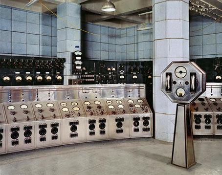
A photograph of the control room of Battersea Power Station, London, by Michael Collins, one of a series which will shortly be on display at the Royal Institute of British Architects.

The images show Battersea Power Station as what Collins describes as a “twentieth century ruined castle” – a building that was built to last, with a high quality structure and interior, including Art Deco walls and ceilings.

Giles Gilbert Scott’s enormous temple of heavy industry continues to sit decaying on the banks of the Thames while property developers come and go. The latest of these, Real Estate Opportunities, has fallen into debt which means proposals to develop the site are once again on hold. A part of me likes the idea of the building sitting there unused and purposeless year after year, like some vast Steampunk Stonehenge; Giles Gilbert Scott’s other Thames-side power station, Bankside, was successfully transformed as Tate Modern, but we know from various proposals that the fate of Battersea, whether as theme park or shopping centre, is likely to be a lot less edifying.

quark1.jpg

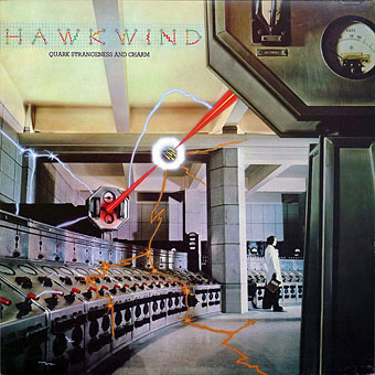
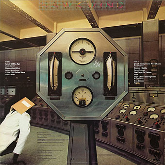
It took redevelopment to transform Bankside from temple of industry to temple of culture but Battersea’s unmistakable presence has a powerful cultural history of its own. Everyone knows the Hipgnosis sleeve design for Pink Floyd’s Animals (1977); less familiar is the photos of the control room which Hipgnosis used for Hawkwind’s Quark, Strangeness and Charm the same year. I tend to prefer the back cover of this sleeve to the front; that octagonal readout device is more interesting than the rather unconvincing sparks and exchanges of energy. And speaking of energy, my former employers are still active, unlike the rancorous Floyd.

quark2.jpg

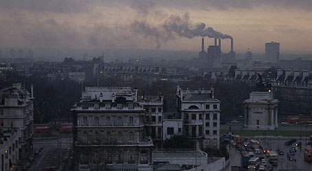
There’s a page here listing other uses of the power station, including its many film appearances which date back to the 1930s. That list mentions the control room’s use as a background for the “Find the Fish” sequence in Monty Python’s The Meaning of Life (1983) but they omit an earlier Monty Python appearance when you briefly see the building in operation during And Now for Something Completely Different (1971). It was closed down a few years later. So here it is, then, belching fumes over west London on a profoundly gloomy winter afternoon.

battersea2.jpg

Elsewhere on { feuilleton }
The album covers archive

Previously on { feuilleton }
The Sonic Assassins
The Bradbury Building: Looking Backward from the Future

New Modofly books

steampunk.jpg

Steampunk: Life in Our New Century!

I’m behind on work updates again. Still being very productive on a range of different fronts—mostly book and CD design as usual—but the workload means that site updates tend to suffer. Anyway…

This new Steampunk illustration was a quick piece done at the weekend to accompany an article Jeff VanderMeer is writing. The collage came out better than expected considering it was pretty much slammed together in an afternoon. Coincidentally, the same weekend there was a request from Modofly for new designs to adorn their range of bespoke notebooks. The last Modofly design I produced was also a Steampunk one (depicting Jeff’s Steampunk formula) so I quickly worked this up into a new book design. I’ve also slightly reworked the Nyarlathotep design done earlier this year so it fits Modofly’s book format. When I get the time I’ll be making some Cafepress products from these designs; I’d like to see both of them as posters for a start.

Update: Jeff’s article, which includes two of my illustrations, is now posted here.

Previously on { feuilleton }
Nyarlathotep: the Crawling Chaos
Steampunk Redux
Steampunk framed
Steampunk Horror Shortcuts

New things for April II

coc.jpg

Another work-related update. This HP Lovecraft collection is published by Barnes & Noble next month and features my colour rendering of the rising monstrosity on its cover. Nice to have something decorating an actual Lovecraft book, the second time this has happened (first time was for a French volume). B&N also sell my own book, of course (with, er…the same cover pic).

And another shout-out, for a preview of Arik Roper‘s new book, Mushroom Magick: A Visionary Field Guide, at Abrams. Read an extract from Erik Davis’s introduction here.

Via Further.

Previously on { feuilleton }
The art of Arik Roper