Essex House book covers

essex01.jpg

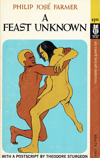
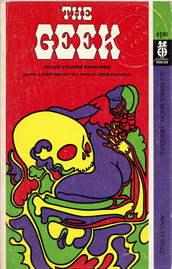
I’ve known the name of American publisher Essex House for many years but the books they published, all of which appeared in a frenzy of activity from 1968 to 1969, have never been easy to find in the UK. The company is chiefly of note today for having three original Philip José Farmer novels on their list, all works of fantasy with the erotic side more dominant than in Farmer’s previous work. Erotic fiction with a generic slant was the Essex House speciality, and while the Farmer covers have appeared here before, I’d not seen any other Essex House covers until the discovery of this page which collects 38 of the 42 published titles.

essex13.jpg

It’s immediately evident looking down the list that the (uncredited) designer managed to forge a distinctive identity for the books at a time when any cover would suffice if the written material was sufficiently pornographic. Many of the covers borrow (or mutate) pre-existing artworks, while others emulate the watered-down psychedelic style that by the late 60s was visible everywhere in the US and much of Europe. These aren’t all great pieces of design but the graphics on erotic titles in the 60s either played safe by favouring text-only covers or sported technically crude emulations of paperback illustration. (For an example of just how technically crude, see this post about some of the many gay pulps on sale in the US.)

essex33.jpg

Essex House may not have been around for long but they seemed to be attempting something different, at least where the covers were concerned. I’ve only read the Farmer books so I can’t vouch for the other titles but the Encyclopedia of Science Fiction writes that

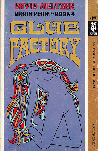
…about half the 42 titles published by Essex House were sf/fantasy; they included novels by Philip José Farmer, Richard E Geis, David Meltzer (perhaps the most distinguished), Michael Perkins and Hank Stine…of which a number were ambitious, some literary, and most somewhat joyless—even emetic—and redolent of 1960s radicalism.

Pornography as a tool of radical politics had a brief vogue in the late 60s and early 70s, something that’s particularly evident in the underground magazines of the period. The results may be “joyless” to some but then I find a lot of the alleged classics of science fiction joyless so it’s all a matter of taste. There was no equivalent of Essex House in the UK but in the 1970s France had the Chute Libre imprint which not only published all of the Essex House Farmer titles but did so with a collection of equally striking (or “joyless”) cover designs.

essex23.jpg

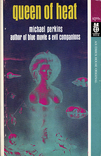
Artwork is a solarised version of Le Bout du monde (1949) by Leonor Fini.

Continue reading “Essex House book covers”

The nocturnes of William Degouve de Nuncques

nuncques04.jpg

The Blind House (1892).

William Degouve de Nuncques (1867–1935) is one of the less well-known Belgian Symbolists but one with a place in art history for the picture above. The mysterious atmosphere of The Blind House (often labelled as The Shuttered House, The Pink House or even The House of Mysteries) was admired by René Magritte who inverted the apparent conjunction of night and day in his own Empire of Lights series. Degouve de Nuncques’ other pictures from this period possess a similar quality of nocturnal mystery, a predilection he shared with other Belgian artists such as Léon Spilliaert and Paul Delvaux. Many of these pictures are pastels, a popular medium among the Symbolists for its nebulous effects.

nuncques09.jpg

In Venice (1895).

nuncques03.jpg

The Black Swan (1896).

Continue reading “The nocturnes of William Degouve de Nuncques”

Invisible Cities: Miscellanea

cities01.jpg

Cover art: The Castle in the Pyrenees (1961) by René Magritte.

A final post for this week devoted to Italo Calvino’s Invisible Cities, and it occurs to me that “Miscellanea” could easily be the name of one of Marco Polo’s cities.

One thing that’s become apparent over the past few days is that this subject is a very popular one with artists, especially in Italy. This is understandable but it also means you could probably fill another week of posts pursuing further illustrations and homages. Rather than belabour things I’m ending with a few of the more notable derivations including some cover designs. The Einaudi volume above was the first printing in Italy in 1972.

cities03.jpg

Cover design by Arnold Skolnick.

And this was the first American edition from Harcourt, Brace and Jovanovich in 1974. The cover is printed in silver foil which makes the book a particularly desirable item. This might explain why it’s also rather expensive today.

cities04.jpg

Cover art: Martyrdom of a Saint by Monsù Desiderio.

The 1979 Picador edition is one of two paperback editions I own. The enigmatic “Monsù Desiderio” has a confused identity (see this post), and specialised in curious architectural paintings so this is an apt choice.

Continue reading “Invisible Cities: Miscellanea”

Max Ernst album covers

ernst01.jpg

The Road To Ruin (1970) by John & Beverley Martyn. Art: Un Semaine de Bonté (1934).

Having already looked at cover art featuring the work of Salvador Dalí and René Magritte, a similar post for Max Ernst seemed inevitable. I did search for Ernst cover art after the Dalí post but at the time there were fewer examples. As usual there may be more than these since Discogs is the main search tool and they (or the albums) don’t always credit the artists. Despite having several books of Ernst’s work I’ve not been able to identify all the artwork so the Ernst-heads out there are welcome to fill in the gaps.

The Road To Ruin was John Martyn’s fourth album, and the second he recorded with wife Beverley. I’m surprised that this is the earliest example, I’d have expected a classical album or two to have predated it.

ernst02.jpg

Martinu’s Symphony No. 6 (Fantaisies Symphoniques) / Vorisek’s Symphony In D Major (1971); New Philharmonia Orchestra, Michael Bialoguski. Art: Bottled Moon (1955).

ernst03.jpg

Bluebeard’s Castle by Béla Bartók (1976); Tatiana Troyanos, Siegmund Nimsgern, BBC Symphony Orchestra, Pierre Boulez. Art: The Eye of Silence (1943–44).

Bluebeard’s Castle is my favourite opera, and The Eye of Silence is my favourite Ernst painting, so this is a dream conjunction even if the match doesn’t work as well as it did for the cover of The Crystal World by JG Ballard. One to seek out.

Continue reading “Max Ernst album covers”

Hans Bellmer’s Maldoror

bellmer1.jpg

Les Fleurs du Mal.

That favourite novel of the Surrealists receives the attention of yet another Surrealist artist. Dalí and Magritte both made their own attempts to illustrate Lautréamont’s Les Chants de Maldoror, a book that many people would consider beyond the reach of easy pictorial representation. I tend to think that the novel’s delirious, dream-like prose offers endless interpretations; this earlier post managed to haul one paragraph in the direction of the Cthulhu Mythos.

Hans Bellmer’s series of 33 intaglio prints were produced from 1967 to 1971, and use the book as a mirror for the artist’s erotic obsessions. Not an unwarranted point of view but Bellmer makes the novel seem much more overtly erotic than it is. The images here aren’t the best quality. Better copies and a complete set of the prints may be viewed at a larger size here.

bellmer2.jpg

Ecstasy.

Continue reading “Hans Bellmer’s Maldoror”