Hector Guimard elevations

guimard1.jpg

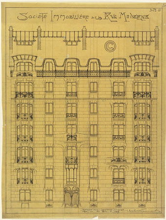
Design for the Facade of Societé Immobilière de la Rue Modern, No. 6 (1909).

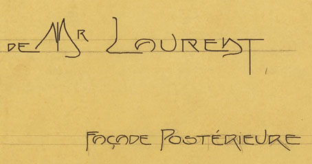
Drawings by French architect and designer Hector Guimard (1867–1942), the man who gave Paris those plant-like entrances to the Metro stations. The examples here can be seen in greater detail at the Google Art Project where there’s a few more of his works including his typically organic smoking bench. One thing I like about the architectural drawings is seeing the way he stylised his lettering. Frank Lloyd Wright used to do the same on his plans but I doubt there are any architects today who do the same.

guimard2.jpg

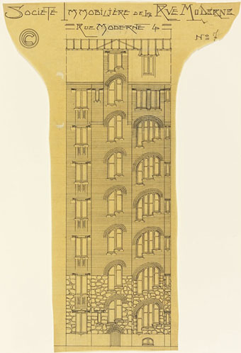
Elevation of an Apartment Building, Société Immobilière, rue Moderne (now rue Agar) (1909–11).

guimard3.jpg

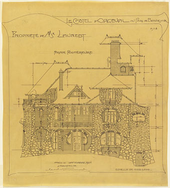
Rear Facade, Castel d’Orgeval, Parc Beauséjour, near Paris: Elevation (1904).

guimard4.jpg

Previously on { feuilleton }
Hector Guimard sketches
Temples for Future Religions by François Garas
Elizabetes Iela 10b, Riga
Atelier Elvira
Louis Bonnier’s exposition dreams
The Maison Lavirotte
The House with Chimaeras

Mars architectures

davidovici1.jpg

Mars Architectures 3

Italian architect Stefan Davidovici was in touch recently asking whether I’d be interested in his speculative views of Mars architectures and an imaginary Jerusalem. I am indeed interested in work such as this, whether the designs resemble Frank Lloyd Wright sketches for David Cronenberg’s unfilmed adaptation of Total Recall or the Piranesian buttresses of the Jerusalem pieces. As to the question of “why Mars?”, Davidovici says this:

Because the functions of any Mars settlement, be it made by near-future humans or by far-future post-humans or by the famous little green local cousins of humans are so, so, so completely obscure to us – answering to an unknown society in an unknown environment – as to become totally, completely, absolutely irrelevant. Therefore we can read the architectural space of such a place as pure art.

A range of his work can be found at his blog, the architecture draftsman.

davidovici2.jpg

Mars Architectures 6

davidovici3.jpg

Mars Architectures 9

davidovici4.jpg

Mars Architectures 10

davidovici5.jpg

Mars Architectures 9

Previously on { feuilleton }
La Tour by Schuiten & Peeters
The art of Pierre Clayette, 1930–2005
The art of Erik Desmazières
The art of Gérard Trignac

A Wilde Night

bragdon.jpg

A couple more pieces from yesterday’s Posters in Miniature. The drawing above is entitled A Wilde Night and credited to Claude Fayette Bragdon (1866–1946) whose design work has appeared here before. Bragdon was an acquaintance of Will Bradley’s, and like Bradley was a man of many talents being variously employed as an architect, writer and stage designer. Bragdon and Bradley both worked together on The Chap-Book, Herbert Stone’s Chicago periodical which commenced publication in 1894, the same year as The Yellow Book, a magazine whose style and light-hearted content Stone and co. seemed keen to emulate. Bragdon’s small drawings for The Chap-Book are less Beardsley-like than Bradley’s designs which is why this very overt homage appears as a surprise.

yellowbook.jpg

Bragdon’s picture is undated but the female figure is taken from Beardsley’s cover for the first issue of The Yellow Book which would place it in around 1894; the satyr-like male is an odd blend of bits of Beardsley’s male and female figures. Aubrey, however, would never have drawn bats like Bragdon’s, or a sleeping policeman…too gauche, my dear. As for the Wildeness, 1894 was only a year away from Oscar’s trial, a time when London was buzzing with scandalous rumours, none of which appear to have reached Chicago.

giannini.jpg

Also in Posters in Miniature is this piece by another American, Orlando Giannini (1860–1928), a glass designer and another Chicagoan who worked for a while with Frank Lloyd Wright. This design is dated 1895 and struck me with its radical appearance, so very different from the evolving Art Nouveau styles of the time. Giannini’s work as a glass designer evidently brought a different sensibility to graphic design, one which would have still looked bold and original ten years later.

Elsewhere on { feuilleton }
The Aubrey Beardsley archive
The illustrators archive
The Oscar Wilde archive

Deutsche Kunst und Dekoration #19

dkd19-01.jpg

Water Serpents I by Gustav Klimt. See it in colour here.

Continuing the delve into back numbers of Deutsche Kunst und Dekoration, the German periodical of art and decoration. Yesterday’s post concerned a Klimt-like artist, today volume 19, covering the period from October 1906 to March 1907, includes further work by Klimt himself. The Wiener Werkstätte, with whom Klimt was affiliated, continues to dominate these editions, understandably so when the architecture, art and design being produced by the group was some of the most advanced in the world. In addition to the customary graphics and interiors there’s also some examples of dress design by Gustav Klimt which I hadn’t seen before.

As usual, anyone wishing to see these samples in greater detail is advised to download the entire number at the Internet Archive. There’ll be more DK&D next week.

dkd19-02.jpg

A portrait of Margaret Stonborough-Wittgenstein by Gustav Klimt. The sitter was the sister of Ludwig Wittgenstein.

dkd19-03.jpg

A poster by Koloman Moser.

Continue reading “Deutsche Kunst und Dekoration #19”

Carlo Scarpa’s Brion-Vega Cemetery

scarpa.jpg

“I would like to explain the Tomba Brion…I consider this work, if you permit me, to be rather good and which will get better over time. I have tried to put some poetic imagination into it, though not in order to create poetic architecture but to make a certain kind of architecture that could emanate a sense of formal poetry….The place for the dead is a garden….I wanted to show some ways in which you could approach death in a social and civic way; and further what meaning there was in death, in the ephemerality of life—other than these shoe-boxes.” Carlo Scarpa

Dan Hill at City of Sound reminds us (okay, reminds me…) of Carlo Scarpa’s incredible private cemetery via a link to a Wallpaper* photo feature about the place. Scarpa’s final work (he’s buried in the grounds) was built for the Brion family at San Vito d’Altivole, Italy, and completed in 1978.

This construction and other Scarpa buildings often come to mind after encountering some disastrous use of concrete in architecture. Scarpa, like Frank Lloyd Wright, shows how well that meanest of building materials could be used with the application of care and imagination. And Scarpa, like Wright, also favoured attention to detail, with the cemetery providing copious examples of this, notably the motif of a pair of interlaced circles which feature as a prominent window design and recur in tiny elements elsewhere. Those paired circles and the garden itself remind me of the Jantar Mantar at Jaipur. I’m sure I read that one of Scarpa’s influences for the cemetery was Arnold Böcklin’s The Isle of the Dead but I’m unable to find any online reference. For more about that painting, there’s my earlier post on the subject.

• Flickr has a wealth of photographs of the cemetery
A black & white photo set by Gerald Zugmann

Previously on { feuilleton }
Hugh Ferriss and The Metropolis of Tomorrow
The Jantar Mantar
Arnold Böcklin and The Isle of the Dead
Frank Lloyd Wright’s future city