Moorcock: Faith, Hope and Anxiety

moorcock.jpg

Photo of the author by Linda Moorcock.

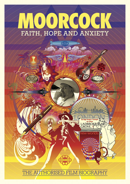
I mentioned a few days ago that I had another new piece of work to reveal, and this is it, a poster/promotional piece for Russell Wall’s forthcoming documentary about Michael Moorcock. The main challenge with one was to create something that would give a sense of Moorcock’s extensive career and the genre-spanning content of his many books.

mm1.jpg

I took the 1970s as the starting point, since this was the period when his reputation as a writer was established worldwide. The decade began with Britain’s bookshelves being colonised by Moorcock’s SF and fantasy novels published by Mayflower with vivid covers; it saw a cult feature film—The Final Programme—made from his first Jerry Cornelius novel, and it ended with the fourth Jerry Cornelius novel, The Condition of Muzak, winning a serious literary award, the Guardian Fiction Prize.

mm2.jpg

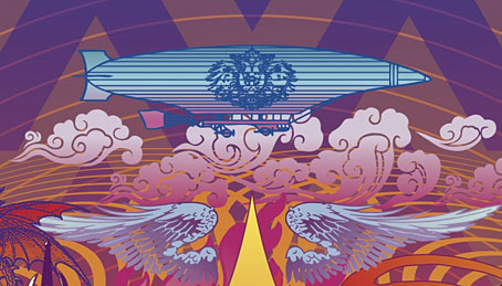
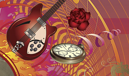
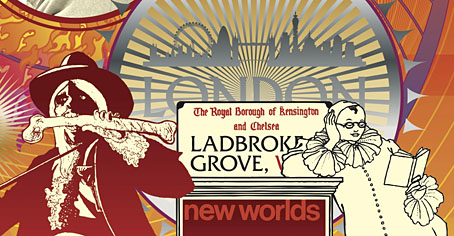
So the general appearance of the design, the headline typography, and the colour scheme are a nod to the Mayflower covers and especially to Bob Haberfield’s artwork which often used a similar style of Tibetan flames and clouds. The rest of the type is set in Rockwell, a preferred typeface of the Hipgnosis design team for much of the 1970s. Early on I had the idea of filling the design with stylised graphics like those used by some of the Hipgnosis illustrators, chiefly George Hardie, but that idea receded once the composition began to arrange itself. The fountain pen is the main hangover from this, a hard-edged graphic tilted at an angle like many of Hardie’s illustrations. The pen is a little inappropriate given that Moorcock is famous for knocking out novels at speed on a typewriter but it made a good visual rhyme with the guitar, a Rickenbacker like the one the author played in his Deep Fix band.

mm3.jpg

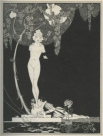
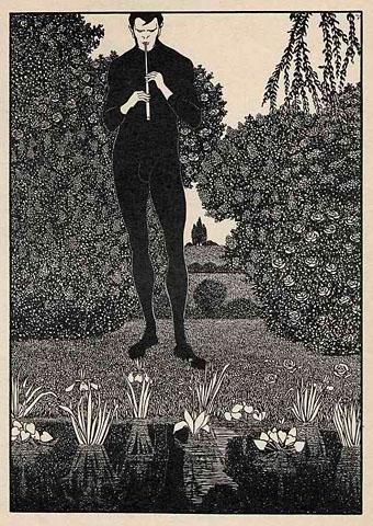
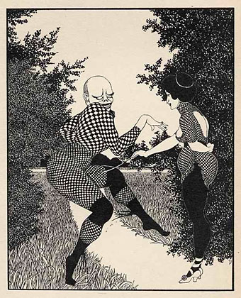
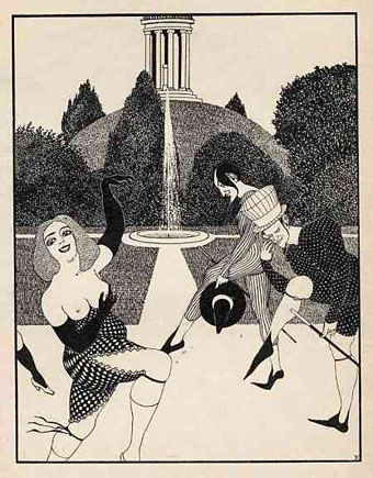
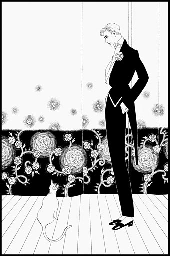
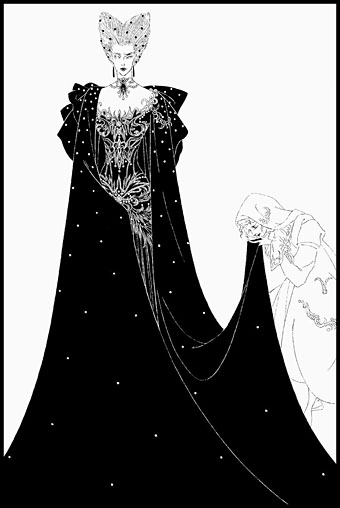
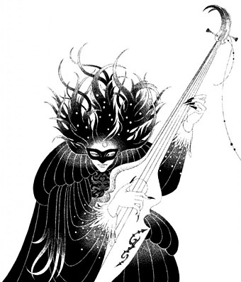
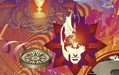
Elsewhere there are many specific references competing for attention: the Elric head is Jim Cawthorn’s illustration from the first edition of Stormbringer (1965); the Jerry Cornelius figure (straddling a repurposed Mayflower logo) is one of Mal Dean’s best, as seen on the cover of issue 191 of New Worlds magazine; the sorcerous blades are my own designs from 1985 as seen on the sleeve of Hawkwind’s Chronicle of the Black Sword album; the Beardsley figures from Salomé were a vague gesture to the 1890s but the Pierrot figure happens to be one Moorcock used for a while as a bookplate, something I didn’t know until I’d placed it in the design; the cat at Pierrot’s feet is another Beardsley from one of the Bon-Mots books; the London skyline is a contemporary one, London past and present having been a continual feature of Moorcock’s writing throughout his career. Lastly, all these details are contained by a graphic based on Abram Games’ BBC TV ident from the 1950s. When Russell and I began talking about this project the words “television biography” were being used so this would have connected to that idea, and to the decade when Moorcock’s career began.

mm4.jpg

I don’t know when the documentary will be released but any news will be posted here in due course. There’s also talk of making copies of the poster available for purchase but nothing concrete has been decided yet.

Previously on { feuilleton }
Eduardo Paolozzi at New Worlds
Elric 1: Le trône de rubis
Into the Media Web by Michael Moorcock
The Best of Michael Moorcock
Revenant volumes: Bob Haberfield, New Worlds and others

John Austen’s Little Ape

austen1.jpg

British illustrator John Austen (1886–1948) illustrated many classic works of fiction throughout the 1920s, one of which, Hamlet, was recently reprinted by Dover Publications. His other work isn’t so easy to find, however, and I’d not seen Little Ape and Other Stories (1921) until Nick H drew my attention to a copy for sale at silver-gryph’s eBay pages. (Thanks, Nick!)

Ralph Holbrook Keen’s story collection was Austen’s first illustrated edition although you wouldn’t necessarily take it for a debut work. There are the familiar nods to Beardsley—the black-and-yellow cover especially—and possibly Harry Clarke whose influence is more evident in the Hamlet drawings. Clarke and Austen exhibited together in 1925. The skeleton with a floral crown makes me think of the rose-crowned skeleton in Edmund J. Sullivan’s Rubáiyát (1913), although this may be a result of Sullivan’s drawing having been made very familiar by its use on Mouse & Kelley’s posters for the Grateful Dead. One of the many connections between the Golden Age of Illustration and the Golden Age of Psychedelia.

austen2.jpg

austen3.jpg

Continue reading “John Austen’s Little Ape”

The art of John Jack Vrieslander, 1879–1957

vrieslander01.jpg

The Darkness (1900).

Another discovery to add to the long list of post-Beardsley illustrators, John Jack Vrieslander was a German artist whose not-very-German name was a pseudonym of Hans Zarth. It took some searching to establish that a) it is Zarth, not “Zahrt” as one site has it, and b) the two were indeed one person. I’ve used the Vrieslander name here since that’s the credit used for most of these examples. Vrieslander/Zarth signed his pictures with a V or a Z according to the prevailing persona.

vrieslander02.jpg

As Beardsley imitations go these drawings could be better—they lack Aubrey’s natural sense of balance and composition—but they’re of interest for leaning so heavily on the style of the later illustrations which favour elegant gardens and meticulously rendered foliage. Some of the figures refer to the earlier Aubrey, however, as does the vaguely lascivious atmosphere. The phallic plant pot in the Lilly Peters picture below is the kind of detail nobody in 1901 would have dared attempt without Aubrey’s lead.

vrieslander03.jpg

Continue reading “The art of John Jack Vrieslander, 1879–1957”

Icons

icon1.jpg

“Iconic” is a much abused word these days but this book from UK publisher Counter-Print can claim the term with some justification:

Icon contains over 200 examples of social media icons from many well-known, as well as up-and-coming, graphic designers and illustrators. This limited and concise canvas for self-expression is represented within this book through a host of examples collected from around the world, chosen for their creativity, intelligence and beauty.

My own icon/monogram/whatever is one of those featured in the “Shapes” section. It’s strange seeing this symbol subjected to any kind of attention even though it’s at the top of this web page and can also be found in much of my work. It appeared in drawings when I was about 15 or 16 and eventually became a personal identifier some time in the early 1980s. One reason I like it and continue to use it is because I don’t know what it is; it doesn’t originate out of any conscious expression, and doesn’t refer to any specific symbolic history even though it resembles other symbols. I always liked Whistler’s habit of using a peacock as his signature so he didn’t have to spoil his paintings with a scrawl; Aubrey Beardsley imitated his example for a while using three vertical lines as his signature. This icon has served a similar purpose for me although these days I’m as likely to use my surname and some Roman numerals.

Icon is a great little book, smartly designed by Leterme Dowling and brimming with equally smart content. Some page samples follow.

icon2.jpg

icon3.jpg

Continue reading “Icons”

The art of Toshiaki Kato

kato01.jpg

Toshiaki Kato isn’t the first contemporary Japanese artist to work variations on Aubrey Beardley’s style but he’s one I’d not come across before. Kato’s cover illustrations run a gamut of familiar styles, not only Beardsley but Harry Clarke, Gustav Klimt, Tamara Lempicka, Maxfield Parrish and no doubt a few more I haven’t recognised. Beardsley’s influence is something I like to follow so it’s the black-and-white work you see here. It’s particularly fascinating seeing Japanese artists playing with Beardsley motifs when so much of Beardsley’s early style was derived from Japanese prints; a rare example of cultural influence finding its way back home after a century or more.

There’s surprisingly little information about Toshiaki Kato on Anglophone websites but scans of his gorgeous paintings proliferate. This page is a good place to start but there’s plenty more at Pinterest and elsewhere.

kato02.jpg

kato03.jpg

Continue reading “The art of Toshiaki Kato”