Raffles, the gentleman thief

raffles1.jpg

The Raffles that concerns us here is the television incarnation as seen in a series of adventures made by Yorkshire TV in 1977. I recently bought a cheap DVD set of the series, not for reasons of nostalgia (a wretched condition) but out of curiosity and whim. I had a vague recollection of enjoying the few episodes I’d seen, and was hoping for another decent Victorian adventure series along the lines of The Rivals of Sherlock Holmes (1971/1973). Raffles proved to be better than I expected; not quite up to the standards of Granada TV’s peerless adaptations of the Sherlock Holmes stories but thoroughly enjoyable. The production values are better than those in The Rivals of Sherlock Holmes, a well-written series with an impressive cast that was nevertheless compromised by a restricted budget. I’m not really reviewing the Raffles series here, this piece is intended to note a couple of points of interest which, for me, added to its pleasures.

raffles2.jpg

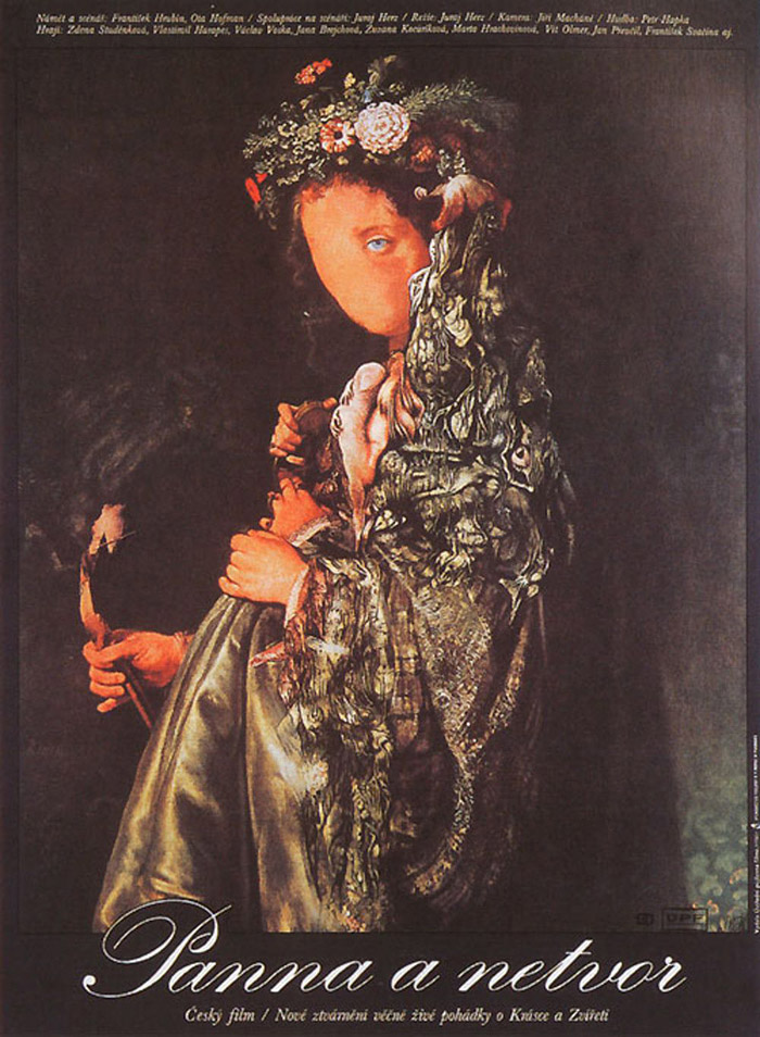
Raffles and Bunny as they were originally. An illustration by FC Yohn from Raffles: Further Adventures of the Amateur Cracksman (1901).

Arthur J. Raffles was invented by EW Hornung, a writer who was, among other things, Arthur Conan Doyle’s brother-in-law. Raffles, like Sherlock Holmes, is a resolute bachelor with a devoted friend and accomplice, but the two men share few other characteristics beyond a talent for outwitting the dogged inhabitants of Scotland Yard. Raffles’ indulgent lifestyle in the bachelor enclave of (the) Albany, Piccadilly, is financed by his burglaries which invariably target aristocrats and the homes of the wealthy. To the general public he’s known as one of the nation’s leading cricket players, a position which gives him access to upper-class social circles from which he would otherwise by excluded. His former school-friend, “Bunny” Manders, is also his partner-in-crime, a position that Bunny is happy to fill after Raffles saves him from bankruptcy and suicide. Conan Doyle disapproved of the immoral nature of the Raffles stories but they were very popular in their day, and they’ve been revived in a number of adaptations for film, TV and radio. George Orwell admired the stories, and writes about them with his usual perceptiveness here, noting the importance of cricket to Raffles’ gentlemanly philosophy of criminal behaviour. I’ve not read any of the stories myself, and I’m not sure that I want now, not when the television adaptations succeed so well on their own terms.

raffles3.jpg

Anthony Valentine and Christopher Strauli.

The TV series was preceded by a pilot episode made in 1975 which saw the first appearances of Anthony Valentine as the dashing Raffles and Christopher Strauli as the fresh-faced Bunny. Valentine and Strauli fit their roles so well it’s difficult to imagine anyone else improving on them, Valentine especially. In the series the pair are supported by many familiar faces from British drama: Graham Crowden, Charles Dance, Brian Glover, Robert Hardy, Alfred Marks, and, in a rare piece of TV acting, Bruce Robinson. Pilot and series were all written by Philip Mackie, and here we have the first noteworthy element since Mackie had earlier adapted six stories for The Rivals of Sherlock Holmes, including the one that features Donald Pleasence as William Hope Hodgson’s occult detective, Thomas Carnacki. Raffles is another rival of Sherlock Holmes, of course, albeit a criminal one, and much more of a mirror image of Holmes than the thoroughly villainous Professor Moriarty. Raffles only breaks the law to improve his bank balance, or as an occasional, daring challenge; he regards theft and evasion from the police as a form of sport, and generally deplores other types of crime. Some of his thefts are intended to punish the victim following an infraction, as with the belligerent South African diamond miner who causes a scene at Raffles’ club, and the Home Secretary who makes a speech in Parliament demanding stiffer penalties for burglary. In one conversation about the morality of their activities Bunny suggests to Raffles that his friend is a kind of Robin Hood figure; Raffles agrees before admitting that he never gives his spoils to the poor.

Continue reading “Raffles, the gentleman thief”

Old Marvel versus Sherlock Holmes

oldmarvel4.jpg

Arriving in the post this week, one of the books whose covers I was creating late last year. Work-wise, the past year has been busier than usual which means I’ve fallen behind with the logging of recent commissions. In the past few months I’ve created several album designs, more book covers, an entire book design (cover plus interior), and also been working on two bigger projects at the same time. Things have calmed down a little now so updates will be forthcoming.

oldmarvel1.jpg

Old Marvel: The Scientific Detective is another design for Mark Williams’ Dark Lantern Tales imprint which once again resurrects a forgotten detective from pulp obscurity, and in a larger format than before. The new volume is significant for presenting a Sherlock Holmes-like character—credited to the pseudonymous “Grip”—who predates Holmes’ first appearance by three years, thereby suggesting a possible inspiration for Arthur Conan Doyle. Holmes collector Joe Rainone provides the details of publication and sets out the available evidence in an informative foreword. The Old Marvel character not only pre-empts Holmes by using his scientific knowledge to solve mysteries but he also pre-empts subsequent generations of spies and investigators with the various gadgets he uses, including what may be the first fictional deployment of an Edison voice recorder. My brief for the cover was to combine the illustration of the character with a vignette showing a shipping disaster from the story plus some of the contents of the detective’s tool kit.

oldmarvel2.jpg

The book is actually two stories in one volume, with the second half being a reprint of the very first Sherlock Holmes novel, A Study in Scarlet. Both stories are presented as semi-facsimiles of their original US printings, together with reproductions of title pages and so on. The Holmes story is reproduced from its appearance in The Illustrated Home Guest in 1892, and includes rare illustrations one of which appears on the cover. Doyle’s first Holmes novel is the most controversial of all his stories—at least if you’re a Mormon—since this is the one where the inhabitants of Salt Lake City are depicted as a murderous religious cult. I filled out the cover with panels showing the two main story locations: a view of London via Ludgate Circus and a canyon in Utah. Finding a period engraving of St Paul’s Cathedral that remained visually interesting when narrowed down in this way took some time.

oldmarvel3.jpg

Previously on { feuilleton }
More detectives
The Joe Phenix Detective Series
Illustrating Sherlock Holmes

Weekend links 574

vyletal09.jpg

Poster for Beauty and the Beast (1978) by Josef Vyletal.

• Next month, Second Run release Juraj Herz’s 1978 adaptation of Beauty and the Beast on region-free blu-ray. I watched this last year on a Czech DVD so it’s good to hear it’s being given an upgrade. Herz’s film is a distinctly sinister take on the familiar tale, with a bird-headed Beast that’s closer to Max Ernst than anything you’ll find in illustrations for Perrault’s stories.

• “In a coincidence so unlikely it almost seems, well, magical, the girls traced illustrations from a book of folklore that also contained a short story by Sir Arthur Conan Doyle himself, a reflection of a reflection of a reflection.” Audrey Wollen on the Cottingley fairy photographs. Related: The Coming of the Fairies by Arthur Conan Doyle.

• “[Mark E. Smith], with his love of Stockhausen, HP Lovecraft, and (bizarrely) the sitcom Keeping Up Appearances, becomes a reverse coder, an apostle of avant pulp, a ‘paperback shaman’.” Sukhdev Sandhu reviews Excavate! The Wonderful and Frightening World of the Fall, edited by Tessa Norton and Bob Stanley.

• “Found photos of men in love from 1850–1950“. Maybe. As before, I’m always cautious about imposing a narrative on old photographs.

• Mixes of the week: A mix for The Wire by Pamela Z, and a dose of post-punk esoterica by Moin for XLR8R.

DJ Food takes another dive into back issues of International Times in search of ads for London’s Middle Earth club.

• At The Smart Set: Colin Fleming watches John Bowen’s drama of pastoral horror, Robin Redbreast.

• At Dennis Cooper’s: Heavily plotted non-linear structures whose velocity lacks narrative drive.

Ryan Gilbey attempts to rank Robert Altman’s features into a list of 20 best.

• Still Farther South: Poe and Pym’s Suggestive Symmetries by John Tresch.

• New music: At One Point by Scorn.

Visionist‘s favourite albums.

The Beast (1956) by Milt Buckner | Leggo Beast (1978) by Gregory Isaac’s All Stars | This Beast (1983) by Tuxedomoon

Illustrating Sherlock Holmes

beeton.jpg

Beeton’s Christmas Annual, 1887.

The latest in the series of illustrated editions I’ve been working on for Spanish publisher Editorial Alma is a single-volume collection of two short Sherlock Holmes novels, A Study in Scarlet and The Sign of Four. Work on this book began immediately after I’d finished Dracula so maintaining the Victorian theme was easy enough, although the commission as a whole was an awkward one. The main problem was having barely enough time to create 20 new illustrations while I was finishing work on the huge Jim Cawthorn book. But even with enough time this would have been a difficult brief. I regard Sidney Paget‘s original Holmes illustrations as the definitive ones so trying to offer people a fresh take on the world’s greatest detective is difficult. (And, as with Dracula, there’s further competition from the innumerable screen adaptations.) Then there are the stories themselves which are often more cerebral than visual, offering little for an illustrator beyond successive views of rooms, streets, houses and so on. Even Paget has trouble with this aspect of the stories, with many of his illustrations showing the various characters standing or sitting in rooms. If I’d had more time I might have tried a lateral take on the content—two of the illustrations in Dracula avoided the people-in-rooms problem by showing collections of objects on tables—but I didn’t have the time…

paget.jpg

Watson and Holmes by Sidney Paget. From The Adventure of Silver Blaze, The Strand Magazine, December 1892.

As things turned out, the least satisfying of the novels from a story perspective, A Study in Scarlet, was easier to illustrate because much of the second half takes place in the United States. This was the first Holmes novel, and it doesn’t work as well as the others for precisely this reason, the narrative attention is removed from Holmes, Watson and London, but the change of scene is a benefit for an artist. The second novel, The Sign of Four, is a better story but was compromised in this edition because the publisher only wanted every other chapter illustrated. For this reason Holmes and Watson are elusive presences in their own books although given the problems outlined above this may be for the best.

There’s still one more volume to emerge from my recent round of work for Alma, a collection of four Lovecraft stories, three of which I hadn’t illustrated before. More about this in a month or so. In the meantime, the full run of Holmes pictures follows below, while all may be seen at a larger size here.

A Study in Scarlet

holmes01.jpg

holmes02.jpg

holmes03.jpg

Continue reading “Illustrating Sherlock Holmes”

The Smoke

smoke01.jpg

London in 1898 was the most populous city in the world, a metropolis of “four million souls” as Arthur Conan Doyle continually reminds us in the Sherlock Holmes stories. The stereotypical representation of London in the 19th century is of a city wreathed in fog but the reality was closer to the dense smogs that plague Chinese cities today. The four million souls heated themselves by burning wood and coal, and the resulting smoke (and a fair amount of steam, no doubt) combined with the British climate to create the noxious, tinted “fogs” that fill the streets of Victorian fiction.

smoke02.jpg

Whatever the health hazards, the vaporous atmosphere had its champions in artists such as Claude Monet and James Whistler, both of whom relished the way the smoky air softened the silhouettes of the city. William Hyde may be added to the list for this superb series of etchings showing London at its most tenebrous, another chance discovery at the Internet Archive. London Impressions is an ambivalent celebration of the capital as a city of shadows, smoke and fog, the essays by Alice Meynell ruefully admitting that while the industrial cities of the north may rival London for their polluted atmosphere, their smaller size means that blue sky is never far away, something the Londoner of 1898 couldn’t take for granted. This is a marvellous book, and one I’d love to own if it wasn’t so rare; there’s a copy on eBay at the moment for $1,640. At least we can read it (and download the pages) here.

smoke03.jpg

smoke04.jpg

smoke05.jpg

smoke06.jpg

smoke07.jpg

smoke08.jpg

Continue reading “The Smoke”