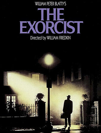
Growing up in the 1970s put cinema-going kids of my generation in a frustrating position: we knew that the censorship of decades past was over but we weren’t old enough to see any of the films benefiting from the relaxed strictures. Consequently some notorious releases grew larger in the imagination than they might have otherwise, especially when their cryptic titles—A Clockwork Orange, Straw Dogs—gave no clue as to their content. Looming larger and darker than all of these was William Friedkin’s The Exorcist whose content was at least clear despite that vague poster design. The film arrived in Britain in March 1974 bearing a ferocious reputation thanks to tabloid reports of a cursed production and hysteria at US screenings. The film’s power has been significantly reduced since its release, not least because of its enormous success which gave us two sequels, a prequel that went through three directors (and ended up as two separate films), a reworked version of the original in 2001, and all the endless parodyings of Linda Blair’s torment.
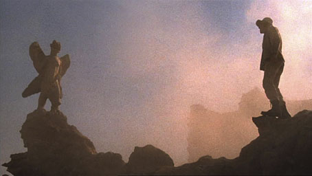
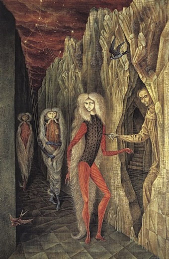
Pazuzu and Father Merrin face off in the desert.
The film and its sequels are explored in a new book from Centipede Press which turned up before Christmas but which has taken me a while to get round to since I wanted to re-watch the film first. I hadn’t seen The Exorcist for many years, the last viewing being a shoddy VHS copy so it was good to see it again in a decent DVD print. I still find the film more admirable on a technical level than as a work of cinematic art: the story has always been a piece of Catholic propaganda—something that author William Peter Blatty freely admits—and even if I set aside my lapsed-Catholic prejudices I have a hard time taking seriously Blatty’s religious narrative. Friedkin is a very good thriller director but the tension sags in the first half of the film when the possessed (or is she?) Regan is being hauled around various hospitals while Father Karras frets about his dying mother and his lapsed faith. A sub-plot with police detective Lee J. Cobb—a pared-down thread from the novel—is completely superfluous. On the plus side, the acting is first-class, the almost wordless sequence in Iraq makes a tremendous opening, and the exorcism itself still packs a considerable punch not least because of Dick Smith’s remarkable makeup effects.
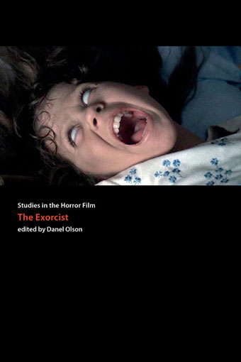
The Centipede volume is a substantial collection (516 pages) of interviews and essays edited by Danel Olson, part of the publisher’s Studies in the Horror Film series. The interviews are especially worthwhile being taken in part from back issues of Cinefantastique magazine: Friedkin and Blatty appear twice, there are talks with Dick Smith and Friedkin’s editor Bud Smith (no relation), and Paul Schrader discusses his troubled prequel, Dominion (2005).
Among the essay highlights Thomas Ligotti juxtaposes Blatty’s moral and theological universe with the amoral pessimism of HP Lovecraft while Blatty recounts the factual origin of his novel in a piece taken from The Exorcist: From Novel to Film (1974). Successful films that spawn sequels often present challenges for critics when the later installments begin to deviate from the premise of the original. Part of the interest in Olson’s collection is seeing how the writers delve into the imperatives of Hollywood sequelitis for moments of value. The critical essays are thought-provoking without wandering into the quicksands of jargon-ridden academicism: Kendall Phillips examines the influence of The Exorcist on The Texas Chainsaw Massacre (1974), there’s a spirited attempt by James Kloda to defend John Boorman’s much-vilified The Exorcist II: The Heretic (1977), and James Marriott points out that horror films are a continuing source (however debased) of metaphysical speculation.
This last notion is an intriguing one: people always take The Exorcist at face value—God and Satan are real; it’s a spiritual battle—yet the demon we see in the film is the Assyro-Babylonian god Pazuzu, a spirit never mentioned by name in the Bible, or in the film for that matter. I’d suggest there’s an argument to be made that it’s only Pazuzu that actually exists as a supernatural force in the film’s world, and that the prayers of the priests confound it but temporarily.
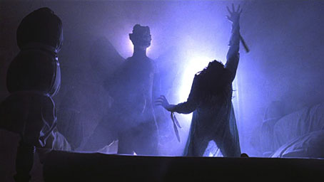
Pazuzu has entered the building.
The aura of metaphysical threat may have diminished but The Exorcist still wasn’t allowed a UK TV screening until 2001. Something about the idea of people confronting supernatural evil continues to compel, however antiquated the scenario may seem. This isn’t too surprising when we have nominees for the US Presidential elections talking in hyperbolic terms about God and Satan without being widely ridiculed. Then there’s news stories like this recent one in the UK: “Boy ‘tortured and drowned’ over witchcraft claims, court told“. Blatty and Friedkin’s devil child was one of the most influential films of the 1970s, and may well be the most influential despite the continued popularity of the wretched Star Wars cycle. In the past couple of years alone we’ve had The Last Exorcism (2010) and The Rite (2011), with The Devil Inside due to appear on UK cinema screens in March; possessed girls appear in all three films. Danel Olson could easily fill another volume tracing this influence through the decades.
Studies in the Horror Film: The Exorcist isn’t published until March 2012 but can be pre-ordered at Amazon (US) and Barnes & Noble.
Previously on { feuilleton }
• A playlist for Halloween: Orchestral and electro-acoustic
• Dead on the Dancefloor
• The monstrous tome