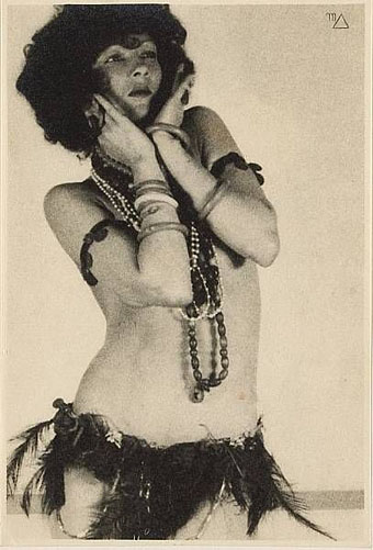
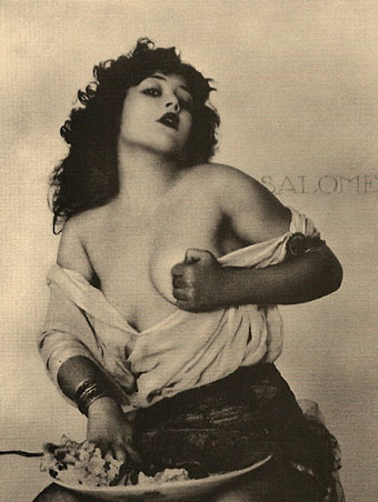
James Joyce in Reverbstorm

jj1.jpg

A post for Bloomsday with a handful of the many and varied appearances of James Joyce in the forthcoming Reverbstorm book. Ulysses was published ninety years ago this year. Among the usual commemorations BBC Radio 4 will be dramatising the entire novel throughout the day.

jj2.jpg

But as before the lightning the serried stormclouds, heavy with preponderant excess of moisture, in swollen masses turgidly distended, compass earth and sky in one vast slumber, impending above parched field and drowsy oxen and blighted growth of shrub and verdure till in an instant a flash rives their centres and with the reverberation of the thunder the cloudburst pours its torrent, so and not otherwise was the transformation, violent and instantaneous, upon the utterance of the word.

James Joyce, Ulysses (1922)

jj3.jpg

Prison and place and reverberation
Of thunder of spring over distant mountains
He who was living is now dead
We who were living are now dying
With a little patience

TS Eliot, The Waste Land (1922)

jj4.jpg

Continue reading “James Joyce in Reverbstorm”

Arrow by The Irrepressibles

arrow.jpg

I’ve kept wondering when we’d hear more from The Irrepressibles following the release of their wonderful Mirror Mirror album. Here at last is a new song, Arrow, from a forthcoming album, Nude. Lyrical allusions to Saint Sebastian accompany two naked guys wrestling until…well, go and see. (Thanks to Thom for the tip!)

Directed & choreographed by Jamie McDermott
Camera Person: Kate Perring
Filmed at Studio 7, Alston Works, London.

Previously on { feuilleton }
Los Bikers by Dënver
The Lady Is Dead and The Irrepressibles

Animating Piranesi

dupond.jpg

Piranesi Carceri d’Invenzione (2010).

When Peacay at BibliOdyssey linked to this short film by Grégoire Dupond I thought it might be one I hadn’t seen before but it turns out I have, and I mentioned the exhibition it was produced for in 2010. No matter, it’s worth drawing attention to again since Monsieur Dupond makes an impressive job of sending a virtual camera through the vast spaces of Piranesi’s Carceri d’invenzione, joining several of the etchings into a series of contiguous chambers.

yoyoma.jpg

The Sound of the Carceri (1998).

Dupond’s film uses Bach’s Cello Suite #2 as a musical accompaniment. As noted earlier that choice probably came from Yo-Yo Ma’s Inspired by Bach (1998) in which Bach’s six solo cello suites are performed in different settings. Suite #2 was The Sound of the Carceri directed by François Girard which places the cellist inside a CGI rending of one of Piranesi’s Careri etchings. YouTube has a copy here.

Elsewhere on { feuilleton }
The etching and engraving archive

Previously on { feuilleton }
Carceri, thermae and candelabra
La Tour by Schuiten & Peeters
Set in Stone
Piranesi as designer
Vedute di Roma
Aldous Huxley on Piranesi’s Prisons

The Fourth Dimension

fourthdimension.jpg

This post ought to have followed the one about Tango since it concerns another experimental film by Zbigniew Rybczynski. The Fourth Dimension was made in 1988 and like many of the director’s films uses a single effect to create striking results. In this case the effect involves photographing people and objects one narrow line at a time. When the lines are combined then shifted slightly the objects seem to bend and twist like melting plastic. This is the kind of semi-analogue technique which has now been made redundant by computer animation but Rybczynski gives his compositions a quasi-Surrealist quality, reinforced by the Magritte-like windows in some of the rooms.

Previously on { feuilleton }
Tango

Recovering Viriconium

viriconium01.jpg

Detail from Assassination in the Night (c. 1600?) by Monsù Desiderio.

Yesterday’s post looked at some of the past cover designs for M. John Harrison’s Viriconium books. This post makes a few suggestions for how they might be presented in the future. Since these are mostly covers that I’d like to see they’re not necessarily ideal for the audience a publisher might be aiming at, cover design is usually a three-way process involving designer, author and publisher. In the end I’ve resisted the temptation to draft a range of original cover proposals—writing these posts has taken long enough—so almost everything here uses pre-existing art. If I was designing covers for all four Viriconium books, however, and the brief was to orient them towards a fantasy readership, the first thing I’d try would be a series of four imaginary Tarot designs. A peculiar pack of Tarot cards is a recurrent feature of the books so I’d create four emblematic cards that featured significant elements and characters from each. The characters wouldn’t be too well defined, they’d be stylised, maybe even silhouettes. Each card would feature a dominant presence: offhand these would be one of the geteit chemosit for The Pastel City, a locust for A Storm of Wings, the Barley Brothers for In Viriconium and a Mari Lwyd horse skull for Viriconium Nights. These presences together with the human characters would loom over a silhouette city at the foot of each card whose outlines would change appearance from book to book, evolving gradually from a fantastic outline of domes and towers to something that resembles a contemporary city. The colours and treatments would show a similar evolution from the bright and bold styles of the Pamela Colman Smith Tarot deck to something more photographic, collaged from elements closer to our world. Maybe.

That’s an idea for the four individual books. All the examples here use the convenience of the omnibus edition so a single image (or pair of images) has to somehow represent the entire series. To save time and effort I’ve taken the liberty of hijacking a couple of Penguin Books layouts. I hope Penguin doesn’t mind, and I should also apologise to Harrison’s UK publishers, Gollancz, for making one of their authors jump ship. The Viriconium omnibus is certainly good enough to be considered a modern classic. Penguin’s recent template for its Modern Classics series happens to be very easy to apply to a wide range of artwork.

viriconium04.jpg

The Anti-Pope (1942) by Max Ernst.

Penguin has a long tradition of using pre-existing art on its covers, especially on those in its Penguin Classics series. You can almost make this into a parlour game: match your favourite novel with the best choice of painting. The tradition was extended to its science fiction titles in the early 1960s when the art of Max Ernst was featured several times along with the work of other Surrealists. Max Ernst is a favourite artist of mine so this is one I can’t resist. Many of Ernst’s decalcomania paintings of the 1940s would suit Viriconium but The Anti-Pope with its horse heads seems especially suitable.

Also on the Penguin sf covers was a picture by the mysterious “Monsù Desiderio” one of whose works can be seen at the top of this post. Desiderio was a 17th-century painter with a vague enough presence—works have been attributed to both François de Nomé and Didier Barra—and a line in gloomy architectural fantasias to make him an ideal Viriconium artist.

Continue reading “Recovering Viriconium”