When you’ve sated yourself on a group’s back catalogue there’s always the solo albums. In the case of Tuxedomoon there are a number of these to choose from, thanks to several of the band members being both multi-instrumentalists and talented songwriters. Some of the more offbeat solo outings may be found among the albums released as part of the Made To Measure series, an offshoot of the excellent Belgian record label, Crammed Discs. Crammed have been Tuxedomoon’s label for some time, and seem increasingly unique in a world where independent labels tend to cater to narrow genres and small, select audiences. Crammed’s roster of artists is extremely eclectic, ranging from the expected Euro-pop and dance releases to a wide range of traditional and contemporary music from around the world.
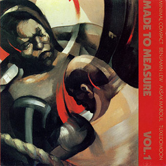
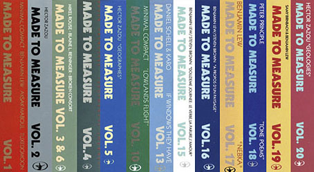
Made To Measure Vol. 1 (1984). Painting by Fernand Steven.
From 1984 to 1994 the Made To Measure series released over 30 albums that represent the more esoteric side of an already fairly esoteric label. All of the early releases were numbered, and Tuxedomoon happen to be on the first release, Made To Measure Vol. 1, together with Minimal Compact, Benjamin Lew, and Aksak Maboul. The series title refers to all of the music being “made to measure” some pre-existing work—film, theatre, dance performance, etc—although some of the later releases were simply an excuse to put out new music by an established Crammed artist. In addition to the first release, Tuxedomoon members Blaine L. Reininger, Peter Principle and Steven Brown were regular contributors to subsequent albums. Two of the Steven Brown albums, A Propos D’Un Paysage (MTM 15, 1985) and Douzième Journée: Le Verbe, La Parure, L’Amour (MTM 16, 1988) are marvellous instrumental collaborations with Benjamin Lew that are very different in tone to Tuxedomoon but well worth seeking out. Brown also recorded a soundtrack album, De Doute Et De Grace (MTM 22, 1990), with readings by actress Delphine Seyrig. The series has been discontinued in recent years but the MTM numbering was resurrected for the latest Tuxedomoon album, Pink Narcissus, which is MTM 39.
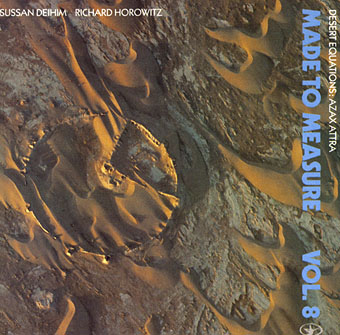
Desert Equations: Azax Attra (1986). Photography by Georg Gerster.
I’ve still not heard all of the Made To Measure series, and I don’t like everything I have heard—I have to be in the mood for Hector Zazou’s quirkier moments. Aside from those mentioned above, the notable releases for me would include Desert Equations: Azax Attra (MTM 8, 1986) by Sussan Deyhim (here credited as Deihim) & Richard Horowitz, an album that led me to acquire almost everything Sussan Deyhim has recorded; If Windows They Have (MTM 13, 1986) by Daniel Schell & Karo; Nekonotopia Nekonomania (MTM 29, 1990) by Seigen Ono; Water (MTM 31, 1992) by David Cunningham; Sahara Blue (MTM 32, 1993) by Hector Zazou; Glyph (MTM 37, 1995) by Harold Budd & Hector Zazou. Sahara Blue exemplifies in miniature the eclecticism of Crammed Discs, being a tribute to Arthur Rimbaud featuring (among others) John Cale, Ryuichi Sakamoto, Gérard Depardieu, Khaled, David Sylvian, Bill Laswell, Lisa Gerrard, Sussan Deyhim and Tim Simenon.
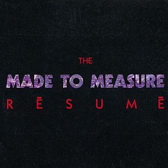
For those wishing to explore further without shelling out on mysterious, unknown quantities, I’d recommend The Made To Measure Résumé (1987), a compilation of tracks from the first 16 MTM releases, and an ideal introduction to the series.
Previously on { feuilleton }
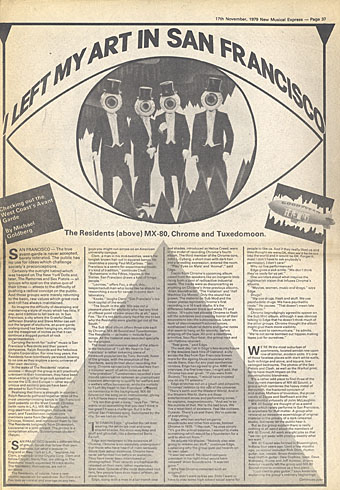
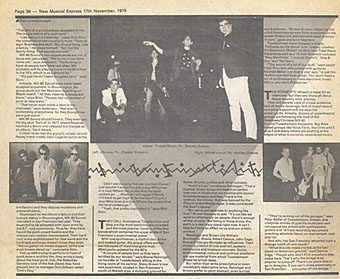
• Subterranean Modern: The Residents, Chrome, MX-80 Sound and Tuxedomoon
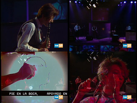
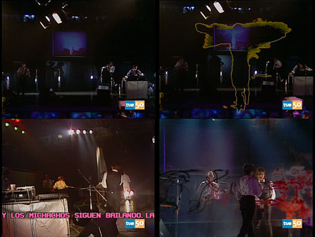
• Tuxedomoon on La Edad de Oro, 1983
• Tuxedomoon designs by Patrick Roques
• Pink Narcissus: James Bidgood and Tuxedomoon
 SAN FRANCISCO—The true avant-garde is never accepted, barely tolerated. The public has no use for ideas which challenge society’s preconceptions.