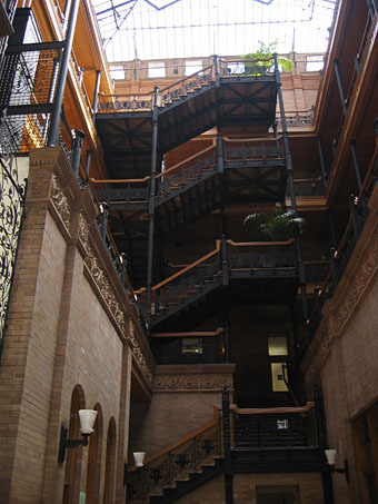
The Bradbury Building, 304 South Broadway, Los Angeles.
This looks like an old photograph but it actually dates from 1989 and comprises part of the Changing Times: Los Angeles in Photographs, 1920-1990 archive that the UCLA Library has recently made public.
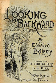 The Bradbury Building (constructed in 1893) was one of the few places I insisted on searching out when I was visiting the city in 2005. That enthusiasm dates from first seeing the building’s interior in Blade Runner where Ridley Scott turned its carefully-preserved atrium into JF Sebastian’s run-down apartment building. All that wrought-iron and polished terracotta (and those elevators!) would be compelling enough on their own but their history as a setting for a several film and TV productions only adds to their enchantment. That a building from the 1890s should be known primarily for its role in a science fiction film perhaps isn’t so surprising when it transpires that the Bradbury’s architect, George Wyman, had been inspired by a passage in a contemporary novel of futurist fantasy, Edward Bellamy’s Looking Backward: From 2000 to 1887:
It was the first interior of a twentieth-century public building that I had ever beheld, and the spectacle naturally impressed me deeply. I was in a vast hall full of light, received not alone from the windows on all sides, but from the dome, the point of which was a hundred feet above. Beneath it, in the centre of the hall, a magnificent fountain played, cooling the atmosphere to a delicious freshness with its spray. The walls and ceiling were frescoed in mellow tints, calculated to soften without absorbing the light which flooded the interior.
Wyman’s exterior is fairly nondescript even beside the younger buildings which now surround it, a fairly ordinary office building of the period. It’s the Bellamy-inspired atrium which captures the imagination and one can only wonder what the result might have been had Bellamy been a bit more liberal with his descriptions of America in the year 2000.
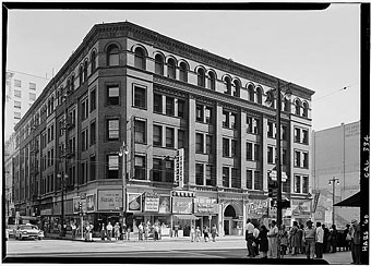
The building exterior and South Broadway entrance.
Blade Runner wasn’t the first film to make use of the Bradbury’s interior, Billy Wilder’s film noir Double Indemnity used the building’s offices as a location in 1944 and six years later Edmond O’Brien found his way there in the climax to another noir thriller D.O.A., directed by Rudolph Maté. This is the film that famously begins with O’Brien’s character staggering into a police station to report a murder—his own. He’s been dosed with a slow-acting poison, something possibly radioactive, as was the fashion of the time. He has a few hours in which to find his killer and his breathless chase leads him to an empty Bradbury building at night, all spider-webbed with shadows.
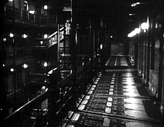
D.O.A. (1950).
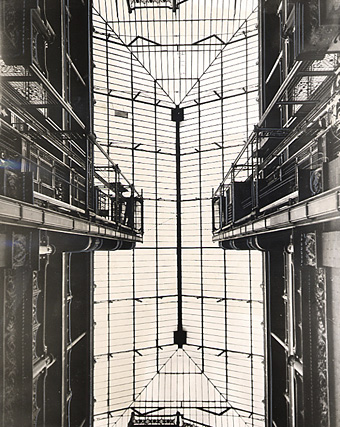
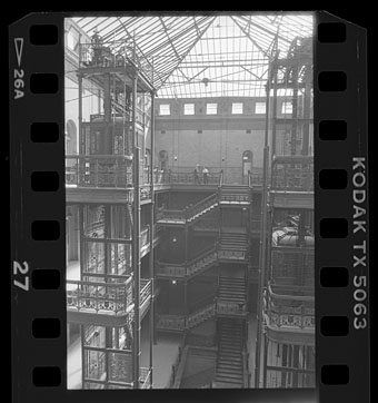
The atrium roof, circa 1961.
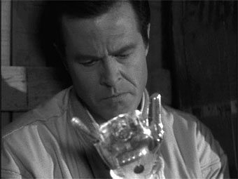
Robert Culp: ‘Demon With A Glass Hand’ (1964).
“I was born ten days ago. A full grown man…born ten days ago. I woke on the streets of this city. I don’t know who I am, where I’ve been, or where I’m going. Someone wiped my memories clean. And they tracked me down and they tried to kill me. Why? Who are you? I ran. I managed to escape them the first time. The hand…my hand…told me what to do….”
The splendid atrium was put to even better use in 1964 for what’s often regarded as the best episode of The Outer Limits, the award-winning ‘Demon With a Glass Hand‘ written by Harlan Ellison. In that TV play the mysterious, amnesiac Trent (a great performance by Robert Culp) finds himself trapped inside the Bradbury after the building is besieged by the Kyben, alien invaders who chased him from the future and who who want both him and the computer he has fitted into his artificial hand. The building proves to be the location of a “time mirror” which enables Trent to return to the future after he’s defeated the Kyben and saved the future human race.
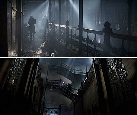
Blade Runner (1982).
We had been searching for locations for a building. We wanted to go on location to an old, decrepit building and take a suite of rooms and use that as Sebastian’s apartment. One day we were downtown Los Angeles looking at a possible location, and I took a stroll across the street with Ridley and a few other people and Ridley took a look inside the beautiful Bradbury building. What we did to that building you wouldn’t believe. On a superficial level we trashed it with high-tech, then filled it with smoke on the inside and shot at night. We also added a canopy with big columns to make it look like it was an old apartment building. All of a sudden we had a very gothic, eerie environment.
Lawrence G. Paull, Blade Runner production designer in Future Noir: The Making of Blade Runner by Paul M. Sammon.
One of my photographs from 2005.
It’s tempting to see Blade Runner‘s vision of Los Angeles as a movie mash-up of the Bradbury’s noir thriller heritage with Bellamy and Ellison’s science fiction scenarios. In Britain such an elegant interior would only ever be used for Victorian costume dramas. The Bradbury’s movie life has mostly been a result of expediency and its convenience as a cheap, ready-made set, but this hasn’t prevented talented filmmakers from showing what can be done with a decent storyline and some photogenic architecture.
D.O.A. is now available as a free download after its copyright lapsed. And you can read Edward Bellamy’s Looking Backward (if you must) here. ‘Demon With A Glass Hand’ is available on DVD along with the rest of the Outer Limits episodes. Blade Runner was finally released in a better DVD edition last year but we’re still awaiting the multi-disc edition of Ridley’s masterpiece.
Previously on { feuilleton }
• Raw Deal
• Film noir posters
• Kiss Me Deadly
• The future is now
• Blade Runner DVD
• Downtown LA by Ansel Adams
 So I finished