Figures of Mortality: Lawrence versus Dalí

lawrence1.jpg

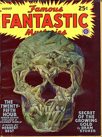
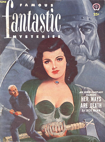
Famous Fantastic Mysteries (August, 1946).

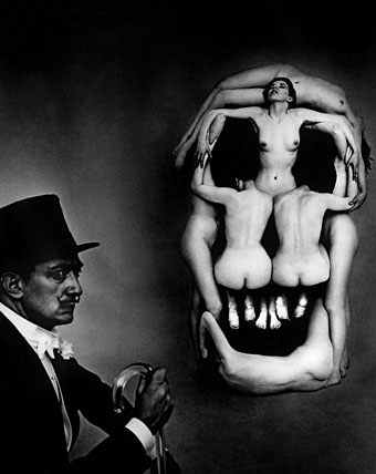
Salvador Dalí and Philippe Halsman popularised the image of a human skull created by an arrangement of bodies in Halsman’s 1951 photo-portrait of the artist, In Voluptas Mors. The assemblage, which was based on a sketch by Dalí, has been imitated by photographers and poster designers but I’ve yet to see any mention of this painted precursor by illustrator Lawrence Sterne Stevens (or “Lawrence” as he was always credited) for Famous Fantastic Mysteries in August, 1946. I’d assume the similarity is a coincidence. The subliminal skull in painting and drawing goes back at least as far as the 1890s (see this post), while Dalí was always very adept at finding and creating visual rhymes. Variations on the skull-from-figures motif appear in paintings throughout his career, one of the earliest being a minor work, Dancer – Skull, from the 1930s. Another painting, a commission for a wartime poster warning US soldiers about the hazards of venereal disease, features a pair of women, and predates Lawrence’s cover by four years.

skull_dali_halsman.jpg

In Voluptas Mors (1951).

Lawrence deserves credit, however, for having created a more successful arrangement of bodies than Halsman and Dalí managed, although it’s easier to do this in a painting than it is to arrange a group of women in a studio. Some of the limbs of Lawrence’s figures are extended or foreshortened, while the contrast between light and shade has been reduced to aid the composition. Lawrence painted a further variation on the subliminal skull in a cover for Famous Fantastic Mysteries the year after the Dalí/Halsman portrait, while Dalí himself returned to the theme with Skull of Zurbarán in 1956.

lawrence2.jpg

Famous Fantastic Mysteries (June, 1952).

Previously on { feuilleton }
Être Dieu: Dalí versus Wakhévitch
Chance encounters on the dissecting table
Salvador Dalí’s Maze
Dalí in New York
Dalí’s discography
Soft Self-Portrait of Salvador Dalí
Mongolian impressions
Hello Dali!
Dirty Dalí
The skull beneath the skin
Impressions de la Haute Mongolie revisited

The Cthulhu Mythos in the pulps

mythos01.jpg

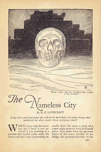
The Nameless City: First published in The Wolverine, November 1921. Reprinted in Weird Tales, November 1928. Illustration by Joseph Doolin.

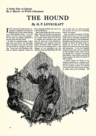
This would have been “The Cthulhu Mythos in Weird Tales” if some of HP Lovecraft’s more substantial stories hadn’t been published elsewhere. To prevent sprawl I’ve limited the list to Lovecraft’s own stories even though the Mythos takes in the work of contemporaries such as Clark Ashton Smith, Robert E. Howard, Frank Belknap Long, Zealia Bishop, August Derleth and others. I like seeing the first appearance in print of familiar tales, and I like seeing their accompanying illustrations even if the drawings are inferior pieces, which they often were for the first decade of Weird Tales. These are the short-story equivalent of first editions, and in the case of The Call of Cthulhu you get to see the first printing anywhere of that mysterious name.

mythos02.jpg

The Hound: Weird Tales, February 1924. Illustration by William Fred Heitman.

This issue is also notable for a story by Burton Peter Thom which shares a title with a Mythos-derived song by Metallica, The Thing That Should Not Be.

mythos03.jpg

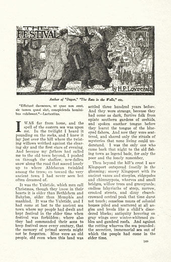
The Festival: Weird Tales, January 1925. Illustration by Andrew Brosnatch.

mythos22.jpg

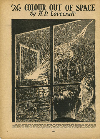
The Colour Out of Space: Amazing Stories, September 1927. Illustration by JM de Aragon.

Lovecraft didn’t think that Weird Tales would appreciate this one even though it’s more horror than science fiction so he sent it to Amazing Stories instead.

mythos04.jpg

mythos26.jpg

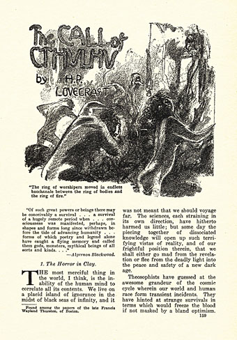
The Call of Cthulhu: Weird Tales, February 1928. Illustration by Hugh Rankin.

It’s doubtful that Rankin, Senf and co. would have been up to the task of depicting Great Cthulhu or the non-Euclidean nightmare of R’lyeh, but this hardly excuses editor Farnsworth Wright’s decision to give the cover to Elliott O’Donnell’s ridiculous ghost table.

Continue reading “The Cthulhu Mythos in the pulps”

Illustrating Zothique

zothique00.jpg

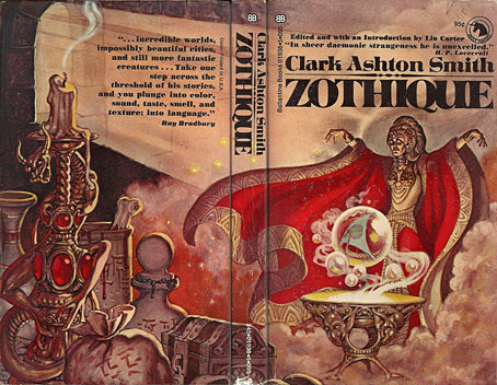
Cover art by George Barr, 1970.

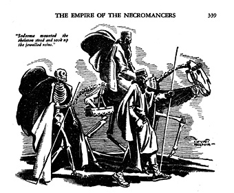
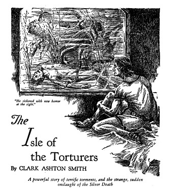
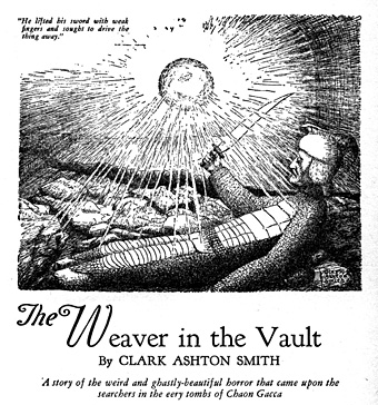
A few years ago I wrote a short piece about Virgil Finlay’s illustrations for a Zothique story by Clark Ashton Smith, The Garden of Adompha, so this post may be regarded as a more substantial sequel. If Smith remains something of a cult author then Zothique is the pre-eminent cult creation from his career as a writer of weird fiction. Most of Smith’s stories can be grouped together according to their location: Atlantis, Hyperborea, Averoigne in medieval France, the planet Mars, and so on. Zothique was a more original conception than his other worlds, being the last continent on Earth in the final years of the planet, an idea which had precedents in earlier novels such as William Hope Hodgson’s The Night Land but which hadn’t been used before as a setting for a cycle of stories. The distant future suggests science fiction but, as with the Zothique-influenced Dying Earth of Jack Vance, science and technology is long-forgotten and sorcery rules the day. The poetry that Smith wrote before he took to writing short stories had a distinctly Decadent quality—”like a verbal Gustave Moreau painting“—and Zothique is a richly Decadent world, with the entire planet in a state of decay along with its barbarous, demon-worshipping peoples.

zothique01.jpg

Weird Tales, September 1932. Art by T. Wyatt Nelson.

All the Zothique stories had their first printings in Weird Tales, a magazine that ran illustrations with most contributions, but unless you’re a pulp collector many of the illustrations have been difficult to see until very recently. One of the pleasures of looking through fiction magazines is seeing how their stories might have been illustrated when they were first published. Popular tales eventually find their way into book collections but their illustrations tend to be marooned in the titles where they first appeared unless the artist is of sufficient merit to warrant a collection of their own.

zothique02.jpg

Weird Tales, March 1933. Art by Jayem Wilcox.

The examples here are all from recent uploads at the Internet Archive which now has a complete run of Weird Tales from 1923 to 1954. The illustrations also run in order of publication with links to the relevant issues, although I agree with Lin Carter’s ordering of the stories. Smith never organised them himself, and the later reprints from Arkham House and others tend to scatter them through separate volumes. When Lin Carter edited the Zothique collection in 1970 he put the stories into an order that follows the very loose chronology running through the cycle.

zothique06.jpg

Weird Tales, January 1934. Art by Clark Ashton Smith.

One surprise of this search was discovering that Smith himself had provided illustrations for several of the stories. Some Smith enthusiasts like his drawings and paintings but I’m afraid I’m not among them, his sculpture work is better. It’s doubtful that these would have been printed at all if they weren’t the work of the author.

Continue reading “Illustrating Zothique”

More detectives

detective.jpg

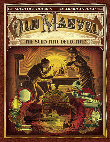
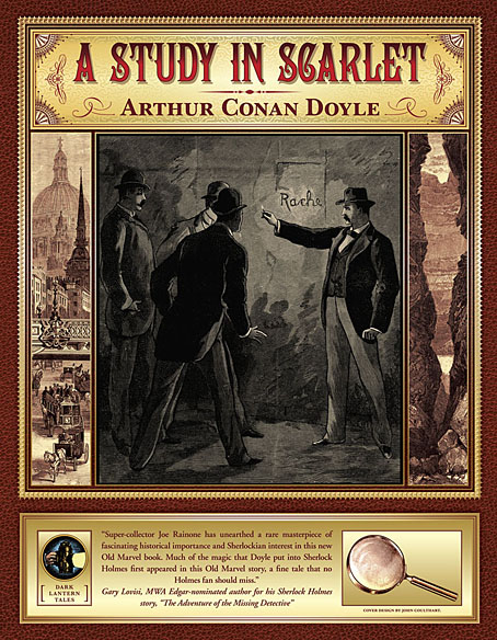
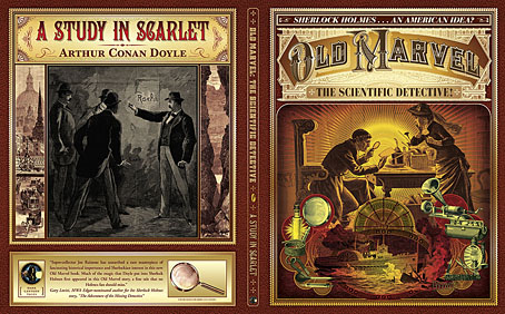
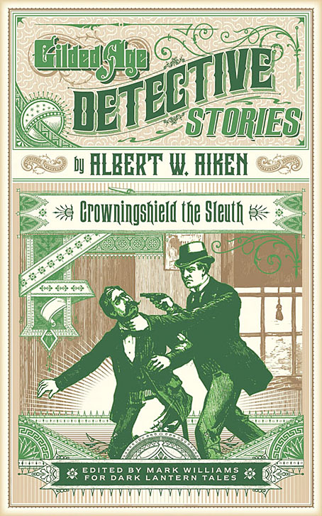
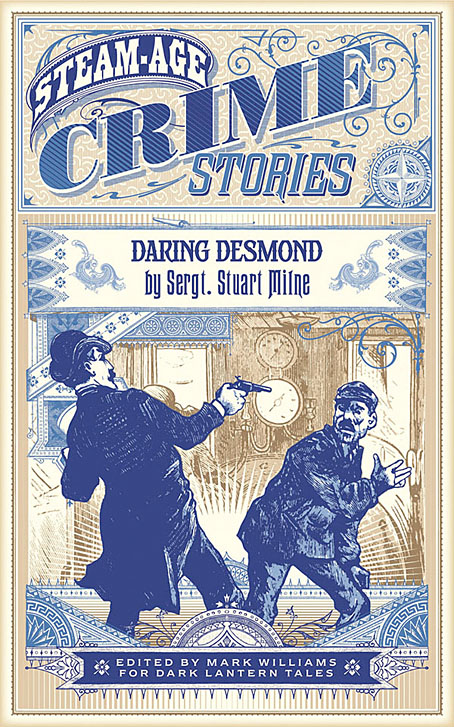
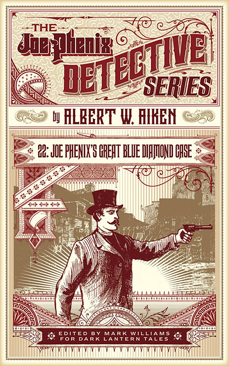
I was going to post these designs a couple of weeks ago but other things kept intervening. Gilded Age Detective Stories and Steam-Age Crime Stories follow my earlier design for the Joe Phenix Detective Series (below), with all three forming a colour-coded trilogy of books from Dark Lantern Tales reprinting late-Victorian crime fiction. My earlier post about the Joe Phenix series went into some detail about the lettering design so there’s no need to repeat that here. The new covers follow the template established by the first, the main deviation being the larger title box for Crime Stories, each title of which is by a different author. As before, the illustrations are adapted from the often crude wood engravings that ran with the original stories. The illustrations in pulp magazines of this period tend to lack the finesse of their counterparts in books and newspapers but then you could say the same about the stories; if you’re attracted to this material then the rough edges are part of the package.

crime.jpg

As before, all these books are currently available as ebooks only but plans are afoot for a series of paperback reprints. Any further news about this will be posted in due course.

joephenix.jpg

Previously on { feuilleton }
The Joe Phenix Detective Series

The eyes have it

oeil01.jpg

Recent picture research turned up issues of L’Oeil de la Police, a lurid French crime magazine that I hadn’t encountered before. It shouldn’t be too surprising when the nation that gave the world the guillotine and Grand Guignol theatre produces magazines filled with gore, but the amount of red ink in these pages (also applied to gun shots and explosions) is certainly unusual for the time. The covers of Le Petit Journal—which ran concurrently with L’Oeil de la Police—also tended to the lurid and gory but the quality of illustration was better there. L’Oeil de la Police is positively cartoon-like, especially on the back covers of each issue which present their disasters in comic-like pages overseen by the spectral Eye of the Law. This is rather disingenuous when many of the scenes don’t involve law-breaking at all, but are reports of natural disasters and fatal accidents. The samples below show the most bizarre feature of the back pages which is the titular Eye in places becoming anthropomorphised, like an atrocity-viewing precursor of the eyeball heads worn by The Residents.

oeil02.jpg

The L’Oeil de la Police archive at Gallica runs from 1908 to 1914 should you require an antique disaster fix. The archive site has improved in recent years but it can still be awkward (and slow) to use so perseverance is required.

oeil03.jpg

oeil04.jpg

oeil05.jpg

Continue reading “The eyes have it”