Moravagine book covers

moravagine01.jpg

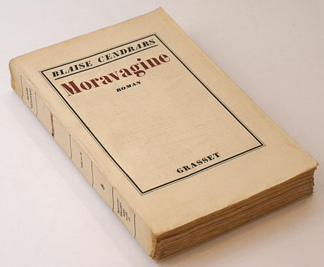
First publication, Grasset, 1926.

I should have liked to open all cages, all zoos, all prisons, all lunatic asylums, see the great wild ones liberated and study the development of an unheard-of kind of human life…

Recent reading was Moravagine (1926) by Blaise Cendrars, a novel that resists easy summary. It’s a Modernist work to some extent although the prose (a good translation from the French by Alan Brown) is never unorthodox in style; it’s also scabrous, amoral, misogynist and deeply misanthropic. The narrative is a picaresque affair narrated by a young doctor who frees the mysterious Moravagine from an asylum where he’s been imprisoned for many years. “Moravagine” is an adopted name whose origin and meaning is never addressed, although a French reader would find a rather unavoidable pun on “death by vagina”. Moravagine himself is an otherwise unnamed member of the Hungarian royal family, a dwarfish intellectual psychopath with a bad leg who goes on the run with the doctor, first to pre-revolutionary Russia, then to the United States and South America.

Reviewers have compared the book to Beckett, Céline and Burroughs although it’s much lighter reading than the first two, and the prose is more coherent than Burroughs in cut-up mode. Since we’ve been hearing a lot about the First World War this year it’s tempting to read the book as a kind of Dadaist reaction to Cendrars’ own experiences in the war, even though the entirety of the conflict is dispensed with in two pages. Cendrars appears as a character in the later chapters; he lost an arm in the war so he has his narrator lose a leg while Moravagine loses his reason altogether. At the end of the book he’s found imprisoned in another asylum where he believes he’s an inhabitant of the planet Mars, and where he spends his last months writing a huge, apocalyptic account of how the world will be in the year 2013.

All this, of course, presents a challenge for a cover designer. I have two Penguin editions, both with very different covers, neither of them unsuitable. Curiosity impelled me to see how the book has been treated since 1926. There aren’t many editions but their difference shows the difficulty of trying to encapsulate the contents of this strange novel in a graphic form. The selection here has avoided text-only treatments in favours of those using some form of illustration.

moravagine05.jpg

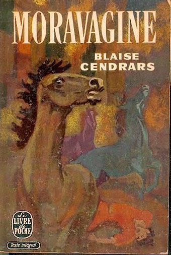
Le Livre de Poche, 1957.

In an early chapter Moravagine describes fleeing the imperial household by strapping himself to a horse. Without knowing this narrative detail the painting here seems bizarrely arbitrary.

moravagine02.jpg

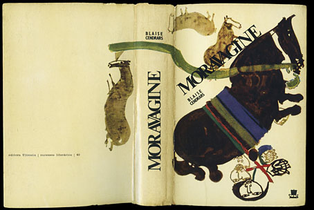
Editora Ulisseia, Portugal, 1966.

The horses again, with Moravagine strapped underneath one of them. I’d guess the illustrators of these two books didn’t read very far.

moravagine03.jpg

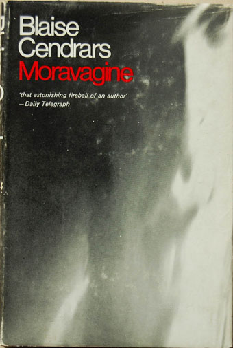
First UK edition, Peter Owen, 1968.

Peter Owen commissioned the first English translation which is still in use today.

Continue reading “Moravagine book covers”

Valette’s steam and smoke

valette1.jpg

Windsor Bridge on the Irwell (1909).

Adolphe Valette (1876–1942) was a contemporary of Lionel Walden, and where Walden was an American who spent some time painting views of Cardiff, Valette moved to Manchester in 1905 where he painted a series of celebrated views of the city. If it’s a commonplace that foreign eyes often see what locals ignore, this has certainly been the case in Manchester. Friedrich Engels catalogued the lethal living and working conditions of the city’s labourers in The Condition of the Working Class in England in 1845, and it took Valette to find a subject for his art in the city’s smogs and polluted atmospheres at a time when many British artists were still painting scenes from Tennyson or the tales of King Arthur.

valette2.jpg

India House, Manchester (1912).

Valette’s Manchester paintings now reside in the Manchester Art Gallery whose curators have always made much of his being “the Manchester Impressionist”. The term isn’t unjustified even though Impressionism was long gone by the time he began these paintings; there is something Monet-like to a few of them. The gallery contains a large amount of fairly typical Victorian art, including a couple of well-known Pre-Raphaelite pieces, so Valette’s work has always stood apart not only for its urban theme but for its looser technique. My favourite is the view of India House from the banks of the River Medlock. Many of the bridges and buildings in these paintings can be seen today, albeit cleaned and (in the case of India House) gentrified. Valette captures the final years of unrestrained industrial pollution when the air in Manchester, London and other cities was often as bad as it is in some parts of China today.

valette3.jpg

Bailey Bridge, Manchester (1912).

Continue reading “Valette’s steam and smoke”

Steam and smoke

walden1.jpg

Cardiff Docks (1894) by Lionel Walden.

There’s a tendency to consider the art of the 19th century as being preoccupied with the rural, the mystical and the historic: all true in the case of the Pre-Raphaelites. But the effects of the Industrial Revolution attracted enough artists to create a sub-genre of painting that takes the miasmas of factories and the hellish glow of furnaces as its subject; Philip de Loutherbourg’s Coalbrookdale by Night (1801) is one of the more well-known examples, not least for being a painting that shows the future emerging from a rural landscape in a truly infernal manner.

Lionel Walden (1861–1933) was an American artist who was in Wales long enough to paint several scenes of the Cardiff docks and the steelworks. I’d not seen this gorgeously atmospheric painting of the docks before but it captures the light and the ambience of a British autumn/winter with the same fidelity as John Atkinson Grimshaw, an artist who made chilly mornings and smoky twilights his speciality. Walden’s other paintings are a lot lighter, with more traditional views of docks, boats and fishermen. (Via Beautiful Century.)

walden2.jpg

The Steelworks, Cardiff at Night (1893–97) by Lionel Walden.

Previously on { feuilleton }
How It Works
The art of John Atkinson Grimshaw, 1836–1893

The art of Fabrizio Clerici, 1913–1993

clerici1.jpg

Un istante dopo (1978).

An Italian painter of the fantastic who’s managed to stay off my radar for one reason or another despite doing many of the things I like to see: weightless structures, imaginary architecture, and (towards the end of his career) a series of variations on Arnold Böcklin’s endlessly adaptable The Isle of the Dead. The latter paintings are some of the best Böcklin variants I’ve seen. These alone would have made him worthy of attention but the rest of his oeuvre is an equally accomplished development of late Surrealism (or, if you need another category, Fantastic Realism). The official website is a very good one so there’s plenty more to see. (Thanks to Michelangelo for the tip!)

clerici2.jpg

La tromba d’aria (1965).

clerici3.jpg

Latitudine Böcklin (1974).

Elsewhere on { feuilleton }
The fantastic art archive

Previously on { feuilleton }
A Picture to Dream Over: The Isle of the Dead
The Isle of the Dead in detail
Arnold Böcklin and The Isle of the Dead

The art of Victor Linford, 1940–2002

linford1.jpg

Victor Linford was a British artist who relocated to the Netherlands so his work seems to be more familiar there than elsewhere. According to the Johfra Museum site, Linford was part of the Dutch Meta-Realist group in the 1970s, along with Johfra Bosschart himself and five other painters. Johfra’s art has been mentioned here before but I hadn’t heard of the others, Linford included. You’d think someone who spent so much time producing detailed oil paintings of surreal/alien landscapes would be better known. Some of his works were used on a series of Dutch sf paperbacks in the 1970s, unsurprisingly when many of his paintings resemble the alien landscapes being produced by Bruce Pennington for British sf books throughout the decade.

There are two main sites showing Linford’s works, here and here. I prefer the landscapes that don’t have too many human figures inserted into them but even the ones that do are worth a look. (None of the paintings are titled or dated.)

linford2.jpg

Continue reading “The art of Victor Linford, 1940–2002”