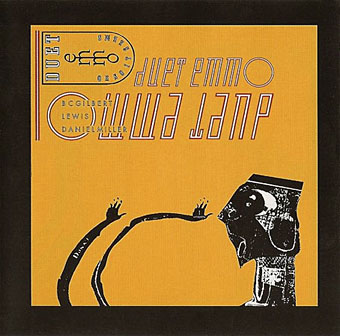
Or So It Seems (1983) by Duet Emmo. Design by The Brothers Quay.
• “Make things, no rules, but be quick.” Bruce Gilbert, musician in (among others) Wire, Dome and Duet Emmo is interviewed. Related: Daniel Miller, Mute label boss and another member of Duet Emmo is interviewed (and provides a mix) at The Quietus. For more electronica with nothing at all to do with Duet Emmo there’s this Matmos interview.
Design by Dick Smith.
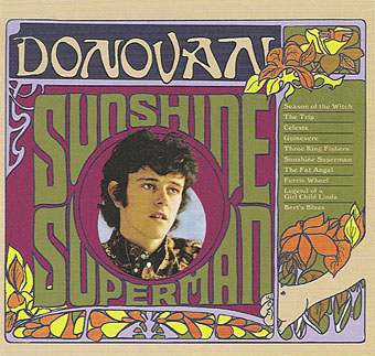
“It’s psychedelic not because we were stoned before we wrote the songs, or stoned during composing them, but the experiences of searching for the transcendental world though altered states of consciousness were in the songs,” he says, which sounds suspiciously like another way of saying he was stoned before he wrote them, but perhaps it’s best not to quibble with the description of the method in the face of such impressive results…
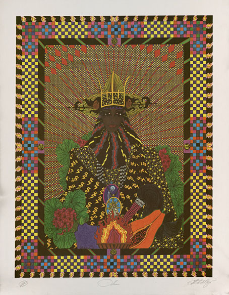
Donovan revisits one of his finest works, Sunshine Superman.
• Yet more Guardian features: A Clockwork Orange: The droog rides again | Ira Cohen: psychedelic photography master | A life in writing: China Miéville | The stars of modern SF pick the best science fiction.
• There are many stars of the gaseous variety in Nick Risinger’s 5000-megapixel photograph of the Milky Way.
“It is quite true I have worshipped you with far more romance of feeling than a man should ever give to a friend. Somehow I have never loved a woman…. From the moment I met you, your personality had the most extraordinary influence over me…. I adored you madly, extravagantly, absurdly. I was jealous of everyone to whom you spoke. I wanted to have you all to myself. I was only happy when I was with you.”
Salon reviews the new unexpurgated edition of The Picture of Dorian Gray.
• Paul Gorman discovered the gay art origins of the notorious Cowboys T-shirt.
• The full complement of Saul Bass’s designs for Vertigo‘s print advertising.
• Photos of the recent Dodgem Logic event by Rosie Reed Gold.
• Peter Ashworth is still taking great photos.
• Jodorowsky’s Dune Finally Revealed?
• Sunshine Superman (1966) by Donovan | Or So It Seems (1983) by Duet Emmo.