Huszti Horvath’s Three Dragons

horvath01.jpg

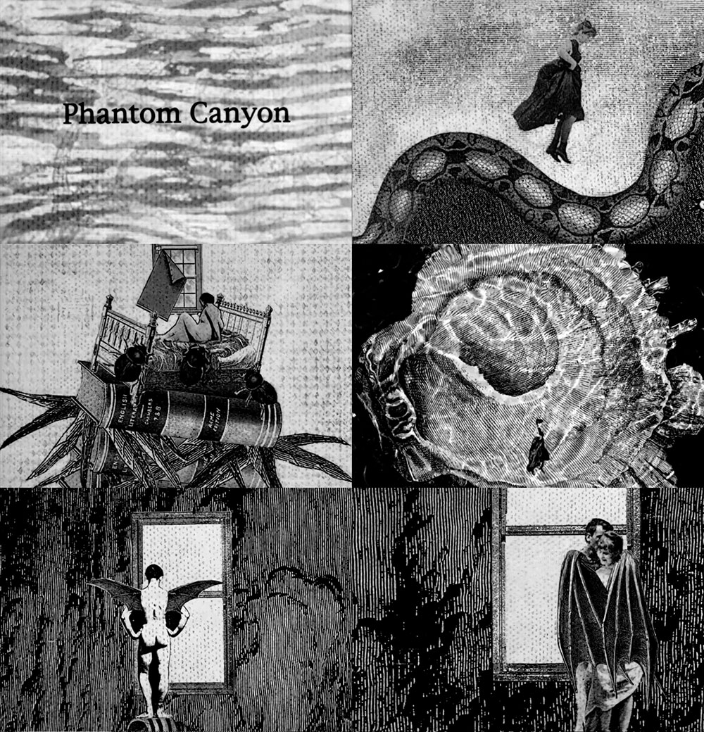
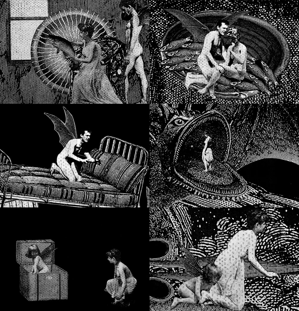
Book of the Three Dragons is an unusual illustrated volume, being an American edition of a retelling of Welsh myths by a Welsh writer, Kenneth Morris, with illustrations by a Hungarian artist, Ferdinand Huszti Horvath (1891–1973). Morris was, among other things, a Theosophist who was living in California when he wrote Book of the Three Dragons which no doubt explains the American publication. There doesn’t appear to be any Theosophy in this book at least. Dragons are an important symbol for the Welsh, with a red dragon being a prominent emblem on the flag of Wales. Morris’s book opens with a guide to the pronunciation of the Welsh names and words that appear in the text.

horvath02.jpg

Ferdinand Horvath, meanwhile, moved to the USA in the 1920s where he eventually found employment as an illustrator before working (without credit) for Disney. It’s at Disney-related websites that you’ll find most of the information about his life and work, where the discussion inevitably concerns his designs for animated films. A list of his other book productions would be welcome. There’s a very nice edition of The Raven that was published in the same year as Book of the Three Dragons but with art in much more of an Expressionist style.

I often wonder what Disney’s animations might have been like if the studio had given artists like Horvath and Kay Nielsen a freer rein. Disney only began to change its style in the late 1950s as a result of competition from other animation studios, and even then the results were compromised. Sleeping Beauty used the designs of Eyvind Earle to distinguish the film from the studio’s previous fairy tales but Earle was dissatisfied with the treatment his work received and he left the project before it was finished; the art direction for One Hundred and One Dalmatians was based on the cartoons of Ronald Searle but Walt Disney hated the results and refused to try anything similar again.

horvath03.jpg

horvath04.jpg

horvath05.jpg

Continue reading “Huszti Horvath’s Three Dragons”

Weekend links 832

corridor.jpg

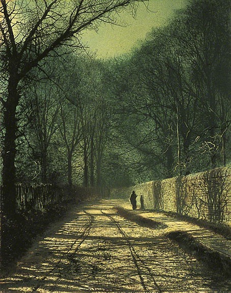
Dark Corridor (1990s) by Unknown Artist.

• “I greatly enjoyed this rich, allusive and strange text, which has affinities to the literary form and style of TS Eliot, David Jones and Iain Sinclair, uniting high modernism with demotic and pulp elements, as well as to the occult thrillers of Charles Williams, Mary Butts and others.” Mark Valentine reviews B-Movie: Serial of Seven Stars by Andrew Duncan.

• New music: Electronic Meditation For Inner Space Travel by Studio Kosmische; Fathom Tides by Werner Dafeldecker & Lawrence English; rust/wave by Tewksbury.

• At Public Domain Review: Animal, Vegetable, Lamb: Thom Sliwowski on the history of the mysterious Vegetable Lamb of Tartary.

• At Door of Perception: Wistman’s Wood, Dartmoor, as photographed by Neil Burnell.

Anne Billson selects 20 of the best corridors in film.

• More corridors: Scificorridorarchive.

Ukrainian animation.

• RIP Sonny Rollins.

Current Rothko

The Black Corridor (1973) by Hawkwind | Corridor (2018) by Steve Jansen | Spectral Corridor Part 4 (2021) by The House In The Woods

Weekend links 831

blackhole.jpg

Black Hole Accretion Disk Visualization by NASA’s Goddard Space Flight Center/Jeremy Schnittman.

• The summer catalogue of lots for the After Dark: Gay Art and Culture online auction. Homoerotic art, photos, historic porn, etc.

• New music: The Sanctity Of Rust by Hollan Holmes; Heavy Water by Magic Tuber Stringband; Sorry I Didn’t Realize by iNFO.

• In another of those foolhardy numbered lists, Alexis Petridis attempts to rank Laurie Anderson’s greatest songs.

“The best of mathematics is a way of thinking,” [Klainerman] said. Progress in the field is made through discoveries rather than inventions, by following its own version of the scientific method. In 1911, for example, Roald Amundsen and four fellow explorers were the first people to reach the South Pole. “The South Pole was there to be discovered,” Klainerman noted, “but the path you take to get there, and the equipment you bring, depends on human inventiveness.” When he and Christodoulou spent six and a half years proving that Minkowski space is stable, they too had to invent the tools to get there. But the stability itself was not their creation. It was a fact to be divined.

A long read by Steve Nadis on Sergiu Klainerman and his conviction that mathematics has an existence that precedes human thought

• At the BFI: Tony Rayns on Lino Brocka’s Macho Dancer (1988), a trip into Manila’s gay underworld.

• Read an extract from In Another World: The Four Seasons Of Talk Talk by Graeme Thomson.

• At The Daily Heller: The Serene Surrealism of Guy Billout.

• At Dennis Cooper’s it’s a Malcolm Le Grice Weekend.

Mathematics And Electronics (1995) by Gas | True Mathematics (2002) by Ladytron | Music Is Math (2002) by Boards Of Canada

Gilgamesh, a film by Pavel Aujezdský

gilgamesh1.jpg

The Epic of Gilgamesh isn’t a natural choice for the subject of a short animated film, but that’s what we have here, the first directorial effort by Czech film-maker and TV director Pavel Aujezdský. I’ve never read the Sumerian saga so I’m in no position to judge the success of Aujezdský’s adaptation, but given the strange and confusing nature of the opening scenes I’d guess it helps to be acquainted with the story. The scenes that follow are more straightforward, depicting a journey by the hero in which various powerful beings have to be confronted and either evaded or defeated.

gilgamesh2.jpg

This is one of those animated tales where the form emulates the content to some extent, in this case presenting the deeds of Gilgamesh in the manner of the tableaux found on Sumerian stone carvings. It wasn’t the first animated short based on The Epic of Gilgamesh. The Quay Brothers made This Unnameable Little Broom in 1985, two years before Aujezdský’s film, although in the Quays’ case they only dramatised a single incident from the saga. You’ll find that one on their DVD/blu-ray collections.

Icarus Descending

tmwfte02.jpg

UK, 2009.

Newton leaned forward, putting his elbows carefully on the table. “Nathan. Nathan. I was afraid of you then. I am afraid now. I have been afraid of all manner of things every moment I have spent on this planet, on this monstrous, beautiful, terrifying planet with all its strange creatures and its abundant water, and all of its human people. I am afraid now. I will be afraid to die here.”

Before my recent rewatch of The Man Who Fell to Earth I decided to read the novel in order to spice up yet another viewing by comparing the film with its source. And as is often the case when reading books of a certain vintage, curiosity had me wondering how the book has been cover-designed over the years.

The Man Who Fell to Earth was published in 1963. Prior to this Walter Tevis had only published one other book, The Hustler, his first novel about pool-player “Fast Eddie” Felson. Such a debut wouldn’t have marked Tevis as a putative writer of science fiction although he had written a handful of stories for SF magazines before attempting anything at novel length. The Man Who Fell to Earth is artistically satisfying science fiction, and a good novel in a literary sense, something you can’t always expect from those writers of Tevis’s generation who seemed to read nothing but technical reports and fiction by other SF writers.

The story opens in 1985, presenting a future which isn’t too different to the 1985 that many of us lived through. Speculation is minor and mostly relegated to the background, with occasional mentions of monorails, food shortages and warring African nations who threaten each other with nuclear weapons. Into this world there arrives the alien who calls himself Thomas Jerome Newton (we never learn his original name), a clandestine emissary from the dying planet his people know as Anthea. Newton has been sent to Earth with plans to build a financial empire using his advanced technical knowledge. This will, he hopes, enable him to build a craft in order to ferry the remaining Antheans to a world where they can survive. Once they’re secure, the Antheans also plan to rescue the inhabitants of Earth from imminent nuclear destruction.

tmwfte22.jpg

The US one-sheet of Vic Fair’s poster. After decades of illustrators and designers working with both the book and the film, Fair’s poster is still the most successful condensation of the story into a single, memorable image.

If you’ve seen the film then the broad strokes are all very familiar. Nicolas Roeg’s direction and Paul Mayersberg’s script treat the material elliptically but the film stays closer to the novel than you might expect, with Mayersberg even reusing some of Tevis’s dialogue. Both novel and film are very much concerned with portraying the Earth itself as an alien planet. For the first half of the novel, “1985: Icarus Descending”, we see our world through Newton’s eyes while he makes his way among the clever but dangerous primates. The second half, “1988: Rumpelstiltskin”, concentrates equally on Newton’s attempts to retain his sanity in a world that must never discover his real intentions or his true nature; and on the curiosity of Nathan Bryce, the chemist helping to construct Newton’s spacecraft, whose suspicions about his employer are eventually confirmed. Bryce believes that Anthea must be the planet Mars, but when asked about this directly Newton simply replies “Does it matter?”

Roeg and Mayersberg’s film received mixed reviews in 1976 but its cult status has grown thanks to its connection with David Bowie’s person and career. Bowie’s Newton has become a dominant motif for book covers even though Tevis’s Newton is a negative inversion of the screen alien, being six-and-a-half feet tall, with tanned skin and pure white hair. For art directors and illustrators the challenge since 1976 has been to present the novel in a manner which does more than merely repeat the imagery of the film. Not everyone succeeds in doing so.

tmwfte12.jpg

USA, 1963. Cover art by Leo and Diane Dillon.

The first printing was as a paperback original with untypical cover art by Leo & Diane Dillon. Without reading the novel it’s hard to tell what this is about at first glance, but the figure on the left is supposed to represent Newton’s unusual lightweight skeleton whose height and shape are contrasted with its human counterpart. The eye presumably refers to the contact lenses that Newton wears to disguise his cat-like pupils.

tmwfte07.jpg

Italy, 1964. Cover art by Karel Thole.

The few covers that pre-date the film are what you might call the innocent ones, free of David Bowie’s face or Bowie-like figures. Here the prolific Karel Thole also favours Newton’s diguises over any other imagery.

tmwfte03.jpg

USA, 1970. Cover art by Howard Winters.

Continue reading “Icarus Descending”