The HAL Project.
January flew by in a blizzard of work so posting here tended to rely more on pictures than words. As usual the things I’ve been designing will be unveiled when they’re closer to being published or released but for now here’s some new or not-so-new items worthy of note.
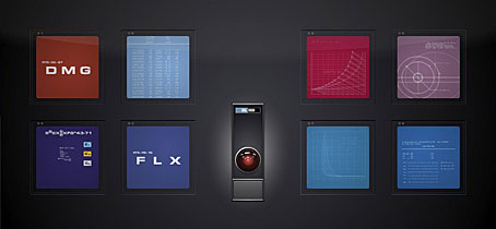
• The HAL Project screensaver. I’ve never had much time for gaudy screensavers, I prefer something which doesn’t get annoying when I’m otherwise engaged. For a while now I’ve been using the Mac-only Lotsawater which turns your monitor into a vertical water tank with slow motion ripples. I replaced that this week with Joe Mackenzie’s HAL Project screensaver (for Mac and Windows) which throws up random samplings of the HAL 9000 monitor animations from 2001: A Space Odyssey. Sounds a bit dull until you see it in action, very crisp and detailed graphics, many of which mimic the animations of those in the film. I’ve belatedly realised how similar these fields of colour and their lines of white type are to the opening titles of A Clockwork Orange, yet another connection between the two films. Now I can sit trying to figure out some of the less obvious 3-letter codes for the spacecraft’s systems; Stanley Kubrick was so thorough you just know they all mean something.
Via the Kubrick obsessives at Coudal.
• A pair of new blogs. Designer Barney Bubbles should need little introduction here but if you require one then read this. Paul Gorman has been in touch to inform me of a new online companion to his BB book, Reasons To Be Cheerful, which already looks like a treat with displays of Bubbles creations that didn’t make the book.
Writer Russ Kick was also in touch this week with news of his books and book culture blog, Books Are People, Too. Russ is the author of several books for Disinformation and his Memory Hole website notoriously caused a headache for the Bush regime when he forced photos of flag-draped coffins returning from Iraq onto the front pages of American newspapers.
• Songs of the Black Würm Gism. And speaking of books, the much delayed sequel to DM Mitchell’s landmark Lovecraft anthology, The Starry Wisdom comes shambling into the light of day at last. The Creation Oneiros website describes it thus:
The Black Würm Gism Cult – oceanic insect porn – a vortex of cosmic mayhem stalked by ravening lysergic entities – a post-human psychedelic seizure of Lovecraftian text, art and fragments. SONGS OF THE BLACK WÜRM GISM picks up where the acclaimed anthology THE STARRY WISDOM left off and goes beyond – way beyond! – what H.P. Lovecraft dared to show. Editor D.M. Mitchell presents an illustrated brainstorm of visceral deep-sea dream currents, aberrant trans-species sex visions, and frenzied ophidian entropy.
Contributors include: alan moore (cover illustration), john coulthart (introduction), grant morrison, david britton, ian miller, john beal, david conway, kenji siratori, herzan chimera, james havoc, reza negarestani, & many others
Yes, the rather pompous introduction for this volume is mine and the cover is Alan Moore’s psychedelic arachnoid rendering of the demon Asmodeus, the same picture I used to create my little hidden film on the Mindscape of Alan Moore DVD. The Starry Wisdom roused a vaporous fury among the more staid Lovecraft readers so I look forward to seeing what squeaks of outrage this new book inspires. Publication is set for September 2009 but you can order it now from Amazon and other outlets.

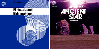
• Ghost Box haunts again. And if anything was going to provide a suitable soundtrack to “aberrant trans-species sex visions, and frenzied ophidian entropy” you could do worse than some of the works of the Ghost Box collective, especially the spooky and abrasive Ouroborindra by Eric Zann. Ritual and Education is a new download-only sampler of Ghost Box tracks and probably an ideal place to start if your curiosity is piqued by my recurrent raves about these releases. From An Ancient Star is the latest CD from Belbury Poly which swaps the Pelican Books graphics of earlier works for a convincing piece of crank lit. cover art which wouldn’t look out of place in the RT Gault archives.
Previously on { feuilleton }
• The Demon Regent Asmodeus
• The Séance at Hobs Lane
• Ghost Box
• 2001: A Space Odyssey program
