
Category: {design}
Design
Polish posters: Freedom on the Fence
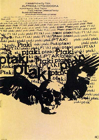
Poster for Alfred Hitchcock’s The Birds, designed by Bronislaw Zelek (1965).
Freedom on the Fence is a 40-minute documentary film by Andrea Marks about the history of the Polish poster which includes a look at the many unique cinema and theatre designs produced in the 1960s and ’70s. Marks spent ten years working on this short film, interviewing many of the artists responsible for designs such as the one above. While searching around for links I came across a brief interview with {feuilleton} favourite Franciszek Starowieyski who died in February.
As to the current state of the art form in Poland, Marks has this unsurprising but still dispiriting note:
The Polish government no longer finances most cultural events; theatres cannot afford to publish artistic posters, and the idea of a film as an excuse to make a poster has vanished. Ironically, although the climate of Communism was a good ground for creating posters, the freedom of a free market society has resulted in a more restrictive climate for the creation of powerful posters. The art form is forever changed. A few concerned collectors and publishers, such as Krzysztof Dydo and Edmund Lewandowski, are attempting to keep the art form alive by commissioning and publishing new works, but their efforts alone will not overcome the situation. It is hoped that an outside appreciation of pre-1980s poster design history in Poland will ultimately help to encourage the government and private interests to commission more posters from Polish artists.
Freedom on the Fence is due to be released on DVD later this year.
• An interview with the director
Previously on { feuilleton }
• The Robing of The Birds
• Franciszek Starowieyski, 1930–2009
• Czech film posters
Kaleidoscope: the switched-on thriller
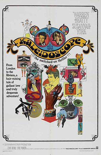
I’ve not seen Jack Smight’s 1966 caper movie for years, and don’t remember much about it beyond Maurice Binder’s kaleidoscopic title sequence. But I like this collage poster, a suitably frenetic piece for one of Hollywood’s many attempts throughout the 1960s to capitalise on modish fashion. I can’t find a credit for the designer so if anyone knows who was responsible, please leave a comment.
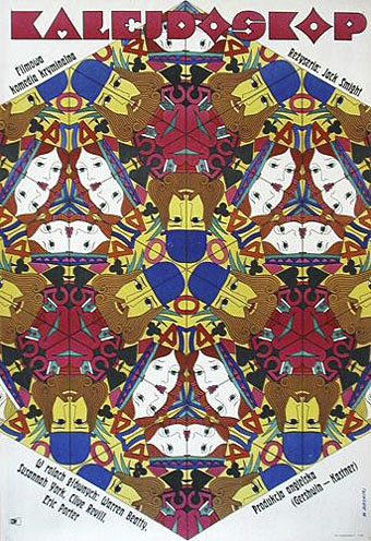
This Polish poster, on the other hand, is the work of Witold Janowski who successfully combines the film’s title with its playing card theme. Too arty and cerebral for Hollywood (No girls!…no guns!) but that’s how it is with all those great Polish poster artists.
Update: the US poster was by the great Bob Peak.
Previously on { feuilleton }
• The Robing of The Birds
• Franciszek Starowieyski, 1930–2009
• Dallamano’s Dorian Gray
• Czech film posters
• The poster art of Richard Amsel
• Bollywood posters
• Lussuria, Invidia, Superbia
• The poster art of Bob Peak
• A premonition of Premonition
• Metropolis posters
• Film noir posters
Telling Tales at the V&A
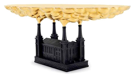
Robber Baron Table (2006) By Studio Job.
Telling Tales, a free exhibition now running at the V&A, London, is subtitled Fantasy & Fear in Contemporary Design. Looking at Studio Job’s timely and prescient Robber Baron Table, “fear and loathing” might be more suitable; a must for the current crop of squalid parasites in the banking industry. And speaking of parasites, among the exhibits there’s also the gilded grubs of Kelly McCallum whose work was featured here last September.
This exhibition explores the recent trend among European designers for unique or limited edition pieces that push the boundaries between art and design. It showcases furniture, lighting and ceramics, designed by a new generation of international designers, including Tord Boontje, Maarten Baas, Jurgen Bey and Studio Job, who are all inspired by the spirit of story-telling. Each tells a tale through their use of decorative devices, historical allusions or choice of materials, sharing common themes such as fantasy, parody and a concern with mortality.
Telling Tales runs until October 18, 2009.
Previously on { feuilleton }
• Al Farrow’s Reliquaries
• Kelly McCallum’s insect art
Charles Ricketts’ Hero and Leander
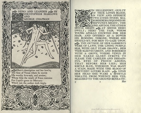
Enthusiasts of Charles Ricketts’ illustrations can find book collections of his drawings and paintings but the artist (with partner Charles Shannon) was also a printer, typographer and book designer who would no doubt have preferred his illustrations to be seen in their intended setting. The Internet Archive has a few choice examples of Rickett’s books, of which the most profusely illustrated is Hero and Leander (1894), Christopher Marlowe’s poem (completed by George Chapman).
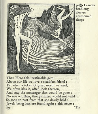
Also of interest is Danaë (1903) by Thomas Sturge Moore with its black and red type, A Bibliography of the Books Issued by Hacon & Ricketts (1904), and A Defence of the Revival of Printing (1899). The latter is of interest to book designers and typographers for its presentation of Ricketts’ aesthetic philosophy. Ricketts’ and Shannon’s books made continual use of a small leaf motif as a pilcrow to mark a fresh paragraph. In A Defence of the Revival of Printing Ricketts discusses his replacement for the ampersand (&), which he disliked, preferring instead a new character combining the letters E and T, ampersands being a contraction of the Latin word “et”. There’s also some discussion of his unique type designs which he charmingly refers to as “founts”, preferring, like contemporary William Morris, the antique terminology.
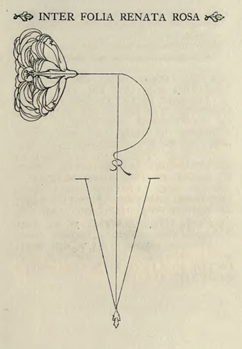
Colophon from Hero and Leander. A rose forms the monogram of Ricketts’ and Shannon’s Vale Press.
Elsewhere on { feuilleton }
• The illustrators archive
Previously on { feuilleton }
• Art Nouveau illustration
• Dorian Gray revisited