Rossetti and His Circle by Max Beerbohm

beerbohm1.jpg

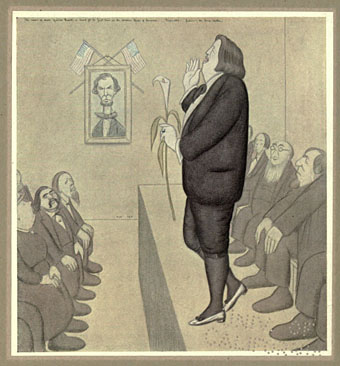
Rossetti’s name is heard in America (Oscar Wilde).

The Happy Hypocrite was Max Beerbohm’s words illustrated by George Sheringham; here we have Beerbohm’s caricatures from a 1922 collection depicting notable figures among the Aesthetes and Pre-Raphaelites from the 1860s on. Beerbohm wasn’t born until 1872 so there’s something of a younger generation’s mockery in these drawings. That said, he was just as happy to mock his London friends of the 1890s, Oscar Wilde included, and often poked fun at himself in his cartoons and his writings.

Some of the pictures in Rossetti and His Circle are familiar from books about the period, the Wilde picture in particular is often reprinted. You don’t always see them in colour, however, so once again the scans at the Internet Archive give us a fuller view provided you ignore the security perforations on each print.

beerbohm2.jpg

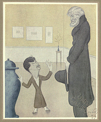
Blue China (JM Whistler and Thomas Carlyle).

A drawing which complements Wilde’s description of Whistler as a “miniature Mephistopheles”. Beerbohm was more succinct in one of his verbal portraits: “Tiny”.

beerbohm3.jpg

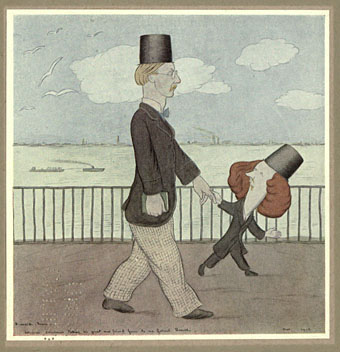
Algernon Swinburne taking his great new friend Gosse to see Gabriel Rossetti.

Swinburne, it seems, was another diminutive figure.

beerbohm4.jpg

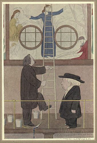
The sole remark likely to have been made by Benjamin Jowett about the mural paintings at the Oxford Union: “And what were they going to do with the Grail when they found it, Mr. Rossetti?”

Previously on { feuilleton }
The Happy Hypocrite by Max Beerbohm

Network 21 TV

network21.jpg

What was Network 21? It’s easiest to grab an explanation from the people responsible:

NeTWork 21 was a pirate television station which broadcast a 30mns program on Fridays from midnight throughout April to September 1986 in London. It had never been done before, and has not been done since anywhere in the UK. The broadcasts took place on channel 21 of the UHF band, slightly below ITV, using a low powered transmitter covering 8-10 miles across London. Program content was literally hand made, shot with a Sony Video 8 camera, edited on Low Band U-Matic, and broadcast on VHS. They showed slices of London’s artistic buzzing underground life as well as casual glimpses of everyday life, something which the normal television stations never showed. We would also offer slots to whoever was willing to appear on pirate TV, saying, showing or doing whatever they wanted, with no pre/post-production censorship of any kind. Because of our low tech approach, we could easily film people, situations and events with minimum disruption and maximum interaction. We were also free to choose program content and style according to our own mood, without having to worry about ratings, advertisers or good taste standards. (more)

In 1986 the UK only had four TV channels, and none of them ran through the night so theoretically there was plenty of space available for other broadcasters. In practice any unauthorised activity was always swiftly curtailed. Those of us outside London could only read about these illicit broadcasts but now it’s possible to jump back in time to the gloomy heart of Thatcherite Britain via the Network 21 YouTube channel. All the clips are fairly short and lean heavily towards the (for want of a better term) Industrial culture familiar from the early RE/Search publications, Simon Dwyer’s sorely-missed Rapid Eye, and Cabaret Voltaire’s “television magazine” TV Wipeout: William Burroughs (reading at the London Final Academy event in 1982), Brion Gysin, Psychic TV, Diamanda Galás, Derek Jarman et al. There’s also Roz Kaveney on passion, and Simon Watney with a news item related to the AIDS crisis in the US. The network website has complete listings for each broadcast.

Previously on { feuilleton }
ICA talks archived
The Final Academy

Dekorative Vorbilder

vorbilder1.jpg

Richard Kühnel.

Some of the Art Nouveau plates from Dekorative Vorbilder, a series devoted to the decorative arts published in Germany from 1895 on. The interior design suggestion above has me wondering whether there’s ever been another period of design when it’s seemed quite natural (so to speak) to offer a giant insect and monstrous flowers as wall motifs. Something to bear in mind if anyone tries to argue that Art Nouveau wasn’t a radical form.

vorbilder2.jpg

Georges de Feure.

These plates are all from a collection at the NYPL Digital Gallery where the samples available cover a range of styles from the ancient world to the 19th century. The collection there doesn’t seem complete, unfortunately, and much as I’d like to point to a complete set elsewhere that doesn’t seem possible for the time being. If anyone knows otherwise, please leave a comment.

vorbilder3.jpg

Otto Prutscher.

Previously on { feuilleton }
Combinaisons Ornementales
Charles J Strong’s Book of Designs
Styles of Ornament
The Grammar of Ornament by Owen Jones

Muto: The Exterface Manifesto

muto1.jpg

In which French photographers Exterface extend their particular brand of erotic styling into the world of online publications. Muto is a typically high-quality production (requires registration with Issuu), the theme this time being the hothouse of the 1970s when the word “clone” was as much associated with gay bars as with the products of science fiction. What was once a visual cliché now seems fresh (and hot!) amid the clichés (twinks and bears) which took its place. With retromania one of the buzzwords du jour there’s no reason why erotic photography shouldn’t get in on the act, is there?

Via Homotography.

Elsewhere on { feuilleton }
The gay artists archive

Previously on { feuilleton }
Let’s get physical: Bruce of Los Angeles and Tom of Finland
Exterface

Dead roads

west1.jpg

Canon de Chelly — Navaho (1904) by Edward Sheriff Curtis.

A few pictures from the substantial Flickr collection belonging to San Diego’s Museum of Photographic Arts. Many of these are views of the western states of the USA from a time when photographers were documenting the vanishing world of Native American tribes. A couple of pictures in the series by Edward Sheriff Curtis would work as cover illustrations for Cormac McCarthy’s Blood Meridian, while the results of a gunshot injury below is the kind of thing you never see in Westerns.

west2.jpg

Untitled (1910) by Richard Throssel.

And speaking of McCarthy’s baleful masterpiece, William Gibson recently recounted his first experience of reading the book on a journey to Berlin. “I awoke from it as from some terribly potent dream, and found myself, quite unexpectedly, in a strange city,” he says. Read the rest here.

Photo tip via Beautiful Century.

west3.jpg

Distortion of Left Lower Extremity after Gunshot Injury, November 30, 1865.

Previously on { feuilleton }
Repackaging Cormac
Cormac McCarthy book covers