Whistler’s Peacock Room revisited

whistler1.jpg

The Peacock Room (1876–1877).

More Japonism courtesy of the Google Art Project where it’s possible to pan around this view of Whistler’s Peacock Room at the Freer Gallery of Art. There’s only one view, unfortunately, it would have been good to see the reverse angle or, better still, a full panorama.

whistler2.jpg

The Princess from the Land of Porcelain (1864).

Google has a number of the Freer’s collection of Whistler drawings and paintings, including The Princess from the Land of Porcelain, the painting which the Peacock Room was designed to show to best effect along with patron Frederick Leyland’s blue-and-white china. Once again the Google views allow us to scrutinise the details of a painting in a way which would otherwise be impossible. It’s fascinating for me to see how loose Whistler’s technique was even at this early date, the brushstrokes of the face seem to have been scumbled over raw canvas.

whistler3.jpg

whistler4.jpg

Caprice in Purple and Gold: The Golden Screen (1864).

Also at the Freer is another piece of exotica from the same period with a suitably Japanese frame. Whistler’s Japonism, and the Peacock Room in particular, leads directly to Aubrey Beardsley’s art thirty years later.

Previously on { feuilleton }
The Peacock Clock
Whistler’s Peacock Room

Kay Nielsen’s East of the Sun and West of the Moon

nielsen05.jpg

Kay Nielsen’s meticulous approach to illustration is shown to great effect in the colour plates for this 1914 collection of fairy tales subtitled Old Tales from the North. The theme might be northern but Nielsen (who was Danish) maintains his beautifully hybrid style with its hints of Japonism and Persian miniatures. The whole book can be viewed or downloaded in a variety of formats here.

Kay Nielsen at Bud Plant

nielsen01.jpg

nielsen02.jpg

nielsen03.jpg

nielsen04.jpg

Elsewhere on { feuilleton }
The illustrators archive

Hapshash Takes a Trip

ufocoming.jpg

UFO Coming (1967) by Hapshash and the Coloured Coat.

It’s always difficult to choose a favourite from the posters that Nigel Waymouth and the late Michael English produced under the name Hapshash and the Coloured Coat, their standards remained high (so to speak) throughout their partnership. But I always liked the ejaculating penis butterfly on this early design for Joe Boyd’s UFO club, a detail which would have given Aubrey Beardsley a chuckle and which is probably unique in art. The gorgeous Hapshash posters receive another airing next month in an exhibition at the Idea Generation Gallery, London, entitled Hapshash Takes a Trip: The Sixties Work of Nigel Waymouth:

Waymouth’s own archive plays a major part in the retrospective. Kept privately for decades and rarely seen since their first creation in the late ’60s, the artist’s personal collection features works made as part of Hapshash and his designs for Granny Takes a Trip. Furthermore it contains his own album covers, photographs, press clippings and magazines. This extraordinary collection unites rare works with rare moments, through photographs never before seen in public.

The exhibition opens on September 9th. There’s more detail on the press release (PDF) including a promise that “Huge silk-screened reproductions of their iconic posters will fill the entirety of one of the Gallery’s soaring 20 foot walls.”

The exhibition title alludes to the celebrated King’s Road boutique Granny Takes A Trip whose series of striking shopfronts were decorated by Waymouth before and during his partnership with Michael English. The Look posted some pictures of Waymouth’s 1947 Dodge decor earlier this week.

Previously on { feuilleton }
The Dukes declare it’s 25 O’Clock!
Psychedelic Wonderland: the 2010 calendar
Michael English, 1941–2009
Max (The Birdman) Ernst
The Look presents Nigel Waymouth
The New Love Poetry

The art of Jindrich Pilecek, 1944–2002

pilecek1.jpg

Knight of Autumn (1971).

A pair of intaglio prints by a Czech illustrator and ex libris artist whose work helped sustain that strand of Surrealism which has never quite expired in Eastern Europe. These are from a larger selection of prints found here, and the tip comes via the ~Wunderkammer~.

pilecek2.jpg

Mirrors II (1986).

Elsewhere on { feuilleton }
The etching and engraving archive

Wildeana 6

robinson1.jpg

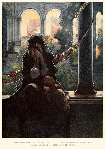
“The rich making merry in their beautiful houses, while the beggars were sitting at the gates.” Above and below: illustrations by Charles Robinson from The Happy Prince and Other Tales, an edition from 1920.

Continuing an occasional series. I’ve yet to see a copy of the recent annotated and unexpurgated edition of The Picture of Dorian Gray but Alex Ross wrote a marvellous essay for the New Yorker about the novel, its creation, its public reception, and Wilde’s decision to tone down the overt homoeroticism of its earlier drafts. This is one of the best pieces I’ve seen for a while about Wilde, replete with choice detail:

The gay strain in Wilde’s work is part of a larger war on convention. In the 1889 story “The Portrait of Mr. W. H.,” a pseudo-scholarly, metafictional investigation of Shakespeare’s sonnets to a boy, Wilde slyly suggests that the pillar of British literature was something other than an ordinary family man. In the 1891 play “Salomé,” Wilde expands a Biblical anecdote into a sumptuous panorama of decadence. Anarchists of the fin de siècle, especially in Germany, considered Wilde one of their own: Gustav Landauer hailed Wilde as the English Nietzsche. Thomas Mann expanded on the analogy, observing that various lines of Wilde might have come from Nietzsche (“There is no reality in things apart from their experiences”) and that various lines of Nietzsche might have come from Wilde (“We are basically inclined to maintain that the falsest judgments are the most indispensable to us”). Nietzsche and Wilde were, in Mann’s view, “rebels in the name of beauty.”

As for the novel, I’m feeling rather Dorian Grayed-out at the moment, having recently completed ten illustrations based on the story for a forthcoming anthology. More about that later.

Elsewhere, the William Andrews Clarke Memorial Library in Los Angeles has been running an exhibition, Oscar Wilde & the Visual Art(ists) of the Fin-de-Siecle, since July, and will continue to do so until the end of September. No word about what’s on display but this page on their website has details of their collection of Wilde materials which they say is the most comprehensive in the world.

Finally, the majority of visits to these pages in recent days have come from this post about Ivan Albright’s astonishing Dorian Gray painting in the Art Institute of Chicago. The post links to an earlier one of mine about the paintings used in Albert Lewin’s 1945 film of the book.

robinson2.jpg

Elsewhere on { feuilleton }
The Oscar Wilde archive