Single sleeves

singles01.jpg

A septet of 7-inch single sleeves from Eastern Bloc Songs, a small but well-selected repository of sleeve art from the record labels of the Eastern Bloc. I’d looked at the album art before but had missed the singles, some of which feature more impressive designs than their 12-inch counterparts. Of special interest are designs that show how the psychedelic styles of the decadent West were transmuted for a Communist audience. The Nautilus sleeve above dates from 1969, and uses the lettering adapted by Wes Wilson from a much earlier design by Alfred Roller. Elsewhere the generic sleeves from venerable Czech label Supraphon stand out for their modish graphics. (Via Record Envelope and Things Magazine.)

singles02.jpg

singles03.jpg

Continue reading “Single sleeves”

Weekend links 291

brooks.jpg

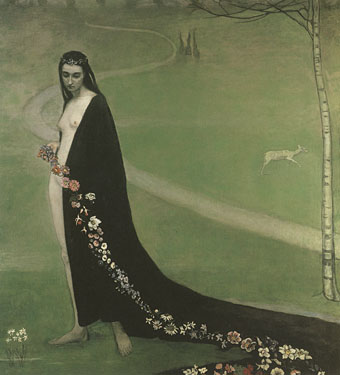
Femme avec des fleurs (1912) by Romaine Brooks.

• This week’s anniversary of the Charlie Hebdo murders was noted by some of those who defended the magazine last year. “I don’t write about Charlie Hebdo in France,” said Robert McLiam Wilson, “they have plenty of people who can do that. But I’ll do almost anything I’m asked to do in the anglosphere. Why? Well, two reasons. Because none of the other Charlie people bothers to do it. And because, really, that’s where all the bullshit lives.” A year on, and the bullshit-mongers seem to have fallen silent, what with knee-jerk outrage being a short-lived affair, and the Bataclan massacre having demolished one of the main criticisms, namely that the magazine wouldn’t have been attacked if the artists and writers had shown some respect. “[Charlie Hebdo‘s] real crime is not racism but its challenge to what has become an unbreakable commandment for many contemporary liberals: ‘Thou shalt not cause offence’,” says Kenan Malik. At Literary Hub Adam Gopnik explored the same issue in a foreword for Stéphane Charbonnier’s Open Letter.

• “Immersion in the past is no escape from the present, but it supplies a constant corrective to the narrative spit out daily by media, advertising, politics, and all those other forces that attempt to mould our thinking like jelly in a pan.” Luc Sante (again) talking to Simone Wolff about his books, Low Life and The Other Paris.

• “…throwing a lot of money behind vintage equipment? Well, that’s just a millionaire’s game. Dave Grohl can do that, but David Bowie doesn’t care about that. Just stick a microphone in front of him and he’s really happy.” Tony Visconti talking to Allyson McCabe about the music business and producing Bowie.

• “Nico Hogg’s photography captures the transformation of urban London,” says George Kafka who talks to Nico about a collection of his work, Sign & Signifiers, which I designed late last year.

• At Strange Flowers: James Conway talks to Cassandra Langer about her recent biography of artist Romaine Brooks (1874–1970).

• At Dangerous Minds: Godzilla, girls and guns, the science-fiction art of Noriyoshi Ohrai. There’s more at Pinterest.

• Mixes of the week: XLR8R Podcast 420 by Andrey Pushkarev, and Secret Thirteen Mix 172 by Julien Bayle.

• Alan Moore’s magnum opus, Jerusalem, will be published later this year. Gosh Comics has a teaser.

New York Public Library makes 180,000 high-res images available online.

Prints of darkness: macabre vintage posters

Scarfolk Television is coming

Godzilla (1977) by Blue Öyster Cult | Giant Robot / Machines in the Modern City / Godzilla (1992) by Praxis | Free-Bass (Godzillatron Cush) (1995) by Axiom Funk

Hollyhock House

house1.jpg

The Hollyhock House in Barnsdall Art Park was the only Frank Lloyd Wright house I got to see up close when I was in Los Angeles. The park on that occasion was the venue for the Arthurfest music festival so the house was omnipresent but was closed to visitors. After renovation the building was opened to the public last year, and in November was filmed by Houzz in this short video which includes drone shots of the exterior. Rain Noe at Core77 notes that the house was one of Wright’s notoriously poor constructions but a leaking ceiling doesn’t seem so bad if your home looks as spectacular as this.

house2.jpg

Previously on { feuilleton }
Remembering Arthurfest

MMMM

batty.jpg

Post number four thousand coincides with Roy Batty’s birthday, so happy birthday, Roy. Best not wish him many happy returns… It’s also David Bowie’s birthday and album release day but he’s receiving enough attention for that already.

WordPress always sends a statistics summary at the end of each year. The stats for 2015 looked like this:

The Louvre Museum has 8.5 million visitors per year. This blog was viewed about 900,000 times in 2015. If it were an exhibit at the Louvre Museum, it would take about 39 days for that many people to see it.

The busiest day of the year was January 18th with 3,460 views. The most popular post that day was The gay artists archive.

No surprise about the most popular section of the site which frequently gets double the traffic of any single post. Input to that section of the blog has fallen off over the past year but I do have a couple more posts lined up when I get a spare moment.

These are the posts that got the most views in 2015.

1 The art of NoBeast June 2007
2 The art of Takato Yamamoto June 2007
3 Phallic casts 2011
4 Compass roses August 2011
5 The art of Thomas Eakins, 1844–1916 March 2006

The phallic casts post had a huge spike of traffic on New Year’s Day for some reason. Some of the attention for these posts will be from Facebook but since I don’t have an account there—and Facebook also hides their referral details—you can’t be certain. As always, my thanks to everyone who takes the time to read and to comment.

Vintage Mishima

vintagemishima01.jpg

Penguin reprinted several volumes of Mishima in their Vintage line in 2010 with covers designed by Anna Crone. Seven of the covers are shown here although there are one or two more, not all of them available as large images. (Not for the first time I wonder why major publishers don’t make their new covers available at a decent size.) I’d have been wary of using Hokusai’s waves on a Mishima cover but colouring the water red makes it readable as a wave of blood.

vintagemishima02.jpg

vintagemishima03.jpg

Continue reading “Vintage Mishima”