The Flatiron Building

flatiron1.jpg

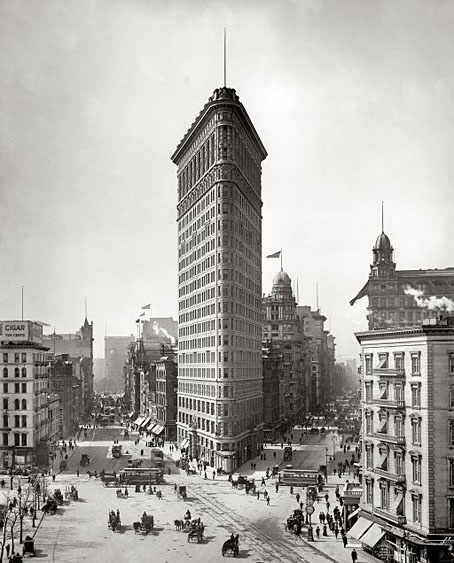
The Flatiron Building, Detroit Publishing Company (1903).

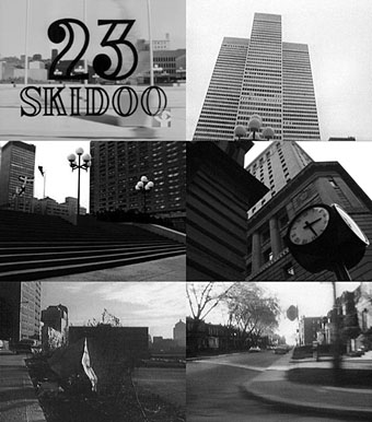
Beautiful Century posted this view of New York’s Flatiron Building at the weekend which had me looking for a larger copy. Happily this is one of the many high-resolution photos at the Shorpy Historical Archive where it’s possible to scrutinise a wealth of detail. Old photos like this are, as Michael Moorcock once said about old postcards, a form of time travel, especially when they’re as good as those in the Shorpy collection. The Flatiron was a popular subject for photographers—famously so in Edward Steichen’s 1904 nocturne—and Shorpy has many more examples such as the street-level view below. Both these photos show a common feature of pictures taken before the age of the motor car: people standing in the middle of the road. The Flatiron also has an oblique connection with Julian Biggs’ film via the mysterious origins of the phrase “23 skidoo“.

flatiron2.jpg

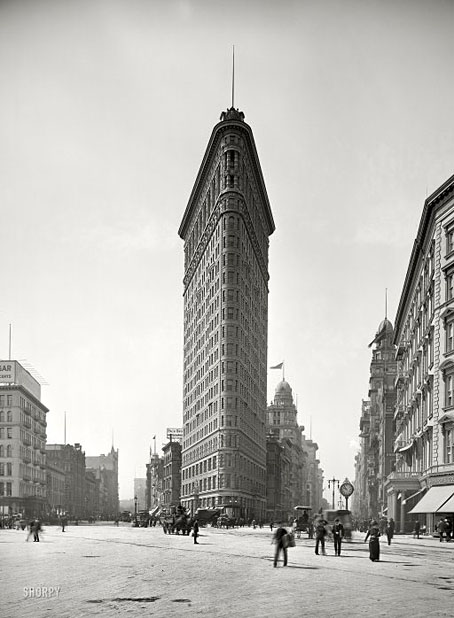
The Flatiron Building, Detroit Publishing Company (c. 1905).

Reinhart Wolf photographed many of New York’s skyscrapers in the late 1970s, the Flatiron included. I have a book of those photos and noticed in his Flatiron view that one of the circular decorations on the foremost angle of the building near the top is now missing (compare his view with the Shorpy photos). Every time I look at the Flatiron now I think of that missing chunk of masonry. Was it removed or did it fall? If the latter, when did this happen and what damage did it cause?

Previously on { feuilleton }
Edward Steichen

Cheeky Frawg Books

cheeky1.jpg

Being a new ebook imprint from Ann & Jeff VanderMeer:

Cheeky Frawg Books has launched a new website. Does it sell our ebooks? Yes! But very…cheekily. It’s an interactive and mysterious experience you truly won’t want to miss, in a 180-degree scrollable environment. Free content, hidden treasures, singing fish, the animated Myster Odd video, and, of course, the full catalogue of Cheeky Frawg ebooks, including Amal El-Mohtar’s The Honey Month and the ODD? anthology, featuring Jeffrey Ford, Caitlin R. Kiernan, Amos Tutuola, Hiromi Goto, Nalo Hopkinson, and many more.

Cheeky Frawg specializes in quality, self-aware e-books. We hand-craft every e-book on a letterpress using only the best, most perfectly formed 00000s and 111111s.  Forthcoming titles include the legendary The Encyclopedia of Victoriana by Jess Nevins, It Came From the North: Finnish Weird edited by Jukka Halme and Tero Ykspetäja, Jagganath by Swedish sensation Karin Tidbeck and Don’t Pay Bad for Bad by iconic Nigeria writer Amos Tutuola.

Note: A percentage of direct sales in December will go to aid iconic fantasy editor, artist, and writer Terri Windling, who is suffering from financial woes.

cheeky2.jpg

In the first run of titles is the ebook edition of The Kosher Guide to Imaginary Animals whose print edition I designed a while back. And mention of Amos Tutuola reminds me that I’ve had a copy of his My Life in the Bush of Ghosts for years and still not read it. While we’re on the subject of Ann & Jeff’s projects, a reminder that Weird Fiction Review is still posting unique pieces of weird fiction, interviews and essays.

Previously on { feuilleton }
Weird Fiction Review

23 Skidoo by Julian Biggs

biggs.jpg

An 8-minute film by Julian Biggs from 1964 (IMDB says 1965) which turns the streets of Montreal into post-apocalypse tableaux.

This short black-and-white film shows eerie scenes of a downtown without people. The effect is disturbing. The camera shoots familiar urban scenes, without a soul in sight: streets empty, buildings empty, yet everywhere there is evidence of recent life and activity. At the end of the film we learn what has happened.

Being a film funded by the National Film Board of Canada, the only place to see this would appear to be on their website. That would be fine if the streaming worked but every time I’ve tried using the latest iteration of their site the connection seizes up. Other viewers may have better luck.

Weekend links 87

scott.jpg

Untitled art by Katie Scott.

“…the very fact that people cannot get published by the big-name publishers in the way that they used to has meant that you’ve got some really interesting and often really beautiful little small publishing houses that are springing up and coming into existence. And the stuff that they’re providing is actually a lot better. I’m thinking of people like Tartarus Press, Strange Attractor and various other commendable small publishers that do a beautiful job and that are producing books that are good to have on your bookshelf.”

Alan Moore discussing books old and new in a lengthy interview at Honest Publishing. In part two he takes to task hardboiled moron Frank Miller and offers his thoughts on the Occupy movement. Elsewhere the Guardian finally paid some attention to the importance of design in the book world. Some of us who do this for a living have been saying for years that if publishers want to see physical books thriving they need to maintain (or improve) the quality of their design and materials. Related: The Truth About Amazon Publishing, Laura Hazard Owen at paidContent examines some the figures behind Amazon’s PR.

• “Tenniel argued for several changes to the characters as conceived by Carroll. The croquet mallets are ostriches in the original drawings, and the hoops are footmen bent over with the tails of their coats hanging down over their bottoms like an animal’s. Tenniel left them out. He told the author that a girl might manage a flamingo, but not an ostrich.” Marina Warner again on John Tenniel, Lewis Carroll and the Alice books.

schoeler.jpg

Untitled painting by Christian Schoeler who was interviewed for a second time at East Village Boys.

Shamanism and the City: Psychedelic Spiritual Tourism Comes Home and Scientists finding new uses for hallucinogens and street drugs. Related: LSD – A Documentary Report (1966), “a totally new kind of record album”.

• More books: Interview with a Book Collector. Mark Valentine, author, biographer and editor was also the co-publisher in 1988 of my adaptation of HP Lovecraft’s The Haunter of the Dark.

• The Priapus Chandelier “features six hand-sculpted phalluses cast in translucent resin, which radiate an atmospheric light.”

Stewart Lee on Top Gear, in which the comedian and Dodgem Logic contributor eviscerates the BBC’s pet trolls.

• The Beinecke Rare Book and Manuscript Library put the Voynich Manuscript online.

• The 432-page SteamPunk Magazine collection with my cover art is now on sale.

Hubble, Bubble, Toil & Trouble: The Haxan Cloak Interviewed

• The Sunn O))) chapter of The Electric Drone by Gilles Paté.

Colonel Blimp: The masterpiece Churchill hated

Submergence (2006) by Greg Haines | Reyja (2011) by Ben Frost & Daníel Bjarnason | The Fall (2011) by The Haxan Cloak.

Cover versions

whippedcream1.jpg

Design by Peter Whorf Graphics.

Another album cover post, and one I’ve wanted to do for a while. Parody covers are a curious sub-genre of sleeve design, and this post was prompted in part by an email from Easy On The Eye books alerting me to the publication this month of Covered, a collection of cover parodies compiled by Jan Bellekens. Hundreds of different examples are featured, many of them by artists few people will have heard of, the parody cover having always been a good way for unknowns to grab some attention on the back (or should that be the front?) of the very famous.

Some covers inspire more parodies than others. One of my favourites is the perennial inspiration provided by Whipped Cream & Other Delights, Herb Alpert’s hugely popular 1965 album whose cover by Peter Whorf Graphics may now be more well-known than the music it packaged. Dolores Erickson was the model, the “cream” was foam, and the modish typography shows (as did the hand-drawn title on Rubber Soul) that the trend for fluid lettering styles slightly preceded the psychedelic explosion. My mother had a copy of this album so the sleeve was the first album cover to make a memorable impression; my sister and I always thought it slightly “rude” since Ms. Erickson is obviously naked under her cream.

whippedcream3.jpg

Sour Cream & Other Delights (1966) by The Frivolous Five.

The success of the design can be gauged by how swiftly the parodies followed, and how they show no sign of abating, the most recent one below being from 2008. The selections here are among the better examples, there are many more to be found. Needless to say, Jan Bellekens’ book makes note of this lineage. Covered can be ordered direct from Easy On The Eye.

whippedcream4.jpg

Spaghetti Sauce & Other Delights (1967) by Pat Cooper.

Continue reading “Cover versions”