A=P=P=A=R=I=T=I=O=N

apparition.jpg

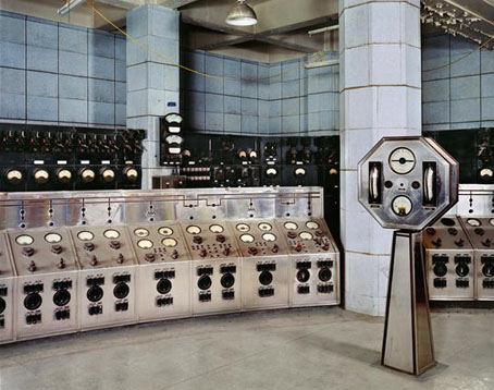
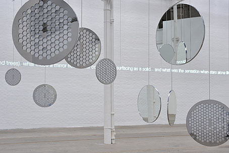
A=P=P=A=R=I=T=I=O=N is a collaboration between artist Cerith Wyn Evans and Throbbing Gristle, the once notorious Industrial music act now enjoying a resurgence of activity and attention. Evans and TG have an earlier connection via Derek Jarman, for whom Evans worked as an assistant. Given how much I enjoy seeing mirrors used in art, I’m very taken with these, and knowing that they function as drifting speakers transmitting specially recorded TG audio makes them doubly interesting. The mirrors-plus-audio aspect is reminiscent of Josiah McElheny’s recent Island Universes with Paul Schütze but that’s not to imply any influence, both artists have been following their individual paths for some time.

The title of this work comes from a poem by Stephan Mallarmé (1842–1898), a poet closely associated with the Symbolists. Looking at an English translation, the piece ends with the line “a snow of white bouquets of perfumed stars”; that final, impossible flourish—perfumed stars—is a very Symbolist touch. Claude Debussy, who took the title of his Prélude à l’après-midi d’un faune from Mallarmé, set Apparition to music in 1884.

A=P=P=A=R=I=T=I=O=N can be seen at Tramway, Glasgow until September 27, 2009.

A=P=P=A=R=I=T=I=O=N test run on Chris Carter’s Flickr pages.

Previously on { feuilleton }
In the Shadow of the Sun by Derek Jarman
The art of Josiah McElheny

Battersea Power Station

battersea.jpg

A photograph of the control room of Battersea Power Station, London, by Michael Collins, one of a series which will shortly be on display at the Royal Institute of British Architects.

The images show Battersea Power Station as what Collins describes as a “twentieth century ruined castle” – a building that was built to last, with a high quality structure and interior, including Art Deco walls and ceilings.

Giles Gilbert Scott’s enormous temple of heavy industry continues to sit decaying on the banks of the Thames while property developers come and go. The latest of these, Real Estate Opportunities, has fallen into debt which means proposals to develop the site are once again on hold. A part of me likes the idea of the building sitting there unused and purposeless year after year, like some vast Steampunk Stonehenge; Giles Gilbert Scott’s other Thames-side power station, Bankside, was successfully transformed as Tate Modern, but we know from various proposals that the fate of Battersea, whether as theme park or shopping centre, is likely to be a lot less edifying.

quark1.jpg

It took redevelopment to transform Bankside from temple of industry to temple of culture but Battersea’s unmistakable presence has a powerful cultural history of its own. Everyone knows the Hipgnosis sleeve design for Pink Floyd’s Animals (1977); less familiar is the photos of the control room which Hipgnosis used for Hawkwind’s Quark, Strangeness and Charm the same year. I tend to prefer the back cover of this sleeve to the front; that octagonal readout device is more interesting than the rather unconvincing sparks and exchanges of energy. And speaking of energy, my former employers are still active, unlike the rancorous Floyd.

quark2.jpg

There’s a page here listing other uses of the power station, including its many film appearances which date back to the 1930s. That list mentions the control room’s use as a background for the “Find the Fish” sequence in Monty Python’s The Meaning of Life (1983) but they omit an earlier Monty Python appearance when you briefly see the building in operation during And Now for Something Completely Different (1971). It was closed down a few years later. So here it is, then, belching fumes over west London on a profoundly gloomy winter afternoon.

battersea2.jpg

Elsewhere on { feuilleton }
The album covers archive

Previously on { feuilleton }
The Sonic Assassins
The Bradbury Building: Looking Backward from the Future

The Studio & Studio International

studio1.jpg

Back in February I posted some pictures from a 1971 collection of Art Nouveau illustration and design, some of which were competition entries from The Studio magazine. The Studio, which later became the long-running Studio International, can be seen from issue 11 onwards at the Internet Archive now that they’ve started uploading Google’s book scans. I’ve only looked at one of these so far, Volume 11–13 which runs over 850 pages and so takes some time to go through, as do all these rather unwieldy PDF books. The issues are missing their covers and so aren’t dated but would appear to be from around 1896 to 1898, one of the final entries being a memorial piece for Aubrey Beardsley who died that year; The Studio was the magazine which had introduced Beardsley to the public only five years earlier.

studio2.jpg

The Studio ran regular competitions among its readers and the examples shown here are from some of those. I especially like these type designs; dare we assume that the “Dorian” design below is named after Dorian Gray? As a whole the magazine is an odd mix of very dull Victorian art of the landscapes and artisans type, with occasional flares of interest when they devote a feature to the emerging Art Nouveau style or profile a Symbolist artist such as Giovanni Segantini.

studio3.jpg

A note for anyone wishing to download Google scans from the Internet Archive: some of the PDF links lead you to a Google page where they’re trying to sell you an e-text or get you to buy a book. To see the available files you need to click “All Files: HTTP”.

Previously on { feuilleton }
The Great God Pan
Art Nouveau illustration
Jugend Magazine