Things Get Ugly

tgu.jpg

Last month I said I had one more cover from 2022 to be made public, having forgotten that there was this one plus another which is currently at the printer, and which I’ll write about at a later date. Things Get Ugly follows last year’s Born For Trouble in being another Joe R. Lansdale cover for Tachyon that uses typography for the whole of the design. As with the earlier cover, this approach sidestepped having to try and summarise a collection of short stories with a single image or graphic. Adding imagery to a collection usually works best when the contents follow a specific theme, which isn’t the case here.

The stories may be described as crime but quite a few of them are dark enough to be included in horror collections. Things do, indeed, get ugly. The intersection between crime and horror fiction isn’t exactly new, the two genres have been entangled since The Murders in the Rue Morgue, and the boundaries remain permeable to this day. The most well-known piece in the new collection is Incident On and Off a Mountain Road, a story that was filmed for TV by Don Coscarelli for the Masters of Horror series, and which also opened the first season in 2005. Coscarelli’s adaptation is even nastier than its source but not everything in the collection is unrelentingly grim. Lansdale has a flair for black comedy which is to the fore in another story, Driving to Geromino’s Grave, in which two Depression-era children have to bring home the rotting body of their deceased uncle. This may not be everybody’s idea of an amusing read but the witty dialogue made me laugh. As well as the cover I’ve designed the interior of this one so I may post samples at a later date.

Things Get Ugly will be published in August. The book can be pre-ordered here.

Previously on { feuilleton }
Born for Trouble
Of Mice and Minestrone

Born for Trouble

trouble.jpg

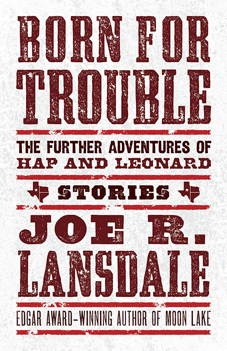
I said at the weekend that I’d recently designed an all-type cover, and here it is. This is my second design for Joe R. Lansdale’s detective duo, and like the earlier Of Mice and Minestrone this one went through more iterations than usual. It’s often the case that the more popular a book is likely to be, the more constraints will be imposed on the cover design. Hap and Leonard are very popular characters so this commission arrived with a number of prerequisites regarding the amount of text, the size of the type and so on. It also required the inclusion of the word “Stories” to emphasise that the book is a story collection rather than a novel. The latter feature is a recent trend in American publishing, one that follows the not-so-recent trend of appending the words “A Novel” to the covers of…novels. As a reader I find these labels to be superfluous and even mildly insulting but as a designer I have to follow the brief, and the brief was to present all of this information in a suitably harmonious manner. Most of the early iterations tried to do this with the addition of some illustrative graphics but the results were persistently unsatisfactory, hence the decision to let the type do the work.

Born for Trouble will be published by Tachyon in March 2022.

Previously on { feuilleton }
Foiled at last
Of Mice and Minestrone

Foiled at last

foil.jpg

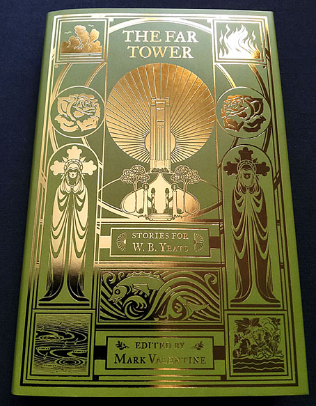
I’ve already written about the design for this story collection from Swan River Press but the gradient layout does nothing to convey the splendour of the foil-embossed printing. In the past when I’d suggested to publishers that foil printing might be an option the idea was always turned down for reasons of cost. My original intention for The Far Tower was for the design to be printed in a metallic ink so it might resemble the gold-on-green cover of the Yeats book which was the model for this volume. Metallic inks don’t always work too well, however, especially on a darkish background, so I said to Swan River “Or we could do it in gold foil…” To my surprise and delight they said “Why not?” So here’s the result. A great end to the year. The book is available here.

lansdale.jpg

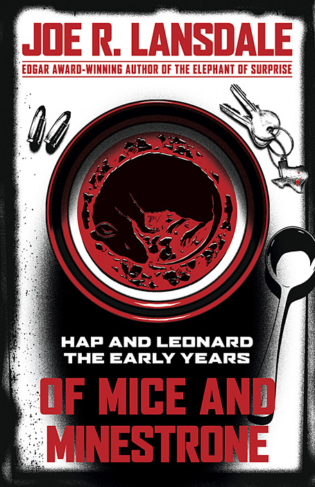
And back in October, I posted what everyone thought at the time was the final design for Of Mice and Minestrone, a new book of Hap and Leonard stories by Joe R Lansdale. The Hap and Leonard books are popular works (there was a TV series based on them a while back) so they’re subject to the demands of the marketplace which in this case required a cover more in line with the red/white/black arrangement of some of Lansdale’s related titles. I’d already done most of this as an additional draft during the work on the first design so the reworking wasn’t too time-consuming. The rodent in the soup is more visible in this version which is another point in its favour. Of Mice and Minestrone will be published by Tachyon in May next year.

Previously on { feuilleton }
The Far Tower: Stories for WB Yeats
Of Mice and Minestrone

Of Mice and Minestrone

lansdale.jpg

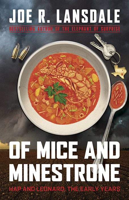
I’ve done a lot of cover work this year, and there are still more designs waiting to be announced. Of Mice and Minestrone isn’t my usual line of work but it’s actually the third cover I’ve done for a Joe R. Lansdale book, although the previous titles were horror and steampunk respectively. The latest volume is a collection of crime stories, and an addition to Lansdale’s Hap and Leonard books, a series about a pair of Texan detectives whose popularity now extends to a TV show.

Crime presents many of the same challenges you find in other genres, all of which come with their own set of clichés which you can either choose to engage with or avoid. In the case of crime there’s a tendency for degraded typefaces to proliferate, along with variations on a red/black/white colour scheme. One of the early drafts of this design did use a red/black/white arrangement but I was told that Joe Lansdale was (unsurprisingly) tired of seeing this scheme applied to his own books. The title of the collection comes from the opening story which concerns the young Hap’s involvement with an older woman and her abusive husband; the marital abuse is resolved via a bowl of soup which has been poisoned with a dead rat, hence the title and the cover image. I like using pareidolia when I can, and the slightly unusual imagery pushed the appearance away from generic clichés (if you discount the bullets) towards the marvellously surreal covers that Tom Adams painted for Agatha Christie’s novels.

The background photo is a rare example of my using a stock image. The soup bowl looked fine from the outset but the background lacked a suitably ominous quality, and was at risk of looking too much like a recipe book. (As it happens there are some recipes by Kasey Lansdale following the fiction although I don’t think any require the use of dead rats.) After trying a number of different table surfaces I decided on a lateral approach so went searching for pictures of Texan storm clouds. The image we eventually used—a tornado over farmland near Patricia, Texas by John Finney at Getty Images—was the second one I tried and it worked so well we decided to keep it.

Of Mice and Minestrone will be published by Tachyon in March 2020 but is available for pre-order now.

Previously on { feuilleton }
The Gods of HP Lovecraft
Lovecraft’s Monsters
Ten titles and a cover
Steampunk overloaded!
New things for April

Weekend links 323

taylor.jpg

Mescaline Woods (1969) by Gage Taylor.

• The soundtrack to The Man Who Fell to Earth will be released for the first time next month in a double-disc set (CD & vinyl). This isn’t, as some people have hoped, David Bowie’s unheard music for the film, but a collection of the pre-existing songs and other pieces, plus the original compositions by John Phillips. Consequence of Sound has a track list.

• At Scream Addicts: Joe R. Lansdale talks about the only film adaptation of Shirley Jackson’s The Haunting of Hill House that you need to see: the 1963 version directed by Robert Wise.

• The new wave of new age: How music’s most maligned genre finally became cool by Adam Bychawski.

• Transmissions From The Abyss: Dark ambient music for the perfect headspace by S. Elizabeth.

Jason Farrago reviews Art Aids America, an exhibition at the Bronx Museum, New York.

Curse Go Back: a limited reissue of tape experiments by William Burroughs.

Samuel Wigley on Notorious at 70: toasting Hitchcock’s dark masterpiece.

Toyah Willcox remembers working with Derek Jarman on The Tempest.

• “Why are musicians so obsessed with David Lynch?” asks Selim Bulut.

• Read the original 32-page programme for Fritz Lang’s Metropolis.

David Parkinson chooses 10 essential films starring Oliver Reed.

• Mixes of the week: The Sounds of the Dawn NTS radio shows.

Keith Haring envisions Manhattan as a kingdom of penises.

Frank Guan on Massive Attack’s Blue Lines, 25 years on.

Honky Tonk Pts 1 & 2 (1956) by Bill Doggett | I’ve Told Every Little Star (1961) by Linda Scott | I’m Deranged (1995) by David Bowie