Forever Changes (1967) by Love.
Art by Bob Pepper, design by William S. Harvey.
Following yesterday’s post about Philip K Dick covers (and Erik Davis’s appraisal of the DAW cover), I decided to check out Bob Pepper’s work a bit more and it quickly became obvious I should have joined the dots with this particular artist years ago. Pepper’s work not only decorates one of the recognisable record sleeves of the late Sixties (above), he was working shortly afterwards as an illustrator on the celebrated series of fantasy reprints edited by Lin Carter for Ballantine books. Pepper’s connections with Elektra Records also saw him provide sleeve art for some of the eclectic releases on their Nonesuch label. What’s surprising to me now is the realisation that I’d been seeing his work for years in a variety of places and never noticed it was the same artist. Better late than never, I suppose.

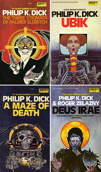
Four more Dick covers for a series of six published in 1982 to coincide with the release of Blade Runner. As with the cover for A Scanner Darkly (in the earlier post) these paintings are all portraits.

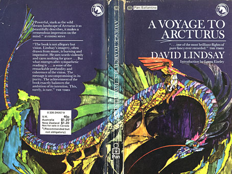
A Voyage to Arcturus (1968) by David Lindsay.
It was the success of the publication of The Lord of the Rings in America which inspired Betty Ballantine to publish a line of fantasy classics in the late Sixties. The series began its run in 1969 and continued until 1974. Lin Carter was commissioned as editor and given free reign to choose any title he thought might be suitable with the result that many of the books in the series—obscurities such as Lud-in-the-mist by Hope Mirrlees—received their first paperback publication. Carter also reprinted personal favourites which frequently shifted from fantasy to outright horror, such as the titles from HP Lovecraft and William Hope Hodgson. The range and scope of this line is what makes the series so notable today and the books have become highly-collectable as a result. Many artists were involved in producing the distinctive cover designs and Pepper’s illustrations were featured on the covers for Mervyn Peake, Lord Dunsany and James Branch Cabell, among others. Unfortunately the various pages devoted to these books aren’t very good at showing the paintings to their best advantage. For a long time Pepper’s cover for A Voyage to Arcturus was one of the few editions available that managed to show a scene from the book, rather than a generic sword-wielding barbarian.

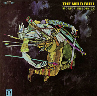
The Wild Bull (1968) by Morton Subotnick.
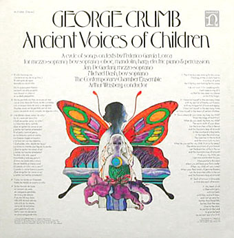
Nonesuch Records was Elektra’s subsidiary classical music label which not only produced classical recordings but also recordings from around the world in their Explorer series, and a range of original works of contemporary electronic music. I’m not positive that the sleeve above is a Pepper painting but it certainly looks like it. This is another surprise since I’ve had Morton Subnotnick‘s album on a reissue CD for years (with different artwork). The George Crumb recording below is Pepper’s work and I’ve had the original vinyl of that one for several years. The similarity between that sleeve and the one for Love is striking.

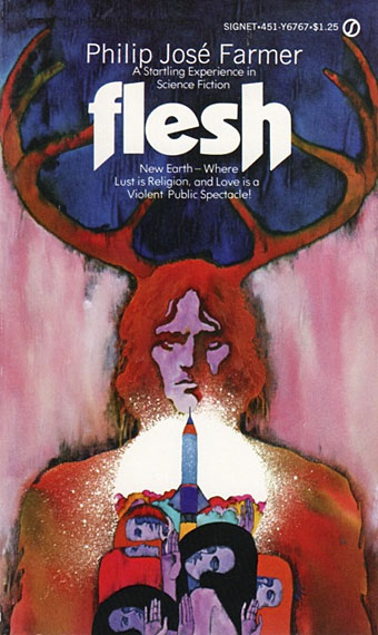
Flesh (1969) by Philip José Farmer.

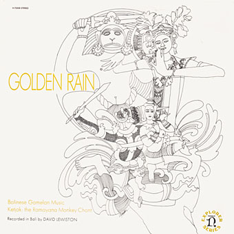
Golden Rain – Balinese Gamelan Music – Ketjak: The Ramayana Monkey Dance (1969) by Various Artists.
Art by Bob Pepper, design by William S. Harvey.

Ancient Voices of Children (1971) by George Crumb.
Art by Bob Pepper, design by Robert W. Zingmark.

Driftglass (1971) by Samuel R. Delany.

Debussy’s Greatest Hits (1972).

Concerto For Harpsichord And Five Instruments by Manuel De Falla (no date).

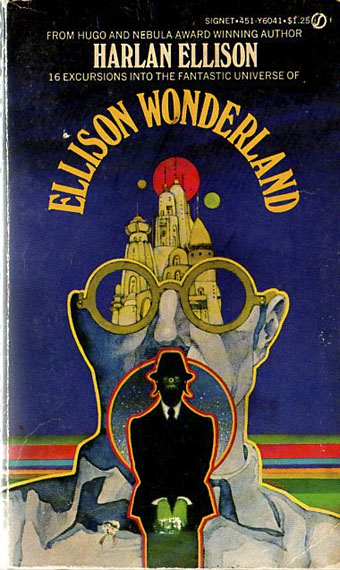
Ellison Wonderland (1974) by Harlan Ellison.

Fiestas of Peru: Music of the High Andes (1975) by Various Artists.
Art by Bob Pepper, design by Jo Ann Gruber.

Flower Dance: Japanese Folk Melodies (no date) by Kofu Kikusui, The Noday Family, Nakagawa & Oishi.
Art by Bob Pepper, direction by William S. Harvey, design by Elaine Gongora.
Pepper is retired now but produced artwork for Dark Tower, a fantasy boardgame, in 1981. The game still has its enthusiasts, and this site features a short interview with the artist.
Update: more about the Ballantine covers.
Update 2: a large scan of the George Crumb cover art.
Update 3: More album and book covers added.
Elsewhere on { feuilleton }
• The album covers archive
• The book covers archive
• The illustrators archive
Previously on { feuilleton}
• Philip K Dick book covers
• Masonic fonts and the designer’s dark materials
