Heartbreak Hotel

hh01.jpg

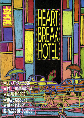
Number One: Teen Angels in Anguish. Cover by Barry Kamen.

Among the recent uploads at the Internet Archive is a complete run of Heartbreak Hotel, a British magazine six issues of which were published in 1988. (More or less…I think the first issue may have appeared at the end of 1987.) Heartbreak Hotel differed from other bi-monthly publications by being predominantly a comics magazine, but it also differed from other comics magazines by a) having the contents of each issue themed to follow a different musical genre, b) running articles by and interviews with people who had little or no connection to the comics world, and c) being a lot more openly sympathetic towards gay men and lesbians than any other magazine aimed at a general readership. The latter stance was a political one in 1988. This was the year when the Thatcher government, growing hubristic after a third election win, passed a Local Government Act whose notorious Section 28 prevented authorities from “promoting homosexuality”. The clause was designed to prevent Labour-run councils from funding gay and lesbian support groups, as well as to stop teachers from mentioning homosexuality in sex education lessons. The editors of Heartbreak Hotel, Don Melia and Lionel Gracey-Whitman, were a gay couple, so the magazine stood against the repressive atmosphere of the time without being too polemical or too serious. The polemic was more overt in affiliated publications Strip AIDS, a benefit comic for the London Lighthouse (a residential and daycare centre for people with AIDS), and AARGH (or Artists Against Rampant Government Homophobia), a collection of comics taking a stand against Section 28 which was the first publication from Alan Moore’s Mad Love imprint.

hh07.jpg

The other notable feature of Heartbreak Hotel was the attention it gave to new artists, to women artists, or to people who weren’t drawing generic action/adventure strips. The first two issues appeared while I was working on the last pages of my adaptation of The Call of Cthulhu so I sent the magazine some sample pages and was subsequently invited to meet the editors at the launch of the next issue in London. I spent a somewhat nervous weekend in the capital; this was my first introduction to the wider comics world, and my introversion in those days was a lot more pronounced among strangers than it is today. I met Alan Moore and Melinda Gebbie for the first time (separately—they weren’t a couple at that time), and was amused when Don made a point of telling me that he and Lionel were gay, something he evidently felt he had to declare even though it had been (for me, at least) quite obvious from the editorial stance of Heartbreak Hotel, as well as the camp graphics scattered throughout the magazine’s pages, and the fact that the publisher was co-named “Willyprods”.

hh08.jpg

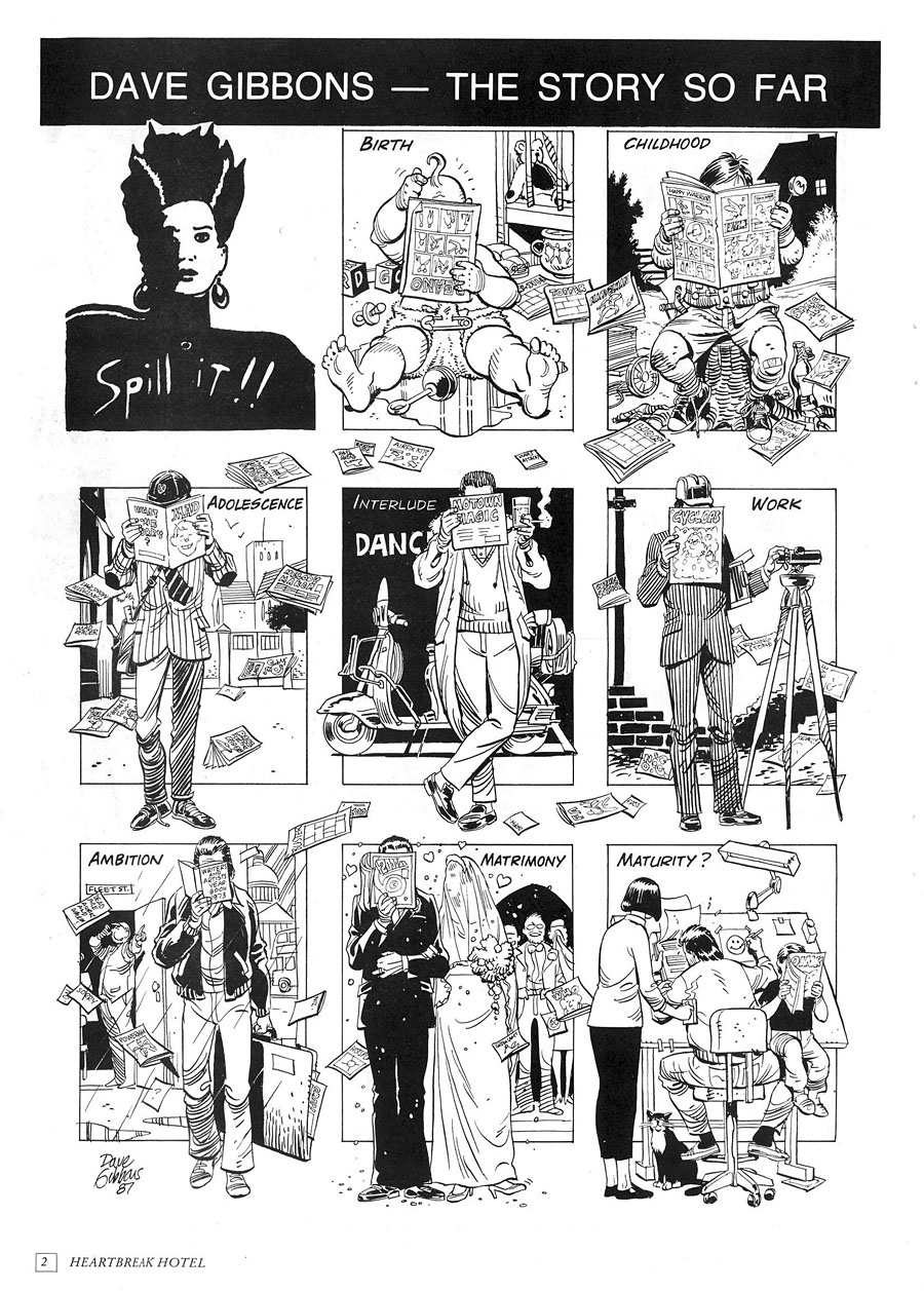
Dave Gibbons spills the beans in issue one.

The format of the magazine was established in the first issue: five or six strips based on songs that suited that issue’s theme, together with interviews or features, some of which also matched the theme. “Spill It!!” was a regular feature in which a different artist had a page to create an autobiographical piece in strip form, and there was also a column about comics and related matters by artist/writer Trina Robbins. I’d initially hoped to draw something for the psychedelic issue but by the time I posted my photocopies that number was already being prepared for print. I did turn up in the fourth issue, however, in a short news piece which announced the publication of the Caemaen Books edition of my Haunter of the Dark strip.

hh09.jpg

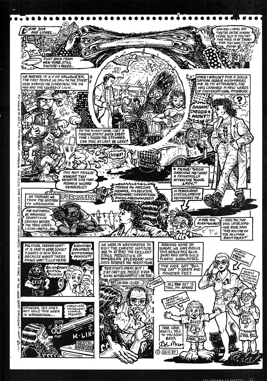
Also from issue one, Alan Moore recounts his trip to the USA.

A more important outcome from my journey to London was Lionel’s offer to run The Call of Cthulhu in BLAAM, a spin-off comic that Willyprods/Small Time Ink was planning. Heartbreak Hotel had been inundated with work by talented newcomers so rather than make them wait for a slot in the parent magazine the editors decided to launch another title to provide an additional outlet for new creators. Lionel had been very impressed with my Lovecraft story, and also assisted with its conclusion when he suggested that I add an extra page to help the pacing near the end, something I did, and which I’ve been grateful for ever since. The first issue of BLAAM, printed on tabloid-size newsprint sheets, came bundled with issue five of Heartbreak Hotel. The idea was that BLAAM would continue separately as a free publication thanks to a combination of low production costs, advertising, and Don Melia’s contacts at Titan Distribution. This was all very exciting, especially when two more issues of BLAAM appeared soon after. My strip was slated to run in number four or five but Willyprods/Small Time Ink didn’t publish anything more after December 1988. I was disappointed by this but not for long. A year later I’d started working on the Savoy comics, and Steve Bissette offered to publish the Cthulhu strip in Lovecraft Lives, a book he was planning for Kevin Eastman’s new enterprise, Tundra Publishing. That one didn’t work out either—the stars weren’t right for a variety of reasons—but all this attention, and the enthusiasm shown by everyone involved with Heartbreak Hotel, made the comics world seem like a good place to be. For a while, anyway.

Continue reading “Heartbreak Hotel”

Mapping the Boroughs

boroughs.jpg

Alan Moore’s magnum opus, Jerusalem, is published today so I can talk at last about my small involvement with this huge novel. The request came through just before Christmas last year: Alan and his publishers, Knockabout Comics, wished to know whether I could create a map for the endpapers of the book. Not a flat street plan, but a bird’s eye view (in isometric or axonometric projection) of the now-demolished area of Northampton known as the Boroughs. The area still exists today under this name but Jerusalem concentrates on the region as it was when Alan was living there as a child: a dense labyrinth of houses, shops and a few small factories dating back to the 19th century, with many older buildings among them. This was the oldest area of the town, having originally grown up around Northampton Castle, a structure that was demolished gradually over the past few hundred years. Some of the street names in the Boroughs recall this history: Castle Street, Fort Street, Moat Street, Castle Terrace, etc.

compton.jpg

Compton Street a few years before demolition.

I immediately agreed to the request, of course, while swallowing heavily at what I was sure would be a demanding task. Looking at the crude street plan that Tony from Knockabout sent through, and examining the available maps on local history websites, it was evident that this was going to be a difficult technical challenge. Difficult, but not impossible if I could get hold of accurate maps of the area, which is what I did shortly after the Christmas break.

boroughs1899.jpg

The Boroughs mapped by Ordnance Survey, 1899.

There’s a wonderful publishing company, Alan Godfrey Maps, that specialises in reprinting old Ordnance Survey charts of Britain for use by genealogists and local historians. I’ve had some of their maps of Manchester city centre for years, so I knew they’d be ideal if they covered the relevant area of the town. Fortunately for my purposes, they publish two 1899 25-inch-to-the-mile maps of Northampton town centre which cover the whole of the Boroughs. When the maps arrived I scanned them at high-resolution then stitched them together; the top of the Boroughs extends onto the lower part of the map of northern Northampton. After scanning, it was a case of tracing all the streets and the outline of every single building in the area in order to create a plan that was much more accurate than any of the vague plans available online.

boroughs1899-2.jpg

When I began work I had the idea of widening all of the streets in order to have legible street names running along the roads, a common practice among mapmakers who draw city plans. (The map of New York City that Alan and Dave Gibbons used when creating Watchmen is a good example.) However, widening the roads (or diminishing the scale of the buildings) would have risked important landmarks appearing too small, and there were other potential problems looming, so I decided to play safe and keep to the map scale.

plan.jpg

The biggest headache after solving the accuracy of the roads and buildings was what to do about the roofs. It wasn’t too difficult to elevate the ground plan once I had it tilted at a suitable angle: the elevation was achieved by making about 12 copies of the ground plan which are stacked one on top of the other. The first layer was run through the bas relief filter in Photoshop in order to give it some depth and shadow. This had the result of shadowing the building walls so they resembled solid three-dimensional blocks when enough layers were stacked together.

plan2.jpg

So all the streets and buildings are accurate up to a point. One inaccuracy is that all the buildings except for the churches are the same height, something that was unavoidable without invention. And there’s no representation of the slight hills which raise the streets in places. As for the roofs, these are mostly speculation. I’d thought at first that I might be able to save time by copying and pasting a generic roof shape but the streets are too meandering, and the building plans are too varied. The only solution was to put a copy of the roofless map into Illustrator then draw every single part of every single roof by hand: over 4500 vector pieces in all. By examining Google’s satellite pictures of the undemolished fringes of the old Boroughs I was able to guess how the some of the roofs might have worked together. At the beginning of the novel there’s repeated mention of the word “angles” (and its confusion with “angels”) so it now seems fitting that I spent the best part of a week drawing so many angles on the map. It would have been nice to also put chimneys on each house, and doors and windows (and add fences and pavements…), but if I’d started doing that I’d probably be finishing the work about now. Louis Bretez spent two years drawing the Turgot Map of Paris; I had deadlines pressing so had to get mine finished in five weeks.

boroughsdetail.jpg

The map is based on the area as it was in 1899 but some of the landmarks are anachronisms. Alan’s story covers the past and present of the area so The Destructor, for example, wasn’t built until the 1920s. This is the building with the smoking chimney, one of several “municipal destructors” (incinerators) built around Britain at the time. The high-rise blocks of Beaumont Court and Claremont Court are even more out-of-time, having been built in 1962. It’s not so obvious from the printed map but these have a slightly ghostly presence since they don’t fit into the streets of the older Boroughs at all. Beaumont Court was built across Scarletwell Street so if you visit the area today you’ll find a block of flats at the end of a street that used to run from the houses where Alan grew up (on St Andrew’s Road) down to the Mayorhold.

A tough assignment, then, but it worked out in the end. It’s been an immense honour being asked to contribute to such a major novel.

Previously on { feuilleton }
Maps of Midtown Manhattan
The Turgot Map of Paris
Art is magic. Magic is art.
Alan Moore: Storyteller
Alan Moore: Tisser l’invisible
Dodgem Logic #4

Maps of Midtown Manhattan

manhattan1.jpg

Midtown Manhattan by Constantine A. Anderson.

Yesterday’s link to a Domus article, The importance of being axonometric, features an interview with map and chart collector Michael Stoll whose Flickr account has some wonderful samples from his archives. Among the many city charts there are several maps of New York in various axonometric projections including this example designed by Constantine A. Anderson for the Manhattan Map Corporation in 1985. Anderson’s map is like a modern equivalent of Turgot’s map of Paris, and caught my attention for possibly being the one that comic artist Dave Gibbons used for reference when he was drawing Watchmen in 1986. Gibbons and Watchmen writer Alan Moore mentioned the map in the huge round table discussion I posted here in 2006 (the discussion at this point concerns the story’s recurrent street corner location):

Dave Gibbons: I didn’t actually make a model of it, although when we first conceived it I did draw a streetmap.
Alan Moore: Well, we checked it up on a map of New York.
Fiona Jerome: It’s really there?
DG: It’s a feasible corner—I’ve got a map at home.
Steve Whittaker: I noticed you put Forbidden Planet N.Y. in there at one stage—where they’re selling all the pirate comics.
AM & DG: No, that’s Treasure Island.
DG: Which would, if you had pirate comics, be FP. At home I’ve got this brilliant map they do which is an isometric projection of New York, so not only is it a street map but it’s all the buildings standing up and it’s got all the post boxes and the trees.
AM: It’s lovely, it’s a work of art you can wander round New York in your head.
DG: It’s about this big but… you know the joke about New York people look at it and say “When’s it going to be finished?” It’s the same with this map, it’s never actually finished because as fast as they put buildings in it, other ones are torn down. There are places in it where there’s just a site with a crane or something.
[…]
DG: But that corner, l’m sure that at some time I’ve been to New York I must have walked past that corner. In fact, what I’d really like to do, the next time I go, is actually walk to that junction and see what’s there. On the isometric map there is a fairly new high rise building which could be the Institute for Extra Terrestrials, another building which looks like a cinema to me because it’s got a curved front, and there are some other, lower buildings.
SW: And a fast food chain, perhaps?
DG: That intersection is feasible, right down to the way that the sun rises. This isn’t just down to me. Alan obviously made specific provision for this in his script. The sun actually does rise in the east end sets in the west, and if you look at the thing, if it’s afternoon the shadows are going this way and in the mornings the shadows are going the other way.

I could no doubt have confirmed this by asking DG on Twitter but didn’t want to pester him. Suffice to say there can’t have been many super-detailed axonometric maps of New York being produced at this time. As Gibbons notes, city maps date very quickly: to see a century of change at work compare this equally detailed map from 1879 with Anderson’s views. Stoll has a more recent axonometric map of New York by Tadashi Ishihara but that’s now twelve years old so it’ll also be out-of-date. If we want a close view of New York’s streets today we can simply fire up Google Earth but there’s still something graceless and clunky about the 3D boxes it imposes on the city’s streets. For the moment these views, especially Anderson’s meticulous line renderings, remain hard to beat.

manhattan2.jpg

Previously on { feuilleton }
The Turgot Map of Paris
Watchmen

DeZ did it first

mindscape1.jpg

Rorschach from The Mindscape of Alan Moore.

The hype over the Watchmen film reached critical mass this week and as a consequence there’s been a spike of interest in the two Alan Moore interviews I posted in 2006, with Empire magazine and other movie sites linking here. I won’t bore you with my lack of interest in the film—read the book, it’s a masterpiece—but it’s worth noting that the feature-length DeZ Vylenz documentary, The Mindscape of Alan Moore, dramatised scenes from V for Vendetta and Watchmen back in 2003, long before Hollywood put either of them on screen. The Rorschach scene is especially interesting for having the opening monologue from Watchmen voiced by Alan himself. I’d never thought of Rorschach having such a gravel-throated delivery until I heard this. If Zack Snyder’s version is the same then you know where they swiped it from.

mindscape2.jpg

V’s dressing-room from The Mindscape of Alan Moore.

As I’ve mentioned a few times here, The Mindscape of Alan Moore is available on DVD in Europe and the US and includes a bonus disc of interviews with Alan’s collaborators, Dave Gibbons among them. All the packaging and interface was designed by yours truly.

Previously on { feuilleton }
The Mindscape of Alan Moore: US edition
The Demon Regent Asmodeus
New things for June
Alan Moore in Arthur magazine
Watchmen
Alan Moore interview, 1988