Heaven and Hell calendar

heavenhell00.jpg

Painting from the poster art for The Highbury Working (2000) by Alan Moore & Tim Perkins.

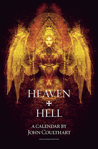
Unlike last year, this year’s CafePress calendar arrives on time, its creation being eased by the fact that it’s a reworking on an earlier version. The idea with the previous Heaven & Hell calendar had been to alternate various pieces of infernal Cradle of Filth artwork with contrasting imagery; as things turned out I had more offerings for Hell than for Heaven—no surprise there—so the reality wasn’t very satisfying.

This year I’ve managed to fill out the Heaven sequence with more recent works, all of which have been slightly adjusted to fit the square page ratio required by CafePress. So even though these are old pieces many of them are unique to this printing. Larger copies of the pages may be seen here while the CafePress purchase page is here. As always, my thanks to everyone who buys these things.

And as before, the calendars for previous years are now available all year round; see the full range here. Note that this means you need to select January as the starting month if you want the months to run for a single year only.

heavenhell01.jpg

JANUARY: Variation of the poster art for Angel Passage (2001) by Alan Moore & Tim Perkins.

Angel Passage was Alan and Tim’s album about the life and work of William Blake. I designed the CD, a poster, and also produced a video for the multi-media performance of the piece at the Purcell Room, London, in February 2001.

heavenhell02.jpg

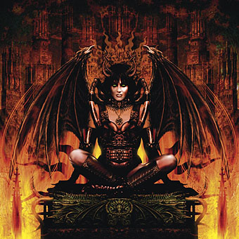
FEBRUARY: Cover for Bitter Suites To Succubi by Cradle of Filth (2001).

My first piece of Cradle of Filth art. I was a little surprised when working on this that they really did want the wings and horns; Dani loved that kind of imagery. I was even more surprised when this cover was subsequently showcased in an entire window in Tower Records’ main London shop in Piccadilly.

Continue reading “Heaven and Hell calendar”

More vapour trails

jeter.jpg

Those covers everyone likes. My designs for KW Jeter’s steampunk novels from Angry Robot and Tor Books.

When I wrote a brief history of steampunk for Eye magazine last year I ended by somewhat provocatively declaring that until something better appeared this was the defining aesthetic of the moment. A year later, the movement (if we can use that term) continues to evolve despite the steady drip of complaints that it’s all reactionary, historically illiterate, and so on. Much of the ire remains nonsensical, and often seems to boil down to a common disdain for people enjoying themselves in some unorthodox manner.

manual.jpg

Design by Galen Smith after the Hetzel editions of Jules Verne’s novels.

If I hadn’t got involved on the art side I would have found it difficult to avoid being attracted by steampunk in one form or another since so much of it originates in areas I was already interested in, not least HG Wells and Victorian science fiction. The rapid evolution of the past few years means we’re currently seeing an aesthetic leaving behind its origins to become an international subculture. What’s striking about this activity—and this is something that doesn’t seem to have been discussed very much—is the way the whole thing has been birthed by genre fiction rather than by pop music, as was the case for the second half of the 20th century. This piece is meant to be a news post, however, not another cultural critique, but if I happen to write any more on the subject there’s something there that’s worth exploring.

manual2.jpg

As to the news: this month finds my steampunk artwork manifesting in three very different locations in one of those odd coincidences of timing that occur now and then. First up there’s the Steampunk User’s Manual edited by Jeff VanderMeer & Desirina Boskovich, a follow-up to 2011’s Steampunk Bible. For the new volume I designed spreads for three entries by Jess Nevins from The Encyclopedia of Fantastic Victoriana: Alternative History Edition.

Continue reading “More vapour trails”

Athanasius Kircher’s Pan

kircher1.jpg

More from the Kircher archives at the University of Heidelberg. As before, it’s good to see illustrations familiar from countless reprintings in books in their place of origin. The volume in question is Obeliscus Pamphilius: hoc est, Interpretatio noua & Hucusque Intentata Obelisci Hieroglyphici (1650), one of Kircher’s attempts at deciphering the hieroglyphics on Egyptian obelisks. I’m still not sure how the Great God Pan fits into these speculations even as a diagrammatic figure, unless in this case it’s Pan as a representative of Nature as a whole.

Whatever the explanation, the Pan picture often turns up in occult anthologies although you’re as likely to see the copy from Manly P. Hall’s The Secret Teachings of All Ages (1928) as the original. Hall’s rendering is useful for the translation of the Latin although he also says it may represent the god Jupiter (?) and he censors the not-very-obtrusive penis, a rather fatuous bit of prudery for a book that’s supposedly concerned with universal truths.

A few more plates follow, one of which features a serpent I swiped several years ago for a Cradle of Filth T-shirt design.

kircher2.jpg

Continue reading “Athanasius Kircher’s Pan”

Melancholy Lucifers

feuchere.jpg

Satan (1833).

I always enjoy it when a search for a piece of information about an artist leads to works you hadn’t come across before. Today it was a quest for the identity of the Satan statue above, created, as it turns out, by French sculptor Jean-Jacques Feuchère (1807–1852). The Louvre site has another view of what seems to have been a popular work, produced in a range of bronzes.

lawh.jpg

I did actually know the artist’s name a few years ago since I’d used the statue as a starting point for the Satan figure on the cover of Cradle of Filth’s Lovecraft & Witch Hearts in 2002. One function of postings such as this is that it allows me to make a note of details which otherwise might flee the memory. Here Feuchère’s statue was combined with some squid tentacles and seated on an elaborate Gothic throne which is mostly obscured by the band’s name. (See a larger version sans lettering here.)

Continue reading “Melancholy Lucifers”

Design as virus 1: Victorian borders

bookplate.jpg

There’s nothing new about drawing attention to the viral nature of design, whether in the repeated use of motifs and styles or the way in which typefaces breed and proliferate; Jonathan Barnbrook alludes to this process directly by calling his font house Virus.

The plate above comes from a Victorian book I bought several years ago, The Pictorial Cabinet of Marvels, a reasonably lavish volume for children concerning places and things of interest around the world. Since I like playing with excessive Victorian flourishes now and then I’m always on the look out for new examples and the border here immediately caught my eye. I have a decent selection of clip art books from Dover and Pepin containing this kind of thing but nothing quite like this particular design. When I was putting the Damnation and A Day album together for Cradle of Filth I took one of the corner pieces as a starting point for a border design I used on the front and back of the booklet and the tray.

damncov.jpg

The poor old Xaverian Brothers of Manchester’s Catholic Collegiate Institute would no doubt be mortified to see part of their prize bookplate being used to decorate such a blasphemous artefact. The album was released by Sony Music in 2003 so this little border motif has travelled the world by now. I seem to recall sending the record company the border design separated from the artwork so they could make up some posters.

And so we come to what I’m assuming is its latest manifestation, a poster design for Manifest Destiny, a Los Angeles music event organised by Tee Pee Records.

tee-pee.jpg

I say “assuming” since I’ve no idea whether this example is from my design or not. But it seems a safe bet seeing as the original is from such an obscure source. Not that I mind if it is, of course. I can’t very well complain when I swiped the thing in the first place, now can I?

Update: Tee Pee designer Sarah MacKinnon writes to say her Victorian motif is from one of Dover’s clip art books. Now I know that I wouldn’t mind finding the book for my own collection. This makes the occurrence of the original more unusual, at least from my point of view, since it’s the only time I’ve spotted one of these reprinted elements in its period setting.

Previously on { feuilleton }
Masonic fonts and the designer’s dark materials