The art of Takato Yamamoto

yamamoto1.jpg

Takato Yamamoto was born in Akita prefecture (Japan) in 1960. After graduating from the painting department of the Tokyo Zokei University, he experimented with the Ukiyo-e Pop style. He further refined and developed that style to create his “Heisei Esthiticism” style. His first exhibition was held in Tokyo, in 1998.

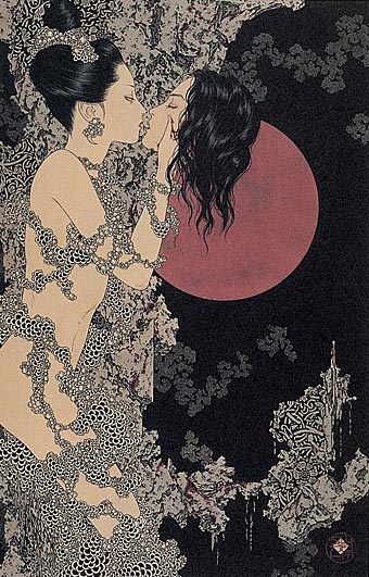
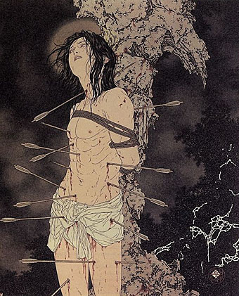
There’s much that’s superficially familiar in Takato Yamamoto’s art—“Boy’s Love” tableaux with fey young men in various states of undress mooning over each other, then the perennial Japanese obsession with naked women bound by ropes. But closer examination reveals a degree of finesse and imagination that elevates his work away from the porn ghetto into the rarified realm of Decadence (as if those favourite Symbolist themes of Saint Sebastian [above] and Salomé [below] weren’t enough of a clue). For a start the drawing style is a great amalgam of influences from Beardsley through to Harry Clarke by way of the finest Edwardian pornographer, Franz von Bayros. Then there’s the curious details of severed heads, claws, sundry bones and eyeballs which decorate the otherwise florid arrangements supporting the figures. So far there don’t appear to have been any books of Takato Yamamoto’s work produced in the west and it’s possible that the sexual content and grotesquery limits that possibility. But you can some galleries here, here and here. His official site is mostly Japanese and has to be navigated from an interior page since there seems to be a file missing from the index.

yamamoto2.jpg

Continue reading “The art of Takato Yamamoto”

The Séance at Hobs Lane

seance.jpg

Séance, 2001 version.

Drew Mulholland, aka Mount Vernon Arts Lab (also Mount Vernon Astral Temple and Black Noise…), has joined forces recently with the masterful Ghost Box collective, purveyors of finely-crafted and frequently creepy electronica. MVAL’s 2001 release, The Séance at Hobs Lane, is now Ghost Box release no. 9 and comes repackaged in their Pelican Books-derived livery. Inspired by (among other things) Quatermass and the Pit, Séance makes a good companion to the creepiest of the Ghost Box releases to date, Ouroborindra by Eric Zann. Further points us to Mark Pilkington’s 2001 interview with MVAL for Fortean Times.

Previously on { feuilleton }
Exuma: Obeah men and the voodoo groove
New Delia Derbyshire
The man who saw tomorrow
A playlist for Halloween
Ghost Box

New things for June II

chaoticum.jpg

Work on two very different CDs was completed this month, a pair of releases so different they’re almost polar opposites. Chaoticum describe their music as “art for your ears” and the label for this album is HORUS CyclicDaemon, producers of the Aleister Crowley anthology I designed in 2005. The package is a digipak and will include a poster which features one of my Great Old Ones portraits.

eskiboy.jpg

Eskiboy is UK Grime artist Wiley who’s proved himself notable enough to be featured on the cover of last month’s Wire magazine. This compilation was a commission from Baked Goods in Manchester. I was trying to avoid the obvious tunnel image at first but the label was keen to see something along those lines so this is the result of the usual to-ing and fro-ing which design work often entails.

Meanwhile the CD I designed earlier this year for Turisas is now in the shops and the band is interviewed in this month’s Metal Hammer. I’ll be putting the full artwork for all these releases onto the site over the next week or so.

Friendly Fire: Jonathan Barnbrook

barnbrook.jpg

The Barnbrook Bible, out in September.

Jonathan Barnbrook at the Design Museum, 19 June–10 October 2007.

Jonathan Barnbrook has emerged in the past two decades as one of the UK’s most consistently innovative graphic designers. Pioneering graphic design with a social conscience, Barnbrook makes powerful statements about corporate culture, consumerism, war and international politics. Through his work in both commercial and non-commercial spheres he combines wit, political savvy and bitter irony in equal measures.

Friendly Fire traces Barnbrook’s career from early experiments in pure typography and pioneering motion graphics in the early 1990s, to recent work, including his latest projects with collaborators such as the anti-corporate collective Adbusters. Drawn from the designer’s own archive, the work represented will span the wide range of disciplines in which the Barnbrook studio work, including one of their most pioneering areas—typeface design.

Previously on { feuilleton }
Jonathan Barnbrook interviewed