
Personal web data to be stored for a year | A policeman’s job is only easy in a police state. Time for everyone to start using Tor.
Category: {technology}
Technology
Susan Kare
![]()
A post for Ada Lovelace Day, “an international day of blogging to draw attention to women excelling in technology.”
Susan Kare was, and still is, a graphic designer specialising in user interface graphics. Facebook users may recognise her gift icons but her earlier work is even more familiar to Macintosh users since it was her job at Apple in 1983 to design the icons for the first Macintosh interface. Many of the original black & white images have been phased out or replaced by higher-resolution equivalents but some still remain, in particular the pointing hand, the stopwatch (which became an hourglass in Windows) and the Command symbol which was based on a map icon for Swedish camping grounds. She also designed some of the fonts used by the first Mac OS including Geneva—still a web standard—and Chicago which was the primary Mac font for many years. In a field overly-dominated by men, her work lies at the heart of technology we’re using today, right down to the Mac keyboard on which I type these words.
Previously on { feuilleton }
• Folder icons
Steampunk framed

Dana Mattocks wrote to me a month or so ago asking if he could have a print of my Steampunk picture to go in a frame on the wall beside his jaw-dropping Steampunk Frankenstein case-mod. I immediately agreed after seeing his photos. A single picture doesn’t do justice to the amount of work and detailing that’s gone into this project which makes most other steampunk craftings look distinctly lacklustre. See his Flickr pictures for a better look at its wood-and-brass lusciousness. What I didn’t expect was that the frame would be an equally impressive heavy-duty item. And I’m especially pleased to see the picture in there along with Colin Clive and Boris Karloff from the first Universal Frankenstein films. Thanks Dana!

I’ve been working on an updated version of the Steampunk pic for something special which I’ll announce here shortly. Meanwhile, if anyone else has one of my pictures in an impressive frame, send me a photo and I’ll feature it here.
Previously on { feuilleton }
• Steampunk Horror Shortcuts
• Zeppelin vs. Pterodactyls
Designing Booklife
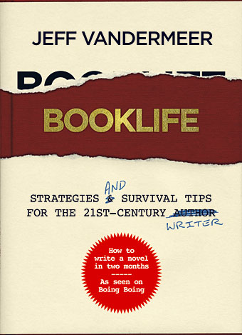
I created a cover design recently for Jeff VanderMeer‘s new novel, Finch, and shortly after completing that Jeff asked if I could put together some cover ideas for his forthcoming writer’s guide, Booklife, which Tachyon will be publishing later this year. Jeff is known as a fantasy writer but this book was intended to have a general appeal for any would-be or working writer. It also needed to look suitably contemporary and (possibly) reflect the discussion within which concerns the modern writer’s use of computers, the internet and social networks. Lastly, several lines of text needed to be placed on the cover without it looking confused or messy.
I agreed to this whilst busy with several other projects so the initial drafts were rather haphazard. (That’s my excuse, anyway.) The first version (above) came out of an idea to apply a kind of trompe l’oeil effect to the cover with a torn dustjacket and handwritten amendments. The red call-out/roundel highlights an important sub-section of the book. This was knocked up very quickly and, as well as not looking very contemporary, the title doesn’t look enough like gold blocking to be convincing. Jeff requested something more up-to-date.
New things for February

More new work appeared recently although as usual this was something I completed a while ago. Einstein’s Getaway is a short album by Stranger Son of WB who play a kind of over-amped muscular harangue which you might call Post Rock if that wasn’t a very tired term by now. Mr Simon Reyonolds should give them a listen. Heavily rhythmic and bass-driven, this is as much Post Punk as anything, bringing to mind bands such as This Heat, The Pop Group and (in the vocal department especially) The Fall. I was responsible for the design of this release only, not the avocado suite backdrops, and you can see the rest of the layout here. This is one of the first releases on a new label, White Box, and I’ve already designed the next release in the catalogue.
 Meanwhile, those of you addicted to mobile phones may like to know that {feuilleton} is now available via a mobile RSS feed. There’s a permalink at the top of the third column on this page although if you arrived here using a mobile network there’s a new WordPress plugin running which converts the site to a mobile feed automatically. I don’t browse the web with my phone very much since its capabilities are so limited it’s hardly worth bothering but this page does at least load the posts now without breaking. Not all of them work, however, since the images are far too big. WP creates thumbnails for each uploaded image so I imagine there’s some way of tweaking the feed to deliver thumbnails. iPhone users shouldn’t have any problem and the optimiser creates a feed just for them. Those of us who remain iPhone-less can experience a vicarious thrill here.