
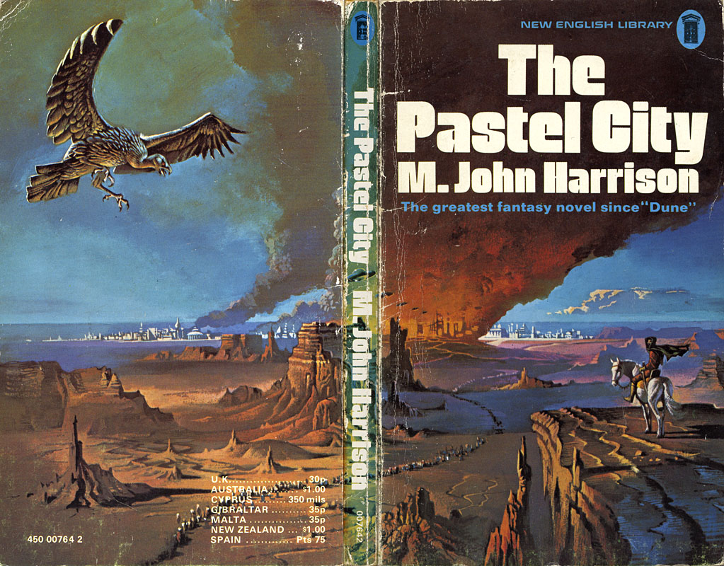
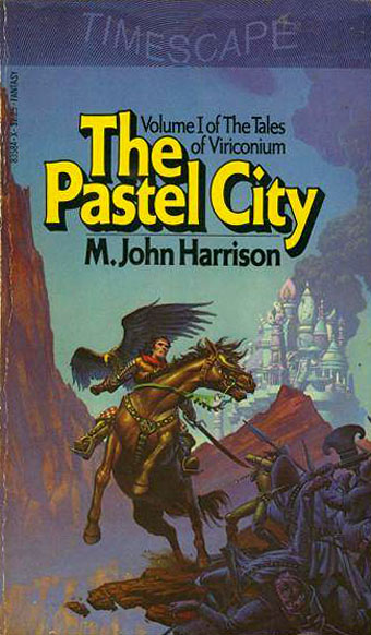
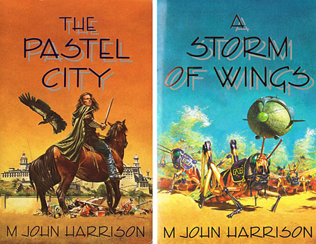
The Pastel City (New English Library, 1971). Illustration by Bruce Pennington.
There are writers’ writers, of course, and M. John Harrison is one of those. He moves elegantly, passionately, from genre to genre, his prose lucent and wise, his stories published as sf or as fantasy, as horror or as mainstream fiction. […] His prose is deceptively simple, each word considered and placed where it can sink deepest and do the most damage.
Neil Gaiman in the introduction to the Bantam/Spectra edition of Viriconium (2005)
This is a lengthy post of potentially minority interest for which I make no apologies. It’s often been a function of the writing here to think aloud while communicating an enthusiasm; as enthusiasms go this one runs deeper than usual. I love these books indecently. If they were people I’d want to sleep with them even though doing so might mean contracting some debilitating illness. When you’re employed as a book designer and illustrator it’s impossible to avoid taking a professional interest in the packaging of your favourite books. M. John Harrison‘s Viriconium books—three novels and a collection of short stories—present challenges that the illustrators and art directors of the past have invariably failed to meet. This post looks at prior cover designs while a subsequent post will suggest some solutions to the challenges. But first it’s necessary to say something about Viriconium itself.
In the distant future of the Earth, when the human race has flourished then lapsed into a state of terminal decay, only one city of note remains: Viriconium, the Pastel City, surrounded by the wastes and fens of a ruined world. Or so we’re told in the first book of a series which begins as outright fantasy and moves by an astonishing feat of authorial dexterity closer to our world and our time. (A shorthand description might describe a series that starts out reading like Jack Vance and ends up closer to Bruno Schulz.) It becomes apparent that Viriconium stands for all the cities that have ever been, and with its avenues, rues and strasses often seems to be a composite of them all. Aside from the unspecified future its fixture in time is indeterminate: one story may concern events which are in the distant past of another while the streets and quarters never remain anchored enough for any kind of map to be drawn. Areas of continuity rise like towers from a sea of vapour. Even the city’s name slips its mooring: the origin is Viroconium Cornoviorum, a Roman town in Shropshire, and Viroconium, a poem by Mary Webb. In the later books we’re told the city is also called Uriconium or Vriko but whether these variants lie in the past or future of Viriconium is unclear. The indeterminacy was deliberate, a riposte to what Harrison calls “fauxthenticity”, and the tendency of genre readers to reduce the subtleties of fiction to the schematics of role-playing games, spaceship diagrams and books with titles like The Science of Middle-Earth. It’s this indeterminacy and a refusal to offer neat resolutions (or that awful term “closure”) that no doubt explains why Harrison’s books often seem to attract more praise than actual readers.
The most remarkable aspect of the books presents the greatest problems in design terms. In the fourteen years that Harrison worked on his series he used its mutable qualities to pull the entire project to pieces without actually destroying it or turning the whole thing into a self-regarding postmodern game. The early books critique the lazy assumptions of the fantasy genre while the later books recast the earlier stories as myths or half-remembered dreams. The first two books may use the apparatus of the fantasy genre but that doesn’t mean the tired imagery of fantasy illustration necessarily suits their covers. The very last story, A Young Man’s Journey to Viriconium, is set in the north of England in our own time. Changing the name Viriconium to London throughout the text, which Harrison has done when the story has been published elsewhere, dissolves the remaining genre trappings. The process is akin to watching those Buddhist monks who construct elaborate mandalas of coloured sand only to sweep them away when the work is finished. All this makes the Viriconium books unique, it’s one of many reasons why I hold them in such high regard and it’s also why they frequently irritate those who want simpler fare. The problem of appealing to a reactionary readership may explain why many of the following covers have failed to honour the content of the books.
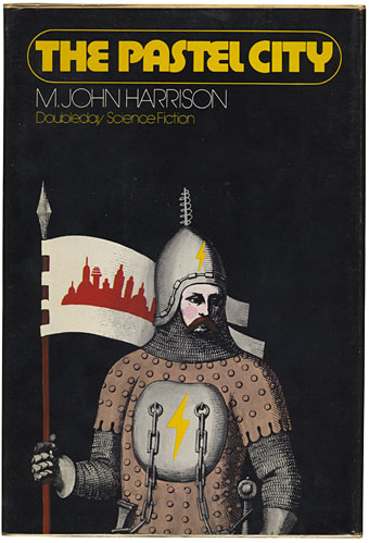
The Pastel City (Doubleday, 1972) Illustration by Wendell Minor.
Dustjacket summaries do none of the books any favours but for the unacquainted they help give a flavour of each volume. They also show how the presentation gradually shifts emphasis. Here’s the Doubleday edition:
An intriguing fantasy in which past and future blend uniquely on an Earth far different from any known to man.
There, in the Empire of Viriconium, a world of chivalry, of magic and strange powers, two Queens clash in bloody warfare for control of the Pastel City and all of its domains. The armies of the defender, Queen Methvet, are led by Lord tegeus-Cromis and the rest of a legendary band of knights, while their attackers are the vicious and cunning Northmen who serve the rival Queen Moidart.
More is involved than a struggle for a throne however, for in their lust for victory the forces of Queen Moidart have unleashed creatures from Earth’s dim past whose terrible potential they little realize until too late. And as Lord Cromis and the rest of his band seek to meet the challenge of these nightmare apparitions, their quest leads them on a perilous journey across many weird lands to a deadly climax in a buried city where a solution is revealed that is as old as time itself.
It’s apposite that a series about an indeterminate city begins with some confusion evident from the outset. The Pastel City in its first UK printing was described on the cover as a fantasy yet compared to Dune which is generally regarded as science fiction; the Doubleday edition is labelled science fiction yet the cover illustration shows a mailed and armoured warrior; the narrative is situated somewhere between the genres in what used to be called science fantasy. While the story concerns the distant future many of the props are the familiar material of heroic fantasy: horses, swords, feuding queens, an axe-wielding dwarf. What technology remains is either defunct or barely functioning. The ruin and decay of Harrison’s world is part of the pleasure, as is the vacillating and ambivalent nature of the characters, a quality which increases as the series develops. None of the publishers dare to reflect this ambivalence in the cover art. Unaware readers would be led to believe from subsequent editions that these books contain the determined and super-efficient heroes they’d find in other books. Compared to what follows the first two covers aren’t so bad; Bruce Pennington gives us one of his flying saucer apocalypses while Wendell Minor’s avoidance of a genre scene is an approach that might have been deployed a lot more often later on.
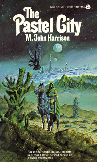
The Pastel City (Avon, 1974). Illustration by Gray Morrow.
Instead of which you get literal depictions like this. Gray Morrow’s painting isn’t very far removed from Pennington’s but overplays the sf angle with its stereotypical futuristic metropolis. Readers would also have been surprised to find that the book lacks “gallant knights” and—if those are supposed to be two moons in the sky—is resolutely earthbound.
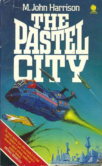
The Pastel City (Sphere, 1978). Illustration by Angus McKie.
At least Morrow’s cover was making an attempt, however slight. This Sphere edition exemplifies everything that was wrong with British sf paperbacks in the 1970s when Chris Foss-style spacecraft were dumped onto covers regardless of the contents. (Even Ballard wasn’t immune.) Angus McKie isn’t to blame for this cover, the fault lay with lazy (or cynical) art directors.
The Pastel City (Timescape/Pocket, 1981). Illustration by Michael Whelan.
The horseman, the metal bird and the imperilled city return. Michael Whelan has dominated genre illustration for several decades but the three covers he produced for the Pocket editions of the Viriconium books were an example of a good artist assigned the wrong material. Harrison was writing in opposition to books that present themselves in this fashion; publishers either ignored this or couldn’t be bothered finding a more suitable way to sell them.
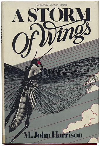
A Storm of Wings (Doubleday, 1980). Illustration by Design Works.
From the Doubleday dustjacket:
A Storm of Wings continues the Viriconium Sequence begun in The Pastel City. It takes place in the far distant future in a post-holocaust world of fantasy, figures: alchemist dwarves, starship captains, and resurrected humans called Reborn Men. But their highly developed civilization is threatened by an invasion from deep space.
The invaders—the storm of wings of the title—are giant locusts swarming through the galaxy leaving destruction and death in their wake. In their path lie Earth and Viriconium.
During the battle to defeat this deadly plague, a cosmic force is released whose effect is to give some of the defenders a kind of second sight, the ability to see behind the surface world of appearances to the underlying reality. But can they see far enough…?
This is still my favourite book in the series, in part because it’s caught in a kind of quantum superposition between the fantasy superstructure of The Pastel City and the nebulous tone of In Viriconium where the overt genre elements are fading into the background. A Storm of Wings is fantastically well-written, the quality of its prose puts great swathes of contemporary fiction of any stripe to shame, never mind the multi-volume Tolkien clones that fall like garish breeze blocks year after year. A shame, then, that the covers of the first editions couldn’t have been better. The Doubleday design is lacklustre, doing nothing to convey the richness of the writing or the baroque weirdness of the narrative.
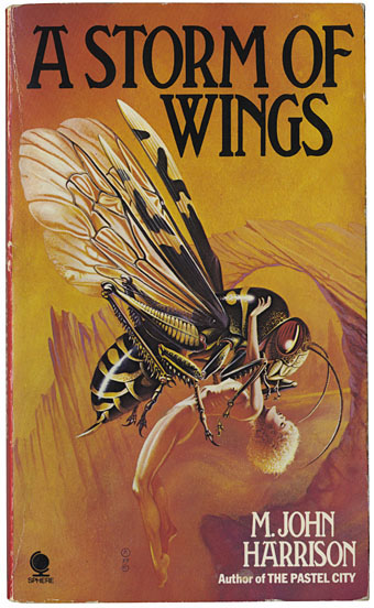
A Storm of Wings (Sphere, 1980). Illustration by Chris Achilleos.
As for Chris Achilleos, he should probably be congratulated for finding the one passage in the entire novel that could give him an opportunity, however tenuous, to paint a ravished woman. In the scene in question the woman is clothed and the whole passage describes a very different event (italics as printed):
The violation, if there was one, was hieratic, notional. Fay Glass lay like a corpse. The creature crouched over her. It resembled no insect Hornwrack had ever seen but was rather a composite of all insects. From its segmented thorax, which was of a curious smoky yellow colour and as shiny as lacquered bamboo, sprang the veiny wings of the ichneumon fly, the wedge-shaped mask of the common wasp, the mysterious upcurved abdomen of the mantis like a symbol from a forbidden language. Its eyes were lit from within, or seemed to be. They were pale green, and streaked with orange. A mass of palps and maxillae hung beneath its head, clattering spasmodically. He thought of the wasteland grasshopper with its serrated legs and arid stridulations. He thought of flight through vast abandoned regions, and the world he knew fell away from him so suddenly that he was sick. When he could see again, the madwoman had come back to life.
Nah, forget the fancy prose, give the punters some wasp sex… The Doubleday edition is dedicated to Harlan Ellison while the Wasp Sex edition is dedicated to my colleagues at Savoy Books, David Britton and Michael Butterworth.
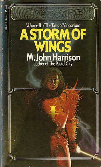
A Storm of Wings (Timescape/Pocket, 1982). Michael Whelan.
The best of the three Whelan covers, a portrait of Alstath Fulthor in his glowing armour. It might be a typical fantasy image but the pose isn’t “heroic” while the face reflects a common state of affairs in Harrison’s fiction where best lack all conviction.
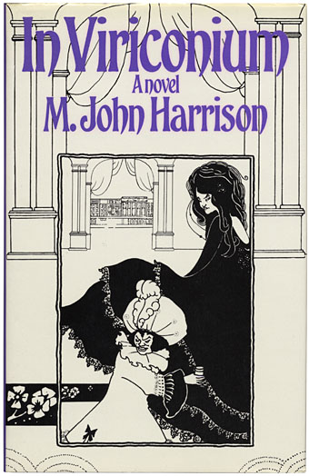
In Viriconium (Gollancz, 1982). Illustration by Aubrey Beardsley.
Viriconium is a city of the imagination: a place of decadent, genteel elegance and shabby poverty which is at once no city and all cities. In this accomplished novel, Viriconium has fallen under a spell, a paralysis of will, symbolised by the mysterious and debilitating plague which is gradually enveloping it. Its gods, incarnated in the absurd shape of the Barley brothers, spend their time rolling drunkenly in gutters and falling in canals; its police, marshalled by the mercurial and sinister dwarf The Grand Cairo, operate an ineffective quarantine.
The story concerns the efforts of one artist, Ashlyme, to rescue another-the frail, consumptive, dying Audsley King from the plague zone. It is a desperate, misconceived enterprise, which draws him into unwilling alliance with The Grand Cairo, and which goes bizarrely wrong. Yet out of the shambles comes the key to lifting the plague.
In Viriconium is a novel of many resonances, from Beardsley and post-Impressionist art to Peake and Wyndham Lewis. Yet the result is wholly original: an imaginative, grotesque, comic novel which should establish M. John Harrison as one of our most stylish fantasists.
Regular readers may be surprised to hear that I don’t find the choice of this Beardsley composite to be ideal. The name of artist Audsley King may have inspired the choice but the descriptions of her paintings are closer to the work of Egon Schiele than Beardsley, and I think Harrison may have said once that he would have preferred a Schiele drawing on the cover. Beardsley’s spaces are too neat and clean to represent a run-down city of decayed observatories and “cat-infested towers”. But the non-generic presentation may have helped when it came to appraisal by the literary world: the novel was runner-up for the Guardian Fiction Prize in 1982.
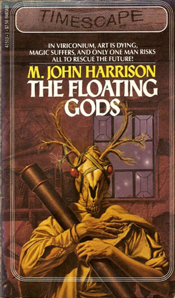
The Floating Gods (Timescape/Pocket, 1983). Illustration by Michael Whelan.
The last of the three Whelan covers, this is actually In Viriconium under a different title. Whelan’s painting of astronomer Emmett Buffo in his horse skull mask can’t be faulted technically but doesn’t convey the inherent absurdity of the scene it depicts. For such a subtle novel I find the change of title and strapline insulting but it’s useful for showing how badly the genre publishers used to treat their writers. A perennial complaint among fantasy and sf readers is that they’re never taken seriously by the big, bad literary world. “We have great writers,” they say, “we can match anything they do!” The validity of that argument is undermined when you see something like this. The horse skull is the most notable thing here, a sinister presence that appears in subsequent short stories and to great effect in Harrison’s science fiction novel, Light (1999).
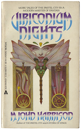
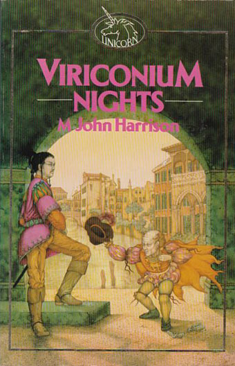
Viriconium Nights (Ace, 1984). Illustration by Robert Gould.
This is an odd collection but an essential one for Viriconium collectors since it contains stories that are omitted from later collections. In addition to two of the earliest Viriconium pieces, Lamia Mutable and Events Witnessed from a City, there’s the original version of The Lamia and Lord Cromis and also In Viriconium condensed to a 55-page novella. Robert Gould’s illustration isn’t too bad for a symbolic design.
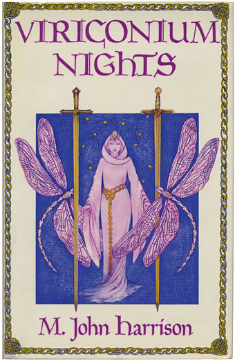
Viriconium Nights (Gollancz, 1985). Illustration by Bregitta Booth.
M. John Harrison’s In Viriconium was runner-up for the 1982 Guardian Fiction Prize, and was praised by the reviewers as one of the most original and distinctive fantasies of recent years. “A witty and truly imaginative writer … a delightful comic fantasy,” said Literary Review; “always elegant … a singular stylist,” wrote the Times Literary Supplement. This new collection of stories returns us to the strange, haunting, mutable world of Viriconium and its citizens.
Viriconium is a city of the imagination, a place in which the familiar and the utterly strange mingle together. Everything in Viriconium is subject to change, even its name: in one story it is Vriko; in another Uroconium. Sometimes its inhabitants’ pursuits are relatively conventional, as in The Lamia and Lord Cromis, where a hero must fulfil his destiny by destroying a Beast, re-enacting a conflict a hundred generations old. Other tales—such as Strange Great Sins, in which a sin-eater must lift the burden of sin from a dead girl’s soul—create their own, wholly original world. M. John Harrison is a writer of resonant and individual imagination, whose stories, written in prose of unusual beauty and precision, offer unique pleasures.
Almost the same elements as the Gould cover: a woman, a pair of swords, insects…yet this is another case of the wrong choice of artist. Bregitta Booth is obviously ideal for lighter fantasy but not for the flint-edged stories in this superb collection. The version of The Lamia and Lord Cromis is the rewritten (and superior) version, and there’s also The Dancer from the Dance which (perhaps) takes the three characters from Lamia Mutable and re-examines them in the context of the later fiction.
Viriconium Nights (Unwin, 1985). Illustration by Linda Garland.
Unwin reprinted the books during the 1980s with covers harking back to the iniquities of the 1970s. Linda Garland here seems to be illustrating a different book entirely.
The Pastel City (Unwin, 1987). Illustration by Kevin Tweddel.
Kevin Tweddel’s paintings were a final attempt by British publishers to go the literal-depiction route. That overbearing typeface is called Enviro and first appeared in 1982. Five years later it might have still looked new but it really doesn’t work.
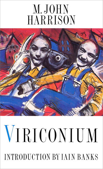
Viriconium (Unwin, 1988). Illustration by Ian Miller.
Enter Mr Miller, and not a moment too soon. Ian Miller also provided an illustration for a Harrison short story collection, The Ice Monkey, in the same year. This volume collects In Viriconium and Viriconium Nights, and the combination of Miller’s suitably crude drawing of the Barley Brothers with an introduction by Iain Banks is evidence at last of a publisher aiming the books away from the fantasy clichés. The summary on the back is entirely accurate but shows how far the author had travelled from the initial bending of the rules in The Pastel City:
The light in Viriconium is the light you see only on record covers and in the colour supplements. You can’t just fly there: neither can you avoid Viriconium. It is all around us: one city, it is all cities, from the Plaza of Unrealised Time to the shopping arcades of Huddersfield.
Political apathy has engulfed the Low City. Its streets are full of illness and poverty. The High City cares nothing for the plague, but continues to indulge its taste for trivia. The Barley Brothers (Gods of the City) roll drunkenly in gutters, inventing wellington boots and Egg Foo Yung.
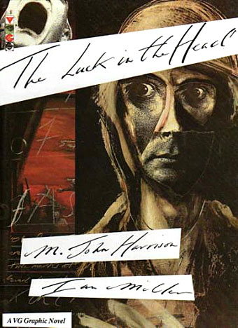
The Luck in the Head (Gollancz, 1991). Written by M. John Harrison, illustrated Ian Miller
Miller’s cover for the Unwin anthology wasn’t one of his best but he made up for that with The Luck in the Head, a 78-page collaboration with Harrison in which the pair rework into graphic form one of the stories from Viriconium Nights. Miller and Harrison are such a good match you have to wonder why no one had tried bringing them together before. Unlike the over-literal fantasists Miller can vary his style from tight and meticulous ink renderings to loosely expressive paint and collage. Some of the wordless comic strips in his Green Dog Trumpet book read like Viriconium avant la lettre with their flair for the grotesque and their ability to grade from black comedy to outright horror. Harrison thinks enough of this book to list it as a standalone work in his recent publications.
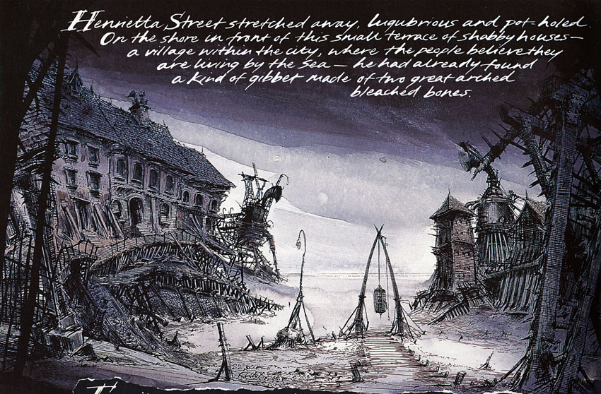
The Luck in the Head: Gollancz at the time was based at 14 Henrietta Street, London.
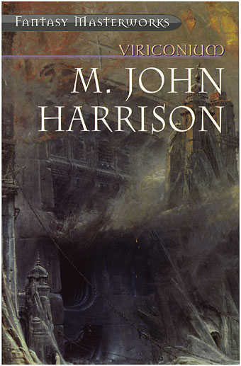
Viriconium (Millennium/Gollancz, 2000). Illustration by Albert Goodwin.
Millennium’s Fantasy Masterworks made Viriconium the seventh volume in a series it called the “most influential fantasy ever written”. This was the first time all three novels and Viriconium Nights had been gathered together, and it sets the template for future editions. Harrison says the books and stories can be arranged in any order so long as A Young Man’s Journey to Viriconium always comes at the end. For illustrations the Masterworks covers used fantasy art or (as is the case here) 19th-century painting. Albert Goodwin (1845–1932, misspelled “Godwin” on the cover) was a British landscape artist who occasionally let his imagination loose in works such as this, The Gates of the Inferno, a painting that’s remarkably similar to some of Wayne Barlowe’s infernal depictions. The scale seems too monumental and the ambience too mephitic for the Pastel City but it’s an improvement on many of the previous attempts.
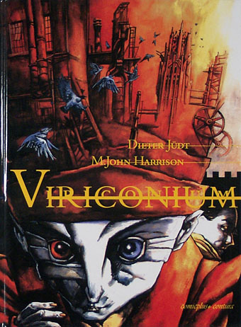
Viriconium (Comicplus+, 2000). Adapted and illustrated by Dieter Jüdt.
Dieter Jüdt’s book is a comics adaptation of In Viriconium which I’ve not read but the publisher’s site has a sample page here.
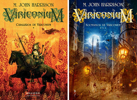
Caballeros de Viriconium, Nocturnos de Viriconium (Bibliópolis, 2004–2005). Design by Alberto Cairo, illustration by Alejandro Terán.
This post mostly concerns the UK & US editions but two recent translations are worth noting. Spanish publisher Bibliópolis produced this three-volume set with covers aimed at the fantasy reader that don’t insult the books. The design is good and Alejandro Terán’s paintings manage to be evocative without being overly specific.
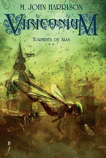
Tormenta de alas (Bibliópolis, 2005).
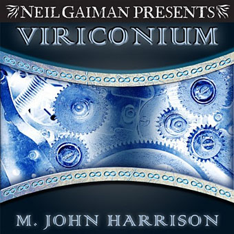
Viriconium (Bantam Spectra, 2005). Design by Karin Batten, illustration by Jamie S. Warren Youll.
Compared to the Bibliópolis edition this US omnibus looks (intentionally?) confused. 2005 is almost the last year you could fill a book cover with tarnished gears without everyone thinking it was a steampunk story, while the uncial typeface is the kind of thing that’s usually applied to medieval fantasy. And is that supposed to be one of Cellur’s mechanical birds? If so, why is it hatching from an egg?
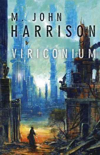
Viriconium ( Laser-books, 2011). Illustration by Edward Miller
Another translated collection, this Czech edition has a great painting by Edward Miller (aka Les Edwards). As with Alejandro Terán’s covers it’s the work of someone who looks like they’ve actually read the book; both artists show a direction for others to follow in the future.
Viriconium ( Audible Audio Edition, 2011). Designer unknown.
For the sake of completeness it’s worth mentioning this audiobook which is currently the most recent manifestation of Viriconium. Simon Vance spends twenty hours reading the entire omnibus unabridged. The cover isn’t much to write home about but then audiobook covers have often been rather perfunctory.
It should be evident that things have improved in the forty years since The Pastel City first appeared. There’s still room for improvement, however, so tomorrow I’ll be pointing the way down some unexplored avenues. You’ll find me waiting in the Bistro Californium. See you there.
Elsewhere on { feuilleton }
• The book covers archive
Previously on { feuilleton }
• The fantastic and apocalyptic art of Bruce Pennington
• The art of Ian Miller
• Giant mantis invades Prague
• Nova Swing
Great to have such a comprehensive analysis. Fascinating to see the many approaches, and salutary to realise how tenuous the links occasionally are between what appears on the cover and the content. When I made a cover for Marly Yeoman’s novella Val/Orson a few years ago, I read the book three times and made extensive notes before attempting any artwork, by which time it was dawning on me just how difficult it would be to make any kind of a living producing cover artwork unless I got seriously faster not just at painting, but at reading too!
Excellent! That was an outstanding post on an outstanding series of books by an outstanding writer. Harrison is far too good at what he does, and I think his stories often defy description – they are neither one thing, nor the other, and are utterly original. They’re like the literary equivalent of Swordfishtrombones or Trout Mask Replica – you love them but sometimes you have no idea why!
Everyone talks about these “multi-volume Tolkien clones that fall like breeze blocks year after year”–but where are they? I could happily read something new in the Professor’s vein on occasion. Most of the fantasy novels I see on Amazon or in book shops are manifestly nothing like Tolkien and aren’t even trying to be. Even Terry Brooks seems to have found his own voice now. I think this is a pervasive cliche that no longer bears on reality, but keeps getting thrown into conversations and passed back and forth.
And if it were true, I think it would be no bad thing. There’s a place for the literary equivalent of the tribute band. But that may be just me.
The Pennington cover induced me to buy Pastel City when it came out, but so far has not helped me to make it past the first chapter.
I wonder if you think there should be a difference between e-book and pb print covers (or maybe I should say, between e-book images & pb covers) – and if so, what & why.
This is excellent. And now I have to find Lamia Mutable and Events Witnessed from a City.
Brendan:
Both Lamia Mutable and Events Witnessed from a City are in Harrison’s first short story collection The Machine In Shaft Ten. It should be easy to find on the second-hand market.
For Lamia Mutable and Events Witnessed from a City, it might make more sense to get the US version of Viriconium Nights and get the condensed In Viriconium.as well. Mr Harrison says something about the relationship between the shorter and the longer versions in the interview Old, Mean and Misanthropic, which closes Parietal Games.
Robin & philiph35: thanks very much. will get on that presently.
Clive: I often get a brief from the publisher which helps, especially if they’re specific as to what they want to see. Anything that narrows down the huge range of options is good.
Zander: I’ve never had much time for tribute bands so I’m the wrong person to ask.
Lee: At the moment I’m still designing for print first and don’t get asked to do anything for ebooks as such. I don’t have a Kindle or iPad so I can’t compare real and virtual editions very easily. I do, however, try and bear in mind that covers today will most likely be encountered first as a tiny thumbnail on a web page or connected device. Ideally you want a design that works to some degree at a small as well as a large size.
Brendan: Lamia Mutable was in Again Dangerous Visions originally, a book that might be easier to trace. It’s quite different to what follows, more New Worlds-style sf than something that would fit with Viriconium Nights.
Sprachense deutsch???
http://www.comicplus.de/viriconium.html
@Gabriel, thanks for the link. Jüdt does interesting work! (Und ja, ich spreche Deutsch.)
An entertaining tour of (mis)representations! However, while Linda Garland’s cover for V. Nights may not hit the mark, I thought her cover for In Viriconium was quite good. Shame I can’t rustle up a good reproduction of it on line, but it gets the Bewley, er, Barley Bros. dissolution and the eeriness of the masks.
A great piece on the MJH covers. I’d like to see you extend to covering the jackets for the (non-Viriconium) novels such as the extraordinary Dave McKean jackets for the British editions of COURSE OF THE HEART and SINGS OF LIFE. BTW, the Ian Miller art for THE ICE MONKEY only featured on the Unwin pbk; the ast edition hc had a piece by Eddie Gornall depicting (fairly literally) a monkey made of ice. I actually love the Kevin Tweddel covers, but I think the recent European ones are far more on the money as to representing the ambience of the stories.
I collect Harrison’s works in all editions (don’t have a 1st of THE PASTEL CITY yet though), so I have nearly all the different covers. The uncredited art of the paperback omnibus ANIMA (which collects COURSE OF THE HEART AND SIGN OF LIFE) is also quite nice and a bit McKean-ish though I suspect it’s merely an inhouse copyist.
Hi Leigh. I wanted to stick with the Viriconium books in part because they’re cult titles of mine but also because the often poor presentation made for a post that allowed discussion of past book cover design, the pro and cons of illustrating works resistant to easy representation, and so on. Consequently, Harrison’s other books are less attractive at least where discussion of cover design is concerned. There’s little to be said about Dave McKean’s covers, for example, because he’s an intelligent designer who did a great job. All you can do is approve of his work which doesn’t necessarily make for an interesting post.
The other fundamental point is that posts such as this which are lengthy and detailed take me a long time to write. This one took about six months to finish: collating information and searching for covers, thinking about the subject then finding the spare time between everything else I’m doing to write it and the follow-up which needed to be posted immediately after. If I had more free time I might do more along these lines but I also have personal projects taking up what spare time is left each day.