
Lord Horror (after Klaus Barthelmess).
(No, not Pete Murphy and co.) Now that the Reverbstorm book is at the printers I have an excuse to discuss a few of the art and design appropriations that run through the narrative. I wanted to use some Bauhaus-style design back in the early 1990s when we were putting the first of the comic issues together but that idea got buried under conflicting demands and the need to actually finish all the drawing. It was only when I started designing the opening pages in 2008 that I was able to return to some of the original intentions. There were two reasons for this choice: one was that the minimalist graphics of the Bauhaus style worked well in black-and-white, and also provided an effective counterpoint to the very dense and detailed drawings that followed. The second was that the Bauhaus design school found itself in the early 1930s in opposition to the fascist forces which the figure of Lord Horror represents. (Many of the Bauhaus architects and designers eventually fled Germany for Britain and the United States.) This combination of antagonistic elements yielded another of Reverbstorm‘s collisions of counterposed philosophies and aesthetics.
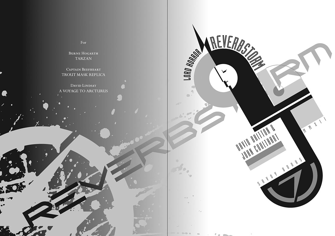
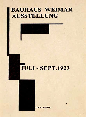
Reverbstorm title page.
The title page is the most flagrant Bauhaus appropriation, a swipe worthy of Peter Saville at his plundering height. Joost Schmidt’s famous Bauhaus-Ausstellung poster is reworked with a Neville Brody typeface (Industria) and with Oskar Schlemmer’s face logo turned into a scowling profile.
On a typographic note, Industria was used right from the start with Reverbstorm since Brody designed it in the Thatcherite 1980s as a deliberate harking back to the authoritarian 1930s. It also has a very appropriate name. The other typefaces used in the book—Morris Fuller Benton’s Empire and Eric Gill’s Perpetua—date from 1937 and 1928 respectively.
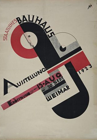
Joost Schmidt (1923).
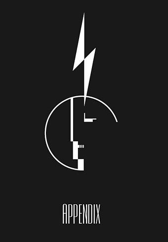
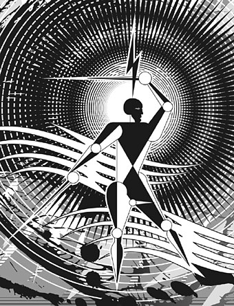
The reworked Oskar Schlemmer face/logo as it appears on the Appendix page. The lightning flash in Reverbstorm has multiple associations: adapted initially from the symbol used by Oswald Mosley’s British Union of Fascists (a symbol also appropriated at various times by David Bowie and Throbbing Gristle) it can also relate to storms, radio broadcasts and electricity in general. Here it becomes a minimal cipher representing Horror’s outrageous plume of hair.
Oskar Schlemmer (1923).
Reverbstorm, part 8.
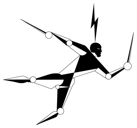
In part 8 of Reverbstorm Horror ends up naked inside “a Soul” (don’t ask), and we see his figure juxtaposed against a series of backgrounds that recapitulate earlier aspects of the narrative. It was always the intention to end the series with a change of style so I did this by creating a kind of digital maquette figure using vector shapes that could be posed in a variety of ways. The origin of the figure was a sketch by Klaus Barthelmess, one of the students in Oskar Schlemmer’s drawing class. The sketch below appeared in a slightly altered form in issue 5 of the original publications but I always felt more could have been done with it: a posable figure turned out to be the perfect solution. By coincidence, while I was working on the final pages, Clive Hicks-Jenkins had been running a maquette exhibition on his blog. I was tempted to offer my example but a combination of too much work and a reluctance to throw Lord Horror’s obscene and reprehensible presence into the mix put paid to that. Besides which, my figure is a digital creation, not a bona fide paper cut-out.
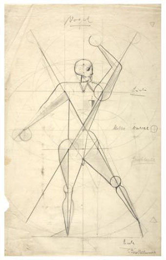
Drawing by Klaus Barthelmess (1922).
For those who want more Bauhaus design, the Barbican in London is currently staging a major exhibition, Bauhaus: Art as Life, that will run throughout the summer.
Previously on { feuilleton }
• Reverbstorm: an introduction and preview
This only makes me drool all the more with anticipation. I don’t take it Savoy does preorders because I’ve not yet seen any kind of news relating to the book on their site. I’ll just have to be patient.
No, there’s no pre-orders system at the moment, in part because a price and release date has still to be decided. I’m trying to arrange a PayPal button on the Savoy site which I’ll then be able to use here. Any further developments will probably be announced here first.
Drat, I wish you had contacted me. I would have leapt at that!! If I do another maquette exploration online, I shall be back at you! A GREAT image , John. Love it.
Ha, okay, thanks!
John, it is hard to make an appropriate comment in relation to your new book and, as importantly, your huge achievement in getting it to press. The Lord Horror image has been echoing in my dreams, and its elasticity and flow as well as sharp contours made me think of the sublimeness of violence and a certain type of masculinity in fascist discourses. “Better a day as a lion, than a year as a jackal” sloganeered Mussolini’s enthusiasts in the 1930s!
Thanks, Ian. I don’t think I’d go as far as to quote Il Duce although the Italians of that era accommodated themselves better with the art of the period, the Futurists being notorious for their espousal of Fascist ideology, at least in the beginning. That’s part of the fascination of that whole era, the shifting boundaries and allegiances in art and politics. Joyce hated violence and spent his final years terrified by the way Europe was going; yet he was also friends with Pound (who broadcast Fascist propaganda), and Eliot (anti-Semite who didn’t mind that Ulysses was a plea for tolerance and better treatment for Jews). Nothing is clear-cut.