
Here at last is the book I spent a good part of last year designing. Into the Media Web is a huge volume as befits a huge talent, 720 pages of Michael Moorcock’s non-fiction spanning fifty years of his career from his days writing for sf and fantasy fanzines, through to journalism, reviews and articles for major newspapers and magazines. Moorcock expert John Davey did an amazingly thorough job of compiling, editing and annotating it all, and it’s been a considerable pleasure to design such an important collection. Alan Moore provided the substantial introduction. Savoy Books haven’t announced a price yet but it’s going to be about £45 since it’s another limited edition and weighs a ton. Into the Media Web makes a fine companion to last year’s The Best of Michael Moorcock from Tachyon, also edited by John Davey (with Ann & Jeff VanderMeer) and whose interior I also designed. Details about Into the Media Web‘s design follow below.
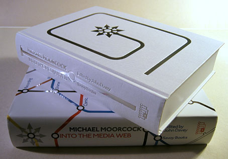
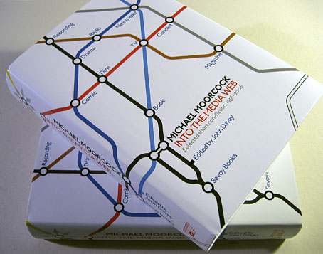
The dust jacket is matt white with a spot UV layer which picks out the titles and lines in gloss.
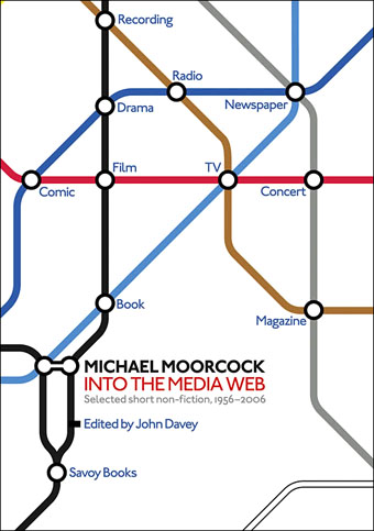
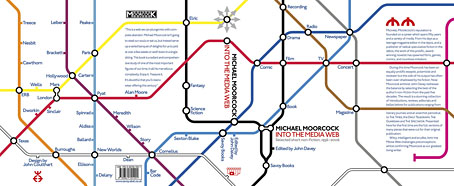
It was the cover design which dictated the look of the interior. The book’s title comes from a prescient article of Moorcock’s from the late 1960s concerning the increasingly interrelated nature of modern media. Accompanying this was a small diagram (below) which showed some of the connections Moorcock was discussing.
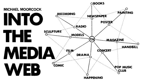
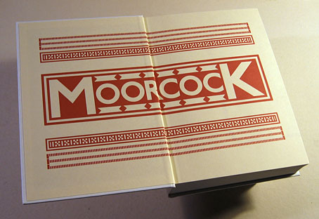
Both Savoy and the editor were keen to use a version of this diagram on the cover. Moorcock is known for his writings about London, some of which are reprinted in Into the Media Web, so my solution was to combine the diagram with Moorcock’s London associations and make a play on Harry Beck’s oft-imitated Tube map design for London Underground. All the headlines throughout the book are set in Edward Johnston’s sans serif typeface which was specially developed for the Underground system.
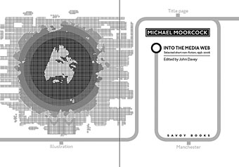
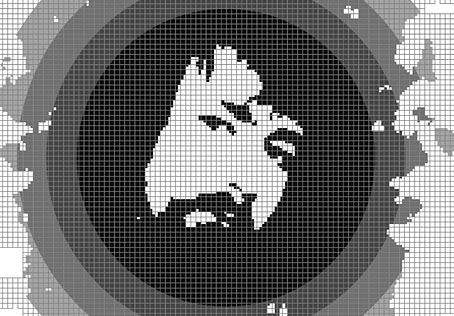
Inside the book a grey Tube line begins on the half-title page and snakes its way through the entire volume, marked with the names of writers or locations encountered along the way. For the title spread I created an illustration of the author intended to resemble the tile mosaics one finds on the walls of the Underground stations in the city centre. The starting point was a photo from the mid-Seventies which appeared inside the very first Savoy Moorcock book, Sojan in 1977.
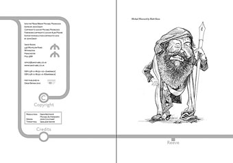
The copyright spread with an illustration by Mark Reeve.
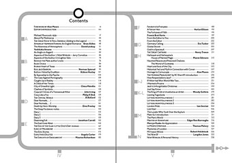
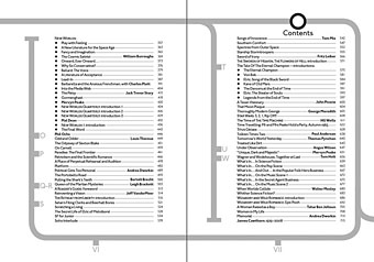
The contents which run over four pages.
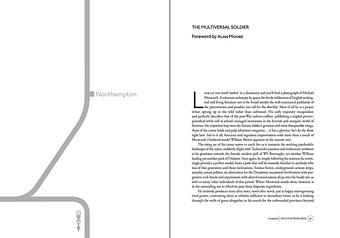
The opening of Alan Moore’s introduction with a station on the line for Moore’s home town of Northampton. This Moorcock map recognises no boundaries; other stations include Gormenghast, London itself and the planet Mars. The line going off the bottom of the page has an arrow pointing to later in the book where Moorcock writes a piece about Alan Moore.
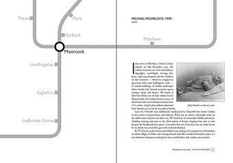
The opening of the first article, an autobiographical essay from 1987. Here the stations are some of the places where the author has lived.
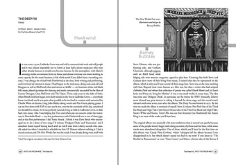
Moorcock writes here about his Deep Fix album from 1975, an apocalyptic concept released in part because of his associations with Hawkwind, hence the band being named as a station. Designer Barney Bubbles was responsible for the cover and his playful approach to graphic design very much inspired my work on Into the Media Web. It was good to be able to pay back that inspiration by putting his name in the book.
Previously on { feuilleton }
• The Best of Michael Moorcock
• Barney Bubbles: artist and designer
Wow. That looks gorgeous. Please do keep us updated on availability.
This looks beautiful, John. Congratulations.
Great work! Look forward to seeing a copy of this.
Thanks, everyone.
Wow, Savoy’s on a publishing role right now, aren’t they?!
I’m crossing my fingers that this means ‘La Squab’ and the complete Reverbstorm will be out soon…
Exiting design John, derived from your Kaballah tree illustration (?)
Thanks, Ed. The Kabbalah poster shares the same Tube-inspired look but this goes a lot further with that idea. I was thinking more of Moorcock’s London concerns and about networked things. The Tube lines going through the book give some consistency to very diverse material.
Troy: La Squab is next on the Savoy schedule, I think, although I haven’t started work on it yet.
Beautiful work, thanks for sharing the process as well.
Nicely done, but that comes as no surprise. Congrats!
Found your site through a link to your Frank Frazetta tribute – was pleasantly surprised to see your wonderful work here! Michael Moorcock’s Elric and Corum books (and Jerry Corneilus, to a slightly lesser extent) were a great inspiration as a pre-adolescent – might have to splurge on this non-fiction volume of the more adult fare : )
Looks fascinating. Will browse through a copy as soon as I see it. Greetings from Vancouver, Canada.