Month: April 2009
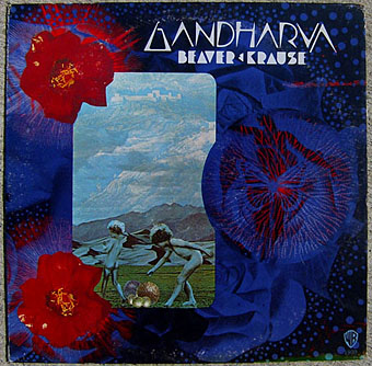
Gandharva by Beaver & Krause
I mentioned Wilfried Sätty’s collage work last week and this album sports one of his few cover designs. A cult object for several reasons, not least Sätty’s involvement. The title lettering was by fellow psychedelic artist David Singer who I had the good fortune to meet in California in 2005 whilst researching Sätty’s career. That chunky Seventies lettering style now looks distinctly contemporary having come back into fashion over the past couple of years.
Beaver & Krause were among the pioneers of Moog-based electronic music in the 1960s and notably provided the throbs and drones which Jack Nitzsche mixed into the soundtrack for Donald Cammell & Nicolas Roeg’s Performance. Gandharva was released in 1971 and one of the few all-electronic pieces on the album, Nine Moons in Alaska, is an outtake from those sessions. The first side is very uneven, with a blues jam and a gospel piece that don’t sit well with each other, never mind with the Moog tracks. Side two, however, is a far more successful suite of improvisations with organ, electronics, guitar, harp and saxophone (played by Gerry Mulligan) recorded live in Grace Cathedral, San Francisco.
Cover photo from the Psychedelic Music Flickr pool which features many fine examples of cover design from the late Sixties on.
Elsewhere on { feuilleton }
• The illustrators archive
Elsewhere on { feuilleton }
• The album covers archive
Previously on { feuilleton }
• Ginsberg’s Howl and the view from the street
• Further back and faster
• Quite a performance
• Borges in Performance
Penguin science fiction

The Drought, 1968; design by Richard Hollis, photography by Dr. J Comroe.
James Pardey contacted me earlier this week announcing his site devoted to Penguin Books’ science fiction covers. I posted some of my own dishevelled copies a while back and this news gives me an excuse to throw up another Ballard cover. Pardey’s site is just the kind of thing I enjoy seeing, with a comprehensive collection and detailed notes for each design. The front page is especially good since you can see immediately how the look of the titles evolved, from spare layouts and pictorial covers through to bold graphic design which culminates in David Pelham’s great run as designer during the 1970s. Creative Review posted a talk Pelham gave a couple of years ago which explores his work at Penguin and touches on the covers he did for Ballard. A shame they didn’t do a complete set of Ballard’s titles at the time, I’d have loved to see how he treated the other books.
Elsewhere on { feuilleton }
• The book covers archive
Previously on { feuilleton }
• Penguin Labyrinths and the Thief’s Journal
• Penguin Surrealism
• Penguin book covers
The art of Anthony Goicolea
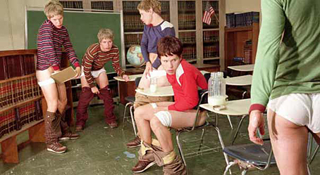
Premature (2003).
It’s difficult to avoid the word “dreamlike” when looking at Anthony Goicolea‘s carefully-staged tableaux, all of which use the artist himself as their subject, redressed and multiplied by Photoshop into an army of clones. The artist-as-model isn’t a new thing—Cindy Sherman has been doing this for years—but the possibilities of digital manipulation still seem rather under-explored in the contemporary art world; whether that’s down to a lack of the necessary aptitude on the part of artists or simply avoidance of a medium more commonly associated with advertising and illustration is hard to say.
The cosmic clock with Ballard at its core
The cosmic clock with Ballard at its core | JGB, Tacita Dean and Robert Smithson’s Spiral Jetty.


