Fade away: Chris Marker | La Jetée and Immemory.
Month: March 2009
Design as virus 8: Keep Calm and Carry On
Continuing an occasional series.
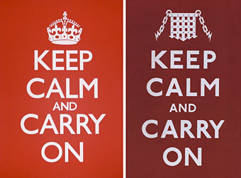
The poster at the top left is the unused Ministry of Information design created to maintain Britain’s resolve after war had been declared in September 1939. This simple slogan struck a chord recently among Britons sick of the climate of fear, security theatre and authoritarian coercion which, deliberately or not, appears to benefit politicians and the agents of the State more than the populace who pay their wages. The BBC asked whether this was the greatest motivational poster ever. The Guardian noted the popularity of the slogan and its inevitable commercial exploitation:
…one day in 2000, Stuart Manley, co-owner with his wife Mary of Barter Books in Alnwick, Northumberland, was sifting through a box of hardbacks he had bought at auction when he saw “A big piece of paper folded up at the bottom. I opened it out, and I thought, wow. That’s quite something. I showed it to Mary, and she agreed. So we framed it and put it up on the bookshop wall. And that’s where it all started.”
The reworked version at the top right is one of the opening pages from The Black Dossier (2007) by Alan Moore and Kevin O’Neill. The crown is replaced by a portcullis and Gill Sans is dropped in favour of Edward Johnston’s sans serif typeface which has been used throughout the London Underground system since the 1930s.
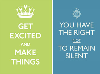
The original poster has been undergoing numerous redesigns, from the jokey to the serious. The green design is one of the better variants by designer Matt Jones.
The blue design is part of an advertising campaign by the British Home Office intended to promote their new “Policing Pledge”, “a set of promises to local residents that not only gives more information about who their local neighbourhood policing team is, but also ensures that communities will have a stronger voice in telling the police what they think is most important and what they are most worried about.”
Laudable as this intention may be, I was very surprised when I saw this poster on a bus shelter earlier in the week. While the Home Office and its advertising people are fully entitled to reclaim a design which originated with the State in the first place, one of the reasons the original poster strikes a chord is because it runs counter to anti-terrorist nonsense like this. It speaks, among other things, to people sick of being lied to by politicians and spied on by police and security services. To see a forgotten design experience a swelling of grassroots popularity then be co-opted by the State itself is as depressing as it would have been had Richard Nixon used psychedelic posters to campaign for his re-election. To see a campaign use slogans which treat the rights of defendants as flippantly as the poster remixers when this present government has spent the past ten years undermining the rights of its citizens is simply a disgrace.
Update: A Flickr pool catalogues the variations.
Previously on { feuilleton }
• Design as virus 7: eyes and triangles
• Design as virus 6: Cassandre
• Design as virus 5: Gideon Glaser
• Design as virus 4: Metamorphoses
• Design as virus 3: the sincerest form of flattery
• Design as virus 2: album covers
• Design as virus 1: Victorian borders
National Portrait Gallery snubs Kylie Minogue and picks Nelson Mandela for gay icons list
Hip Gnostics and more Moore
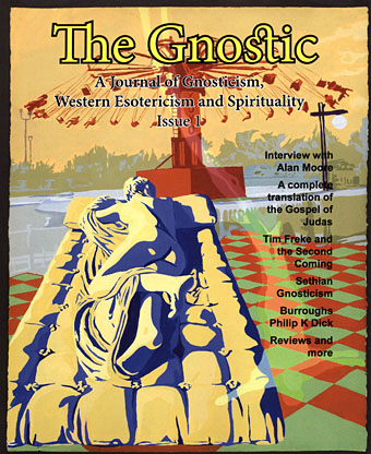
Coincidence abounds: on Wednesday I was following a few referral URLs to see who’d been linking here and was led to a Lexic.us page about hermaphrodites which in turn had me looking again at the wonderful Borghese Hermaphroditus in the Louvre. Thursday’s postal delivery brought issue 1 of The Gnostic which prominently features the Louvre sculpture on its cover. Inside there’s my portrait of William Burroughs illustrating a piece about Burroughs’s Gnostic identification by Sven Davisson. (I linked to another essay on the same theme in 2007.) The Gnostic is an excellent publication which, the Alan Moore interview aside, I’ve only skimmed through so far. Alan’s piece is very enlightening since the discussion stays fixed around religion, science and the occult and includes the most thorough extrapolation I’ve seen to date of his long work in progress, Jerusalem. There’s also a transcript of part of his William Blake piece from 2001, Angel Passage. If you want to know more I suggest you order a copy ($12 / £8 / €9) from Bardic Press.
Coincidence further abounds as this arrived just as Pádraig Ó Méalóid publicly announced his discovery of the long-lost and unpublished third issue of Alan Moore’s Big Numbers. This was Alan’s self-published “real life” comic series from 1989 which got off to a great start then fatally collapsed when artist Bill Sienkiewicz, then his replacement, Al Columbia, both dropped out of the project. It’s one of the great lost projects of contemporary comics and seeing the third issue sustaining the quality of the first two is deeply frustrating.
The last piece of Moore news concerns The Mindscape of Alan Moore once again which is now available to buy through iTunes. $9.99 will only get you the feature-length documentary, however. If you buy the double-disc DVD you also get my groovy interface design and an extra disc of interviews with major comic artists.
Update: Alan Moore has certainly ruled the week in this household with the delivery on Friday of The Extraordinary Works of Alan Moore, a new edition of George Khoury’s book-length autobiographical interview with Alan, and an essential purchase for anyone with more than a cursory interest in Alan’s life and work. The book features copious artwork examples by many Moore collaborators including my CD designs and the cover for the forthcoming Moon & Serpent Bumper Book of Magic.
Previously on { feuilleton }
• William Burroughs: Gnostic visionary
Xiphophilia
How else to name this obsession? (Which, it should be noted, is more a mild preoccupation than a full-on fetish.) Xiphoid isn’t a word one hears very often:
\Xiph”oid\ (?; 277), a. [Gr. ? sword-shaped; xi`fos a sword + ? form, shape: cf. F. xiphoide.] (Anat.)
(a) Like a sword; ensiform.
(b) Of or pertaining to the xiphoid process; xiphoidian.
Ensiform is less of a challenge but doesn’t lend itself to a suffix while foinery is a term which only refers to combat with foils. Xiphophilia will have to suffice.
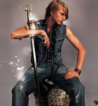
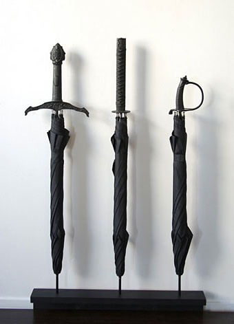
The Aragorn type at the top of the post is a Polish model, Jared Koronkiewicz, and his uncredited photo is via Queerty. The identity of the pouting sword boy is a mystery but this picture and another look like scans from a fashion mag. Thanks to Callum for the tip. Finally, the umbrella swords are a design concept from Materious. While these might be useful for keeping commuters at bay, in the current climate of security theatre they’d probably only lead to your arrest or worse. But they look good. Via Core77.
Elsewhere on { feuilleton }
• The men with swords archive

