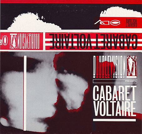
Videocassette box insert. Design by Neville Brody.
A couple of years back I tracked down some of the releases on Cabaret Voltaire’s Doublevision video label, the early titles of which have never been reissued on DVD. The first Doublevision release was the Cabs’ collection of their own music videos which Mute Records reissued on DVD 2004. That reissue seems to be deleted for the moment so it’s good to find a copy of the original tape release on YouTube. As with the other Doublevision releases I was well aware of this but didn’t have a VHS player at the time so wasn’t eager to buy anything I couldn’t watch. Unlike the other releases I did get to see several of the tracks during the Cabs’ Doublevision video night at the Haçienda in 1983, an evening that ended with the group performing for an hour.
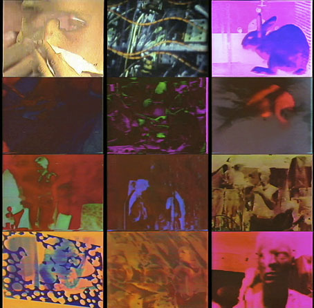
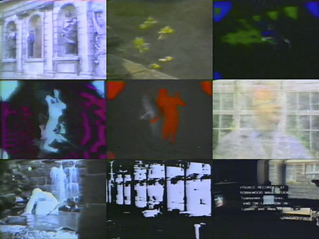
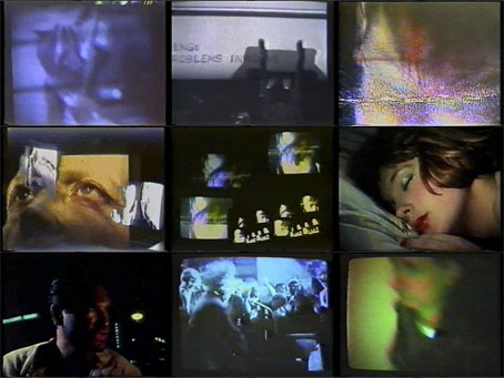
It’s good to be reminded of these videos, however crude they appear today. As with any early use of technology you need to bear in mind the limitations of the time. The tape was released in 1982 but the group had been experimenting with video equipment from about 1979 onwards. At that time commercial music video was just getting started but most of the examples on TV were paid for by the big record companies. Cabaret Voltaire and some of their associates in the UK Industrial scene—notably Throbbing Gristle and 23 Skidoo—were ahead of the game in acquiring equipment to make their own video recordings and promos. These videos were seldom shown on mainstream TV; I recall being thrilled to see a clip from the Nag, Nag, Nag promo on a pop programme but that was a rare one-off moment. The music industry was being forced to accommodate the awkward DIY merchants but the gates of broadcast television remained heavily policed.
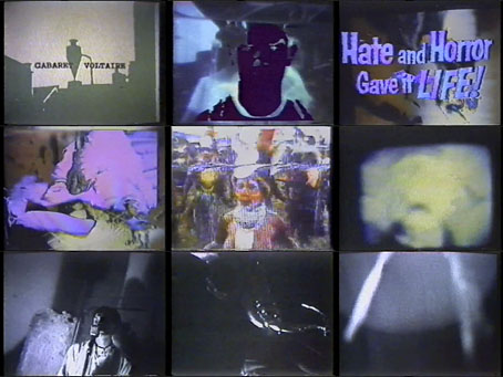
And speaking of heavy policing, you get some of that here, the Cabs’ obsessions with coercion and control being illustrated by footage of riot squads, together with religious mania, medical surgery, psychotronic films and much else, all of it processed, fragmented and distorted. Direction was by the group and by St. John Walker, with an extract from Johnny YesNo (recently reissued by Mute) directed by Peter Care. I’ve been listening to Seconds Too Late a lot this week so it’s great to see a video for that song. There’s also a slight conundrum in the tracklisting: if you’re familiar with the free four-track single that came with The Crackdown album it seems that Badge of Evil and Moscow have had their titles swapped. The Moscow video track, however, includes a shot of an Aeroflot passenger plane so it’s more likely that the tracks on one side of the single were mis-labelled when they appeared a year later, an error carried over to the CD release.
Tracklist: Diskono / Obsession / Trash (Part 1) / Badge Of Evil / Nag, Nag, Nag / Eddie’s Out / Landslide / Photophobia / Trash (Part 2) / Seconds Too Late / Extract From Johnny YesNo / Walls Of Jericho / This Is Entertainment / Moscow
Previously on { feuilleton }
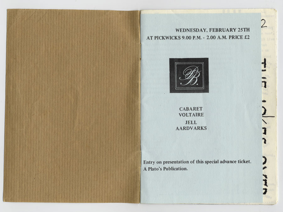
• Just the ticket: Cabaret Voltaire
• European Rendezvous by CTI
• TV Wipeout
• Seven Songs by 23 Skidoo
• Elemental 7 by CTI
• The Crackdown by Cabaret Voltaire
• Network 21 TV