Beardsley’s Salomé

salome1.jpg

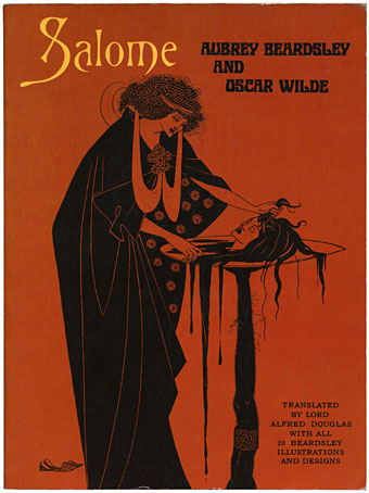
So the first book purchase of the year turns out to be the original Dover edition of Beardsley and Wilde’s Salomé. This appeared in 1967, a year after the major V&A exhibition which introduced Beardsley’s work to a new generation and commenced the Beardsley craze that lasted into the Seventies. Not that I’m in desperate need of these drawings, having most of them several times already in different Beardsley books, but this volume is worth having since the reproductions are large size, very sharp and they took enough care to ensure that the uncensored versions of the drawings were used. The book also includes the complete text of Wilde’s play and Robert Ross’s Note on Salomé from 1930 which I don’t have elsewhere.

salome2.jpg

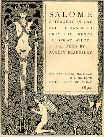
Beardsley’s work was subject to many censorship actions during his career but the Salomé book caused the most trouble (his later erotic works were private editions so don’t really count). The original title page shown here had the semi-erect penis of the winged boy and the pendulous genitals of the herma removed while one drawing, The Toilette of Salomé, was deemed too much and had to be redrawn entirely. That picture did contain a masturbating page boy so it’s perhaps not so surprising. There was such a lot to offend Victorian sensibilities in Beardsley’s work at this time, whether overt or surreptitious, that it’s remarkable the book was printed at all. His art was so radically different from anything else being done in 1894 that many people had difficulty accepting these pictures as illustrations at all, regardless of the content. As a result they missed salacious details that would have finished the career of a lesser artist. Wilde’s play was equally scandalous and could only be performed in France, having been banished from the London stage. As Robert Ross says in his Note:

Wilde used to say that Salomé was a mirror in which everyone could see himself. The artist, art; the dull, dullness; the vulgar, vulgarity.

salome3.jpg

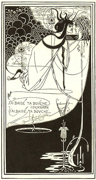
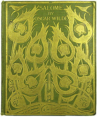
The sense of shock extended back to Beardley’s original Salomé drawing (also included in the Dover volume) which appeared in the first number of The Studio in 1893, some of the readers of that magazine finding the detail of the spilled blood nourishing a phallic lily a grotesque detail too far. The Studio drawing was reworked and simplified as The Climax for Salomé. You can see the complete set of illustrations here. Neither that collection nor the Dover book include a picture of the original cover, however, whose splendid gold-on-green peacock feathers look a lot more impressive than Beardley’s rough design. So here it is.

salome4.jpg

Download the 1906 US edition of Salomé free at the Internet Archive

Elsewhere on { feuilleton }
The book covers archive
The illustrators archive
The Salomé archive

Paisley patterns

paisley1.jpg

Kirking shawl design (1850).

December is a month when I normally shun the secondhand shops so as to avoid being taken for a cheapskate trying to save money while Christmas shopping. Sometimes it pays to break your own rules, however, as with this discovery, Paisley Patterns: A Design Source Book (Studio Editions, 1989) by Valerie Reilly. This falls into the class of those books you didn’t know you’d wanted for years until you hold it in your hands, being a marvellous history of the evolution of the Paisley pattern from its origin in Kashmiri shawls to its development among the shawl weavers in the Scottish town of Paisley (and elsewhere) during the 19th century. With 100 colour plates it’s impossible to give a fair representation of the book’s contents but many of the examples are astonishingly abstract and worlds away from what we normally consider Victorian design.

paisley2.jpg

Silk shawl design (1860).

The pre-psychedelic splendour of Paisley (and its “Oriental” character) was what led to its popularity during the 1960s. There was plenty of Paisley clothing around in the 1970s as a result, I had a particularly garish turquoise tie when I was about 11-years old and I think it was this which first set me wondering what the design was and who invented it. As Valerie Reilly notes, the boteh teardrop shape is a motif that’s as old as civilisation and its original use in patterns can’t be pinned to a single location. One of the nice things about this book is the quantity of shawl designs taken from the Paisley Museum that have sufficient detail for you to see how the pattern makers went about creating a design. The book is out of print but a swift search on Amazon reveals a couple of similar titles. The article below is a good overview of the evolution of the shawls and their designs.

Kashmir and Shawls of Paisley Design at Victoriana.com

Previously on { feuilleton }
Flowers of Love

Visions and the art of Nick Hyde

visions.jpg

Cover painting: Holy Grove by Gage Taylor (1975).

Book purchase of the week was this American collection of what we have to call “hippy art” (or “California Visionary Art”, as its creators preferred) published by Pomegranate Publications in 1977. I’d seen this circa 1979 and many of the pictures inside were used by Omni Magazine to decorate the science fiction stories in their early issues. After that it vanished from view completely which leads me to believe that UK distributors Big O didn’t sell as many as they would have liked. The white cover design made me remember it for a long time as being part of the David Larkin series which I discussed in May but it isn’t, although the Larkin books were quite probably the model for the book’s presentation.

Finally acquiring a copy was something of a disappointment since it transpires I remembered the decent painters and forgot the terrible ones who comprise at least half the book. Cliff McReynolds is one of the better artists (Omni thought so too) and by coincidence I posted one of his Visions paintings, Landscape with Grenade, almost a year ago to the day.

hyde.jpg

BethAnn (1970).

Best of the bunch for me is Nick Hyde whose fantastically detailed works blend the fractal filigree of psychedelic art with the kind of dreamscapes and tableaux one sees in Surrealism. The print reproductions do little justice to his detail and the web degrades his work even further (see Abraxas for a good example). Happily there are posters available.

Elsewhere on { feuilleton }
The fantastic art archive

Penguin Labyrinths and the Thief’s Journal

labyrinths1.jpg

Detail from La Havane by René Portocarrero; photo by C. Marker.

This week’s book finds are a pair of titles I hadn’t come across before in these particular editions, another haul from the vast continent that is the Penguin Books back catalogue. Labyrinths I’ve had for years in a later edition (see below) but the cover of this one seems more suited to Borges (as much as he can be illustrated) than the somewhat bland Surrealism of illustrator Peter Goodfellow. René Portocarrero (1912–1985) was a Cuban painter with a post-Picasso style who specialised in hallucinogenic profiles like the one here. And it’s a guess but I’d bet the “C. Marker” who photographed the painting is French filmmaker Chris Marker (who I compared to Borges last year), director of La Jetée and Sans Soleil. Marker worked as a photo-journalist for many years and made a documentary entitled ¡Cuba Sí! in 1961.

Continue reading “Penguin Labyrinths and the Thief’s Journal”

Kafka and Kupka

kafka_kupka.jpg

And speaking of Kafka, today’s book purchase was this 1979 story collection. The picture on the cover is a coloured aquatint and my favourite work by Czech artist Frantisek Kupka (1871–1957).

kupka2.jpg

Resistance, or The Black Idol (1903).

Kupka is one of the more unique artists of the period, having begun his career in the Symbolist mode then abruptly changed course, post-Cubism, to become one of the earliest abstract painters. Kandinsky and Mondrian followed a similar evolution but little of their early work is valued, whereas Kupka’s Symbolist pastels and etchings are still regarded as significant. This page has several of his pictures on mystical themes.

As well as being a good match for Kafka, The Black Idol was also the model for the ruined castle in Francis Coppola’s Dracula. There aren’t any decent pictures around, unfortunately, but if you must you can go and squint at the screen grabs here.

Elsewhere on { feuilleton }
The book covers archive