Steampunk framed

sp1.jpg

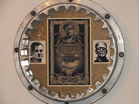
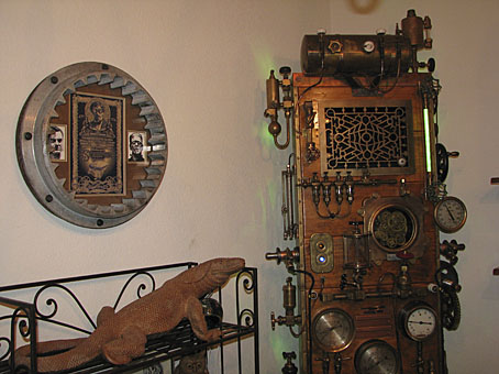
Dana Mattocks wrote to me a month or so ago asking if he could have a print of my Steampunk picture to go in a frame on the wall beside his jaw-dropping Steampunk Frankenstein case-mod. I immediately agreed after seeing his photos. A single picture doesn’t do justice to the amount of work and detailing that’s gone into this project which makes most other steampunk craftings look distinctly lacklustre. See his Flickr pictures for a better look at its wood-and-brass lusciousness. What I didn’t expect was that the frame would be an equally impressive heavy-duty item. And I’m especially pleased to see the picture in there along with Colin Clive and Boris Karloff from the first Universal Frankenstein films. Thanks Dana!

sp2.jpg

I’ve been working on an updated version of the Steampunk pic for something special which I’ll announce here shortly. Meanwhile, if anyone else has one of my pictures in an impressive frame, send me a photo and I’ll feature it here.

Previously on { feuilleton }
Steampunk Horror Shortcuts
Zeppelin vs. Pterodactyls

Designing Booklife

bl1.jpg

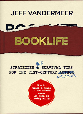
I created a cover design recently for Jeff VanderMeer‘s new novel, Finch, and shortly after completing that Jeff asked if I could put together some cover ideas for his forthcoming writer’s guide, Booklife, which Tachyon will be publishing later this year. Jeff is known as a fantasy writer but this book was intended to have a general appeal for any would-be or working writer. It also needed to look suitably contemporary and (possibly) reflect the discussion within which concerns the modern writer’s use of computers, the internet and social networks. Lastly, several lines of text needed to be placed on the cover without it looking confused or messy.

I agreed to this whilst busy with several other projects so the initial drafts were rather haphazard. (That’s my excuse, anyway.) The first version (above) came out of an idea to apply a kind of trompe l’oeil effect to the cover with a torn dustjacket and handwritten amendments. The red call-out/roundel highlights an important sub-section of the book. This was knocked up very quickly and, as well as not looking very contemporary, the title doesn’t look enough like gold blocking to be convincing. Jeff requested something more up-to-date.

Continue reading “Designing Booklife”