Le style Louis XV

rococo1.jpg

I’m not always in the mood for the filigree excesses of the rococo era but this French collection of 200 engravings from the reign of the hated Louis XV (1710–1774) is a treat. Peter Jessen is the compiler and the publisher is Guérinet, the house responsible for Friedrich Hottenroth‘s book of costume through the ages. The rococo I prefer is often at the weirder end of the scale where animals start crawling out of the foliage, ogees sprout webs and the sweeping flourishes seem to take on a life of their own. Jessen’s selection includes a number of such examples, in addition to designs for furniture and architectural decoration. Ludwig II would have eagerly taken this as a guide book.

rococo2.jpg

rococo3.jpg

rococo4.jpg

Continue reading “Le style Louis XV”

Summer of Love

donna.jpg

RIP Donna. People who know me well are usually surprised when I tell them I used to go disco dancing. It didn’t happen a lot but in the summer of 1977 I was 15 and used to get taken out by my mother and her new husband to a cabaret spot called the Planet Room in part of Blackpool’s sprawling Winter Gardens complex. Ordinarily I might have needed some persuading but I loved the Winter Gardens and especially liked the Planet Room, a large open space that was originally the very Victorian Indian Lounge. In 1964 someone had decided that the place needed a Space Age facelift so they covered the elaborate ceiling with an illuminated starry sky, painted the walls with a lunar landscape and dimmed the purple lights. Voila! Planet Room. It’s taken me all this time to realise what a suitable location it was to first hear the flanged chords of Donna Summer’s I Feel Love come surging from the dancefloor speakers, the song that famously represented “the future” on her I Remember Yesterday album. Nothing else from those dance nights was remotely memorable although for various reasons (lack of money, shitty home life) I didn’t actually buy a copy of I Feel Love until the Patrick Cowley Mega-Mix appeared in 1982. It’s impossible to talk about this song in any detail, it bypasses the rational brain and still thrills like few others. Prior to this there was the incredible (and banned) epic of Love To Love You Baby, and after it her version of State of Independence, a song that Brian Eno called “one of the high points of 20th century art“. Those songs and many others show the range of her voice to far better effect, but for me I Feel Love will always be something very special. (And let’s not forget Giorgio Moroder and Pete Bellotte either.)

How Donna Summer’s I Feel Love changed pop: Jon Savage and producer Ewan Pearson on the majesty of Donna Summer’s finest 3 minutes & 47 seconds.

KraftWork

kraftwork1.jpg

KraftWork by Seeper is another projection-mapping video where projections of 3d animations onto a building façade bring the architecture to life. Plus points for using the original Volkswagen factory in Wolfsburgh, Germany; minus points for the annoying editing which limits appreciation of the overall effect. Via Dressing the Air‘s weekly bulletin. For more projection mapping, see Apparati Effimeri.

kraftwork2.jpg

Previously on { feuilleton }
Lumiere at Durham
Tetragram for Enlargement

Reverbstorm: Bauhaus Horror

reverbstorm1.jpg

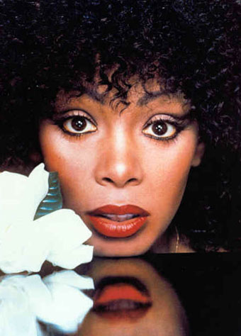
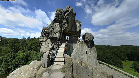
Lord Horror (after Klaus Barthelmess).

(No, not Pete Murphy and co.) Now that the Reverbstorm book is at the printers I have an excuse to discuss a few of the art and design appropriations that run through the narrative. I wanted to use some Bauhaus-style design back in the early 1990s when we were putting the first of the comic issues together but that idea got buried under conflicting demands and the need to actually finish all the drawing. It was only when I started designing the opening pages in 2008 that I was able to return to some of the original intentions. There were two reasons for this choice: one was that the minimalist graphics of the Bauhaus style worked well in black-and-white, and also provided an effective counterpoint to the very dense and detailed drawings that followed. The second was that the Bauhaus design school found itself in the early 1930s in opposition to the fascist forces which the figure of Lord Horror represents. (Many of the Bauhaus architects and designers eventually fled Germany for Britain and the United States.) This combination of antagonistic elements yielded another of Reverbstorm‘s collisions of counterposed philosophies and aesthetics.

reverbstorm2.jpg

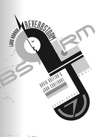
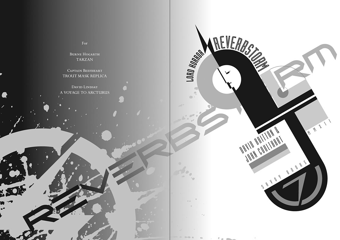
Reverbstorm title page.

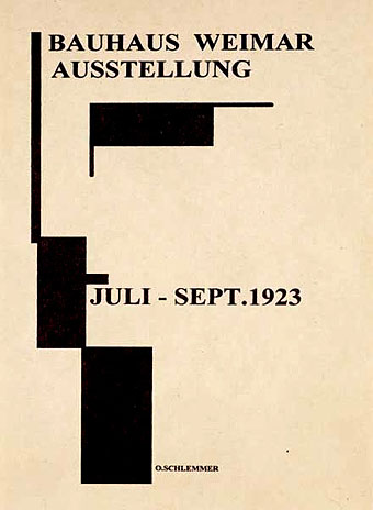
The title page is the most flagrant Bauhaus appropriation, a swipe worthy of Peter Saville at his plundering height. Joost Schmidt’s famous Bauhaus-Ausstellung poster is reworked with a Neville Brody typeface (Industria) and with Oskar Schlemmer’s face logo turned into a scowling profile.

On a typographic note, Industria was used right from the start with Reverbstorm since Brody designed it in the Thatcherite 1980s as a deliberate harking back to the authoritarian 1930s. It also has a very appropriate name. The other typefaces used in the book—Morris Fuller Benton’s Empire and Eric Gill’s Perpetua—date from 1937 and 1928 respectively.

reverbstorm3.jpg

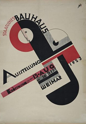
Joost Schmidt (1923).

reverbstorm4.jpg

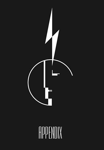
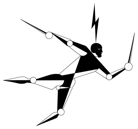
The reworked Oskar Schlemmer face/logo as it appears on the Appendix page. The lightning flash in Reverbstorm has multiple associations: adapted initially from the symbol used by Oswald Mosley’s British Union of Fascists (a symbol also appropriated at various times by David Bowie and Throbbing Gristle) it can also relate to storms, radio broadcasts and electricity in general. Here it becomes a minimal cipher representing Horror’s outrageous plume of hair.

reverbstorm5.jpg

Oskar Schlemmer (1923).

reverbstorm6.jpg

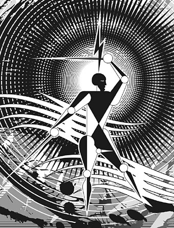
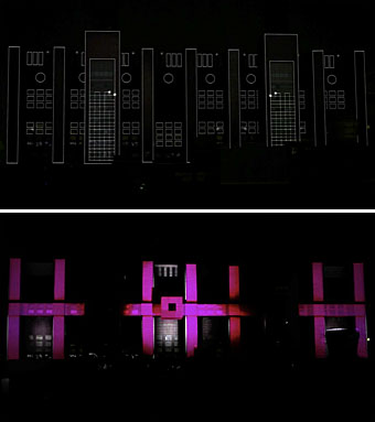
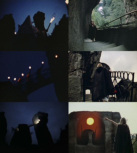
Reverbstorm, part 8.

In part 8 of Reverbstorm Horror ends up naked inside “a Soul” (don’t ask), and we see his figure juxtaposed against a series of backgrounds that recapitulate earlier aspects of the narrative. It was always the intention to end the series with a change of style so I did this by creating a kind of digital maquette figure using vector shapes that could be posed in a variety of ways. The origin of the figure was a sketch by Klaus Barthelmess, one of the students in Oskar Schlemmer’s drawing class. The sketch below appeared in a slightly altered form in issue 5 of the original publications but I always felt more could have been done with it: a posable figure turned out to be the perfect solution. By coincidence, while I was working on the final pages, Clive Hicks-Jenkins had been running a maquette exhibition on his blog. I was tempted to offer my example but a combination of too much work and a reluctance to throw Lord Horror’s obscene and reprehensible presence into the mix put paid to that. Besides which, my figure is a digital creation, not a bona fide paper cut-out.

reverbstorm7.jpg

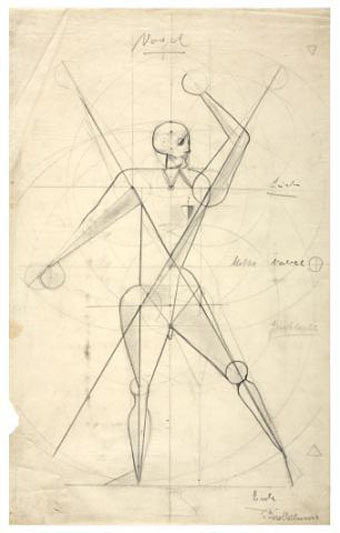
Drawing by Klaus Barthelmess (1922).

For those who want more Bauhaus design, the Barbican in London is currently staging a major exhibition, Bauhaus: Art as Life, that will run throughout the summer.

Previously on { feuilleton }
Reverbstorm: an introduction and preview

Externsteine panoramas

externsteine3.jpg

Lucifer Rising (1973).

The first time I saw Kenneth Anger’s Lucifer Rising (1983, at a film club) I recognised all the ancient monuments apart from the peculiar group of rocks where we see a line of robed and cowled torchbearers ascending a stairway at night. These shots are intercut with a caped Marianne Faithfull making the same ascent in daytime until she reaches an alcove where she’s given a vision of an Egyptian sunset. It took a few more years to discover the location was the Externsteine rock formation in northwest Germany, one of those singular outcrops which—like Glastonbury Tor—was a focus of pagan ritual before being co-opted by the Christian church.

externsteine1.jpg

Photo by Markus Krueger.

360cities.net has a number of panoramic views of the area, the best being the one above which shows Marianne’s alcove as well as allowing views of the surrounding countryside. Photos such as the one below are far more common. While these give some idea of the unusual nature of the site they don’t show just how isolated the rocks are. For an older view, the Library of Congress has this Photocrom print.

externsteine2.jpg

Photo by Wilfried Pinsdorf.

Elsewhere on { feuilleton }
The panoramas archive

Previously on { feuilleton }
Kenneth Anger on DVD again