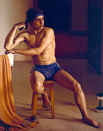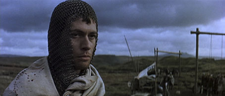
Macbeth (1971).
There are few actors I’ve ever felt sufficiently cultish about who could make me watch films or TV dramas I wouldn’t otherwise be interested in. Orson Welles would be one (up to a point, he was in a lot of crap in later years), Patrick McGoohan another and Jon Finch most definitely a third. Having watched Finch just over a week ago in Roman Polanski’s superb adaptation of Macbeth it’s been a shock to discover that he’d died shortly after Christmas, the news of his funeral only being announced this week.
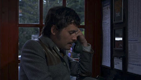
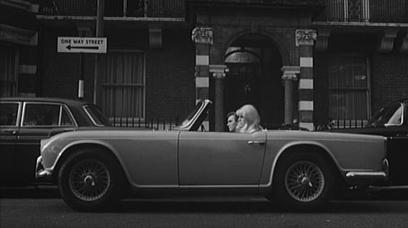
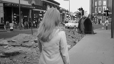
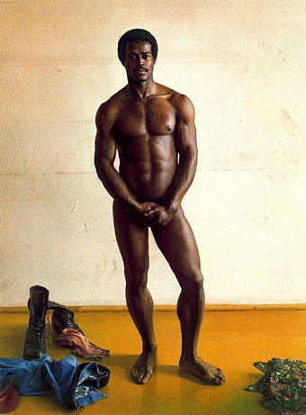
Frenzy (1972).
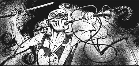
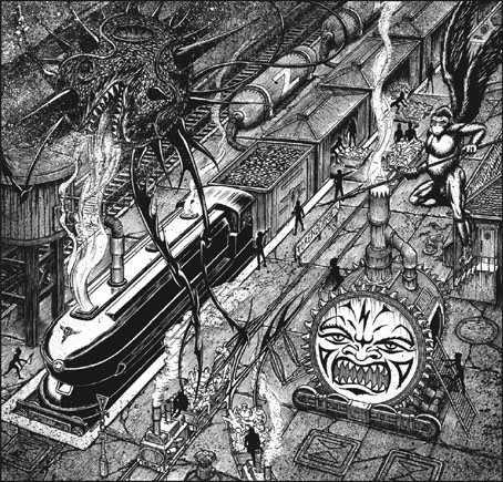
The cult status stems from the remarkable run of lead roles he was offered in the early 1970s: playing Macbeth for Polanski, the “wrong man” role in Hitchcock’s last great film, Frenzy, and a perfect Jerry Cornelius in Robert Fuest’s adaptation of Michael Moorcock’s The Final Programme. There were plenty of other roles, of course, but those three are standouts which also show something of his range: suitably brooding, weak and malevolent in Macbeth, in Frenzy a hounded man who seems disreputable enough for his friends to suspect he may be a murderer, in The Final Programme as smart and insouciant as Moorcock’s Cornelius ought to be.
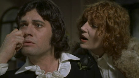
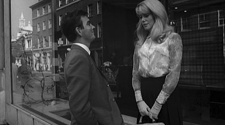
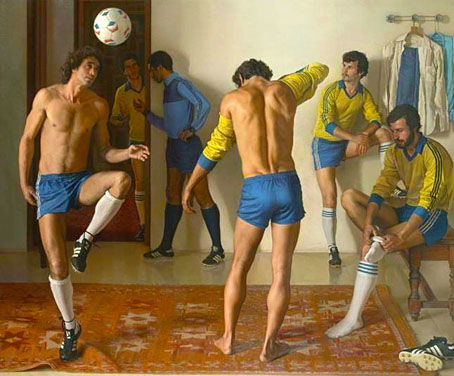
The Final Programme (1973): Finch with Jenny Runacre (Miss Brunner).
I’m happier that Finch played Cornelius instead of James Bond, a role he was offered after Sean Connery quit. Jerry Cornelius, “the English Assassin”, in the first novel in Moorcock’s Cornelius quartet is a kind of anti-Bond, and there were few actors around in 1973 who would have possessed the necessary charisma and intelligence for the part. Mike Moorcock was friends with Finch around the time the film was being made so when I was visiting the Moorcocks in Paris a few years ago I asked him why Finch hadn’t done more with his career after such an impressive start. Mike says he was one of those actors who often preferred to be doing something else with his time.
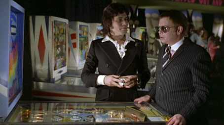
Finch and Ronald Lacey (Shades) in The Final Programme.
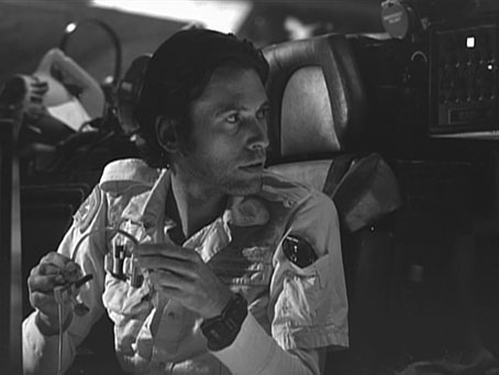
On the set of Alien (1978).
Obituaries will no doubt regard Finch’s rejection of the Bond role as a missed opportunity but I wish we could have seen him as intended in Ridley Scott’s Alien where he’d been cast as Kane but had to drop out after contracting a severe case of bronchitis once shooting was underway. The photo and screen grab below are seldom-seen images from the Alien DVD extras. I’ve nothing against John Hurt in the role but with Finch playing the part it would have made a cult film a little more special. He did get to act for Ridley Scott eventually with a small role in Kingdom of Heaven in 2005.
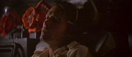
An outtake from Alien.
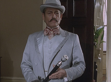
As Count Sylvius in The Memoirs of Sherlock Holmes (1994).
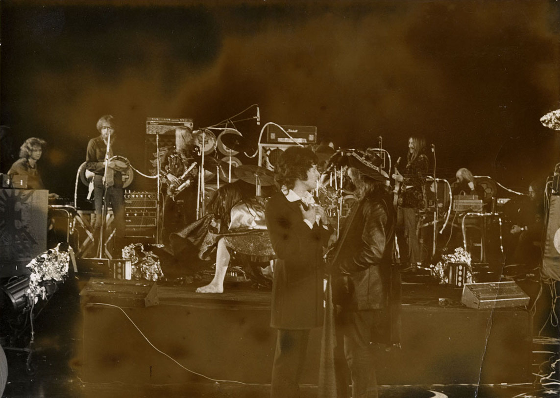
Update: Found on an archive disc, this rare photo from the set of The Final Programme showing Finch as Jerry Cornelius facing off with his creator, Michael Moorcock. (Click for a larger copy.) That’s the Space Ritual line-up of Hawkwind in the background. Band and author appear for a fraction of a second in a shot during the film’s arcade scene. Considering how common it was to have rock bands in feature films during this time it still surprises me that Fuest and co. went to all this trouble then left them on the cutting-room floor. The photo was Moorcock’s own, as I recall, something we ran in one of the Savoy books.
• Guardian obituary
• Independent obituary
• Telegraph obituary
• Macbeth trailer
• Frenzy trailer
• The Final Programme trailer
Previously on { feuilleton }
• Dan O’Bannon, 1946–2009
• Patrick McGoohan and The Prisoner