Mazes, a film by István Orosz

mazes1.jpg

Until last week I didn’t know Hungarian artist István Orosz had been making short animated films since the 1970s. I’ve known about Orosz’s Escher-like drawings for some time but missed the mention of the films in this interview with Steven Heller. Útvesztök (Mazes) from 2008 is one of the few Orosz films that you can see on YouTube, a short piece that seems to be a self-portrait going by the drawing tools littering one of the shots.

mazes2.jpg

The film is divided into nine sections, each one of which opens with a view of a maze where a hand (or pencil) traces a route matching the number of the section. The sequences that follow are all of the animated type wherein familiar things (animals, people, objects) mutate in some way, the mutations eventually revealing a face which ages slightly from one sequence to the next. I was hoping we might also see some of Orosz’s architectural illusions but if he has animated any of these they must be in his other films.

Previously on { feuilleton }
False perspective

Documents d’atelier: Art décoratif moderne

documents01.jpg

These collections would have been useful when I was mining my Art Nouveau reference books while working on the Bumper Book of Magic. Documents d’atelier is a two-volume overview of the Nouveau idiom as it manifested throughout the worlds of art and design, from architecture and housing interiors, to jewellery, ceramics and so on. The books were compiled in 1899 by Victor Champier, and no doubt draw on the resources of Revue des arts décoratifs, the magazine that Champier edited from 1880 to 1902. The Nouveau era didn’t last very long but it generated many guides of this kind, not all of which are useful if you’re looking for something to work from. Documents d’atelier is better than most in presenting actual works rather than speculative designs, and with more variety than you find in other guides. The colouring is also an attractive feature: black-and-white photos have been tinted in pastel shades to match the colour reproductions. The creators of each design are credited on the pages so you don’t have to go hunting through an index.

documents02.jpg

Both these volumes are hosted at Gallica where the web interface remains as inefficent as ever. If you want to see more pages I recommend downloading the PDFs rather than trying to leaf through the things online.

Volume 1 | Volume 2

documents03.jpg

documents04.jpg

documents05.jpg

Continue reading “Documents d’atelier: Art décoratif moderne”

Weekend links 767

east-totem-west.jpg

East Totem West head shop poster, from DJ Food‘s latest delve into the psychedelic poster auctions.

• The week in science-fiction illustration: Joachim Boaz on Rodger B. MacGowan’s “approachable New Wave art”; and Andrew Liptak talks to Adam Rowe about Rowe’s Worlds Beyond Time: Sci-Fi Art of the 1970s.

• At The Wire: Philip Brophy sets out his intentions for the return of his long running column on film music.

• At Public Domain Review: Gustatory Wisdom: Bruegel the Elder’s Twelve Proverbs (1558).

Though the project’s genesis predated Roeg’s involvement, Cammell said that his codirector “needled” him: “He provoked me, made me focus more and more clearly on what I was trying to say.” It was Roeg’s visual sensibility, Cammell graciously admitted, that “mobilized” and “improved” his own concepts. It’s appropriate that the movie concerns two men who become fully realized only in meeting and merging with each other. Turner, said Cammell, “believes himself to be at the end of his creative life. He’s a man in despair. And then destiny brings him his mirror image, Chas, the man in whom he sees what he was and what he could be again.”

Roeg and Cammell were hardly in despair in 1968; both were novices in the foothills of their own artistry. It is not fanciful, though, to see in their collaboration something like the same lightning connection that forms between Turner and Chas. Cammell said that he set out “to make a transcendental movie.” In achieving that goal, he stretched and challenged not just himself but cinema too. Even as Performance closed the lid definitively on the sixties, it opened the door to a radical new way of making films.

Ryan Gilbey on Donald Cammell and Nicolas Roeg’s Performance

• At A Year In The Country: Broadcast and Pathways Through Otherworldly Villages.

• “Pilot is an elegant and expressive display serif,” says Kim Tidwell.

Winners of the 2025 World Nature Photography Awards.

• New music: Forgotten Worlds by Rodrigo Passannanti.

• Janus Rose presents her Digital Packrat Manifesto.

• RIP Jamie Muir and Gene Hackman.

Pilots Of Purple Twilight (1981) by Tangerine Dream | Pilots (2000) by Goldfrapp | I’m With The Pilots (2001) by Ladytron

The Return, a film by Jerzy Kucia

kucia1.jpg

“Jerzy is the greatest among the living—the greatest Polish author of animated films that is still alive.” So says Piotr Dumala, a formidable animator in his own right, in a video discussion of Jerzy Kucia’s films. The first of these, The Return (1972), is collected on Studio Miniatur Filmowych, a YouTube channel devoted to Polish animation. My complaints about YouTube are legion but the place is still worthwhile when it allows channels like this one to exist. The same goes for the channel devoted to films from the Zagreb Studios. The only trouble with these outlets is a lack of translation for the films that feature dialogue.

kucia2.jpg

This isn’t an issue with The Return, however, a wordless account of a nocturnal train journey undertaken by a shuffling man in a cloth cap. Stills don’t convey the remarkable sense of verisimilitude that Kucia creates with the patterns of light flashing over the walls and against the windows of the unlit carriage. The whole piece is meticulously observed, and a reminder to keep searching for the director’s other films.

Previously on { feuilleton }
Crime and Punishment, a film by Piotr Dumala
Walls, a film by Piotr Dumala
Academy Leader Variations

The art of Nikolai Petrovich Theophilaktoff, 1878–1941

theophilaktoff07.jpg

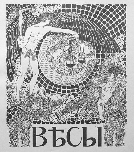
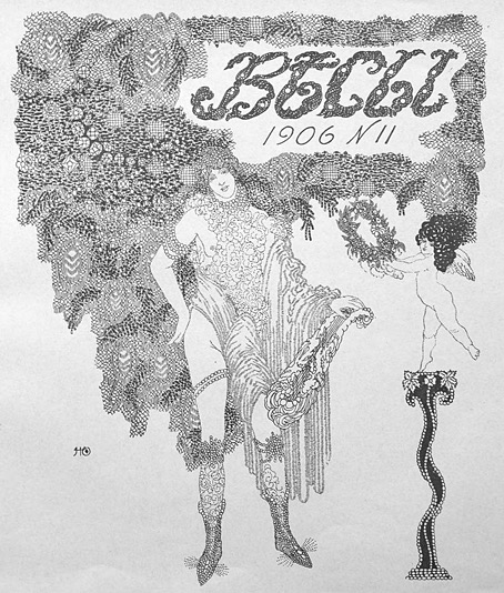
I’m taking the biographical details about this Russian artist from a Christie’s listing, accuracy being of particular importance to auction houses. The trouble with searching for information about Nikolai Theophilaktoff is that he’s one of those Russians whose name isn’t common enough to exist in a settled non-Russian form, so you may find his drawings credited to “Nikolai Feofilaktov” or even “Nikolai Theophylactus”. Whatever the spelling of his surname, Theophilaktoff is remembered today for illustrations with a distinct Beardsley influence, which is how he came to my attention. Aubrey Beardsley only had a few years for his art to impress itself on the world but he was known in Russia during his lifetime; Sergei Diaghilev was especially enthusiastic, using his position as editor of arts journal Mir Iskusstva (World of Art) to promote Beardsley’s work after the artist’s death. A later Russian arts journal, Libra, maintained the enthusiasm, devoting an entire issue to Beardsley in 1905. It was reading about Libra that led me to Nikolai Theophilaktoff, an artist who was sufficiently beguiled by Beardsley’s drawings to embark on his own variations on the Beardsley style.
theophilaktoff06.jpg

Theophilaktoff’s cover art for the Beardsley issue of Libra, November, 1905.

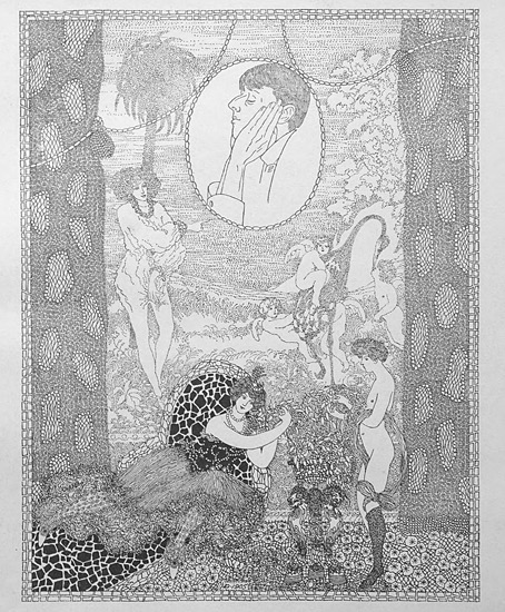
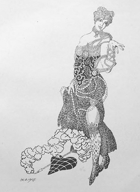
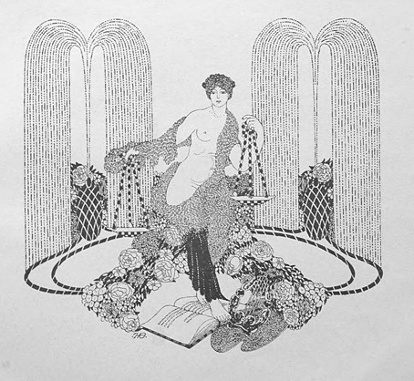
You can usually divide Beardsley’s followers into two groups: those who pick up on the striking contrasts that Beardsley created using areas of solid black against the white of the paper—Harry Clarke, Will Bradley and John Austen are good examples of this type. A second class would be those who favour the delicate, filigree style of Beardsley’s illustrations for The Rape of the Lock—Alastair (Hans Henning Voigt) and Nikolai Theophilaktoff are in this category. (Harry Clarke was also an expert filigree-ist but Clarke is really in a class of his own.) If you accept this artistic division it’s notable that the weaker artists are in the latter class. It’s easier to disguise deficiencies of figure drawing, say, with abundant stippling and decoration than it is when using nothing more than fine lines and masses of black ink. Theophilaktoff’s accomplishments are very uneven but they’re also rare examples of Beardsley’s style of Decadent art in a country that would soon have no time for such a thing at all.
theophilaktoff05.jpg

Most of the pictures here are from a book, 66 Dessins (1909), which collected many of the Theophilaktoff drawings published in Libra. The pornographic drawing at the very end is a swipe from an auction listing. Also near the end are drawings for Wings (1906), a novel by Mikhail Kuzmin which is one of the first literary works to openly deal with same-sex relationships. As for Libra, I thought copies of the magazine might be impossible to find but the trusty Internet Archive has what seems to be a complete run here. Mir Iskusstva, which seems rather staid by comparison, may also be found at the Internet Archive in a series of bound volumes.
theophilaktoff04.jpg

theophilaktoff08.jpg

Continue reading “The art of Nikolai Petrovich Theophilaktoff, 1878–1941”