Calendar sale!

calendar.jpg

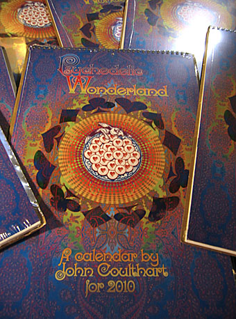
Now we’re into January it’s customary here to reduce the cost of the latest calendar since these things have a limited shelf-life. This year’s Psychedelic Wonderland production has been my most popular so far and can be had now for $17.99, one dollar over the base cost. Thanks again to everyone who bought a copy.

Previously on { feuilleton }
Psychedelic Wonderland: the 2010 calendar

New projects and new interview

kosher.jpg

The final post of an exceptionally productive year arrives with 2010 already shaping up to be just as busy and stimulating work-wise. In 2009 I designed at least 12 books (or was it 13? I’ve lost count…), 8 or 9 book covers, several CDs and many one-off commissions, as well as producing that calendar. If the precise details are vague it’s because the year has passed in something of a blur.

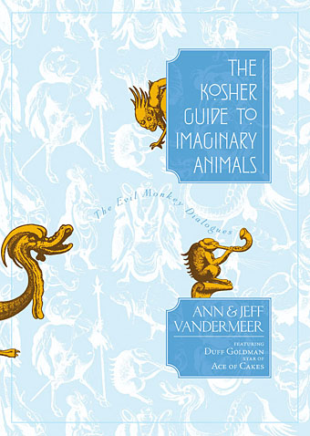
A number of the books I’ve been working on have yet to be published, among them The Kosher Guide to Imaginary Animals by Ann & Jeff VanderMeer which will be appearing soon from Tachyon. This is a small hardback whose humorous nature should be self-explanatory but if you need further details, Jeff can tell you more. And one of the major tasks of next year will be work for another VanderProject, The Thackery T Lambshead Cabinet of Curiosities, a sequel to the acclaimed Thackery T Lambshead Pocket Guide to Eccentric and Discredited Diseases. The new anthology will be a HarperCollins title due for publication in 2011; once again, Jeff has further details.

Finally, the good people at Innsmouth Free Press talked to me recently and their interview is now posted. Given the nature of the site, the discussion mostly concerns matters Lovecraftian but I also talk a little about how I ended up doing all this stuff in the first place. And if you read to the end you’ll discover which Lovecraft character I’d prefer to be. I decided to stick with the human cast; choosing from among the Great Old Ones seems far too presumptuous, even for an inflated ego like mine.

Strange Attractor Salon

tarot.jpg

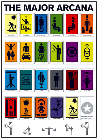
Some of my work makes a rare appearance in the gallery world next month as part of the Strange Attractor Salon at Viktor Wynd Fine Art, London. The Major Arcana (2006) will be one of the designs on display as a large print with its occult theme complementing the esoteric tenor of the exhibition. Not sure how busy I’ll be in the New Year but I may be down there for the opening on the January 7th.

The first Strange Attractor Salon will be held at Viktor Wynd Fine Art (incorporating The Little Shoppe of Horrors), 11 Mare Street, London, UK, E8 4RP, between 7 and 31 January 2010. The exhibition will gather together, for the first time, a selection of art and illustration from Strange Attractor’s contributors, friends, allies and inspirations.

Like our books and events the Salon will incorporate a wide range of media (painting, drawing, photography, sculpture, sound and video) from both trained and untrained artists. The assembled exhibitors all share Strange Attractor’s fascinations with inner space, craft, science (natural and unnatural) and the fantastic.

Confirmed contributing artists are:
Joel Biroco * Richard Brown * Ossian Brown * John Coulthart * Rod Dickinson * Disinformation * Tessa Farmer *Blue Firth * Alison Gill * Doug Harvey * Josephine Harvatt * Stewart Home * Julian House * Ali Hutchinson * Alyssa Joye * Maud Larsson John Lundberg * Eleanor Morgan * Drew Mulholland * Katie Owens * Edwin Pouncey * Arik Roper * Gavin Semple * Martin Sexton * Catharyne Ward  * Eric Wright *

Previously on { feuilleton }
SAJ again
Strange Attractor Journal Three
The Major Arcana

More Steampunk and the Crawling Chaos

steampunk1.jpg

Yes, it’s these again, and no, I’m not posting them because it Christmas (although you probably don’t believe that). This is the first opportunity I’ve had to add the designs to CafePress after letting them sit for a while seeing as they’re all still available on Modofly’s book range. I’ve had queries recently for the Steampunk designs as poster prints so these are now available in the usual CafePress sizes of large, small and mini. There’s also a range of CafePress t-shirts, and if you’d like one of those they have a bewilderingly extensive choice. The four pieces are:

Steampunk | CafePress shop
Steampunk Redux | CafePress shop
Steampunk: Life in Our New Century! | CafePress shop
Nyarlathotep: the Crawling Chaos | CafePress shop

steampunk2.jpg

While we’re on the subject of Coulthart merchandise, I haven’t mentioned that I’ve discontinued selling signed prints for the time being so CafePress is now the sole place to get a print of anything. I’ve been so busy recently that keeping up with print orders was becoming a serious problem, in addition to never having been very lucrative in the first place. CafePress has excellent printing and can produce things at a large size a lot more cheaply than I’d be able to manage. This doesn’t rule out signed prints altogether but in future they’ll probably be strictly limited editions, signed and numbered. Any developments along those lines will be announced here.

Previously on { feuilleton }
New Modofly books
Nyarlathotep: the Crawling Chaos
Steampunk Redux
Steampunk framed
Steampunk Horror Shortcuts

Queer Noise and the Wolf Girl

queer_noise.jpg

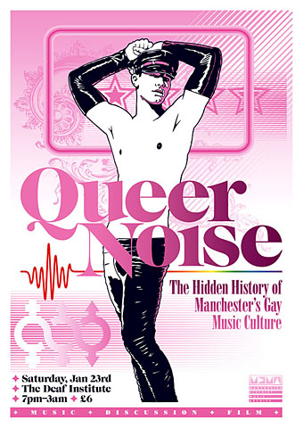
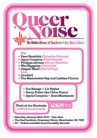
Two recent pieces of work which were being created at the same time so they share some similarity of style (and the same baroque flourish). Queer Noise is a music-related event taking place in Manchester (UK) next month. Music journalist Jon Savage will be leading the discussion and some may recognise the event title as relating to his Trikont CD compilation Queer Noises 1961–1978: From the Closet to the Charts. There are further details about the event at the MDMArchive.

Designing for gay content can be a fraught business since it’s almost inevitable that someone will disagree with your choices. Best then to abandon any thought of trying to please everyone and follow your own instincts. Making this a riot of pink seemed like a good way to offset the fetishised figure as well as making an eye-catching design. My first impetus had been to try an arrangement of pink and black on white similar to that used by Barney Bubbles in one of his Ian Dury designs. In the end this evolved away from that idea but it was a useful starting point. And while we’re on the subject of pink, there’s a growing backlash against the way the colour is forced on young girls:

Back in the 1800s, most children were dressed alike. Gender differences weren’t really apparent until they could walk, or later: boys and girls both wore dresses or skirts until they were six or so. By the end of the century, as the Ladies’ Home Journal noted, boys’ and girls’ clothing styles began to diverge. According to Professor Jo Paoletti of the University of Maryland, pink emerged as an appropriate colour for boys because it was “a close relative of red, seen as a fiery, manly colour”. Blue was considered better suited for girls because of its associations, in art, with the Virgin Mary. (More.)

curse.jpg

Curse of the Wolf Girl is a young adult title by Martin Millar about which I can tell you very little at the moment other than I’ve finished the cover and the book will be out some time in the new year from Underland Press. More about that when it happens.

Previously on { feuilleton }
Coming Out Day
Over the rainbow
Queer Noises