Corner of a Canal (1919–20).
This week’s post is another by Sander Bink about a Dutch artist whose work may be unfamiliar to those outside the Netherlands. Jacob Bendien was certainly new to me. My thanks again to Sander for the post.
* * *
Jacob Bendien, born in Amsterdam in 1890, was one of the pioneers of abstract art (“absolut art” as Bendien and kindred artistic spirits called it) but is nevertheless little known in the Anglophone world. In the Netherlands he is not ignored or forgotten since he is mentioned in most overviews of early Dutch abstract art. Bendien’s work belongs to a somewhat later period than the other Dutch artists in this series but can be related thematically via his roots in the mystical/Symbolist art from around 1900.
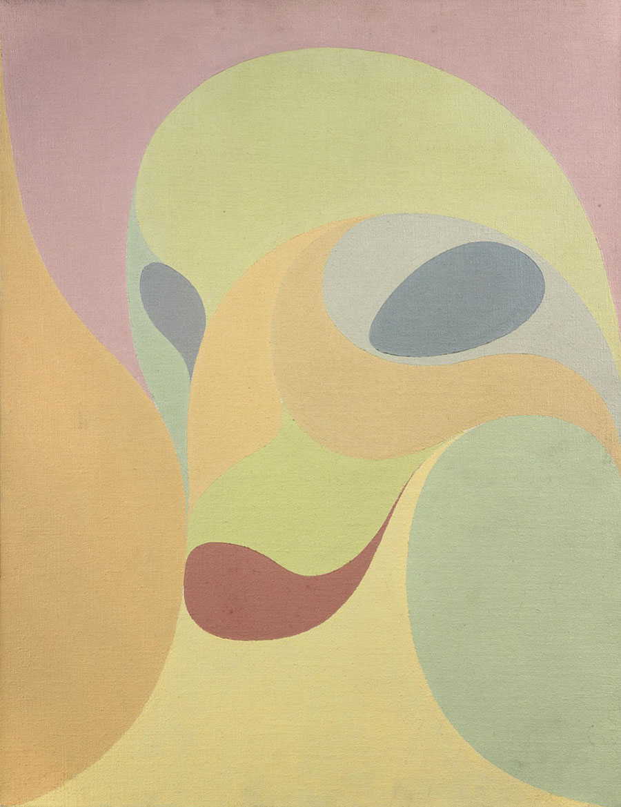
Although Bendien was an early admirer of Mondrian’s art, his work differs from Neo-plasticism in its use of lines and round forms instead of bars and straight lines.
Composition (1912); Stedelijk Museum, Amsterdam.
Peinture I (1912); Centraal Museum, Utrecht.
Two examples of Bendien’s early abstractions are the graceful oil-on-canvas Composition from 1912, and the slightly Surrealist portrait Peinture I from the same year.

Amsterdam Canal (1916).
Somewhere between Surrealism, Modernism and Symbolism is the lithograph Amsterdam Canal which could just as well be a décor for some German Expressionist movie from the 1920s.
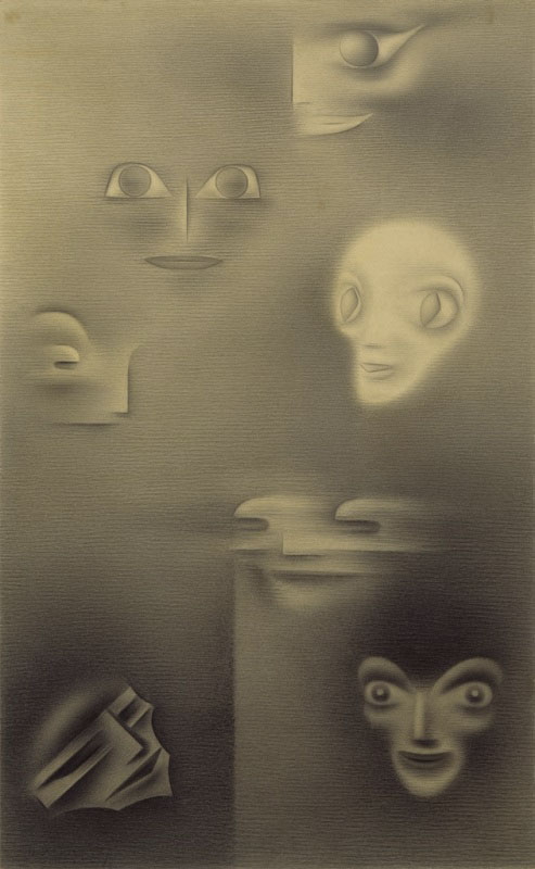
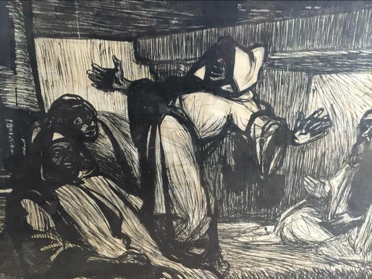
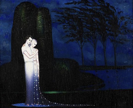
Seven Masks (1917); Museum Belvédère, Heerenveen.
Surreal and Redon-like is his chalk drawing Seven Masks from 1917.
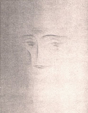
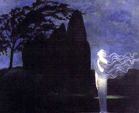
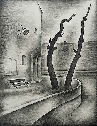
Melancholy (1917).
Around 1916 Bendien made some drawings which seem to be directly inspired by Dutch Decadent-Symbolist artist Carel de Nerée (see this Dutch article) of which his self-portrait Melancholy is a fine example.
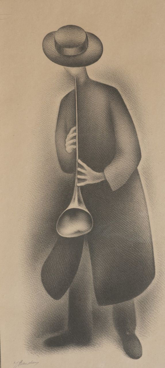
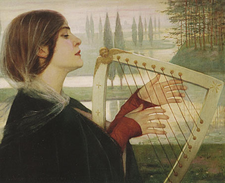
Musician.
More realist but quite endearing is his Musician lithograph from the early 1920s.
As far as I know the last Bendien exhibition was in Utrecht in 1985. His work is hard to find and rarely offered on sale although if one is lucky one can find his lithographs.
Previously on { feuilleton }
• The art of Henricus Jansen, 1867–1921
• The art of Antoon van Welie, 1866–1956
• The art of Simon Moulijn, 1866–1948
• René Gockinga revisited
• Gockinga’s Bacchanal and an unknown portrait of Fritz Klein
• More from the Decadent Dutch