Das Haus zur letzten Latern

sands.jpg

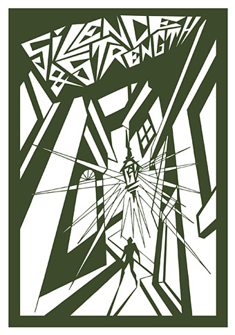
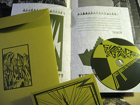
From HP Lovecraft to another writer of weird fiction, Gustav Meyrink. Das Haus zur letzten Latern is a tribute to Meyrink by Silence & Strength and the package I designed late last year for Horus CyclicDaemon has just been released. I’ve mentioned before that Horus make a particular effort with all their CD productions, choosing their materials carefully, and this release is no exception. An envelope of green textured card has two of my designs embossed on either side. Inside this there’s another envelope containing the disc and an 8-page A5 booklet of dark green ink on heavy paper with a grainy texture. The music is suitably dark and atmospheric and would work very well as a soundtrack to Paul Wegener’s Der Golem, wie er in die Welt kam (1920). Seeing as Wegener’s film is the most famous Meyrink adaptation I borrowed the shapes of Prague buildings from one of the original film posters. The rest of the graphics are done in a very spare, quasi-Expressionist drawing style which was a pleasure to do since it’s quite different to my usual work. The background of the booklet pages show an old map of Meyrink’s city, Prague.
sands2.jpg

When people have asked me recently what I think about the proliferation of music downloads I tell them that the best way for record labels (and book publishers for that matter) to continue to attract purchasers is to make beautiful objects which people feel compelled to own. The content is always endlessly reproducible, the packaging isn’t. As far as this argument goes, Horus CyclicDaemon has been ahead of the game for some time.

Previously on { feuilleton }
New things for November II
Hugo Steiner-Prag’s Golem
Nosferatu
Barta’s Golem

Nyarlathotep: the Crawling Chaos

nyarlathotep.jpg

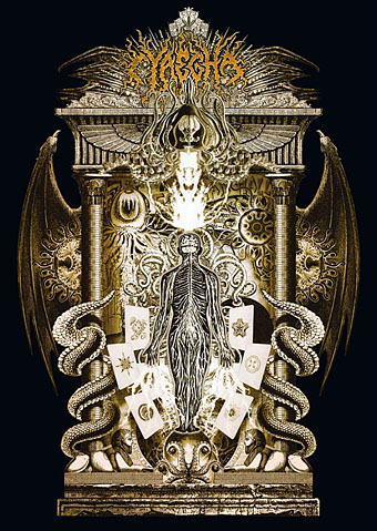
Unveiling another new piece of work, this is a T-shirt design for metal band Cyaegha whose Steps of Descent album I illustrated and designed last year. They asked for something based on HP Lovecraft’s god Nyarlathotep so I thought I’d take the opportunity to rework from scratch the version of this I created in 1999 for the first edition of The Haunter of the Dark. I always felt the earlier piece was going in the right direction but lacked somewhat in execution; this makes up for that. Lovecraft’s Nyarlathotep is one of his most curious creations, in part because the conception of the character changed over many years. In various stories, letters and dream fragments the god/entity is variously described as an Egyptian pharaoh, an itinerant showman with electrical apparatus, the “black man” of European witch cults and the more typically Lovecraftian squamous alien monstrosity. The challenge, then, is to try and represent a little of each of these elements without overly favouring one or the other.

This is one of two illustrations I’ve produced in recent months which use Photoshop to imitate the engraving collage style of Wilfried Sätty, an artist whose work I discussed in an essay for Strange Attractor #2 in 2005. Sätty’s style was derived from Max Ernst’s famous collage “novels” of the 1930s and Photoshop is the ideal tool for this, far better than the old method of scissors, paper and glue. Sätty expanded Ernst’s technique by using reverse printing and the duplication of images; Photoshop extends the technique even further, making it possible to scale images up or down instead of being limited to the size of the original reproduction. The other illustration I’ve done in this style is for a short story and I’ll reveal that closer to publication. In the meantime I should be making a slightly different version of the new Nyarlathotep suitable for the usual range of CafePress products. More about those when they’re done.

Previously on { feuilleton }
The Haunted Palace
The art of Stephen Aldrich

New things for April III

figment.jpg

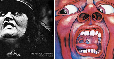
The results of the Figment album art competition have now been posted and you can see my choice of the winner on the left here. You can see the rest of the winners and read my comments on the Figment site. The winning design reminded me of the famous cover for the first King Crimson album, In the Court of the Crimson King (1969), a painting by Barry Godber. Both have an arresting quality which make you wonder what it is that’s being witnessed beyond the picture frame.

King Crimson’s debut is one of the key moments when British music abandoned the silliness of psychedelia and got down to the serious business of becoming progressive rock. For some people this means it’s also the moment when rock music Went Wrong but I’ve no time for such Spartan sophistries; Robert Fripp rules. Digressions aside, I’ve not finished with the present psychedelic obsession (no, you don’t escape that easily), and the other piece of news today comes with an alert from Valis whose radio show of psychedelic music, Trip Inside This House, runs for two hours every Tuesday morning on KBHX, St Louis, from 5am to 7am. There’s archived shows on a blog of the same name and that site currently features an interview with Matt Piucci, ex of the fantastic Rain Parade, for my money the best of the Paisley Underground bands of the 1980s. If you haven’t yet heard their finest moment, No Easy Way Down, then your life is quite simply a hollow sham.

New things for April

drive-in.jpg

I drew attention yesterday to the abraded look of the Taking Woodstock poster and mentioned a recent book design of mine which used a similar effect. This is that cover, created for a collection of Joe R Lansdale’s horror novels coming soon from Underland Press. Lansdale is known mainly for being the writer of the story which Don Coscarelli adapted for Bubba Ho-tep in 2002 (a great film, incidentally) but he’s done a lot more besides. Find out more at his website.

While on the subject of self-promotion, the invent-your-own-band website Figment posted an interview with me as a complement to their cover art competition which I’ve been judging. Results of that will be announced at the end of the week.

And speaking of interviews, I’ll mention again Jay Babcock’s exclusive interview/feature with comic artist Rick Veitch over at Arthur. Rick’s an artist I’ve always had a lot of time for and this piece includes a special intro/appreciation by collaborator Alan Moore. The interview examines the serious business of dreaming, with Rick’s advice on using your dreams for artistic breakthroughs, personal growth, problem solving, and time/space travel.

Previously on { feuilleton }
Sleeve craft
Finch

Taking Woodstock

taking_woodstock.jpg

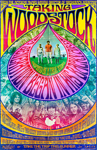
I mentioned Ang Lee’s forthcoming film, Taking Woodstock, last week and this poster by Mojo makes a decent fist of capturing some of the West Coast psychedelic style. I thought at first that the rainbow hues were garish in the wrong way, the San Francisco poster artists used bold colours but limited their palette since many of them were working for screenprinting. But since this film concerns the story of a gay man, Elliot Tiber, and his attempt to provide a home for the Woodstock festival in 1969—and since the rainbow flag is now a gay symbol—it makes sense even if the overall impression is of colour clash. I like the subtle touch of making the poster look worn, something I’ve done myself on a recent book cover design which is also styled as a cinema poster. I’ll be posting that here in due course.

woodstock.jpg

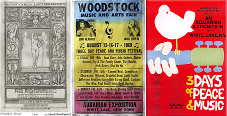
That’s the film promotion; the posters for the original event can be seen at Woodstock posters. The pencil sketch on the left is an elaborate Art Nouveau-styled design intended for the festival before the original choice of venue was refused. The sheet in the centre looks like a hasty promo piece for the new venue while the poster on the right is the final version with the famous dove graphic by Arnold Skolnick. That dove came to symbolise the whole event, hence its appearance on the Taking Woodstock one-sheet.

Taking Woodstock opens in the US on August 15th, 2009, the 40th anniversary of the festival.

Previously on { feuilleton }
Over the rainbow
Dutch psychedelia
Family Dog postcards