 Sam Leith is engrossed by a formidable essay on the father of ‘weird fiction’.
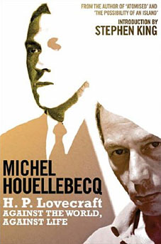
HP Lovecraft: Against the World, Against Life
by Michel Houellebecq
tr by Dorna Kazheni
intro by Stephen King
256pp, Weidenfeld & Nicolson
£10 (pbk)
Saturday, August 12, 2006
The Daily Telegraph
“I AM SO BEASTLY TIRED of mankind and the world that nothing can interest me unless it contains a couple of murders on each page or deals with the horrors unnameable and unaccountable that leer down from the external universes.” So wrote Howard Phillips Lovecraft (1890–1937). His extraordinary body of work can be seen as a sustained effort to fill that prescription.
The founding father of what has become known as “weird fiction”, Lovecraft was not a congenial figure. Tall, ugly, misanthropic, snobbish, reclusive, he hated people in general, and people of other races in particular. More or less nothing happened in his life. He was 32 before he kissed a woman and his brief, unsuccessful and wholly unexpected marriage put paid to love for good. He died of intestinal cancer at 47.
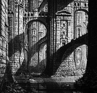
His literary concerns were as follows: unkillable tentacled beings from beyond space worshipped by cannibal death cults; hideous prodigies of miscegenation; gibberings from the abyss; indecipherable languages of madness; insane architectural geometries; colours outside any nameable spectrum. Lovecraft has nothing in common with Anita Brookner.
On the surface, he has very little in common with Michel Houellebecq, either. What they seem to share, though, is an aggressive misanthropy. In this consistently engaging essay, an infatuated Houellebecq argues that Lovecraft’s work pioneered a sort of anti-literature: a great shout of “NO!” to human life.
Lovecraft was not just unrealistic, Houellebecq argues, but anti-realistic: the devotee of a sort of malevolent sublime. Religious writers see our animal lives as validated by the notion that beyond our perception lies something infinitely larger, more ancient and more benevolent. Lovecraft played with the opposite idea. If there’s something else, why should we imagine it would be benevolent? How much more likely that we have, here, a pretty disgusting animal existence; but that if we caught a whiff of what lies outside it, we’d go instantly mad—if we were lucky.
Very little of what Lovecraft wrote conforms to the conventional canons of what literature should be doing. His characters are more or less interchangeable: drab men with drab jobs, no pasts and no futures. They are there to bear witness, to have the living daylights frightened out of them and, if they are unlucky, to be “devoured by invisible monsters in broad daylight at the Damascus market square”. There’s no interest in human life, or money, or sex. The stories don’t start in the real world and amble into horror: they start midway through the screaming hab-dabs and turn up the volume from there producing what Houellebecq calls “an open slice of howling fear”. The involuted and clumsily baroque sentences disapproved of by Lovecraft’s detractors are serving, then, a singular purpose: to pile more on—to generate an intoxicating fever pitch of rhetoric.
Houellebecq’s essay is often perverse, sometimes jejune, more than occasionally downright silly. He attributes more consistency of philosophical purpose to Lovecraft than, I think, a sensible reading of the “great texts”—”The Call of Cthulhu” (1926), ‘The Colour Out of Space” (1927), ‘The Dunwich Horror” (1928), “The Whisperer in Darkness” (1930), “At the Mountains of Madness” (1931), “The Dreams in the Witch House” (1932), ‘The Shadow over Innsmouth” (1932) and “The Shadow Out of Time” (1934)—will bear.
And he on more than one occasion dismisses Lovecraft’s critics, with Houellebecquian arrogance, as “idiots” and such like. But his essay is both a formidable literary performance in itself, a work of real imaginative sympathy, and a consistently engrossing intellectual workout. It bursts with new ideas, and new ways of thinking about this oddest of writers. Bolstered by an introduction by Stephen King, and a pair of first-rate Lovecraft stories, it’s worth anyone’s tenner.
Lovecraft, as Houellebecq observes, “writes for an audience of fanatics—readers he was finally to find only years after his death”. That his work at last found those readers is beyond question. The “Cthulhu Mythos”, like Tolkien’s Middle-Earth, has become a place in which devotees live.
Ever since Lovecraft’s friend August Derleth completed some of his unfinished stories after his death, fantasy writers have done more than imitate Lovecraft’s approach: they have set their stories in his universe. The internet now throws up thousands of references to the mythos, allusions to the dread Necronomicon, and artists’ imaginings of Lovecraft’s monsters.
When I was a child, there was a Call of Cthuthu role-playing game. There’s even an internet cartoon series, “Hello Cthulhu“, that pits the Elder Gods against the overpowering cuteness of “Hello Kitty”. “Hi there! Would you like a cookie?!?” asks a fwuffy kitty with a ribbon in her hair. “No, actually. I would hate to have a cookie, you vapid waste of inedible flesh!” retorts Cthulhu. Lovecraft wouldn’t have liked it, I don’t think. But somewhere, sepulchrally, he might have been flattered.
Previously on { feuilleton }
• Le horreur cosmique